This document is intended for developers who are already familiar with Panel Mini Program development. You need to fully understand what Panel Mini Program and Product Features are. If you have questions about these concepts, Tuya recommends that you learn the following prerequisites. If you already understand them, you can skip this section.
Understanding Relationships
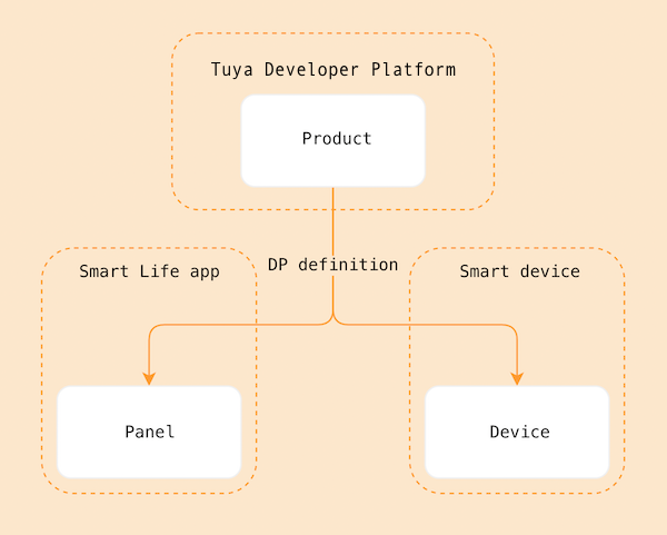
A panel is the product form of IoT smart devices in App terminals. Before creating a product, let's first understand what a panel is and the relationships between panels, products, and devices:
- A panel is an interface interaction program that runs on the Smart Life App and OEM App (Tuya customized App) to control the operation of smart devices and display the real-time status of smart devices.
- A product connects panels with smart devices. A product describes its features, the name displayed on the panel in the App, and the function points owned by smart devices.
- A smart device is a device equipped with Tuya smart modules. Usually, there is a QR code on the device. Use the Smart Life App to scan the QR code to obtain and install the control panel for the device in the App.
- The relationships between products, panels, and devices can be referenced in the following diagram:
The string light template is developed using SDM (Smart Device Model). For information about SDM, refer to the SDM Documentation.
Related Concepts
Product Name: Dreamcolor String Light
Product Introduction
String lights are smart lighting devices that support multi-channel control. They can be divided into different channels based on the supported function points:
- Five-channel: Supports color light
colour_data, white light brightnessbright_value, and white light color temperaturetemp_value - Four-channel: Supports color light and white light brightness
- Three-channel: Supports color light
- Two-channel: Supports white light brightness and white light color temperature
- One-channel: Supports white light brightness
This template mainly supports three-channel string lights (color light mode). Other channels can be adapted according to the logic.
Requirements Prototype
- Switch: Click the switch button to toggle the switch state through the
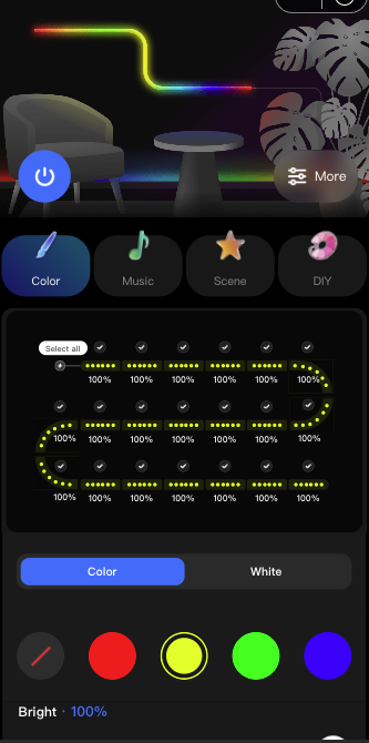
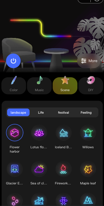
switch_ledDP. - Home Page: The page contains a switch, work mode switching (color light, scene, music, DIY), dimming control, and more function entries. The panel displays specific content based on the function points configured for the product.
- Work Modes:
- Color Light Mode (colour): Supports color light adjustment and smearing functions
- White Light Mode (white): Supports white light brightness and color temperature adjustment (if the product supports it)
- Scene Mode (scene): Supports built-in scenes and custom scenes
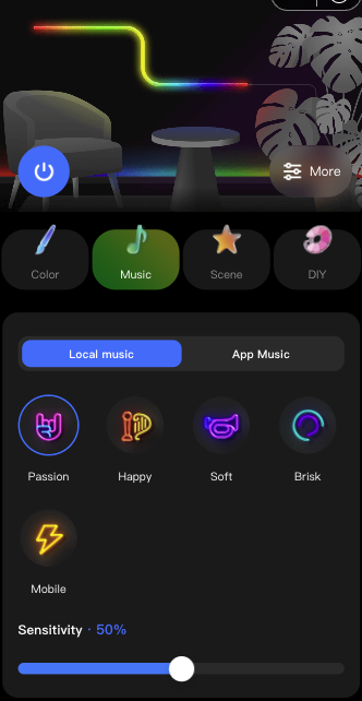
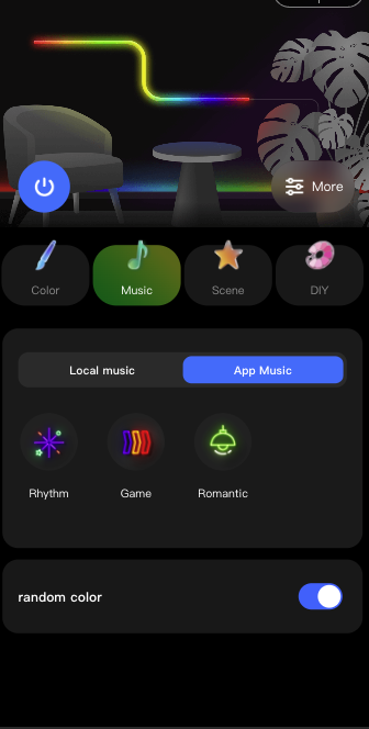
- Music Mode (music): Supports local music and App music rhythm
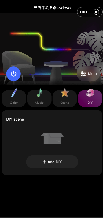
- DIY Mode (diy): Supports custom scene editing
- Color Light Adjustment:
- Supports point selection and select-all toggle
- Supports smearing operations (paint bucket, single-point smearing, eraser)
- Supports color palette adjustment
- Supports brightness adjustment
- Sends data through the
paint_colour_1DP
- White Light Adjustment:
- Supports brightness adjustment (
bright_value) - Supports color temperature adjustment (
temp_value, if the product supports it)
- Supports brightness adjustment (
- Scene Function:
- Built-in scenes: Written and concatenated according to the format defined by the DP
- Custom scenes: Allows users to edit scene effects themselves
- Sent through the
rgbic_linerlight_sceneDP
- Music Rhythm:
- Local Music: Uses the device hardware microphone for audio input, and the panel sends the corresponding music mode configuration
- App Music: Uses the phone microphone for audio input, the panel converts the audio received by the App, and continuously sends it through the DP
dreamlightmic_music_data
- DIY Scene Editing:
- Supports smearing editing mode
- Supports color combination editing mode
- Supports saving custom scenes
- Sends data through the
diy_sceneDP
- More Functions:
- Timer and Countdown Function: Directly jump to the function page for implementation
- String Light Trimming Function: Directly jump to the function page for implementation
- String Light Adjustment: Supports LED count setting (
led_number_set) and segment count setting (segment_num_set)
Function Summary
Required function points for the current string light template:
switch_led,
work_mode,
paint_colour_1,
rgbic_linerlight_scene,
dreamlightmic_music_data,
music_data,
led_number_set,
segment_num_set,
Optional function points for the current string light template:
countdown,
bright_value,
temp_value,
colour_data,
diy_scene,
Switch
Parameter | Value |
dpid | 20 |
code | switch_led |
type | Boolean (Bool) |
mode | Readable and writable (rw) |
Work Mode
Parameter | Value |
dpid | 21 |
code | work_mode |
type | Enum |
mode | Readable and writable (rw) |
property | Enum values: white, colour, scene, music |
White Light Brightness
Parameter | Value |
dpid | 22 |
code | bright_value |
type | value |
mode | Readable and writable (rw) |
property | { "min": 10, "max": 1000, "scale": 0, "step": 1, "type": "value" } |
White Light Color Temperature
Parameter | Value |
dpid | 23 |
code | temp_value |
type | value |
mode | Readable and writable (rw) |
property | { "min": 0, "max": 1000, "scale": 0, "step": 1, "type": "value" } |
Color Light Data
Parameter | Value |
dpid | 24 |
code | colour_data |
type | String |
mode | Readable and writable (rw) |
Countdown
Parameter | Value |
dpid | 26 |
code | countdown |
type | value |
mode | Readable and writable (rw) |
property | { "unit": "s", "min": 0, "max": 86400, "scale": 0, "step": 1, "type": "value"} |
Music Light
Parameter | Value |
dpid | 27 |
code | music_data |
type | String |
mode | Readable and writable (rw) |
Dreamcolor Local Music Rhythm
Parameter | Value |
dpid | 52 |
code | dreamlightmic_music_data |
type | raw |
mode | Readable and writable (rw) |
property | { "type": "raw", "maxlen": 128 } |
LED Count Setting
Parameter | Value |
dpid | 58 |
code | led_number_set |
type | value |
mode | Readable and writable (rw) |
property | { "min": 0, "max": 99999, "scale": 0, "step": 1, "type": "value" } |
Segment Count Setting
Parameter | Value |
dpid | 63 |
code | segment_num_set |
type | value |
mode | Readable and writable (rw) |
property | { "min": 2, "max": 20, "scale": 0, "step": 1, "type": "value" } |
Paint Color 1
Parameter | Value |
dpid | 69 |
code | paint_colour_1 |
type | raw |
mode | Readable and writable (rw) |
property | { "type": "raw", "maxlen": 128 } |
RGBIC Liner Light Scene
Parameter | Value |
dpid | 56 |
code | rgbic_linerlight_scene |
type | raw |
mode | Readable and writable (rw) |
property | { "type": "raw", "maxlen": 128 } |
DIY Scene
Parameter | Value |
dpid | 74 |
code | diy_scene |
type | raw |
mode | Readable and writable (rw) |
property | { "type": "raw", "maxlen": 128 } |
The above are function points other than raw type DPs. For the specific protocol format of raw type DPs, please refer to the code implementation or product solution definition.
First, you need to create a product and define what function points the product has, and then implement these function points one by one in the panel.
Register and log in to the Tuya Developer Platform, and create a product on the platform:
- Click Products > Product Development on the left side of the page, and click Create Product on the Product Development page.
- Under Standard Categories, select Lighting, and select Dreamcolor String Light as the product category.
- Select the smart method, choose Dreamcolor String Light Three-Channel as the product solution, and complete the product information, such as entering LampString as the product name.
- Click the Create Product button to complete product creation.
Note: This template mainly supports dreamcolor string light three-channel. Other channels can be adapted according to the logic.
🎉 At this step, a string light product named LampString has been created.
Create Panel Mini Program on Developer Platform
Panel mini program development is performed on the Mini Program Developer platform. First, go to the Mini Program Developer Platform to complete platform registration and login.
For detailed steps, refer to Panel Mini Program > Create Panel Mini Program.
Pull and Run Template Project
Panel template repository: Repository Address
- First, pull the project.
git clone https://github.com/Tuya-Community/tuya-ray-materials.git - Enter the string light template, install dependencies and start the project.
cd ./template/PublicPanelStringLamp - Open the IDE and click Import.
- Select the downloaded path to import and associate it with the created panel mini program and product.
- Bind a specific device, and the IDE will automatically install dependencies and build the project.
Project Directory
After completing the above steps, a panel mini program development template is initialized. The following is the project directory and its description:
├── public
│ ├── images # Static resources of the project
├── src
│ ├── app.config.ts # Auto-generated configuration
│ ├── app.tsx # App root component
│ ├── components # Component directory
│ │ ├── home-head # Home page header component (includes switch)
│ │ ├── light # Dimming component
│ │ │ ├── colorLight # Color light dimming
│ │ │ ├── whiteLight # White light dimming
│ │ │ └── SmearLight # String light smearing component
│ │ ├── light-string # String light display component
│ │ ├── scene # Scene component
│ │ ├── music # Music component
│ │ ├── tab-diy # DIY scene component
│ │ └── work-mode # Work mode switching component
│ ├── constant # Constant directory
│ │ └── dpCodes.ts # DP code constant definitions
│ ├── containers # Aggregated component directory
│ ├── devices # Smart device model directory
│ │ ├── index.ts # Define and export smart device model
│ │ ├── protocols # Define DP declarations required by the current device
│ │ │ ├── index.ts # Protocol export
│ │ │ ├── paintColour1.ts # paint_colour_1 DP protocol parsing
│ │ │ ├── RgbicLinerlightSceneFormater.ts # Scene DP protocol parsing
│ │ │ ├── DiySceneFormatter.ts # DIY scene DP protocol parsing
│ │ │ └── powerMemoryParser.ts # Power-off memory protocol parsing
│ │ └── schema.ts # Current smart device DP function point description, can be auto-generated by IDE
│ ├── global.config.ts
│ ├── hooks # Custom Hooks directory
│ │ ├── useIsSupport.ts # Check if a DP is supported
│ │ ├── useSceneSet.ts # Scene setting related
│ │ └── ...
│ ├── i18n # Multi-language directory
│ ├── pages # Page directory
│ │ ├── home # Home page
│ │ ├── diyEdit # DIY editing page
│ │ ├── staticDiyEdit # Static DIY editing page
│ │ └── ...
│ └── routes.config.ts # Route configuration
├── typings # Business type definition directory
│ └── sdm.d.ts # Smart device type definition file
Requirements Implementation
IDE Generates SDM Schema to Project
Generate SDM schema to the project, you can view src/devices/schema.ts.
export const defaultSchema = [
  {
    code: 'switch_led',
    defaultValue: '',
    canTrigger: true,
    iconname: 'icon-dp_power2',
    type: 'obj',
    executable: true,
    mode: 'rw',
    defaultRecommend: false,
    name: '开关',
    property: {
      type: 'bool',
    },
    subType: 'bool',
    id: 20,
    editPermission: false,
  },
  {
    code: 'work_mode',
    defaultValue: '',
    canTrigger: true,
    iconname: 'icon-dp_mode',
    type: 'obj',
    executable: true,
    mode: 'rw',
    defaultRecommend: false,
    name: '工作模式',
    property: {
      range: ['white', 'colour', 'scene', 'music'],
      type: 'enum',
    },
    subType: 'enum',
    id: 21,
    editPermission: false,
  },
  // ...
] as const;
Home Page: Switch Control Implementation
Analyze Requirements
- Add a switch button component to the home page.
- Display different button images based on the value sent by
switch_led. - Click the switch component to trigger an event and report the DP value for on and off.
- Display different button images based on the value sent by
- Confirm that the switch DP is
switch_led, which can be passed as a property to the component. - Use
usePropsto get the real-time DP value sent.Example:import React from "react"; import { View } from "@ray-js/ray"; import { useProps } from "@ray-js/panel-sdk"; export default function () { const power = useProps((props) => props.switch_led); return ( <View style={{ flex: 1 }}> <View>switch_led: {power}</View> </View> ); } - Use
useActionsto send DPs. For how to send DPs through SDM, refer to: SDM Sending Tutorial.Example:import React from "react"; import { View } from "@ray-js/ray"; import { useActions } from "@ray-js/panel-sdk"; export default function () { const actions = useActions(); const handleTogglePower = () => { actions.switch_led.toggle({ throttle: 300 }); }; return ( <View style={{ flex: 1 }}> <Button img={power} onClick={handleTogglePower} /> </View> ); }
Implement Switch Component
Based on the above analysis, implement the switch component: src/components/home-head/index.tsx
import React from 'react';
import { Image, View } from '@ray-js/ray';
import { useActions, useProps } from '@ray-js/panel-sdk';
import Res from '../../res';
import styles from './index.module.less';

export const HomeHead = () => {
  const switchLed = useProps(state => state?.switch_led);
  const actions = useActions();

  return (
    <View className={styles.contain}>
      <Image
        className={styles.head}
        mode="aspectFill"
        src={switchLed ? Res.homeahead_on : Res.homeahead_off}
      />
      <View className={styles.bottom}>
        <View
          className={`${styles.switch} ${switchLed ? '' : styles.switchOff}`}
          hoverClassName="button-hover"
          onClick={() => {
            actions.switch_led.toggle();
          }}
        >
          <Image mode="aspectFit" className={styles.switchIcon} src={Res.switch_icon} />
        </View>
      </View>
    </View>
  );
};
Work Mode Switching
The work mode switching component is located at src/components/work-mode/index.tsx and supports switching between white, colour, scene, music, and diy.
// Usage example
<WorkMode
  current={work_mode}
  onChange={mode => {
    if (['colour', 'white', 'scene', 'music'].includes(mode)) {
      deviceActions.work_mode.set(mode);
    }
    if (mode === 'diy') {
      // Initialize DIY scene
      setWorkModeDiy('diy');
    }
    setWorkMode(mode);
  }}
/>
Color Light Adjustment: Smearing and Color Adjustment Function
Core Implementation
The color light adjustment function is mainly implemented through the paint_colour_1 DP, which is a raw type and requires a custom protocol parser.
- Protocol Parser:
src/devices/protocols/paintColour1.tsThis file defines theSmearFormaterclass for parsing and formattingpaint_colour_1DP data.export enum DimmerMode { white, // White light mode colour, // Color light mode colourCard, // Color card mode combination, // Combination mode } export enum SmearMode { all, // Select all (paint bucket) single, // Single-point smearing clear, // Eraser } export interface SmearDataType { version: number; // Version number dimmerMode: DimmerMode; // Dimming mode effect?: number; // Smearing effect (0: none, 1: gradient) ledNumber?: number; // String light UI segment count smearMode?: SmearMode; // Smearing action hue?: number; // Color light hue saturation?: number; // Color light saturation value?: number; // Color light brightness brightness?: number; // White light brightness temperature?: number; // White light color temperature singleType?: number; // Point selection type (0: continuous, 1: single point) quantity?: number; // Number of string lights operated this time indexs?: Set<number>; // Selected LED indices combination?: ColourData[]; // Color combination } - String Light Component:
src/components/light-string/index.tsxThis component is responsible for rendering the string light UI and supports:- Displaying the color of each LED
- Supporting click to select LEDs
- Supporting smearing operations (drag to select multiple LEDs)
- Dimming Component:
src/components/light/index.tsxThis component integrates string light display and color adjustment functions, including:- Color light adjustment (
ColorLight) - White light adjustment (
WhiteLight) - Smearing operations (
SmearLight)
- Color light adjustment (
Usage Example
import { useActions, useStructuredActions, useStructuredProps } from '@ray-js/panel-sdk';
import { DimmerMode, SmearMode } from '@/devices/protocols/paintColour1';

// Get current smearing data
const paintColorData = useStructuredProps(p => p.paint_colour_1);
const structuredActions = useStructuredActions();

// Send select-all color light
const handleSetAllColor = (hue: number, saturation: number, value: number) => {
  structuredActions.paint_colour_1.set({
    dimmerMode: DimmerMode.colour,
    smearMode: SmearMode.all,
    hue,
    saturation,
    value,
    ledNumber: 20, // LED count
  });
};

// Send color for selected LEDs
const handleSetSelectedColor = (indexs: Set<number>, hsv: { hue: number; saturation: number; value: number }) => {
  structuredActions.paint_colour_1.set({
    dimmerMode: DimmerMode.colour,
    smearMode: SmearMode.single,
    hue: hsv.hue,
    saturation: hsv.saturation,
    value: hsv.value,
    indexs,
    ledNumber: 20,
  });
};
Scene Function Implementation
The scene function is implemented through the rgbic_linerlight_scene DP, which is a raw type.
- Protocol Parser:
src/devices/protocols/RgbicLinerlightSceneFormater.ts - Scene Component:
src/components/scene/index.tsxSupports:- Built-in scene list (categories such as landscape, atmosphere, festival)
- Custom scenes
- Scene preview and switching
// Usage example
import { useStructuredActions } from '@ray-js/panel-sdk';

const structuredActions = useStructuredActions();

// Set scene
structuredActions.rgbic_linerlight_scene.set({
  key: 1, // Scene ID
  value: {
    // Scene data
    colors: [
      { hue: 0, saturation: 1000, value: 1000 },
      // ...
    ],
  },
});
Music Rhythm Function
Music rhythm supports two modes:
- Local Music: Sent through the
dreamlightmic_music_dataDP- Uses device microphone for audio input
- Component:
src/components/music/local/index.tsx
- App Music: Sent through the
music_dataDP- Uses phone microphone for audio input
- Component:
src/components/music/app/index.tsx
// Local music usage example
import { useActions } from '@ray-js/panel-sdk';

const actions = useActions();

// Set local music mode
actions.dreamlightmic_music_data.set(musicData, {
  success() {
    console.log('Music mode set successfully');
  },
});
DIY Scene Editing
The DIY scene editing function is implemented through the diy_scene DP and supports two editing modes:
- Smearing Editing Mode:
src/pages/staticDiyEdit/index.tsx- Supports smearing colors on the string light
- Supports saving custom scenes
- Color Combination Editing Mode:
src/pages/diyEdit/index.tsx- Supports selecting multiple color combinations
- Supports setting change type and speed
// DIY scene save example
import { useStructuredActions } from '@ray-js/panel-sdk';

const structuredActions = useStructuredActions();

// Save DIY scene
structuredActions.diy_scene.set({
  name: 'My Scene',
  segments: [
    {
      colors: [
        { hue: 0, saturation: 1000, value: 1000 },
        // ...
      ],
    },
  ],
});
Home Page Layout
The home page displays corresponding Tab pages based on the function points supported by the product:
- If color light or white light is supported, display the dimming Tab
- If scenes are supported, display the scene Tab
- If music is supported, display the music Tab
- If DIY is supported, display the DIY Tab
Dimming Function Implementation Points
- HSV Model: Color light is mainly based on the HSV model, integrating Hue (hue), Saturation (saturation), and Value (brightness) into the
paint_colour_1DP. - Smearing Modes:
- Select All Mode: After clicking or dragging the color palette, all LEDs change color synchronously
- Point Selection Mode: LEDs must be selected first, then color adjustment will take effect
- Eraser: Clears the color of selected LEDs
- Cloud Storage: Since the
paint_colour_1DP can only remember the most recent lighting data, it is necessary to store the color value of each LED of the string light in the cloud and synchronize the LED colors in the cloud whenever the DP changes. - String Light Rendering: The string light image is drawn using Canvas or components. To facilitate calculation of smearing positions, the string light shape can be simplified to a rectangle, which also expands the operation range to facilitate user operations such as clicking and smearing.
Scene Function Implementation Points
- Built-in Scenes: Written and concatenated according to the format defined by the DP. For details, see
src/components/scene/scenes.ts - Custom Scenes: Created through DIY editing function, saved to the cloud, and sent through the
diy_sceneDP - Scene Switching: Send scene data through the
rgbic_linerlight_sceneDP
Music Rhythm Implementation Points
- Local Music:
- Sent through the
dreamlightmic_music_dataDP - Uses device hardware microphone for audio input
- Panel sends DP data for music configuration once
- Sent through the
- App Music:
- Continuously sent through the
dreamlightmic_music_dataDP - Uses phone microphone for audio input
- Panel converts audio data received by the App
- Continuously sent through the
- Protocol Format: Refer to the implementation in the
src/standModel/musicModel/directory
More Functions

- String Light Trimming: Directly jump to the function page for implementation, no need for developers to develop the function themselves
- Timer and Countdown: Directly jump to the function page for implementation, no need for developers to develop the function themselves
- String Light Adjustment:
- LED count setting: Set through the
led_number_setDP - Segment count setting: Set through the
segment_num_setDP
- LED count setting: Set through the
Protocol Declaration
For simple protocol conversion, you can directly declare it in src/devices/protocols/index.ts:
import dpParser from './parsers';
import { lampSchemaMap } from '@/devices/schema';
const { colour_data } = lampSchemaMap;

export const protocols = {
  [colour_data.code]: [
    {
      name: 'hue' as const,
      bytes: 2,
      default: 0,
      defaultValue: 0,
    },
    {
      name: 'saturation' as const,
      bytes: 2,
      defaultValue: 1,
    },
    {
      name: 'value' as const,
      bytes: 2,
      defaultValue: 1,
    },
  ],
};
For advanced protocol conversion, you can place the corresponding protocol rules in the src/devices/protocols/ directory, and then reference them in src/devices/protocols/index.ts:
import PaintColour1 from './paintColour1';
import RgbicLinerlightSceneFormater from './RgbicLinerlightSceneFormater';
import DiySceneFormatter from './DiySceneFormatter';

export const protocols = {
  [dpCodes.paint_colour_1]: new PaintColour1(),
  [dpCodes.rgbic_linerlight_scene]: new RgbicLinerlightSceneFormater(dpCodes.rgbic_linerlight_scene),
  [dpCodes.diy_scene]: new DiySceneFormatter(dpCodes.diy_scene),
};
Related Resources
1. How to determine which functions the product supports?
Use the useSupport Hook:
import { useSupport } from '@ray-js/panel-sdk';

const support = useSupport();

// Check if color light is supported
const isSupportColour = support.isSupportColour();

// Check if white light is supported
const isSupportBright = support.isSupportBright();

// Check if a DP is supported
const isSupportDp = support.isSupportDp('paint_colour_1');
2. How to handle group devices?
Group device handling is already implemented in src/devices/index.ts:
const isGroupDevice = !!getLaunchOptionsSync()?.query?.groupId;

export const devices = {
  common: isGroupDevice
    ? new SmartGroupModel<SmartDeviceSchema, Abilities>(options as any)
    : new SmartDeviceModel<SmartDeviceSchema, Abilities>(options),
};
3. How to synchronize LED colors to the cloud?
Refer to the handleUpdate2Cloud method in src/components/light/index.tsx, which uses cloud storage capabilities to save LED color data.
4. How to customize scenes?
Refer to the implementation in src/pages/diyEdit/index.tsx and src/pages/staticDiyEdit/index.tsx, which supports two editing modes.
This document introduces the core function implementation of the string light template, including:
- Switch Control: Implemented through the
switch_ledDP - Work Mode Switching: Supports color light, white light, scene, music, and DIY modes
- Color Light Adjustment: Implements smearing and color adjustment function through the
paint_colour_1DP - Scene Function: Implemented through the
rgbic_linerlight_sceneDP - Music Rhythm: Supports local music and App music
- DIY Scene Editing: Supports smearing and color combination editing modes
Developers can refer to this document and code implementation to extend and customize functions according to actual needs.