This document is intended for developers who understand panel miniapp development, panel miniapp, and product functions. If you have questions about the above knowledge, learn the following prerequisite knowledge. Skip this document if you have mastered the mentioned knowledge.
Relationship learning
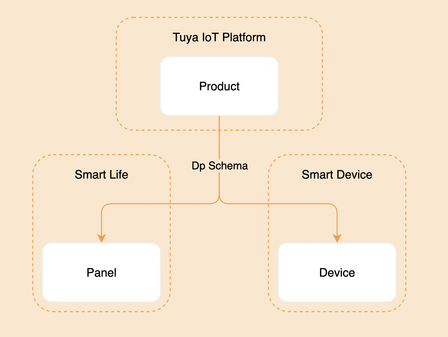
A panel is a product that represents an IoT smart device in the Tuya Smart Life app. Before you create a product, you shall understand the definition of the panel and the relationship among the panel, product, and device.
- A panel is an interaction program running on the Tuya Smart Life app and OEM app (Tuya custom app) used to control the running of smart devices and display the real-time status of smart devices.
- A product is used to associate the panel with the smart device and describes the product functions, panel name displayed in the app, and the data points of the smart device.
- A smart device is a device equipped with the smart module of Tuya, with a pasted QR code for users to scan using the Tuya Smart Life app to get and install the control panel of the device.
- The relationship among the panel, product, and device is shown in the figure below.
The strip lights template is developed based on SDM (Smart Device Model). For more information about SDM, see Smart Device Model.
Concepts
Product name: Dreamcolor strip lights (RGB)
Product introduction
The strip lights support cool white light (C), cool and warm light (CW), colored light (RGB), cool white and colored light (RGBC), and white and colored light (RGBCW) modes based on the data points of the white light mode and multicolor light mode.
Definition:
- RGBCW: Supports setting colored light
colour_data, white light brightnessbright_value, and white light color temperaturetemp_value. - RGBC: Supports setting colored light and white light brightness.
- RGB: Supports setting colored light.
- CW: Supports setting white light brightness and white light color temperature.
- C: Supports setting white light brightness.
Requirement prototype
- Switch: Changes the on/off status of
switch_ledby tapping on the on/off button. - Homepage: Displays the switch, dimmer, scene, music, and other buttons, including the timing, countdown, and strip lights tailor, based on the data points configured for the product.Note that the C and CW strip lights only support the white light mode, the RGB strip lights only support the multicolor light mode, and the RGBC and RGBCW strip lights support both the white light mode and multicolor light mode.
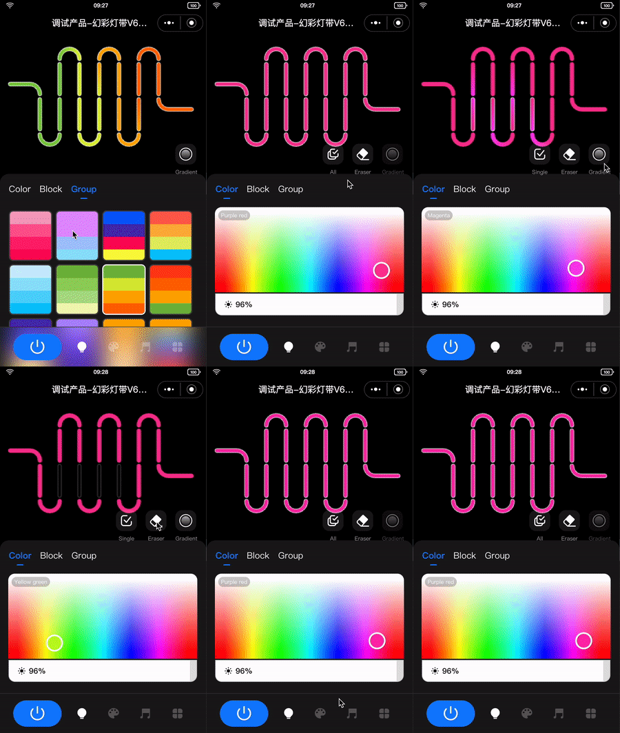
- Multicolor light adjustment:
- When multicolor light mode is selected:
- Supports selecting certain or all strip lights for light adjustment.
- When all strip lights are selected, users can tap or drag and drop the color picker to send the
paint_colour_datadata point to change the color of the above strip lights. - When certain strip lights are selected, users can tap or drag and drop the color picker to send the
paint_colour_datadata point to change the color of the selected strip lights. Note that the strip lights are selected only when they are highlighted. Users can select the strip lights by sliding.
- When all strip lights are selected, users can tap or drag and drop the color picker to send the
- Supports turning off the strip lights by tapping on the eraser.
- Does not support tapping on the gradient button (🔘) when all strip lights are selected.
- Supports selecting certain or all strip lights for light adjustment.
- When color block is selected:
- Supports selecting certain or all strip lights for light adjustment.
- When all strip lights are selected, users can tap or drag and drop the color picker to send the
paint_colour_datadata point to change the color of the above strip lights. - When certain strip lights are selected, users can tap or drag and drop the color picker to send the
paint_colour_datadata point to change the color of the selected strip lights. Users can select the strip lights by sliding.
- When all strip lights are selected, users can tap or drag and drop the color picker to send the
- Supports turning off the strip lights by tapping on the eraser.
- Does not support tapping on the gradient button (🔘) when all strip lights are selected.
- Supports selecting certain or all strip lights for light adjustment.
- When combination is selected:
- Supports displaying the strip lights evenly according to the selected color blocks.
- Supports displaying the gradient effect after tapping on the gradient button (🔘).

- When multicolor light mode is selected:
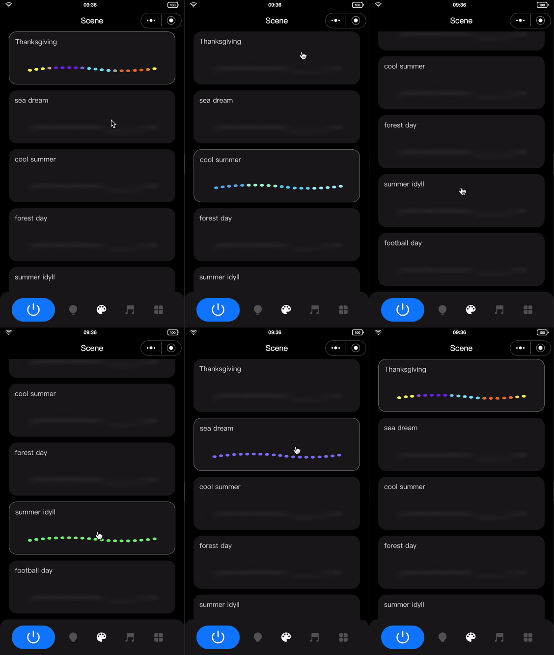
- Scene linkage:
- The following two scenarios are involved:
- Local scene: The scenes configured based on the defined formats of the data points. For more information, see the following section.
- Cloud scene: The scenes configured in the backend provided by Tuya that do not need development. Advanced functions need to be enabled. Automatic jumping to a functional page is supported after tapping on the cloud scene.
- Operation: After tapping on the scene, the
dreamlight_scene_modedata point is sent, and the strip lights change accordingly.
- The following two scenarios are involved:
- Music setting:
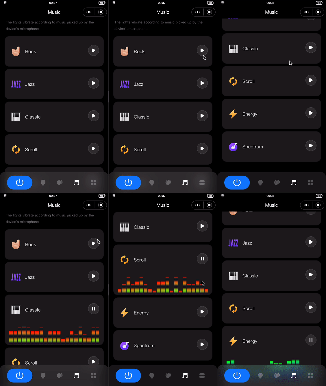
- The following two scenarios are involved:
- Local music: The sound picked up by the device microphone. After users tap on the local music mode, the data of the data point configured for the local music by default is sent. You can either customize the data point or contact the Tuya official personnel to get the data point.
- App music: The sound picked up by the mobile phone microphone. The panel converts the received audio file to color data and sends the data to the device using the
dreamlightmic_music_datadata point.
- The following two scenarios are involved:
- More settings:
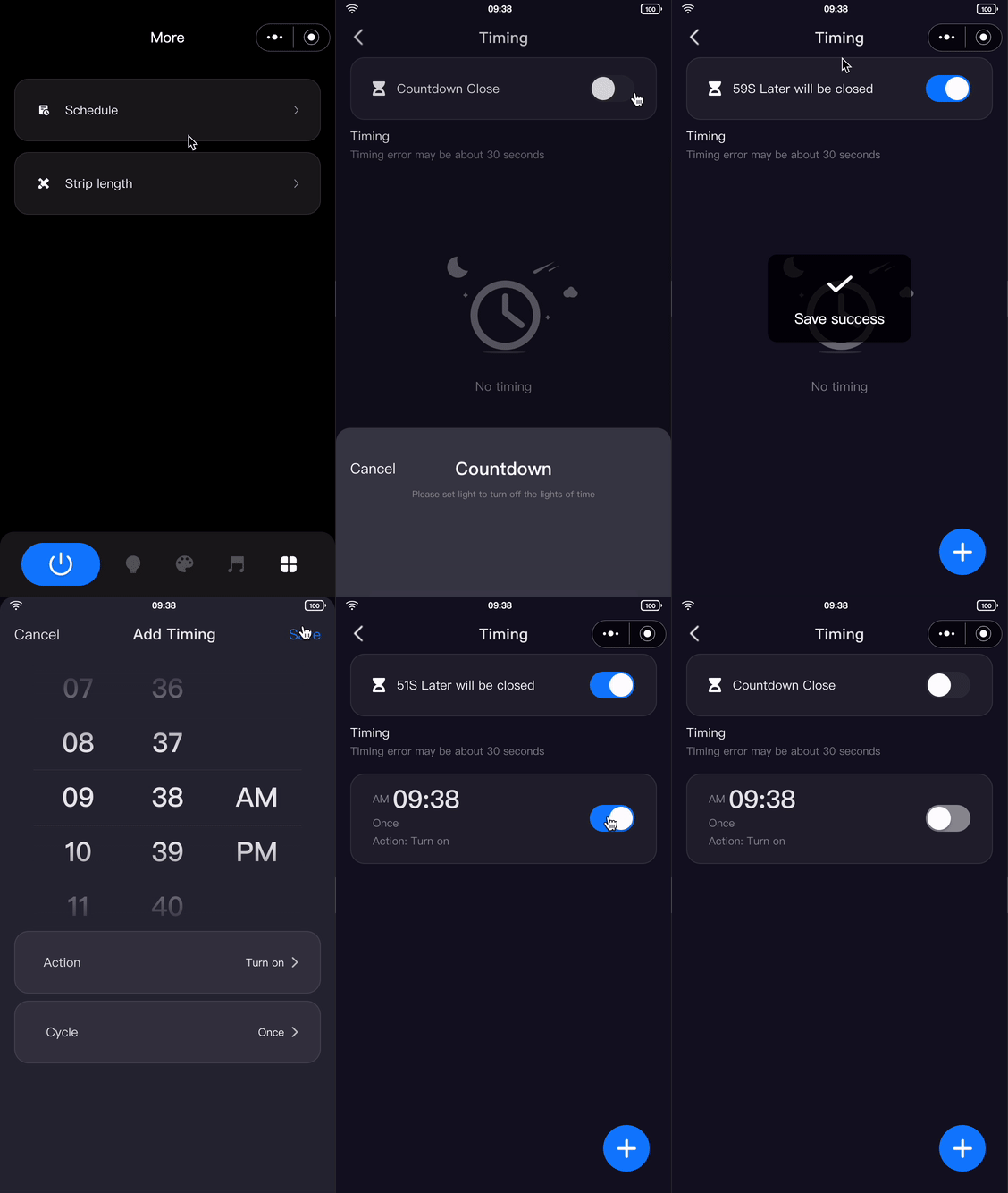
- Timing and countdown:
- Timing: Executes the predefined operation at the specified time point.
- Cloud timing: Sends the data point data from the cloud at the specified time point through the timer API, and the device responds to the received data.
- Device timing: Sends the data point data, including the specified time point and function, and the device responds to the received data.
- Countdown: Executes the predefined operation after a specified duration.
- Devices in the group do not support the timing and countdown functions.
- Data is sent using the
countdowndata point in seconds.
- Strip lights tailor:
- Users can customize the length of the strip lights in the app to adjust the lighting area.
- Multiple data points are used to adjust the length of the strip lights and the number of lighting beads.

- Timing and countdown:
Features
The strip lights template must have the following data points.
switch_led,
work_mode,
paint_colour_data,
dreamlight_scene_mode,
dreamlightmic_music_data,
light_pixel,
lightpixel_number_set,
The strip lights template has the following available data points that can be selected.
countdown,
light_length,
Switch
Parameter | Value |
dpid | 20 |
code | switch_led |
type | Boolean |
mode | Send and report (read-write) |
Working mode
Parameter | Value |
dpid | 21 |
code | work_mode |
type | Enum |
mode | Send and report (read-write) |
property | Enum values: white, colour, scene, music |
Countdown
Parameter | Value |
dpid | 26 |
code | countdown |
type | value |
mode | Send and report (read-write) |
property | { "unit": "s", "min": 0, "max": 86400, "scale": 0, "step": 1, "type": "value"} |
Strip lights length
Parameter | Value |
dpid | 46 |
code | light_length |
type | value |
mode | Report only (read-only) |
property | {"unit": "cm", "min": 1, "max": 10000, "scale": 0, "step": 1, "type": "value" } |
Strip lights bead number
Parameter | Value |
dpid | 47 |
code | light_pixel |
type | value |
mode | Report only (read-only) |
property | { "min": 1, "max": 1024, "scale": 0, "step": 1, "type": "value" } |
Bead/Length setting
Parameter | Value |
dpid | 53 |
code | lightpixel_number_set |
type | value |
mode | Send and report (read-write) |
property | { "min": 1, "max": 1000, "scale": 0, "step": 1, "type": "value" } |
The data points with a data type other than Raw are listed above. For data points with the data type of Raw, see the specific protocol.

Create dreamcolor strip lights, define data points, and configure the data points in the panel.
Log in to Tuya Developer Platform and create dreamcolor strip lights.
- Go to Product > Development and click Create on the Product Development page.
- On the Standard Category tab, select Lighting. In the Select a product step, select Dreamcolor Strip Light.
- Select a smart mode and an RGB solution and complete the product information. For example, enter PublicLamp for Product Name.
- Click Create.
Note: This template only supports dreamcolor RGB strip lights. For other modes, configure the product according to the logic.
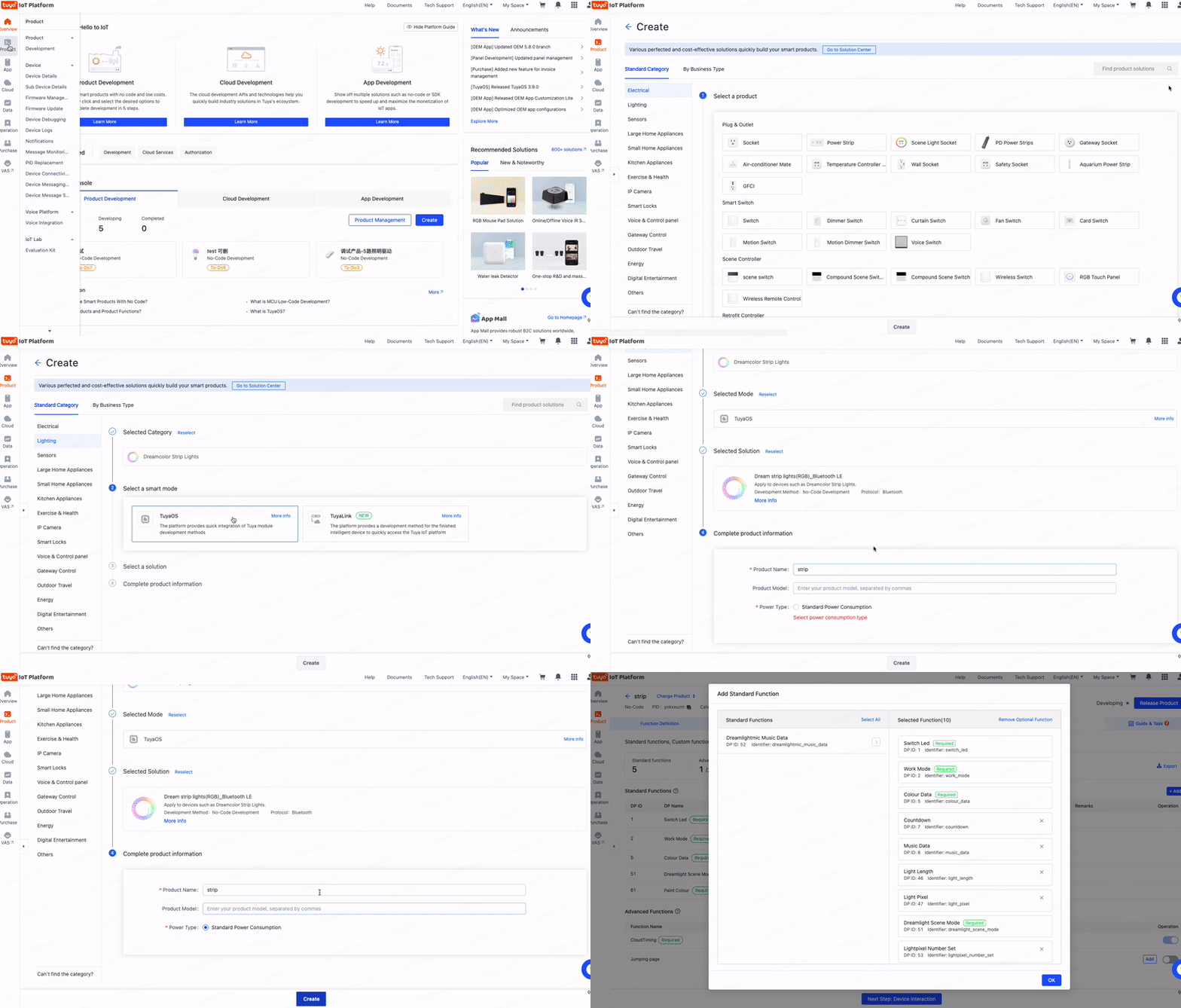
🎉 By now, dreamcolor strip lights named PublicLamp are created.
Create panel miniapp on Tuya MiniApp Developer Platform
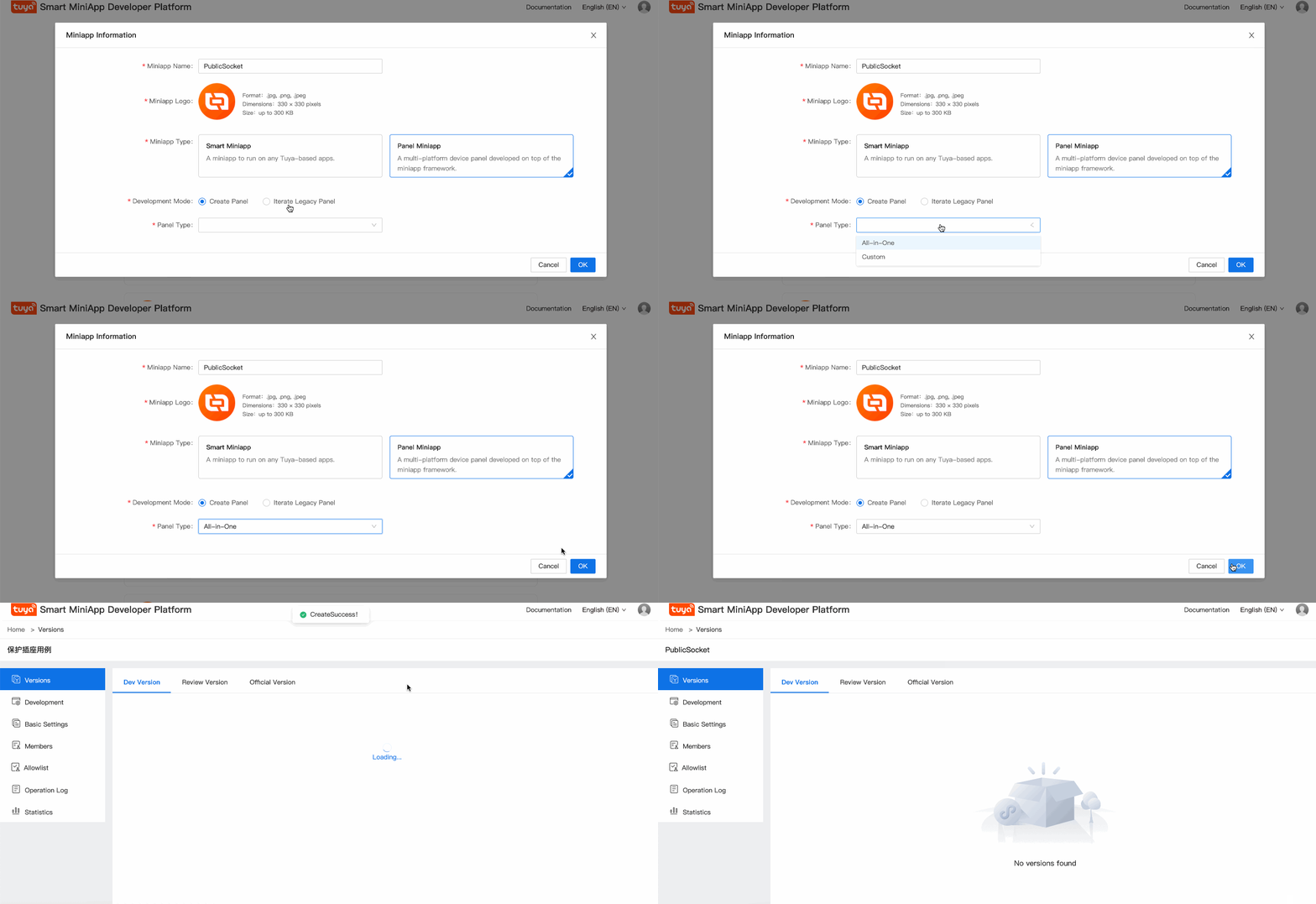
Log in to Tuya MiniApp Developer Platform to create a panel miniapp.
For more information, see Panel MiniApp > Create panel miniapp.
Pull and run template project
Panel template repository: Repositories.
- Pull the project.
git clone https://github.com/Tuya-Community/tuya-ray-materials.git - Select the strip lights template, install the dependencies, and start the project.
cd ./template/PublicPanelStripLamp - Open IDE and click Import.
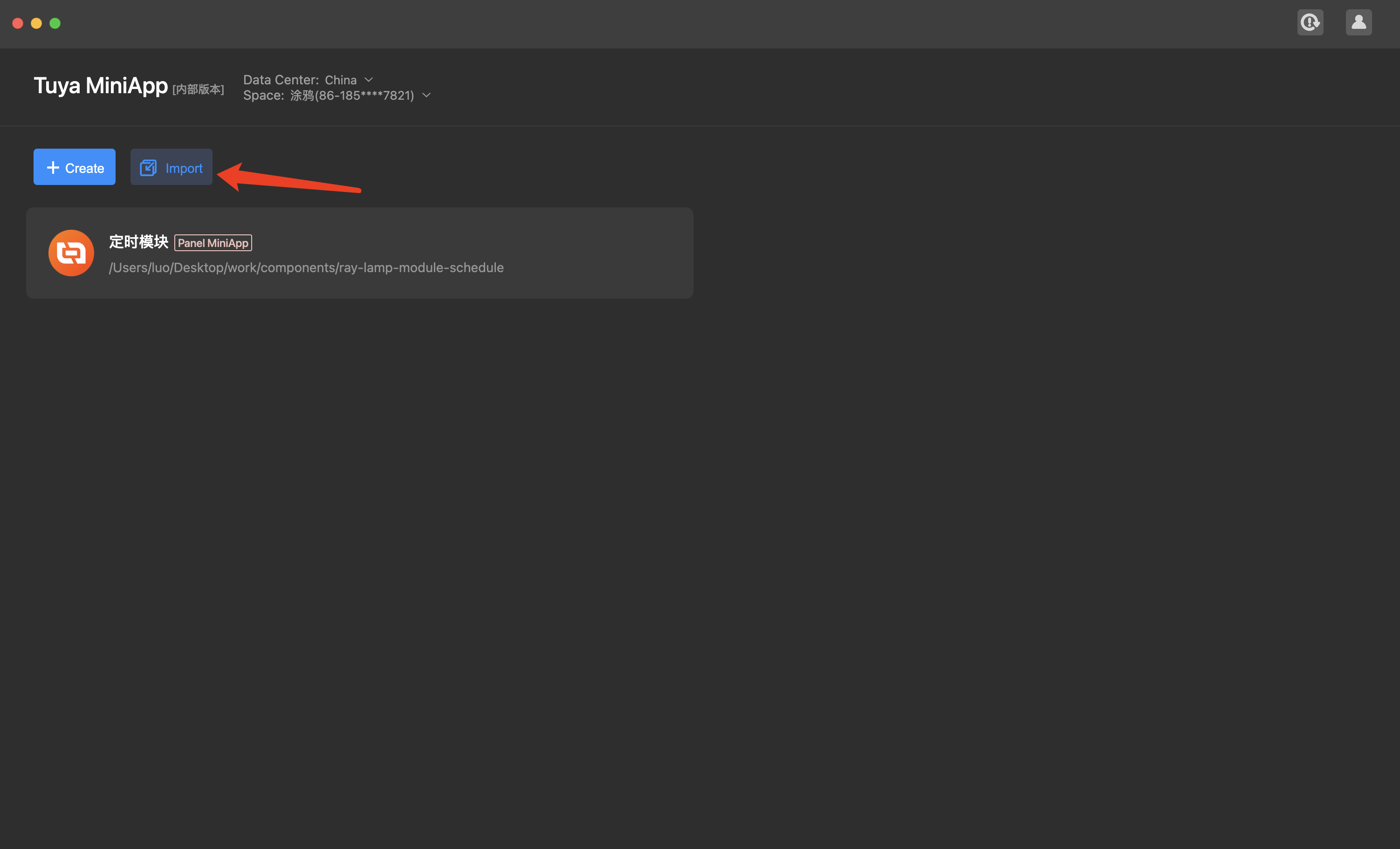
- Enter the project path for import and associate the project with the created panel miniapp and product.

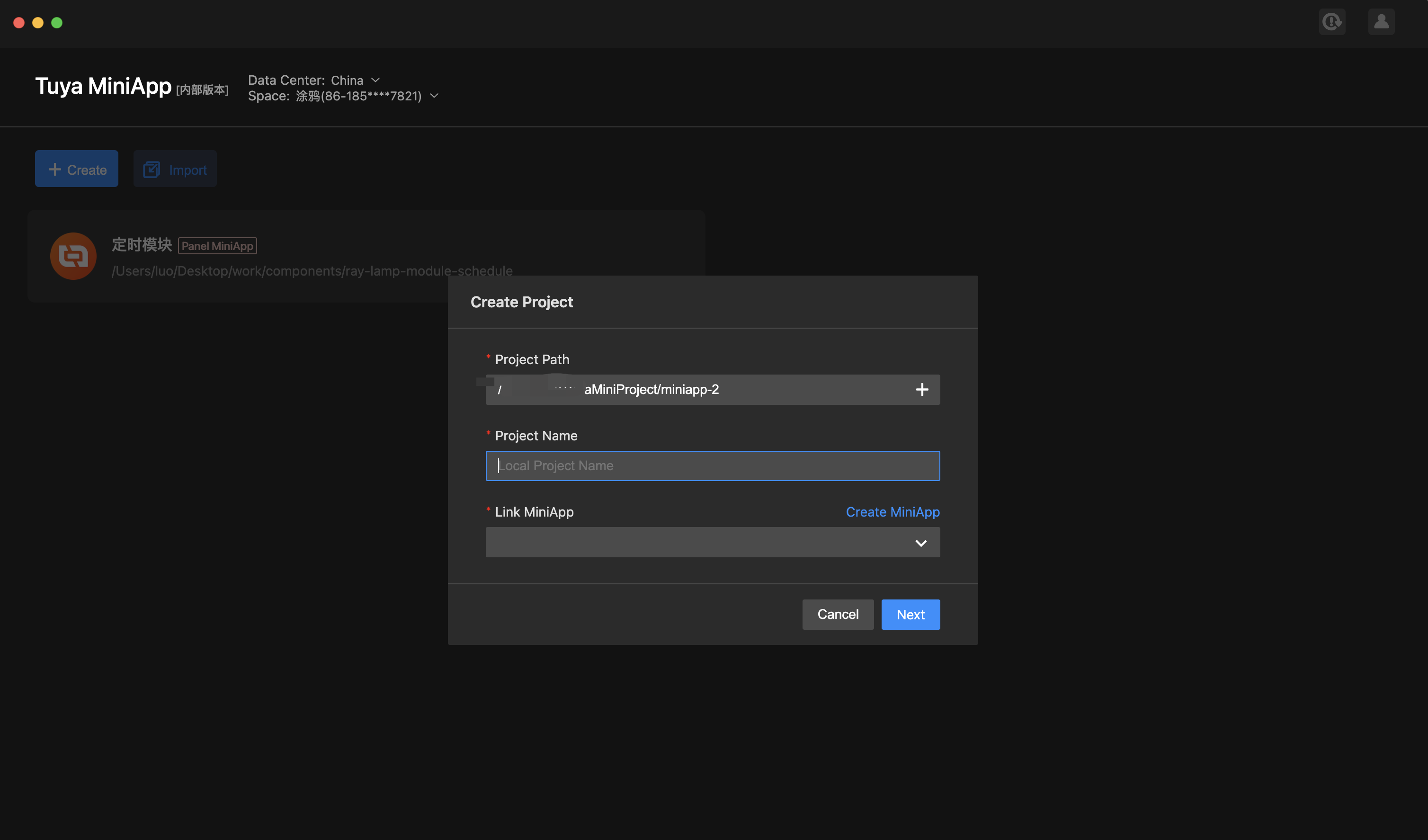
- Associate the device, and IDE automatically installs dependencies and creates the project.
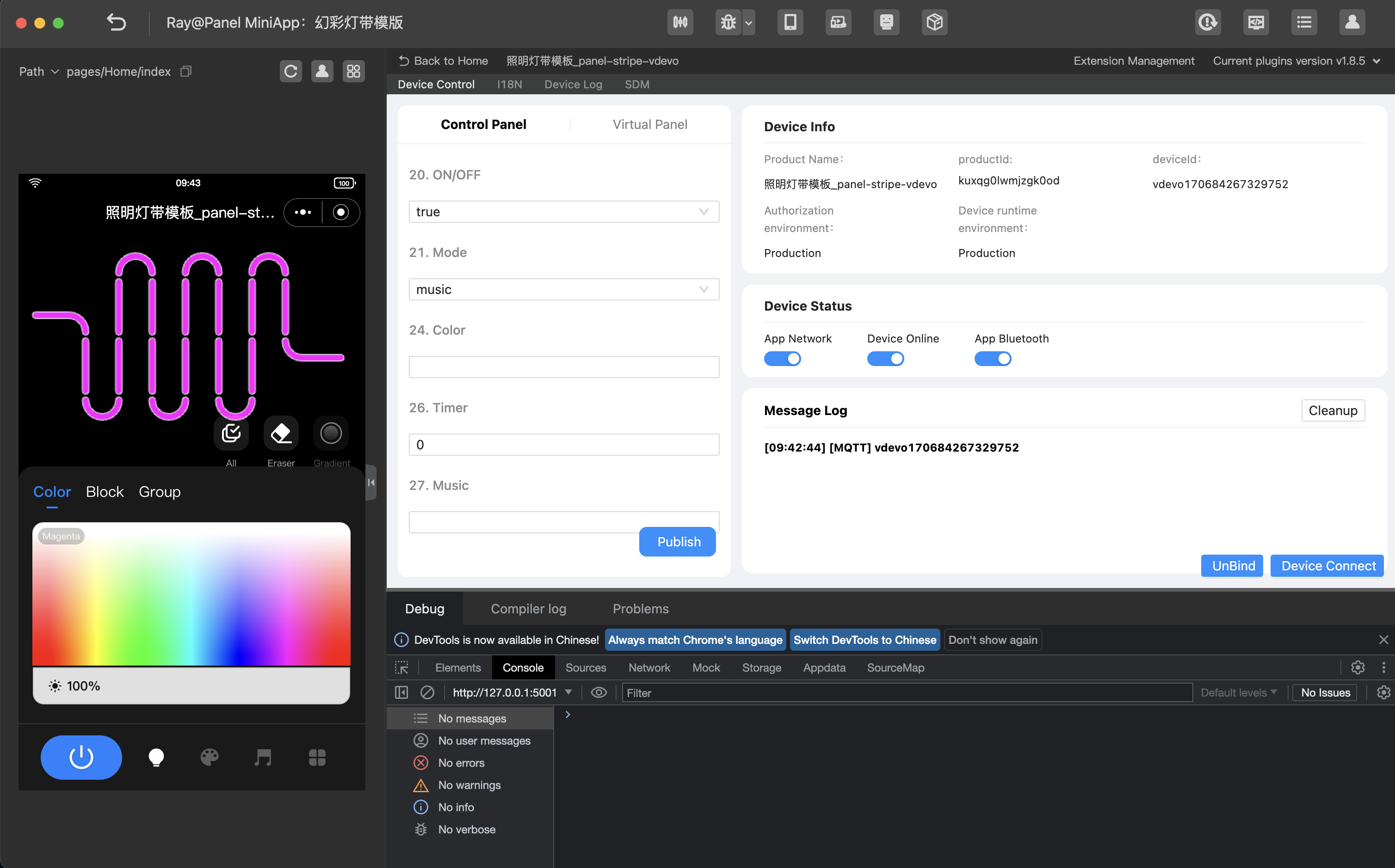
Project directory
By now, the initialization of the development of a panel miniapp is completed. The introduction to the project directory is as follows.
├── public
│ ├── images # Static resources of the project.
├── src
│ ├── app.config.ts # Configurations generated automatically.
│ ├── app.tsx # App root component.
│ ├── components # Component directory.
│ ├── constant # Constant directory.
│ ├── containers # Aggregated component directory.
│ ├── devices # Smart device model directory.
│ │ ├── index.ts # Smart device model definition and export.
│ │ ├── protocols # Declaration definition of the DP required by the device.
│ │ ├─────parses # Complex protocol definition of the DP required by the device.
│ │ └── schema.ts # Description of the DP of the current smart device, which can be generated automatically by IDE.
│ ├── global.config.ts
│ ├── hooks # Custom hooks directory.
│ ├── i18n # Multilingual directory.
│ ├── pages # Page directory.
│ └── routes.config.ts # Route configuration.
│─── typings # Definition directory of business types.
│ └── sdm.d.ts # Definition files of smart device type.
Requirement implementation
Generate SDM schema in IDE for project
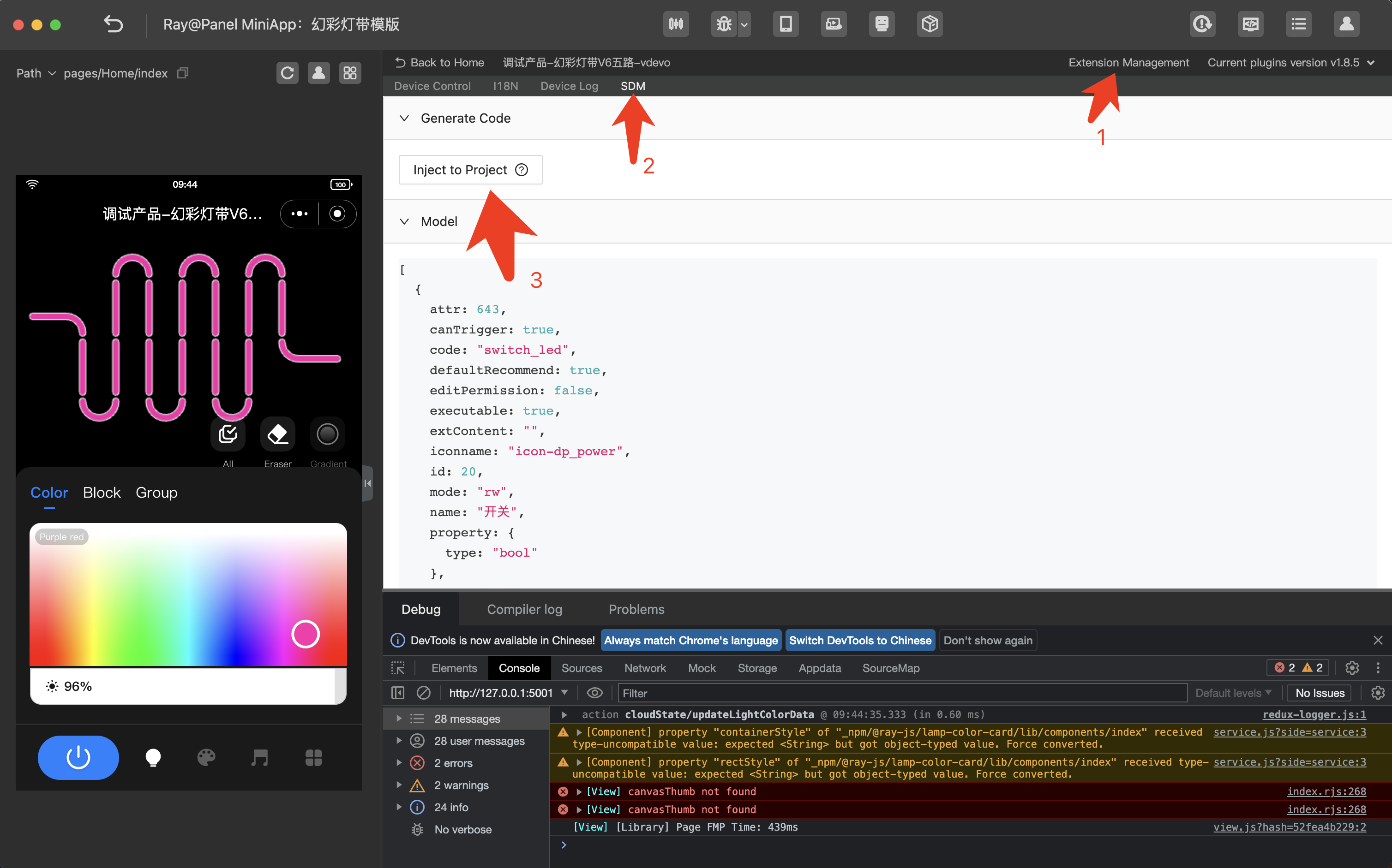
Generate SDM schema for the project by referring to src/devices/schema.ts.
export const defaultSchema = [
	{
		attr: 641,
		canTrigger: true,
		code: "switch_led",
		defaultRecommend: true,
		editPermission: false,
		executable: true,
		extContent: "",
		iconname: "icon-dp_power",
		id: 20,
		mode: "rw",
		name: "Switch",
		property: {
			type: "bool",
		},
		type: "obj",
	},
	{
		attr: 640,
		canTrigger: true,
		code: "work_mode",
		defaultRecommend: true,
		editPermission: false,
		executable: true,
		extContent: "",
		iconname: "icon-dp_mode",
		id: 21,
		mode: "rw",
		name: "Mode",
		property: {
			range: ["white", "colour", "scene", "music"],
			type: "enum",
		},
		type: "obj",
	},
	// ...
] as const;
Homepage: Multicolor light adjustment
Requirement analysis
- Add the on/off button component to the homepage.
- Display different button icons according to the value sent by
switch_led. - Tap the on/off button component to report the DP value of the on and off events.
- Display different button icons according to the value sent by
- Check whether the DP identifier of the on/off button is
switch_led. If yes, pass this attribute to the component. - Use
usePropsto get the value of the data point sent in real time.Example:import React from "react"; import { View } from "@ray-js/ray"; import { useProps } from "@ray-js/panel-sdk"; export default function () { const power = useProps((props) => props.switch_led); return ( <View style={{ flex: 1 }}> <View>switch_led: {power}</View> </View> ); } - Use
useActionsto send the data point. For more information about how to use SDM to send data points, see useActions.
Example:
import React from "react";
import { View } from "@ray-js/ray";
import { useActions } from "@ray-js/panel-sdk";

export default function () {
	const handleTogglePower = () => {
		actions.switch_led.toggle({ throttle: 300 });
	};
	return (
		<View style={{ flex: 1 }}>
			<Button img={power} onClick={handleTogglePower} />
		</View>
	);
}
On/Off button component implementation
Implement the on/off button component based on the analysis. For more information, see ControlBar.
import React from "react";
import res from "@/res";
import { View, Image } from "@ray-js/ray";
import dpCodes from "@/config/dpCodes";
import { Button } from "@/components";
import { useActions, useProps } from "@ray-js/panel-sdk";
import styles from "./index.module.less";

export const PowerButton = () => {
	const power = useProps((props) => props.switch_led);
	const actions = useActions();
	const handleTogglePower = () => {
		actions.switch_led.toggle({ throttle: 300 });
	};
	return (
		<View className={styles.container}>
			<Image className={styles.bg} mode="aspectFill" src={bottom_dark} />
			<Button
				img={power}
				onClick={handleTogglePower}
				imgClassName={styles.powerBtn}
				className={styles.powerBox}
			/>
		</View>
	);
};
- Homepage: Displays different tabs according to the configured data points of multicolor light mode or white light mode. The template supports only RGB strip lights.
- Dimming: The multicolor light mode is developed based on the hue, saturation, value (HSV) model, integrating the hue, saturation, and value data into
paint_colour_data. You can view the data point protocol for project creation on Tuya Developer Platform and see parsers for data point sending.- Two types of operations are supported, namely, sliding (including strip light selection, eraser selection, and gradient setting) and dimming mode selection (including the selection of multicolor light, color block, and combination).
- The color of each strip light bead is stored in the cloud for bead color synchronization along with the data point change because the
paint_colour_datadata point stores only the latest light data. - The image of the strip lights is rendered on canvas, and the shape of the strip lights is designed as a rectangle to simplify drawing, selection, and other operations.
- Scene linkage: Scene data is sent using the
dreamlight_scene_modedata point. - Dance to music:
- Music data is sent using the
dreamlightmic_music_datadata point. - For more information about the music data format, see Music.
- Music data is sent using the
- More settings:
- Strip lights tailor: This setting is implemented automatically by jumping to Feature Pages and does not require development.
- Timing and countdown: This setting is implemented automatically by jumping to Feature Pages and does not require development.
- For conversion of simple protocols, you can declare the conversion in
src/devices/protocols/index.import dpParser from './parsers'; import { lampSchemaMap } from '@/devices/schema'; const { colour_data } = lampSchemaMap; export const protocols = { [colourCode]: [ { name: 'hue' as const, bytes: 2, default: 0, defaultValue: 0, }, { name: 'saturation' as const, bytes: 2, defaultValue: 1, }, { name: 'value' as const, bytes: 2, defaultValue: 1, }, ], }; - For conversion of complex protocols, you can place the protocol rules in
src/devices/protocols/parsersand reference them insrc/devices/index.import _ from 'lodash-es'; import { utils } from '@ray-js/panel-sdk'; import { lampSchemaMap } from '@/devices/schema'; import { log } from '@/utils'; /** Dimmer mode */ export enum DimmerMode { white, colour, colourCard, combination, } export type DimmerTab = keyof typeof DimmerMode; /** Sliding type */ enum SmearMode { all, single, clear, } interface ColourData { hue: number; saturation: number; value: number; } /** Value type of dimmer */ export interface DimmerValue { colour?: ColourData; colourCard?: ColourData; combination?: ColourData[]; } /** Sliding DP data */ export interface SmearDataType { /** Version number */ version: number; /** Mode (0: white light mode, 1: multicolor light mode, 2: color picker, 3: combination) */ dimmerMode: DimmerMode; /** Sliding effect (0: none, 1: gradient) */ effect?: number; /** Number of strip lights UI segments */ ledNumber?: number; /** Sliding action (0: paint bucket, 1: sliding, 2: eraser) */ smearMode?: SmearMode; /** Multicolor light hue */ hue?: number; /** Multicolor light saturation */ saturation?: number; /** Multicolor light value */ value?: number; /** White light brightness */ brightness?: number; /** White light color temperature */ temperature?: number; /** Multicolor light mode applied */ isColour?: boolean; /** Selection type (0: contiguous, 1: single) */ singleType?: number; /** Number of controlled strip lights */ quantity?: number; /** Combination type */ combineType?: number; /** Color combination */ combination?: ColourData[]; /** No. */ indexs?: Set<number>; } const { toFixed, generateDpStrStep, numToHexString } = utils; const { paint_colour_data } = lampSchemaMap; function nToHS(value = 0, num = 2) { return numToHexString(value || 0, num); } /** Conversion to number */ function toN(n: any) { return +n || 0; } function avgSplit(str = '', num = 1) { const reg = new RegExp(`. {1,${num}}`, 'g'); return str.match(reg) || []; } function sToN(str = '', base = 16) { return parseInt(str, base) || 0; } const _defaultValue = { version: 0, dimmerMode: DimmerMode.colour, effect: 0, smearMode: SmearMode.all, hue: 0, saturation: 1000, value: 1000, brightness: 1000, temperature: 1000, ledNumber: 20, } as SmearDataType; export default class SmearFormater { uuid: string; defaultValue: SmearDataType; constructor(uuid = paint_colour_data.code, defaultValue = _defaultValue) { this.uuid = uuid; this.defaultValue = defaultValue; } parser(val = ''): SmearDataType { const validVal = (val || '').slice(0, 1) === '0'; if (!val || typeof val !== 'string' || !validVal) { console.warn(paint_colour_data.code, 'Parsing failed because DP data error occurred.', val); return this.defaultValue; } const step = generateDpStrStep(val); const version = toN(step(2).value); // Version number const dimmerMode = toN(step(2).value); // Dimmer mode const effect = toN(step(2).value); // Dimming effect const ledNumber = toN(step(2).value); // Number of segments const result = { version, dimmerMode, effect, ledNumber, } as SmearDataType; if (dimmerMode === DimmerMode.white) { // White light result.smearMode = toN(step(2).value); // Dimming action result.brightness = toN(step(4).value); // B (Brightness) result.temperature = toN(step(4).value); // T (Color temperature) } else if ([DimmerMode.colour, DimmerMode.colourCard].includes(dimmerMode)) { // Multicolor light/color picker const smearMode = toN(step(2).value); // Dimming action result.smearMode = smearMode; result.hue = toN(step(4).value); // H result.saturation = toN(step(4).value); // S result.value = toN(step(4).value); // V if ([SmearMode.clear, SmearMode.single].includes(smearMode)) { const singleDataStr = toFixed(toN(step(2).value).toString(2), 8); // Segment selection const singleType = sToN(singleDataStr.slice(0, 1), 2); result.singleType = singleType; // Segment selection (0: contiguous, 1: non-contiguous) result.quantity = sToN(singleDataStr.slice(1), 2); // Segment selection (contiguous: no meaning, non-contiguous: number of segments) let indexItem = step(2); const indexs = new Set<number>(); while (!indexItem.done) { indexs.add(toN(indexItem.value - 1)); indexItem = step(2); } if (indexItem.done) { indexItem.value ! == null && indexs.add(toN(indexItem.value - 1)); } result.indexs = indexs; } } else if (dimmerMode === DimmerMode.combination) { result.smearMode = SmearMode.all; // Combination of colors result.combineType = toN(step(2).value); const getHSV = () => { const hue = toN(step(4).value); const saturation = toN(step(4).value); const lastItem = step(4); const value = toN(lastItem.value); return { hue, saturation, value, done: lastItem.done }; }; result.combination = []; let _done = false; while (! _done) { const { hue, saturation, value, done } = getHSV(); const res = { hue, saturation, value }; result.combination.push(res); _done = done; } } log(result, 'SmearDataType result'); return result; } formatter(_data: SmearDataType): string { const data = { ...this.defaultValue, ..._data, }; const { version = 0, dimmerMode = DimmerMode.colour, effect = 0, ledNumber = 20, smearMode = SmearMode.all, hue = 0, saturation = 0, value = 0, brightness = 0, temperature = 0, combineType = 0, combination = [], } = data; // White light mode does not support gradient effect. const _effect = nToHS(dimmerMode === DimmerMode.white ? 0 : effect); let result = `${nToHS(version)}${nToHS(dimmerMode)}${_effect}${nToHS(ledNumber)}`; if (dimmerMode === DimmerMode.white) { // White light result += `${nToHS(smearMode)}${nToHS(brightness, 4)}${nToHS(temperature, 4)}`; } else if ([DimmerMode.colour, DimmerMode.colourCard].includes(dimmerMode)) { // Multicolor light/color picker const isClear = smearMode === SmearMode.clear; if (isClear) { // 0 is sent if the eraser is tapped to turn off all strip lights. const _hue = 0; const _saturation = 0; const _value = 0; result += `${nToHS(smearMode)}${nToHS(_hue, 4)}${nToHS(_saturation, 4)}${nToHS(_value, 4)}`; } else { result += `${nToHS(smearMode)}${nToHS(hue, 4)}${nToHS(saturation, 4)}${nToHS(value, 4)}`; } if ([SmearMode.single, SmearMode.clear].includes(smearMode)) { const { singleType = 1, indexs = new Set() } = data; const quantity = indexs.size; const singleDataStr = `${nToHS( parseInt(`${singleType}${toFixed(quantity.toString(2), 7)}`, 2) )}`; const indexsStr = `${[...indexs].reduce((acc, cur) => acc + nToHS(cur + 1), '')}`; result += `${singleDataStr}${indexsStr}`; } } else if (dimmerMode === DimmerMode.combination) { // Combination const colors = combination.map( item => `${nToHS(item.hue, 4)}${nToHS(item.saturation, 4)}${nToHS(item.value, 4)}` ); result += `${nToHS(combineType)}${colors.join('')}`; } log(new SmearFormater().parser(result), 'SmearDataType formatter'); return result; } }src/devices/protocols/parsers/index.tsis used for batch export.import dpParser from "./parsers"; import { lampSchemaMap } from "@/devices/schema"; const { dreamlightmic_music_data, paint_colour_data } = lampSchemaMap; export const protocols = { [dreamlightmic_music_data.code]: dpParser.micMusicTransformer, [paint_colour_data.code]: dpParser.smearFormatter, };