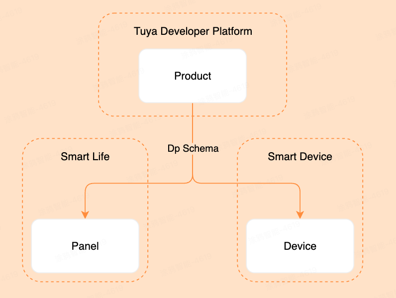
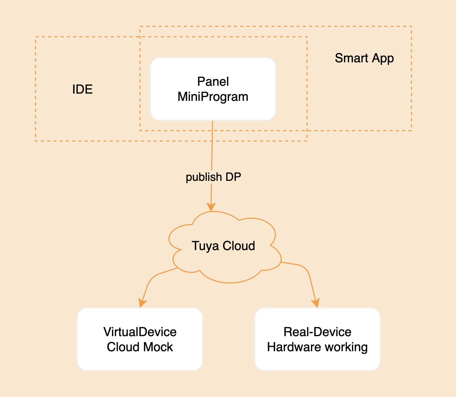
A control panel runs on an app and represents a product that is an abstraction of a smart device. Before you create a product, you can learn about the following correlations between control panels, products, and devices.
1.1 What is a panel?
- A control panel is a graphical user interface (GUI) application that can run on the Smart Life app and Tuya-enabled OEM apps to control smart devices and display real-time device status.
- A product links a control panel with a smart device. A product describes the name, features, and data points (DPs) of the smart device displayed on the app.
- A smart device is embedded with a network module provided by Tuya. The device is labeled with a QR code. Users can scan the QR code with the Smart Life app, and get and install the control panel of the device on the app.
1.2 Correlations between products, control panels, and devices
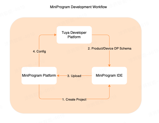
The following figure shows the correlations between products, control panels, and devices.
1.3 Create a product
A product defines the DPs of the associated panel and device. Before you develop a panel, you must create a product, define the required DPs, and then implement these DPs on the panel.
Register and log in to the Tuya Developer Platform and create a product.
- Choose Product > Development > Create.****
- Taking large home appliances for example, choose Standard Category > Large Home Appliances > Air Conditioner.
- Select the smart mode and product solution, and complete the product information. Enter Universal Panel in the Product Name, and keep the other options as default.
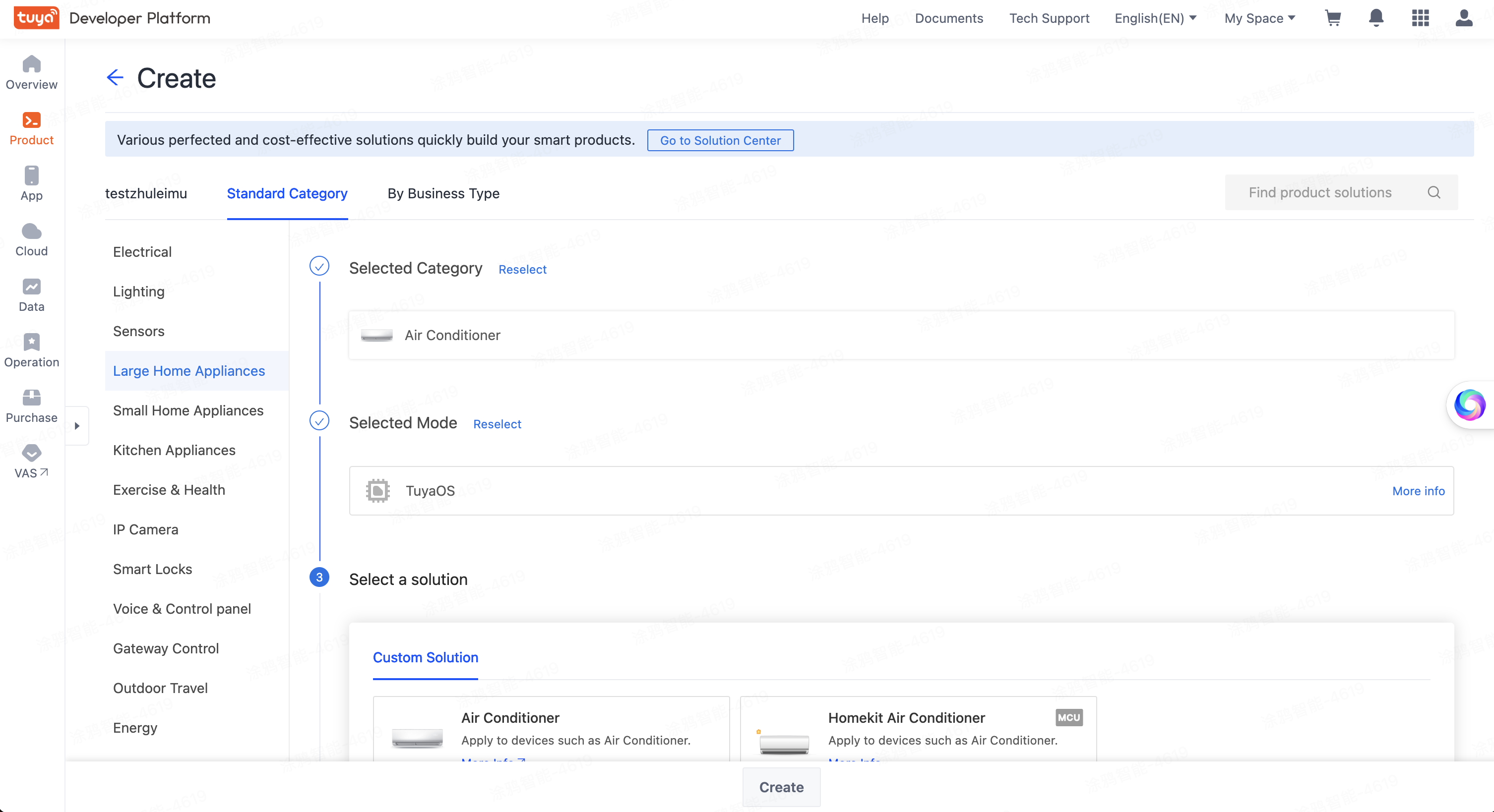
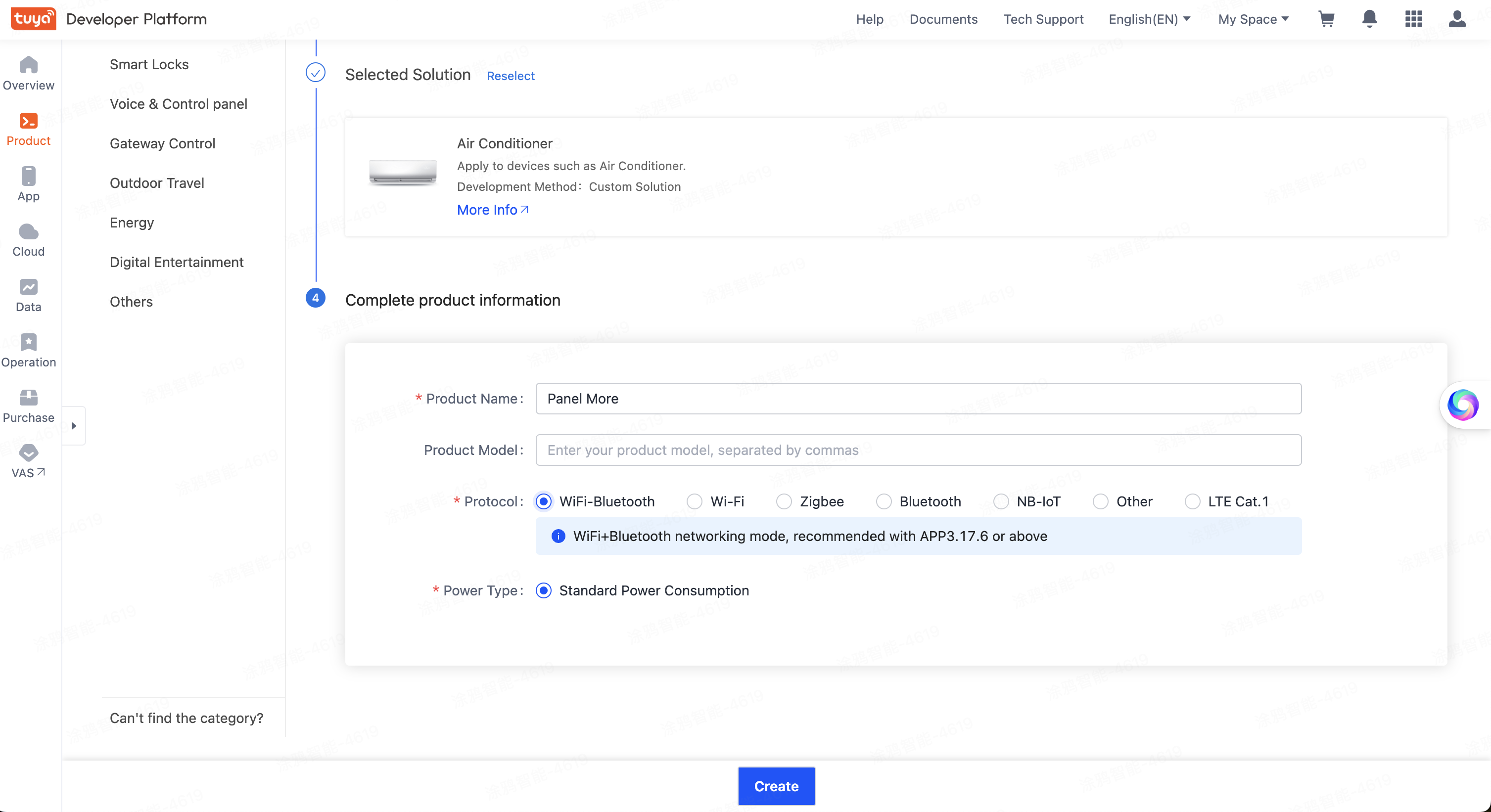
- Click Create.
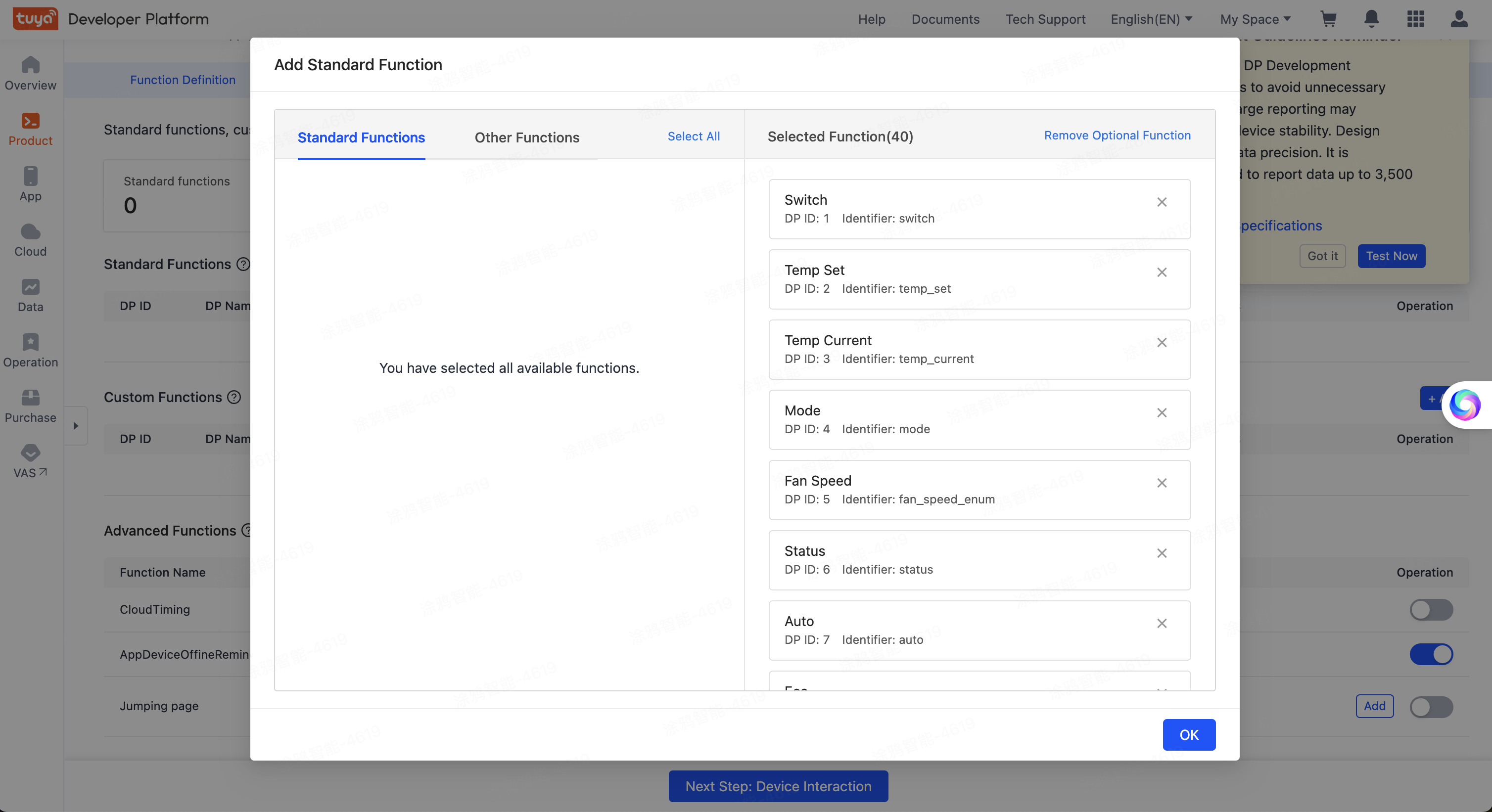
After your product is created, the Add Standard Function dialog box appears. In the Standard Functions section, you can see a list of available standard functions. Click Select All > OK to have standard functions configured for the product.
You can then continue with Panel MiniApp development. Register and log in to the MiniApp Developer Platform.
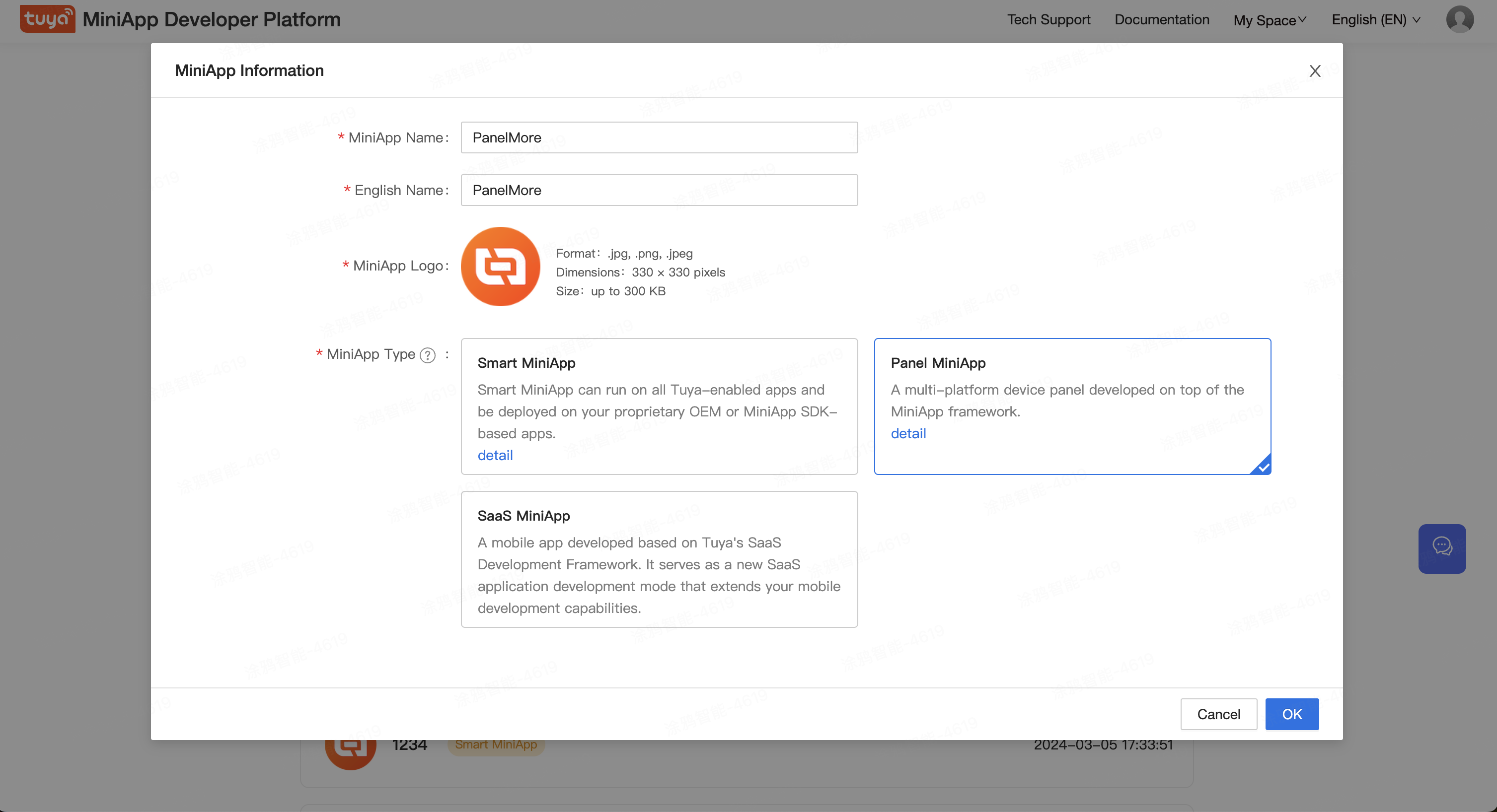
Click Create. On the MiniApp Information page that appears, enter Universal Panel in the MiniApp Name, select Panel MiniApp as the MiniApp Type, and then click OK.
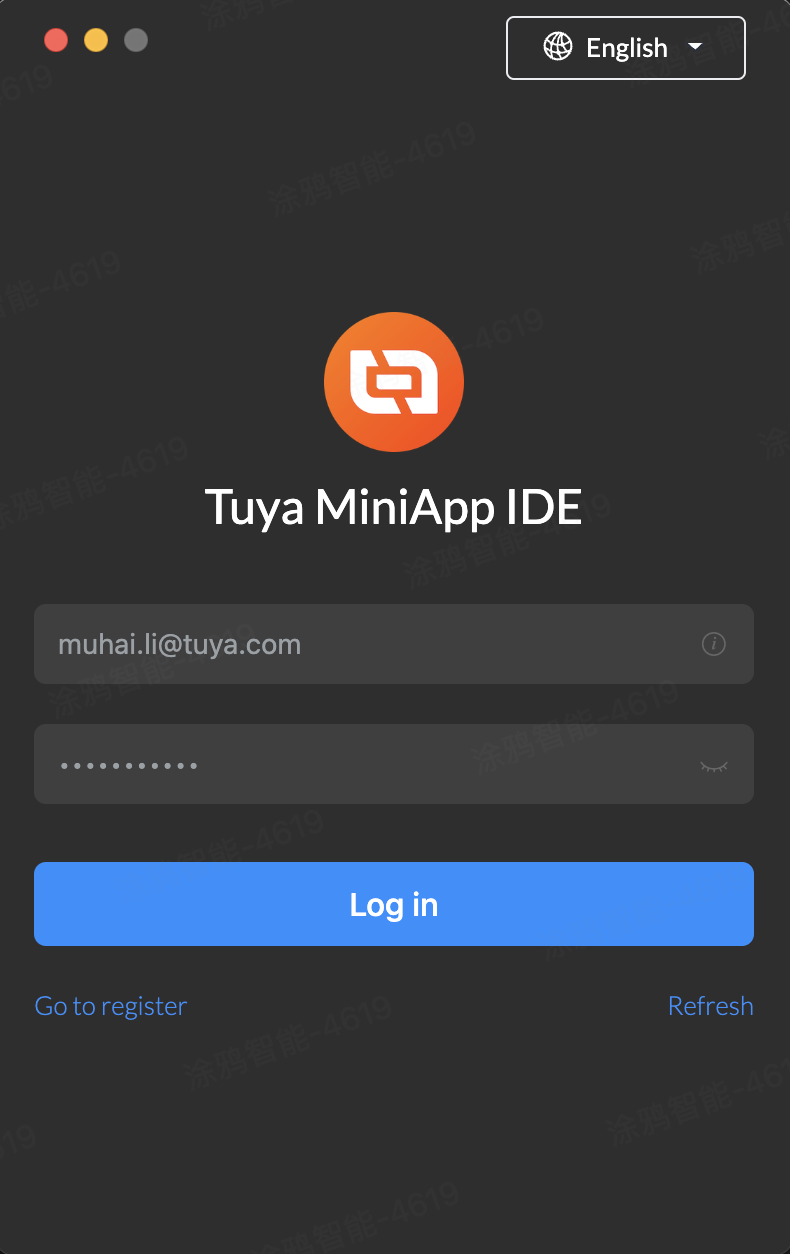
Download, install, and open the miniapp IDE tool. Then, log in to the IDE using your Tuya Developer Platform account.
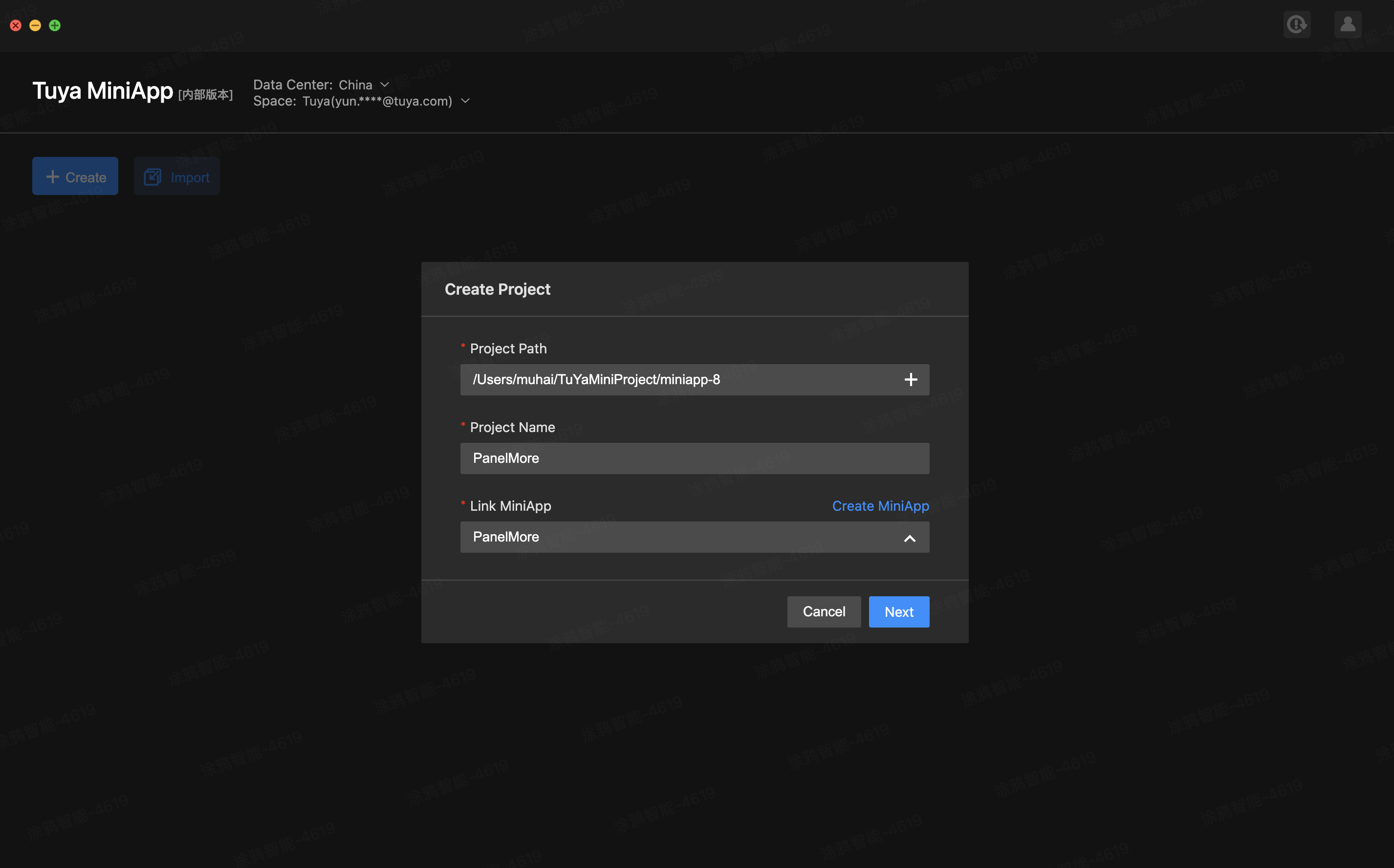
4.1 Create project code
- Click Create and configure the following information:
- Project Path: Keep the default path.
- Project Name: Enter a project name, such as Universal Panel.
- Link MiniApp: Select the panel miniapp created on the MiniApp Developer Platform in Step 3.
- Debug Product: Select the product created on the Tuya Developer Platform in Step 1.
 Click Next.
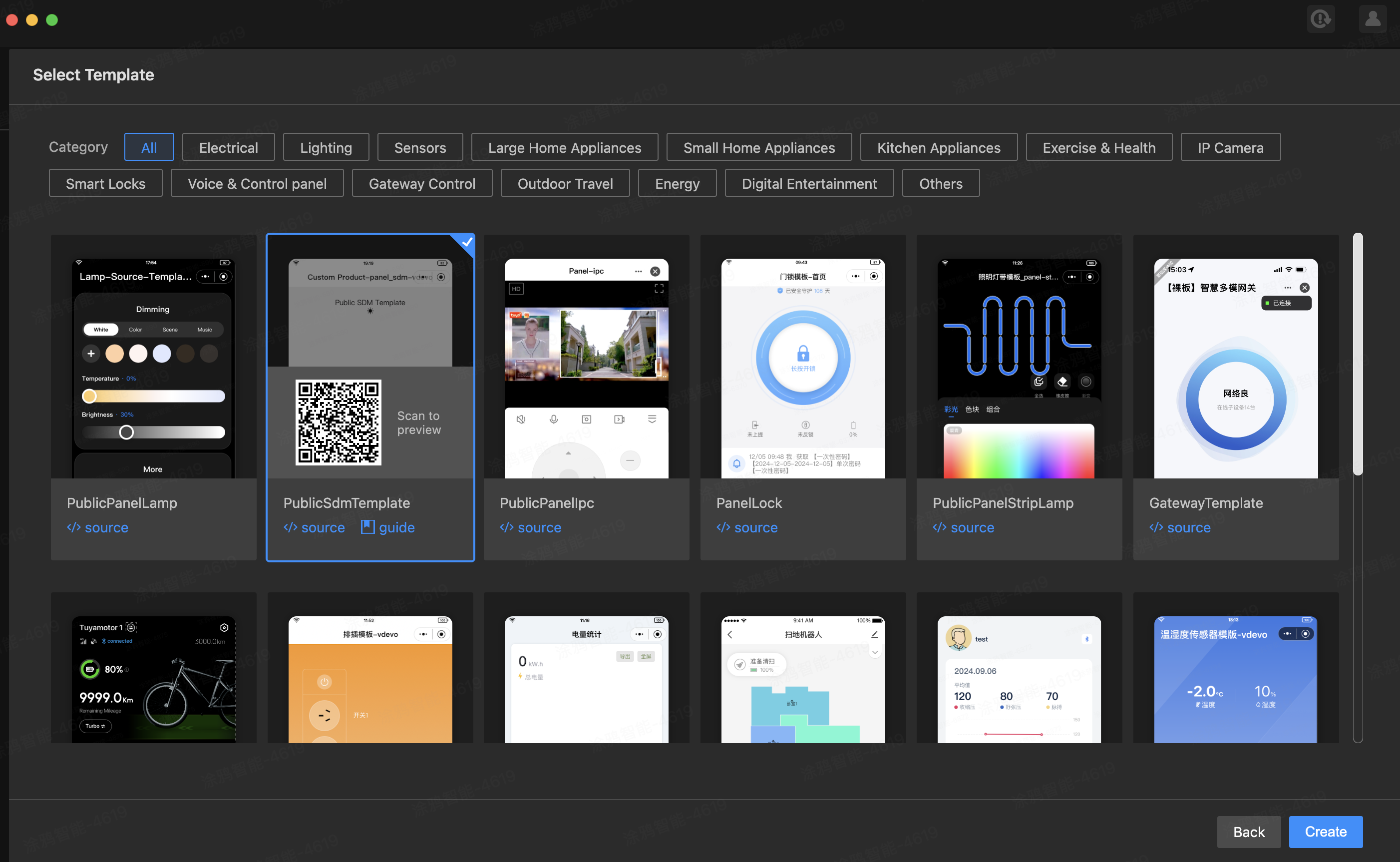
 - On the page of Select Template, select PublicSdmTemplate and click Create to generate a Ray panel project. Similar to Taro, Ray is a multi-platform R&D framework. You can write code once and run it on all compatible platforms.
4.2 Start project
- After you open the project, you can scan the QR code with the Smart Life app to authorize login.
- After login, click IDE panel tool plugins and click Add Virtual Device in the top right corner.
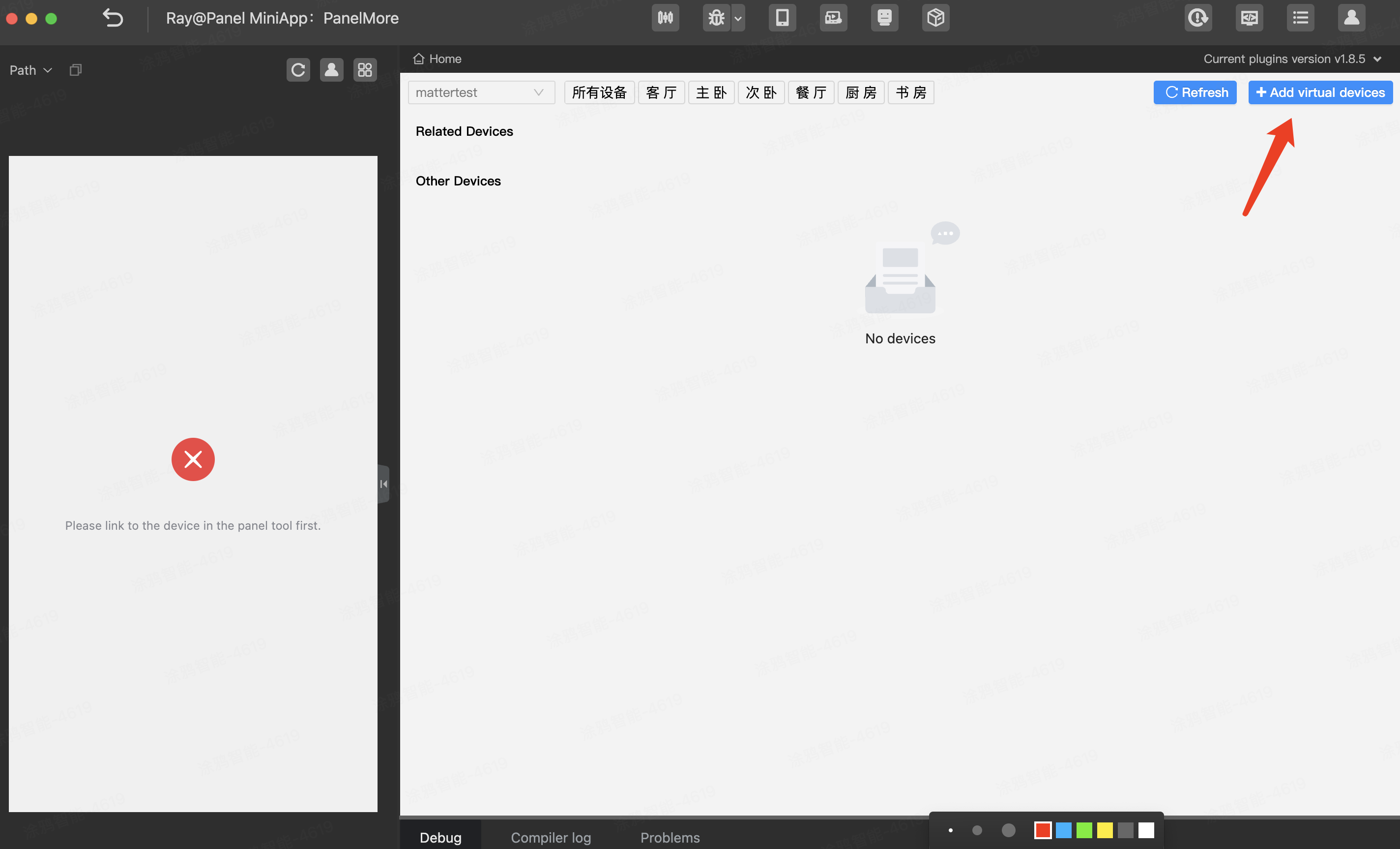
- Scan the QR code of the virtual device with the Smart Life app.
- After scanning, the project will be recompiled and loaded to get the device information and load the rendering panel.
 After the miniapp is imported, the IDE automatically installs dependencies. It also compiles and runs the program automatically after the program is modified.If an error like Error (MiniKit does not have the specified version 2.3.3) appears, in the top right corner of the IDE, choose Setting > Env Settings > Kit and select the recommended versions.
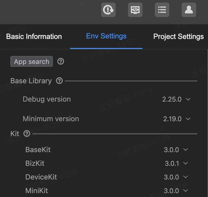
To develop a panel miniapp, you rely on the Tuya Developer Platform, Smart MiniApp Developer Platform, and Smart MiniApp IDE.
After the previous steps are completed, a panel miniapp is created. Next, proceed to the actual code development tutorial.
6.1 Project directory
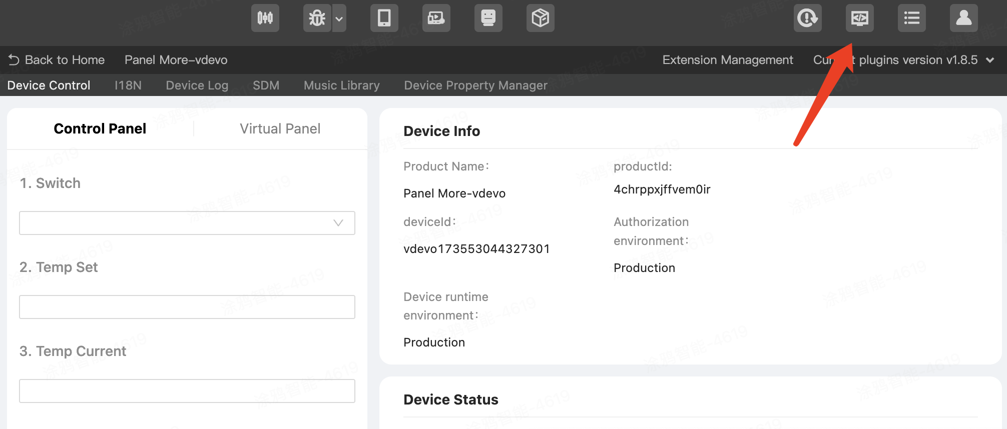
To understand the project's directory structure, click the Open in VS Code icon in the toolbar.
If it prompts that there is no code command, you need to select Show All Commands in the Help menu of Visual Studio Code, search for code, and install it. For more information, see the official documentation of Visual Studio Code.
Then, you can see the project code's file directory in Visual Studio Code.
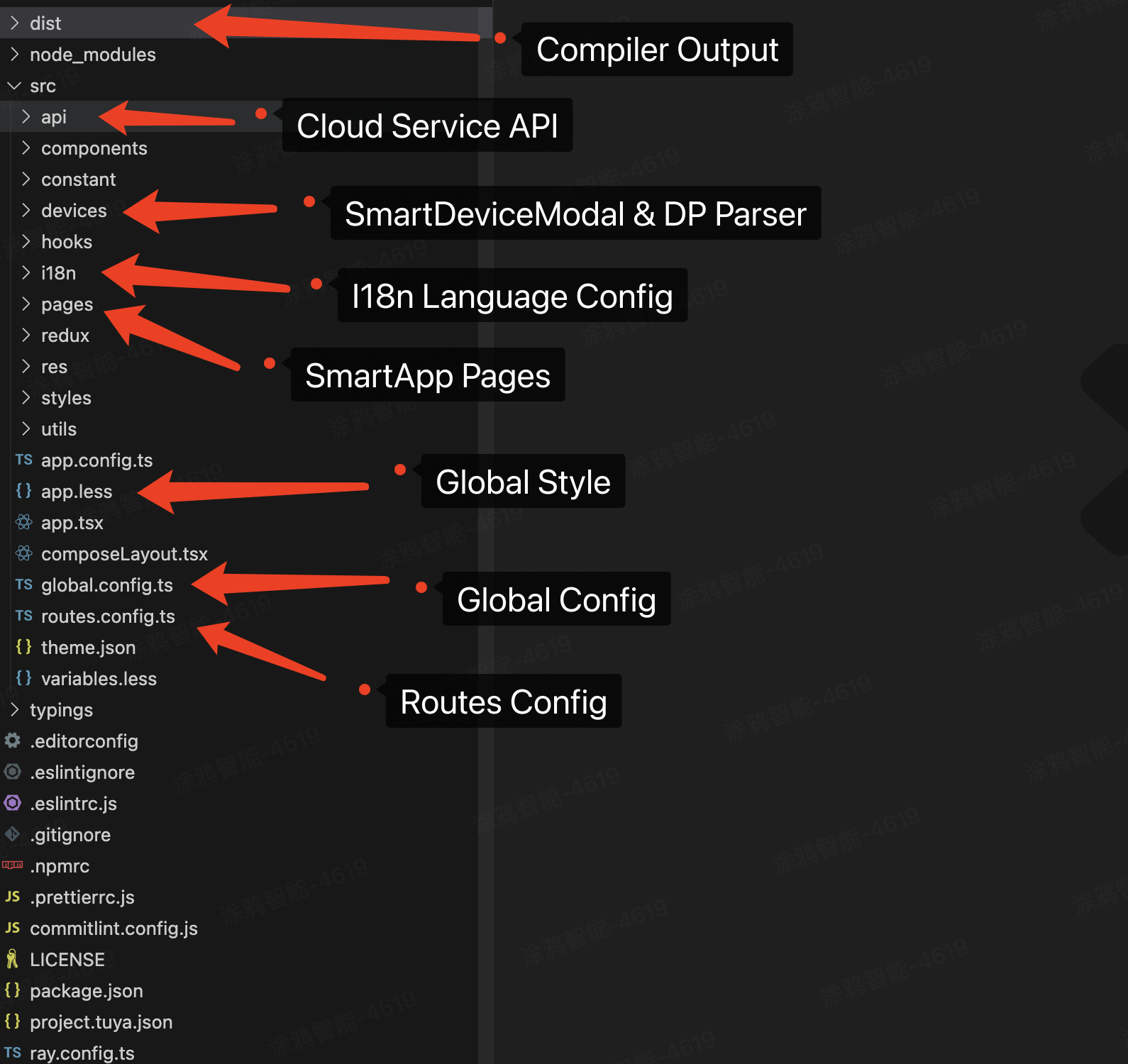
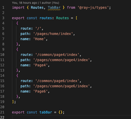
6.2 Page route configuration
You code the pages in the pages directory, and configure the page routes in the file src/routes.config.ts. Example:
The other files will be described in subsequent development steps.
7.1 Use Smart Device Model (SDM) state management to pull device data
For more information, see the SDM documentation.
- In the IDE, click SDM in the device tool plugin, and then click Inject to Project.
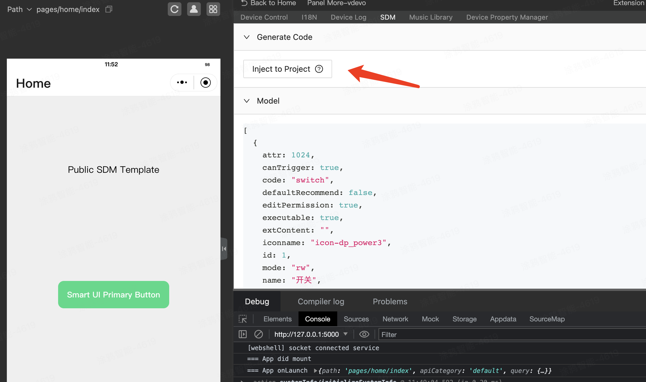
- In the top right corner of the IDE, click Open in VS Code to open the VS Code editor.
- Open the
src/devices/schema.tsfile and setas constafter the generated Schema list for type hinting. And use thedeviceSchematype insrc/devices/index.ts.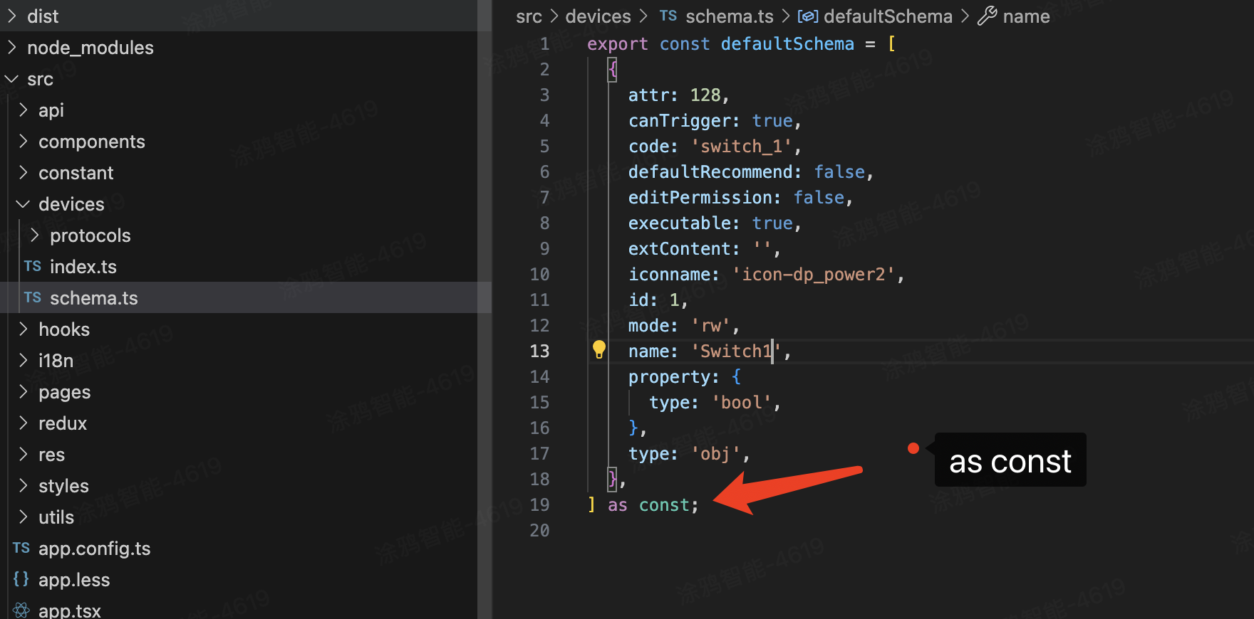
- In
src/devices/index, you can see the initialization logic of SDM, which is simplified as follows:// Create SDM const value = new SmartDeviceModel({ deviceId }); value.init(); // Perform initialization // Initialization completion event value.onInitialized(() => { // After initialization is completed, get the device information and operate the device // For example, value.getDpSchema() // ... }); - In
src/app.tsx, set the application root component as follows, and useSdmProviderto place the SDM instance in the Context:import { SdmProvider } from "@ray-js/panel-sdk"; import { devices } from "@/devices"; import { initPanelEnvironment } from "@ray-js/ray"; initPanelEnvironment({ useDefaultOffline: true }); class App extends React.Component { render() { return ( <SdmProvider value={devices.common}>{this.props.children}</SdmProvider> ); } } - Write the following example in
src/pages/home/index.tsx:
Note that when usingimport React from "react"; import { useDpSchema, useProps } from "@ray-js/panel-sdk"; import { View } from "@ray-js/ray"; export default () => { // When the project starts, automatically pull the product schema information corresponding to the productId on the developer platform const dpSchema = useDpSchema(); // Read dpState data from the device model const dpState = useProps(state => state); // Get all dpState const switch = useProps(state => state.switch); // Get values where dpCode is switch console.log("dpSchema", dpSchema); // Print to view the contents of dpSchema console.log("dpState", dpState); // Print to view the contents of dpState return <View>hello world</View>; };useProps, it is recommended to specify exactly which DP to read. For example, read the switch state asstate.switch. The component will only re-render when theswitchchanges.
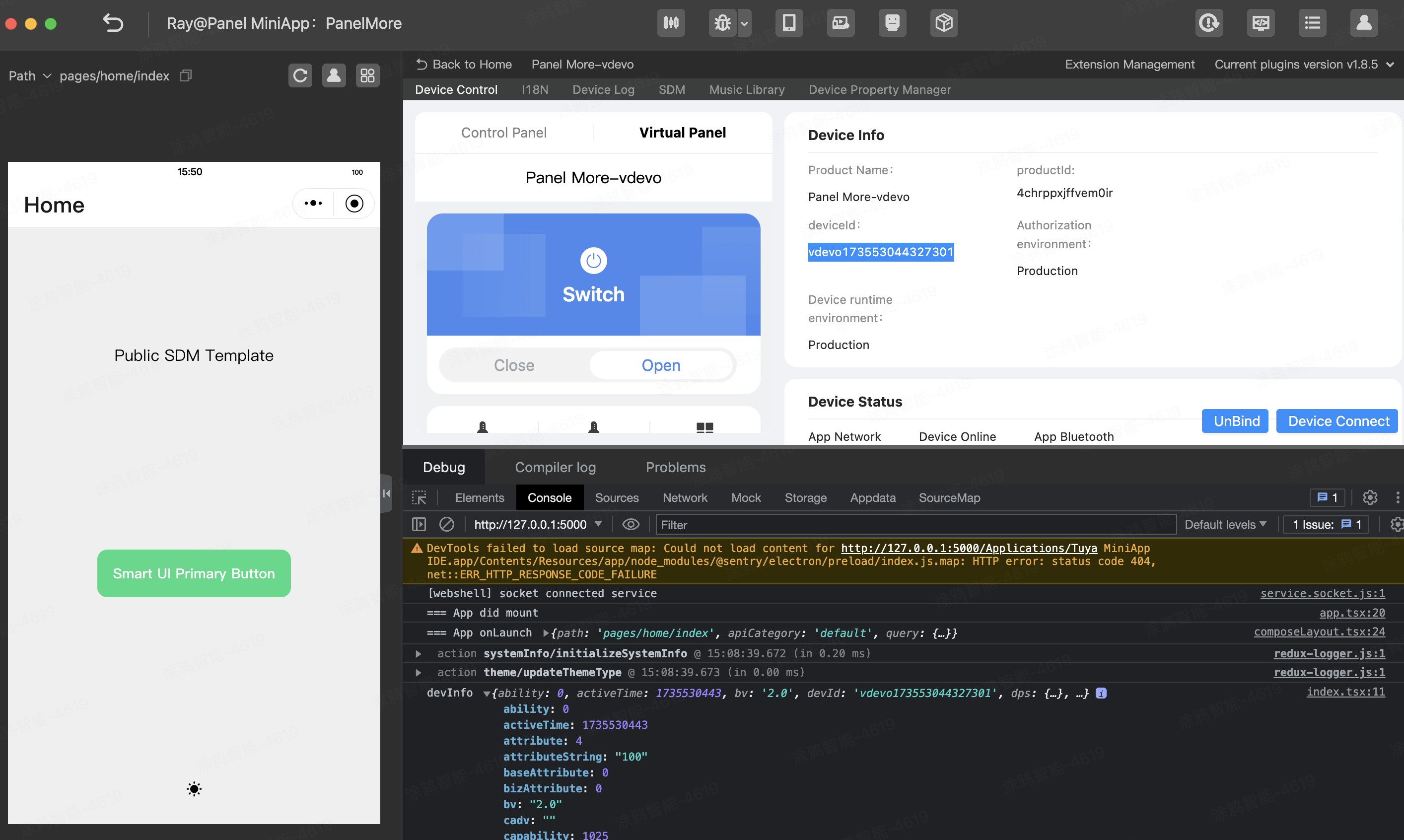
7.2 Print log in IDE debugger console
Go to IDE > Debug > Console to see the printed devInfo:
Get devInfo from the code:
import { useDevInfo } from "@ray-js/panel-sdk";

const devInfo = useDevInfo();
console.log("devInfo:", devInfo);
7.3 Fields of deviceInfo
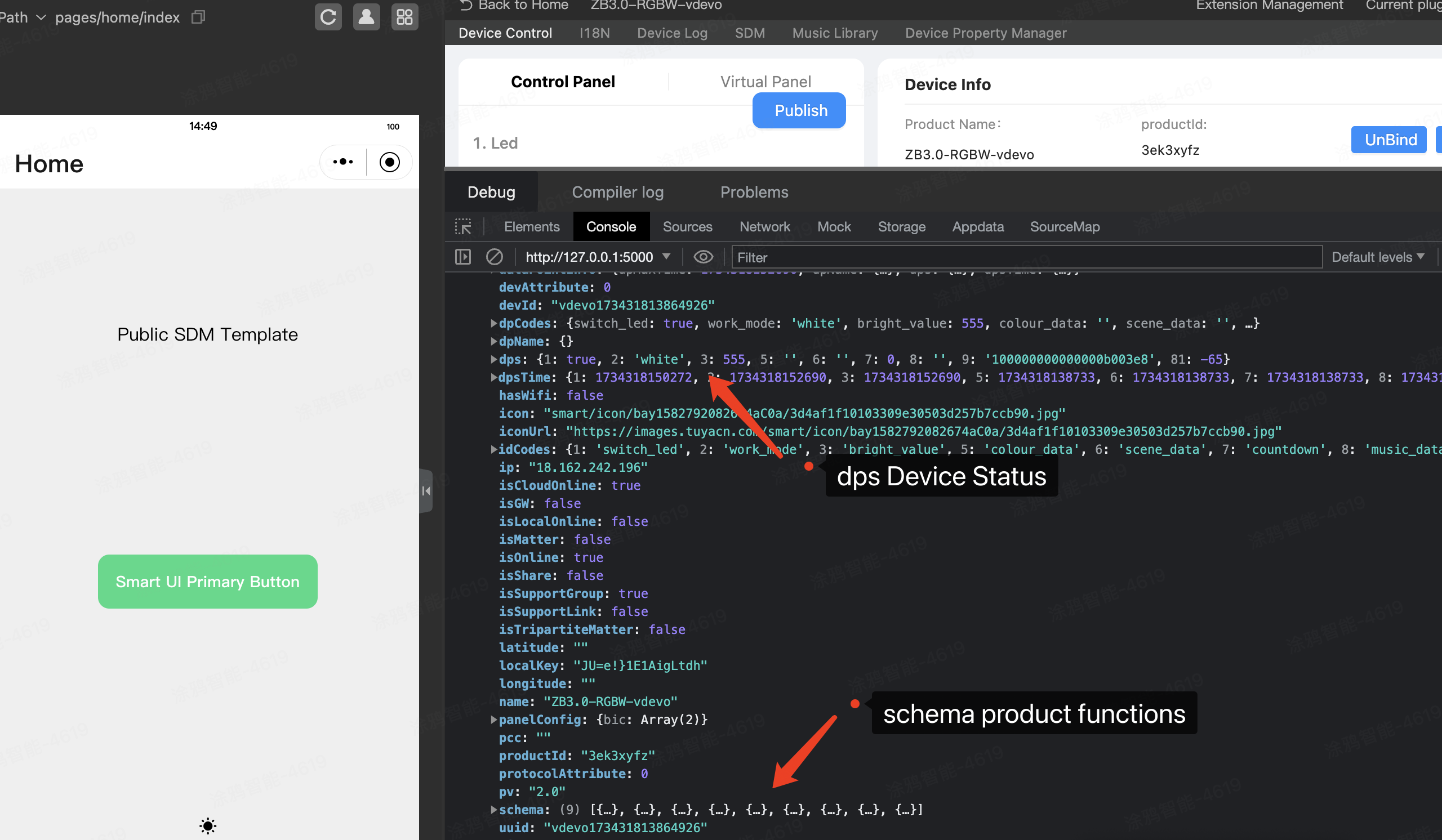
The Console panel outputs much information. The most important data is devInfo that is the device information.
devInfo includes the following key fields:
codeIds: an object that consists ofdpCodeas the key anddpIdas the value.devId: the device ID. It starts withvdevofor a virtual device.deviceOnline: indicates whether the device is online.dps: an object that consists ofdpIdas the key and DP status as the value.idCodes: an object that results from reversingcodeIds.panelConfig: the panel configurations, includingbicas advanced functions.productId: the product that is bound with the device.schema: defines the DPs of the product and details thecode, type, value range, and icon of each DP.state: an object that consists ofdpCodeas the key and DP status as the value.ui: theuiIdof the panel.
Typically, the useDevInfo API is used to read devInfo from the code. DPs are defined on the Tuya Developer Platform.
7.4 Get product schema
You can get the product schema from useDpSchema:
import { useDpSchema, useProps } from "@ray-js/panel-sdk";
const dpSchema = useDpSchema(); // DP schema
const dpState = useProps((state) => state); // DP status
Traverse the schema to get all DPs and attributes of the product.
schema.map((item) => {
  // item.code
  // item.property
  // ...
  return <Text>{item.name}</Text>;
});
Based on item.property.type, you can determine and render the UI display of different types of DPs.
8.1 Use rpx unit
The styles in Ray development are defined with Less and support CSS modules. Create a file named index.module.less in the following directory: src/pages/home/index.module.less.
.container {
  border-radius: 24rpx;
  background-color: #fff;
  margin-bottom: 24rpx;
}
The unit rpx is a special unit used for the Ray framework to adapt to different devices.
8.2 Use CSS modules to add styles
Use styles in the following example:
import React from "react";

import { useDpSchema } from "@ray-js/panel-sdk";
import { View } from "@ray-js/components";
import styles from "./index.module.less"; // Note the method to import styles

export default () => {
  const dpSchema = useDpSchema();
  // Add className
  return <View className={styles.container}>hello world</View>;
};
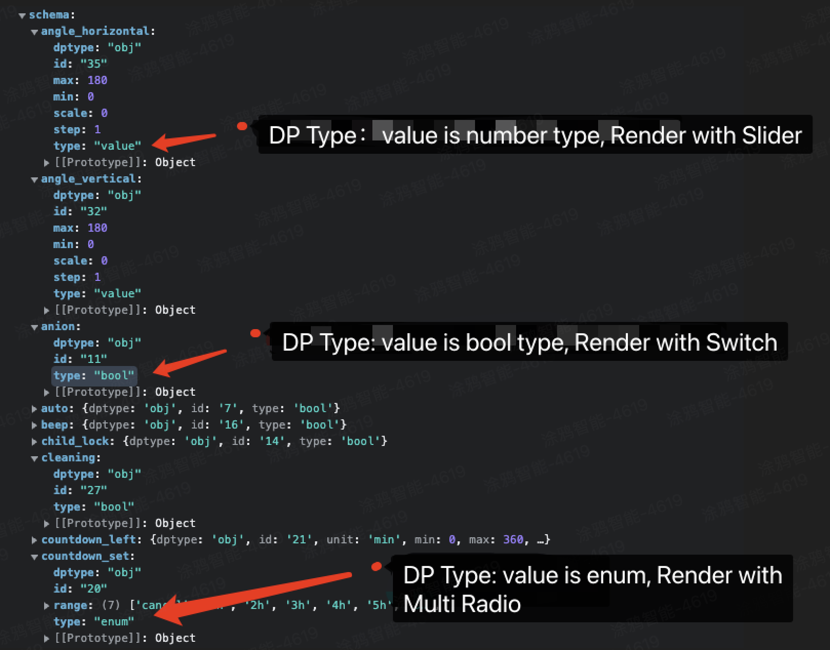
9.1 Structure of schema
- The DPs of Tuya-enabled smart devices support six data types, including boolean, value, enum, fault, string, and raw.
- Each DP has different value types and ranges. UI views are rendered according to the value types and ranges during panel rendering.
The Console panel outputs the logs that show the structure of the schema in the following format:
For more information, see Custom Functions.
9.2 Render schema display
Write the following example in src/home/index.tsx:
import React from "react";

import { useDevInfo, useDpSchema, useProps } from "@ray-js/panel-sdk";
import { View } from "@ray-js/components";

export default () => {
  const dpSchema = useDpSchema();
  const dpState = useProps((state) => state);

  console.log("dpSchema", dpSchema);
  console.log("dpState", dpState);

  return (
    <View>
      {Object.keys(dpSchema || {}).map((dpCode) => {
        // Traverse and render each DP
        return (
          <View key={dpCode}>
            {dpCode}: {dpState[dpCode]}
          </View>
        );
      })}
    </View>
  );
};
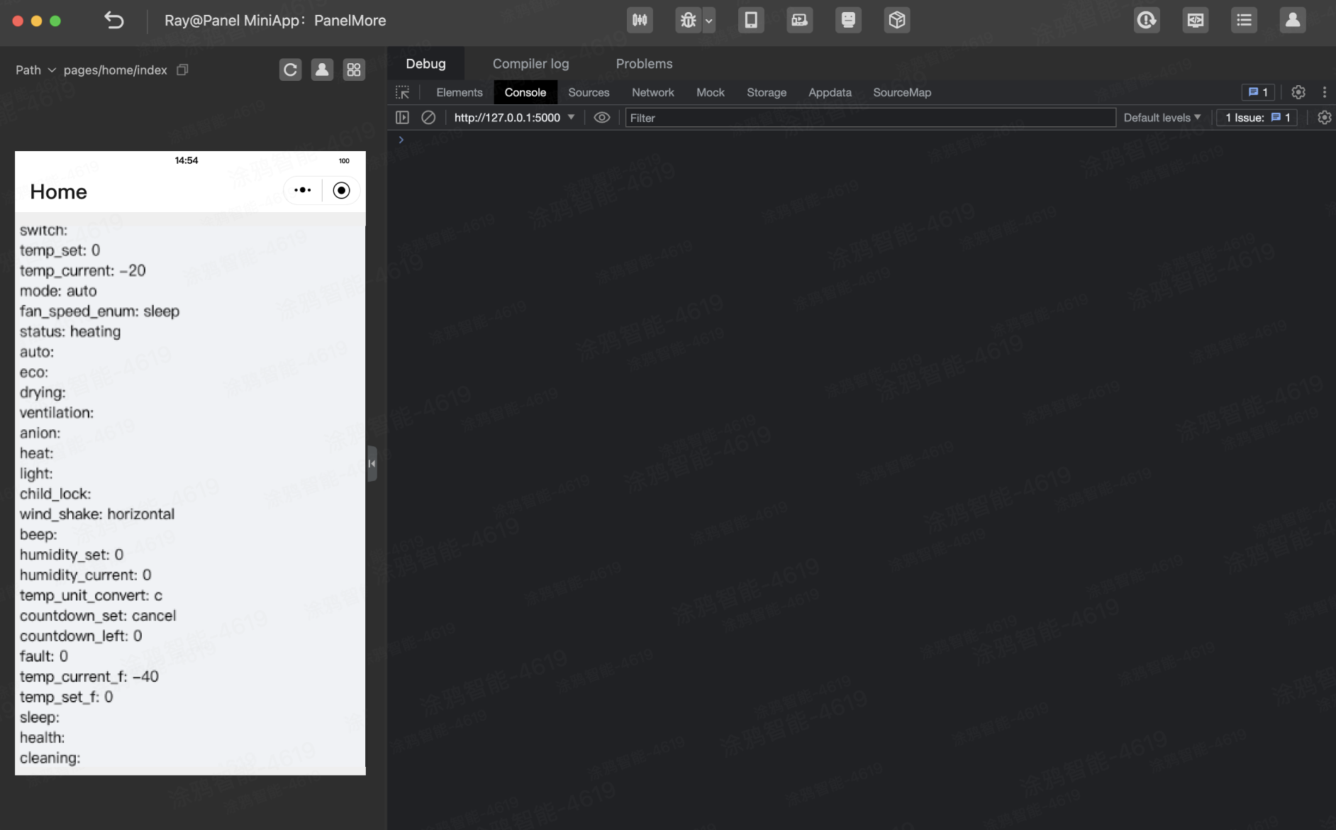
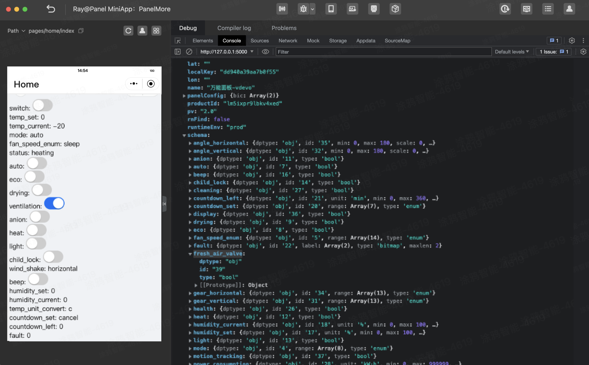
Compile the program to see all DP codes and device status in the previewed panel in the left-side pane of the IDE.
10.1 Data structure of DPs of boolean type
The Console panel in the IDE shows the data structure of boolean DPs in the following example:
{
  dptype: "obj";
  id: "39";
  type: "bool";
}
10.2 Install extension component library
Use the switch component TySwitch provided by the package @ray-js/components-ty to render data, and run the following command to install the extension component library provided by Ray:
yarn add @ray-js/components-ty
10.3 Use switch component TySwitch
Write the following example:
For boolean DPs, a toggle method can be called in actions to switch the DP value between true and false.
import React from "react";

import { useDpSchema } from "@ray-js/panel-sdk";
import { TySwitch } from "@ray-js/components-ty";
import { View } from "@ray-js/components";

const BoolCard = ({ dpCode }) => {
  const dpValue = useProps((state) => state[dpCode]);
  const actions = useActions();
  return (
    <View>
      {dpCode}:{" "}
      <TySwitch
        checked={dpValue}
        onChange={() => {
          actions[dpCode].toggle();
        }}
      />
    </View>
  );
};

export default () => {
  const dpSchema = useDpSchema();
  const dpState = useProps((state) => state);

  console.log("dpSchema", dpSchema);

  return (
    <View>
      {Object.keys(dpSchema || {}).map((dpCode) => {
        const props = dpSchema[dpCode];
        // If it is a boolean type, return TySwitch
        if (props.type === "bool") {
          return <BoolCard dpCode={dpCode} />;
        }
        return (
          <View key={dpCode}>
            {dpCode}: {dpState[dpCode]}
          </View>
        );
      })}
    </View>
  );
};
Compile the program. Then, the IDE renders all DPs of boolean type as switch components.
10.4 Get DP-specific multilingual settings
During the function definition, a DP already has multilingual texts in the product information. In the following example, the Strings tool in src/i18n is used to get the DP text. Write the following code:
import React from "react";

import { useDpSchema, useProps } from "@ray-js/panel-sdk";
import { TySwitch } from "@ray-js/components-ty";
import { View } from "@ray-js/components";
import Strings from "@/i18n";

export default () => {
  const dpSchema = useDpSchema();
  const dpState = useProps((state) => state);

  console.log("dpSchema", dpSchema);

  return (
    <View>
      {Object.keys(dpSchema || {}).map((dpCode) => {
        const props = dpSchema[dpCode];
        if (props.type === "bool") {
          // Use the Strings.getDpLang method to get multilingual text
          return (
            <View>
              {Strings.getDpLang(dpCode)}:{" "}
              <TySwitch checked={dpState[dpCode]} />
            </View>
          );
        }
        return (
          <View key={dpCode}>
            {dpCode}: {dpState[dpCode]}
          </View>
        );
      })}
    </View>
  );
};
Compile the program. Then, the IDE renders all DPs of boolean type in Chinese.
Now, all DPs of boolean type are rendered.
11.1 Use API to send DP
However, DPs must be sent if you want to control devices. For this purpose, you can use SDM hooks useActions to implement DP sending. Example:
import { useActions } from "@ray-js/panel-sdk";

const actions = useActions();

// Send DPs to the specified device. xxx in actions.xxx is dpCode, and set is the method of sending commands. Pass in dpValue to invoke and send the commands.
actions.switch.set(true); // Send a DP and set switch to true
actions.switch.on(); // Turn on DPs of boolean type
actions.switch.off(); // Turn off DPs of boolean type
actions.switch.toggle(); // Toggle the boolean value between true and false
11.2 Send switch DP of boolean type
This is an example of how to write code to send switch DPs.
First, implement the boolean DP sending and reporting component.
import React from "react";

import { useActions, useProps } from "@ray-js/panel-sdk";
import { View } from "@ray-js/components";

const BoolCard = ({ dpCode }) => {
  const actions = useActions();
  const dpValue = useProps((state) => state[dpCode]);
  return (
    <View>
      {dpCode}:{" "}
      <TySwitch checked={dpValue} onChange={() => actions[dpCode].toggle()} />
    </View>
  );
};
For boolean DPs, taking the actions of switch DP as an example, actions.xxx applies the following tool methods:
actions.switch.on; // Send the switch DP with a value of true
actions.switch.off; // Send the switch DP with a value of false
actions.switch.toggle; // Toggle between true and false
export default () => {
  const schema = useDpSchema();
  const dpState = useProps((state) => state);
  const actions = useActions();

  return (
    <View>
      {Object.keys(schema || {}).map((dpCode) => {
        const props = schema[dpCode];
        // If it is a boolean type, return TySwitch
        if (props.type === "bool") {
          return <BoolCard key={dpCode} dpCode={dpCode} />;
        }
        return (
          <View key={dpCode}>
            {dpCode}: {dpState[dpCode]}
          </View>
        );
      })}
    </View>
  );
};
11.3 Debug with virtual device plugin
After the program is compiled in the IDE, use the virtual device plugin to debug the program. Go to Virtual Device > Virtual Panel and click a switch in the debugger. During the debugging, the switch in the simulator receives a DP command and changes to the respective switch state.
12.1 Data structure of DPs of enum type
The schema for the DPs of enum type includes the following properties:
{
  dptype: "obj";
  id: "20";
  range: ["cancel", "1h", "2h", "3h", "4h", "5h", "6h"];
  type: "enum";
}
12.2 Use TyActionsheet dialog component and TyCell list component
The items in the range can be rendered with the ActionSheet dialog component and Cell list component from @ray-js/components-ty. Write the following code:
First, implement the enum display control component.
import React from "react";

import { useActions, useProps } from "@ray-js/panel-sdk";
import { View } from "@ray-js/components";
import Strings from "@/i18n";

const EnumCard = ({ dpCode }) => {
  const actions = useActions();
  const dpValue = useProps((state) => state[dpCode]);

  const [showEnumDp, setShowEnumDp] = useState(null);

  return (
    <View>
      {Strings.getDpLang(dpCode)}:
      <Button onClick={() => setShowEnumDp(dpCode)}>
        {Strings.getDpLang(dpCode, dpState[dpCode])}
      </Button>
      <TyActionsheet
        header={Strings.getDpLang(dpCode)}
        show={showEnumDp === dpCode}
        onCancel={() => setShowEnumDp(null)}
      >
        <View style={{ overflow: "auto", height: "200rpx" }}>
          <TyCell.Row
            rowKey="title"
            dataSource={props.range.map((item) => ({
              title: Strings.getDpLang(dpCode, item),
              onClick: () => {
                actions[dpCode].set(item);
              },
            }))}
          />
        </View>
      </TyActionsheet>
    </View>
  );
};
For enum DPs, taking the actions of work_mode DP as an example, actions.xxx applies the following tool methods:
actions.work_mode.set("white"); // Send work_mode with a value of white
actions.work_mode.next(); // Switch to the next enum value
actions.work_mode.prev(); // Switch to the previous enum value
actions.work_mode.random(); // Switch to a random enum value
Traverse schema rendering:
import React, { useState } from "react";

import { useDpSchema, useProps } from "@ray-js/panel-sdk";
import { TyActionsheet, TyCell, TySwitch } from "@ray-js/components-ty";
import { Button, ScrollView, View } from "@ray-js/components";
import Strings from "@/i18n";

export default () => {
  const schema = useDpSchema();
  const dpState = useProps((state) => state);

  console.log("schema", schema);

  const [showEnumDp, setShowEnumDp] = useState(null);

  return (
    <View>
      {Object.keys(schema).map((dpCode) => {
        const props = schema[dpCode];
        // For the sake of length, other types are ignored here. You can copy and paste the local code of boolean type in the previous section here.
        if (props.type === "enum") {
          return <EnumCard key={dpCode} dpCode={dpCode} />;
        }
        return (
          <View key={dpCode}>
            {dpCode}: {dpState[dpCode]}
          </View>
        );
      })}
    </View>
  );
};
Click the button to trigger an ActionSheet dialog that uses the Cell list component to render multiple enumerated items, as shown in the following result:
13.1 Data structure of DPs of string type
The schema for the DPs of string type includes the following properties:
{
  dptype: "obj";
  id: "20";
  type: "string";
}
13.2 Use Input component
First, implement the Input component.
import React from "react";

import { useActions, useProps } from "@ray-js/panel-sdk";
import { Input } from "@ray-js/components";
import Strings from "@/i18n";

const InputCard = ({ dpCode }) => {
  const actions = useActions();
  const dpValue = useProps((state) => state[dpCode]);

  const [showEnumDp, setShowEnumDp] = useState(null);

  return (
    <Input
      value={dpState[dpCode]}
      onInput={(event) => {
        actions[dpCode].set(event.detail.value);
      }}
    />
  );
};
For string DPs, taking the actions of name DP as an example, actions.xxx applies the following tool methods:
actions.name.set("my device"); // Send name with a value of my device
Traverse schema rendering:
import { useDpSchema, useActions } from "@ray-js/panel-sdk";
import { Input } from "@ray-js/components";

export default () => {
  const schema = useDpSchema();
  const dpState = useProps((state) => state);

  console.log("schema", schema);

  return (
    <View>
      {Object.keys(schema || {}).map((dpCode) => {
        const props = schema[dpCode];
        // For the sake of length, other types are ignored here. You can copy and paste the local code in the previous section here.
        if (props.type === "string") {
          return <InputCard value={dpState[dpCode]} />;
        }
        return (
          <View key={dpCode}>
            {dpCode}: {dpState[dpCode]}
          </View>
        );
      })}
    </View>
  );
};
DPs of raw type generally do not need to be rendered. If necessary, they can be rendered in the same way as that of string type.
14.1 Data structure of DPs of value type
The schema for the DPs of value type includes the following properties:
{
  dptype: "obj";
  id: "18";
  max: 100;
  min: 0;
  scale: 0;
  step: 1;
  type: "value";
  unit: "%";
}
14.2 Use Slider component
First, implement the Slider component.
The following example defines the range of values and units to be rendered with the Slider component:
import React from "react";

import { useActions, useProps } from "@ray-js/panel-sdk";
import { Slider } from "@ray-js/components";
import Strings from "@/i18n";

const ValueCard = ({ dpCode }) => {
  const actions = useActions();
  const dpValue = useProps((state) => state[dpCode]);

  return (
    <View>
      {Strings.getDpLang(dpCode)}:
      <Slider
        step={props?.step}
        max={props?.max}
        min={props?.min}
        value={dpState[dpCode]}
        onChange={(event) => {
          actions[dpCode].set();
        }}
      />
    </View>
  );
};
For value DPs, taking the actions of add_ele electricity consumption DP as an example, actions.xxx applies the following tool methods:
actions.add_ele.set(1000); // Send add_ele with a value of 1000
actions.add_ele.inc(); // Progressively increases by the step of the current DP
actions.add_ele.dec(); // Progressively decreases by the step of the current DP.
Traverse schema rendering:
import { useDpSchema, useActions, useProps } from "@ray-js/panel-sdk";
import { Slider } from "@ray-js/components";

export default () => {
  const schema = useDpSchema();
  const dpState = useProps((state) => state);

  console.log("schema", schema);

  return (
    <View>
      {Object.keys(schema).map((dpCode) => {
        const props = schema[dpCode];
        // For the sake of length, other types are ignored here. You can copy and paste the local code in the previous section here.
        if (props.type === "value") {
          return <ValueCard dpCode={dpCode} />;
        }
        return (
          <View key={dpCode}>
            {dpCode}: {dpState[dpCode]}
          </View>
        );
      })}
    </View>
  );
};
The Slider component is a slider that limits a value range. As rendered in the IDE, all DPs of value type are rendered as sliders.
15.1 Data structure of DPs of bitmap type
A bitmap is used to report faults and includes the following properties:
{
  dptype: "obj";
  id: "22";
  label: ["sensor_fault", "temp_fault"];
  maxlen: 2;
  type: "bitmap";
}
15.2 Use Notification component
Use the Notification component provided by @ray-js/ray-components-plus to render the DPs of bitmap type:
import { useDpSchema, useActions, useProps } from "@ray-js/panel-sdk";
import { Notification } from "@ray-js/ray-components-plus";

export default () => {
  const schema = useDpSchema();
  const dpState = useProps((state) => state);

  console.log("schema", schema);
  // Notification messages are handled in useEffect
  useEffect(() => {
    Object.keys(schema).forEach((dpCode) => {
      const props = schema[dpCode];
      if (props.type === "bitmap") {
        Notification.show({
          message: Strings.getFaultStrings(dpCode, dpState[dpCode]),
          icon: "warning",
        });
      }
    });
  }, [schema, dpState]);

  return (
    <View>
      {Object.keys(schema).map((dpCode) => {
        const props = schema[dpCode];
        // For the sake of length, other types are ignored here. You can copy and paste the local code in the previous section here.
        return (
          <View key={dpCode}>
            {dpCode}: {dpState[dpCode]}
          </View>
        );
      })}
    </View>
  );
};
Bitmaps are usually used to report faults by means of notifications. Traverse the schema in useEffect to find bitmaps and generate dialogs.
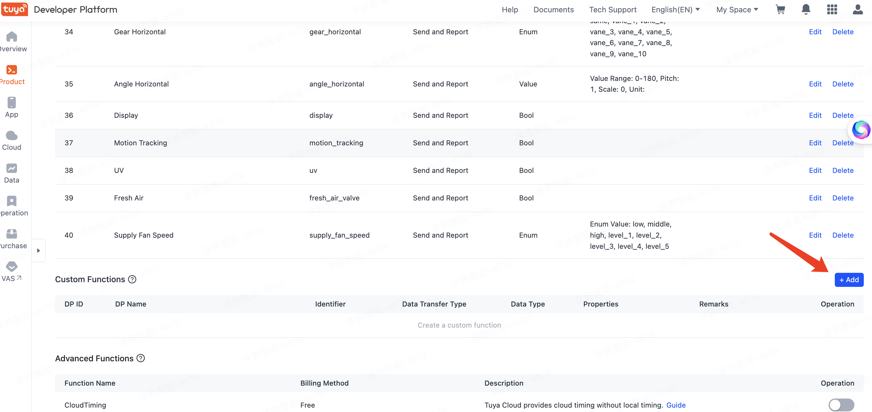
16.1 Add custom DPs on Tuya Developer Platform
The above schema contains the standard DPs for home appliances. Custom DPs can be added.
- On the Tuya Developer Platform, go to Product > Development, and click Develop in the Operation column.
- In the Function Definition > Custom Functions section, click Add.
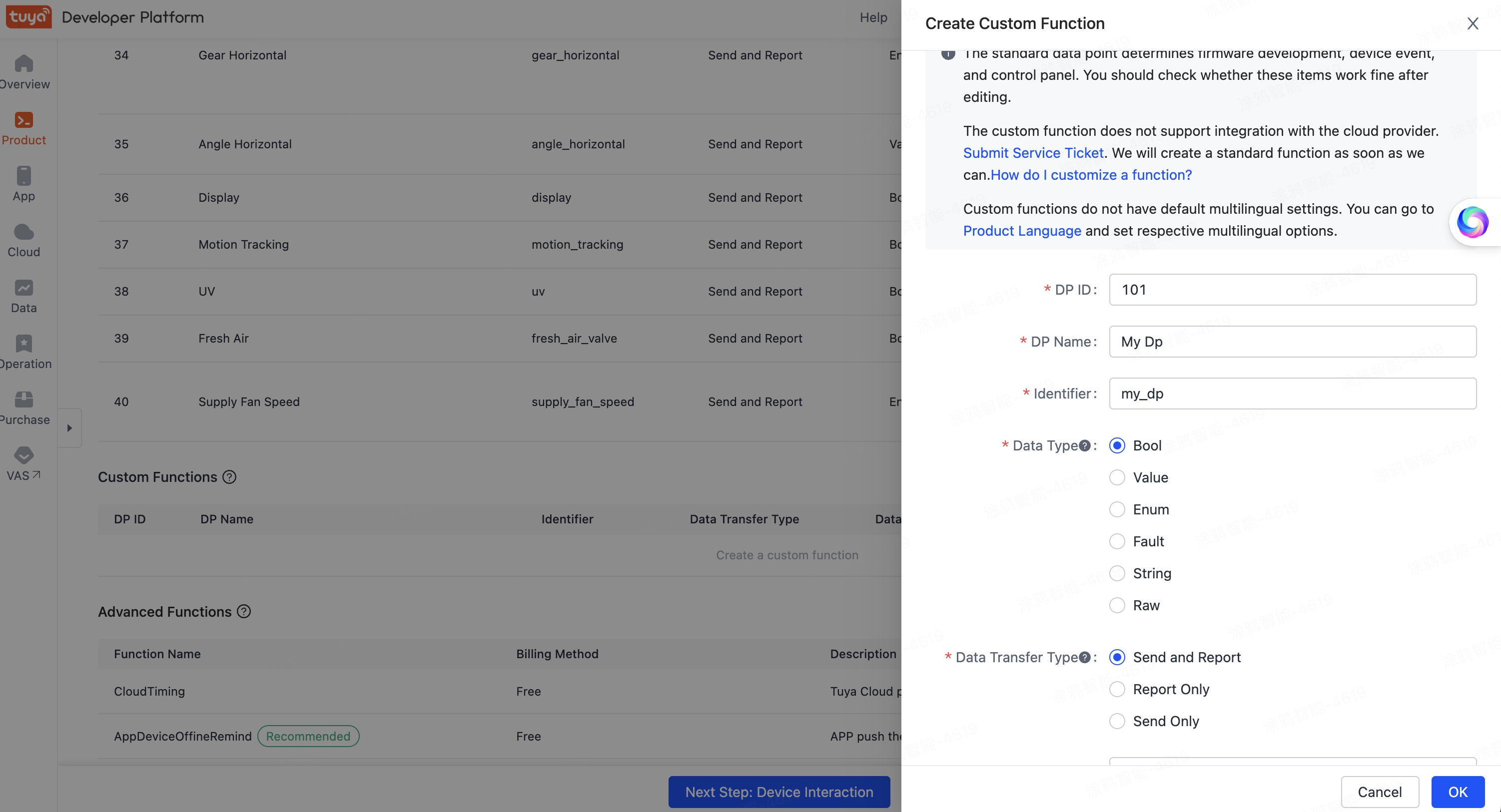
16.2 Configure properties of custom functions
Create a DP of boolean type.
16.3 Refresh IDE and pull custom functions
Return to the IDE, click the Compile button, and then refresh the panel to see that the newly-created DP is rendered.
17.1 What is the purpose of a virtual device?
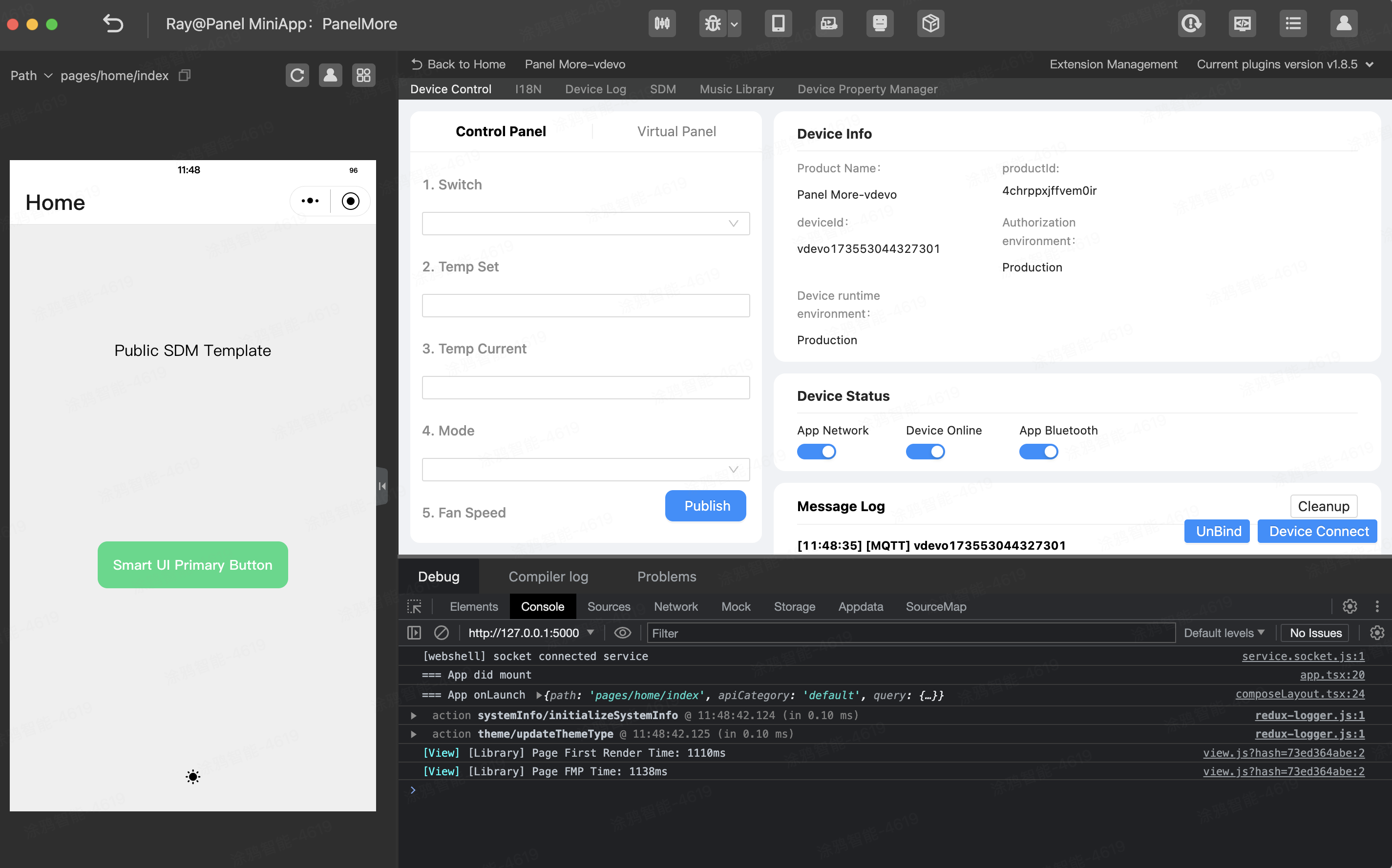
When a panel is running, it must get device information to display the running status of the device. During panel development, if you do not have a real device, use a virtual device to finish debugging. The result is the same as that when a real device is used. For panel miniapps, virtual devices are equivalent to real devices. The following figure shows their relationship.
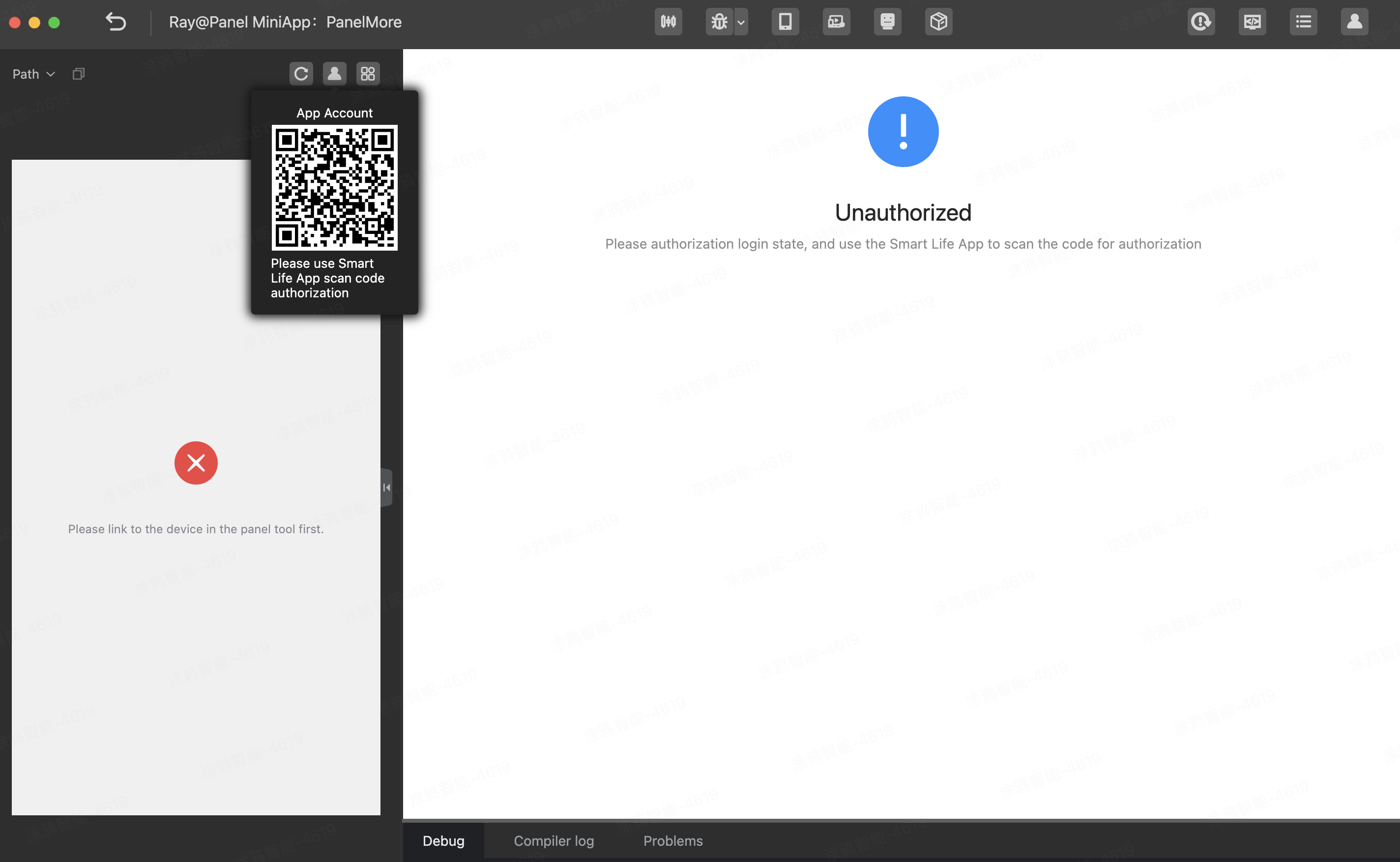
17.2 Authorize login to IDE
Before a virtual device is used, make sure your app account is authorized to log in to the IDE. In the top right corner of the IDE, use the Smart Life app to scan the QR code and authorize login.
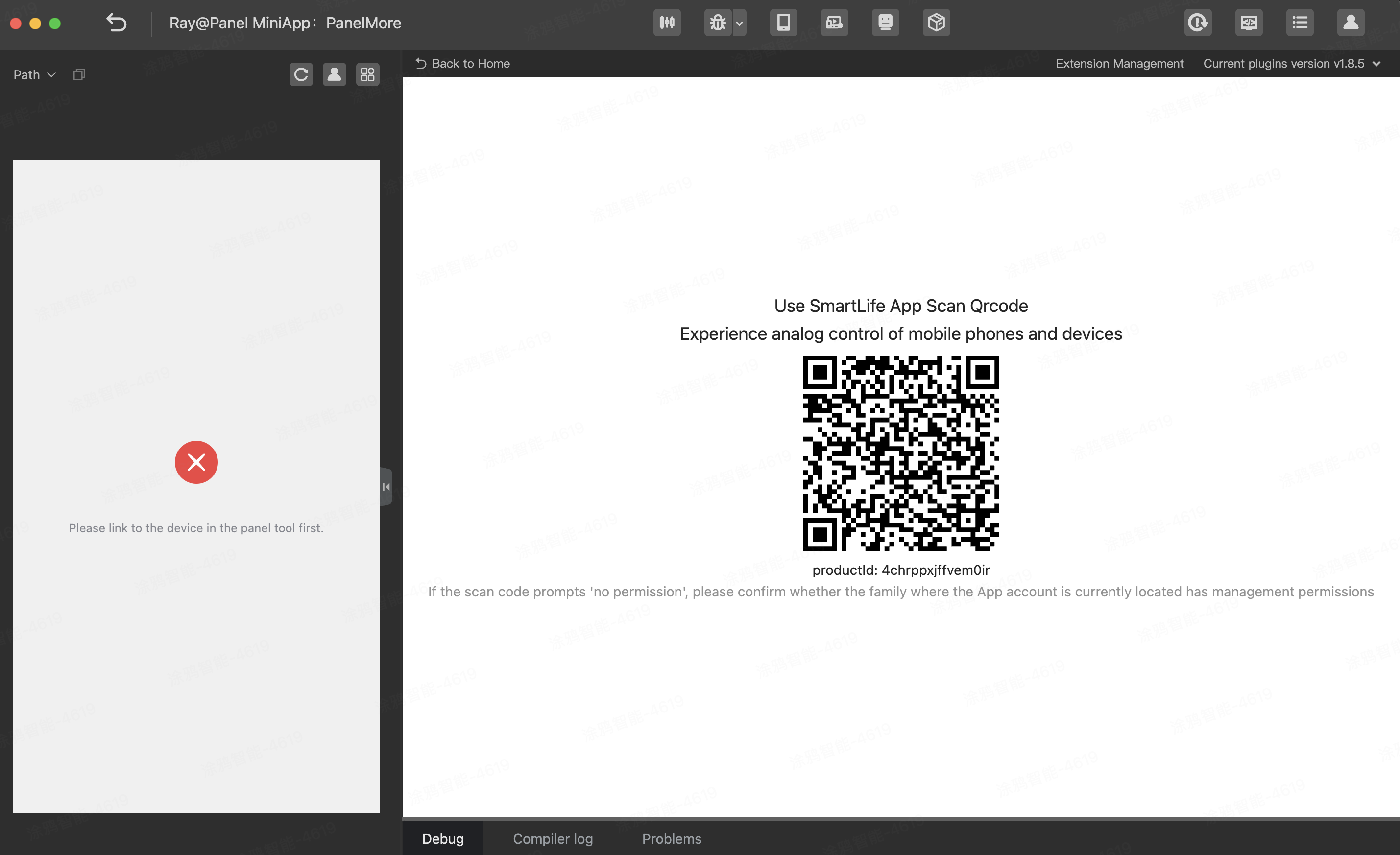
17.3 Use app to scan QR code and create virtual device
After login, open the Universal Panel project, click the debugging tool Virtual Device, and then use the Smart Life app to scan the QR code and create a virtual device.
17.4 Operation guide
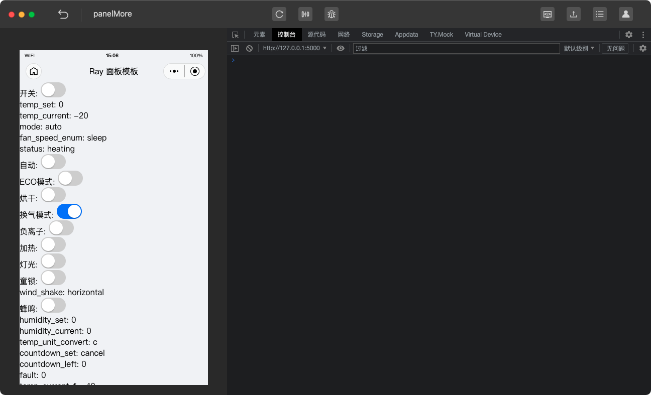
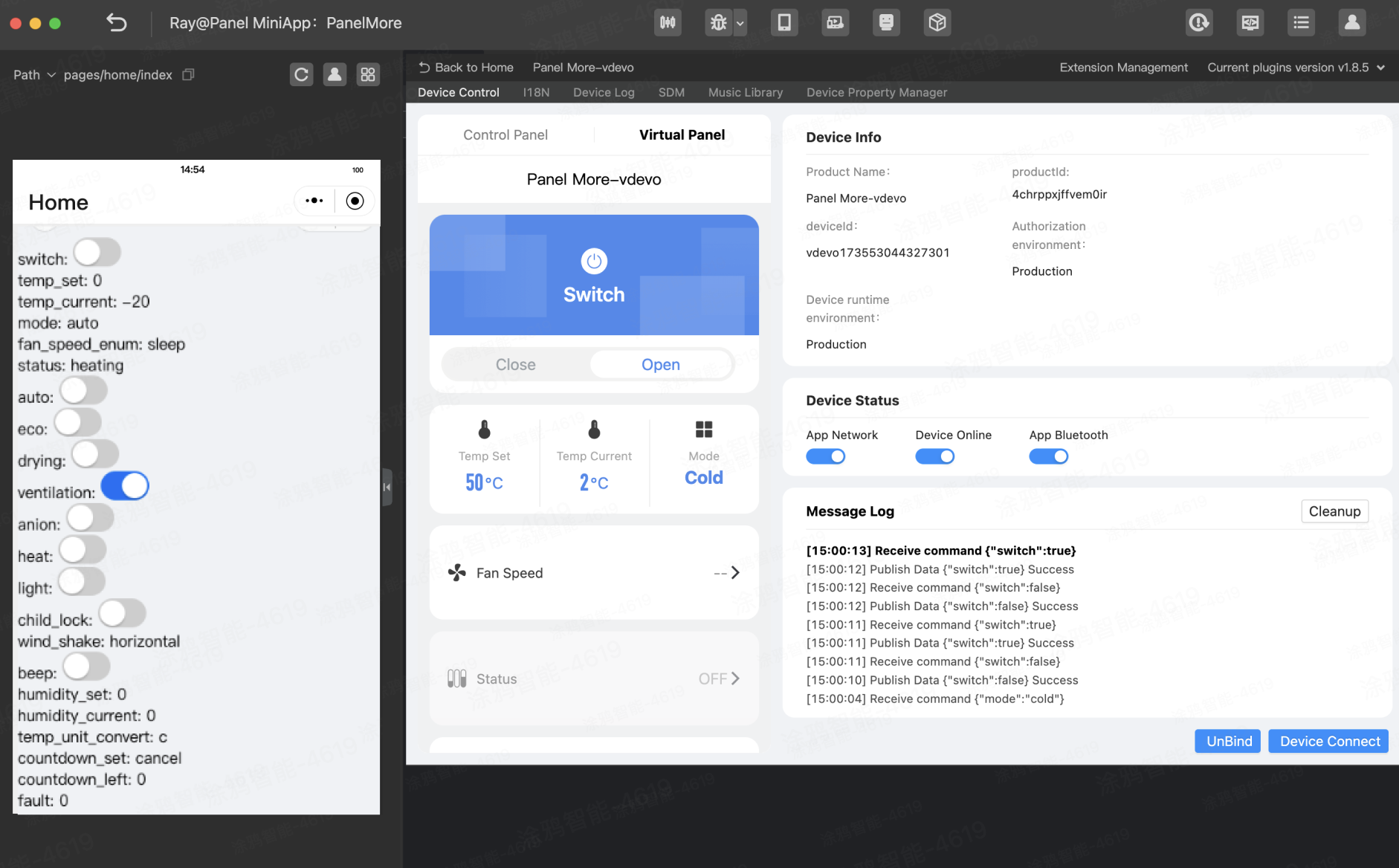
The Virtual Device panel is divided into three sections. The fallback control panel on the left displays the DPs of the current product. The list of DPs on the right is used to control the virtual device. You can click a DP and click Report to simulate DP reporting. The Log panel outputs MQTT logs. Click the Virtual Panel tab and switch to the fallback control panel view that provides the same features as the Control Panel tab but with a more intuitive view of product DPs.
17.5 Debug program
Debug the program you have written.
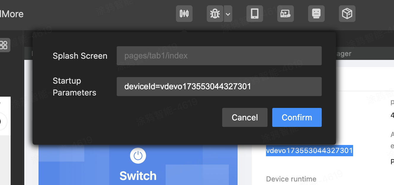
18.1 Get virtual device ID
Go to the page for debugging with Virtual Device, find Device Information > deviceId, and then copy the device ID.
18.2 Set debugging parameters
In the top menu bar of the IDE, click Compilation Parameters, and enter the debugging parameters in the required format. Example: deviceId=vdevo165398364416684.
18.3 Use app to scan QR code and open debugger
After you set compilation parameters, click Remote Debugger in the top menu bar. The mobile phone for testing must have the Smart Life app downloaded and installed.
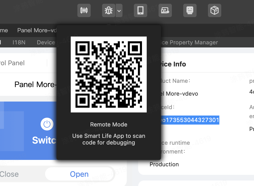
Use the Smart Life app to scan the QR code and open the panel miniapp. Then, you can debug the universal panel.
Now, you have walked through the rendering and sending of six types of DPs. Here is the open source address of the universal panel code: panel-universal.
After style optimization, the universal panel is displayed as shown in the following figure.
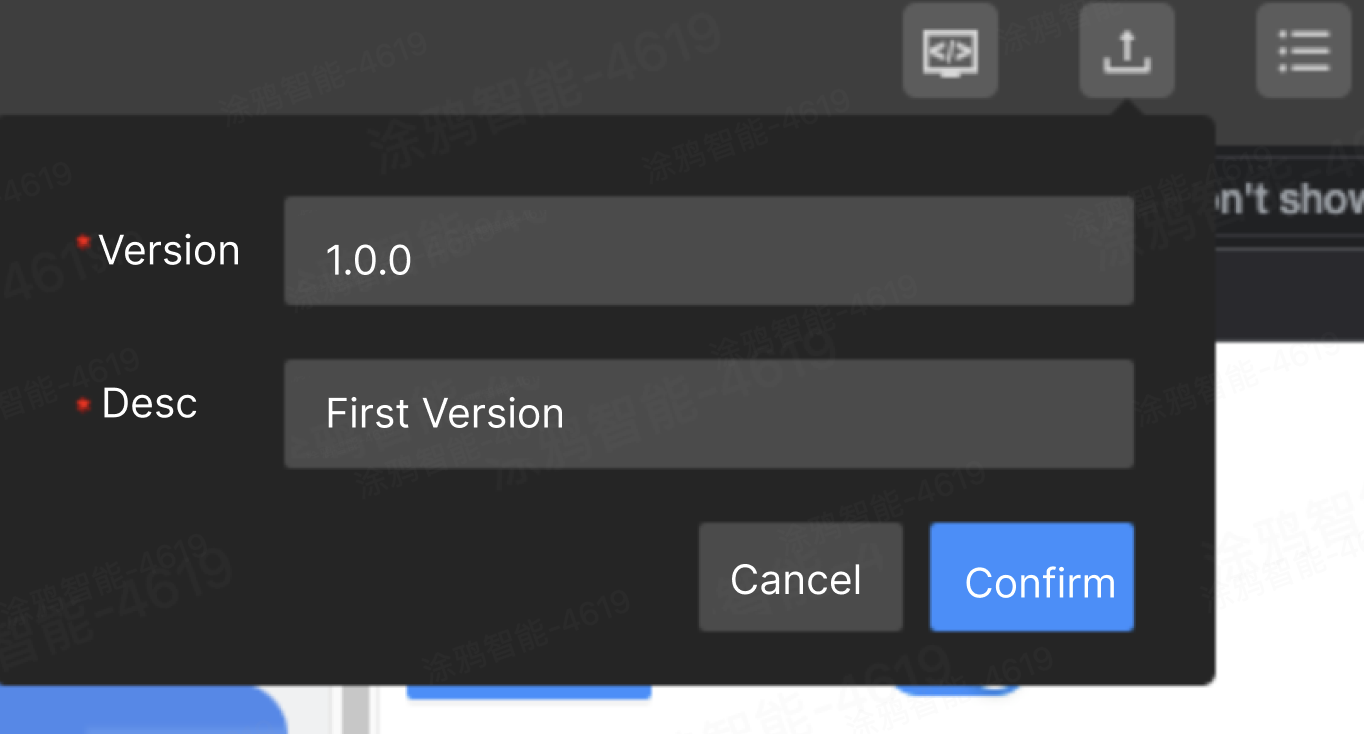
20.1 Upload source package
After debugging in the IDE, click Upload Source Code, enter the version number and description, and then click Upload.
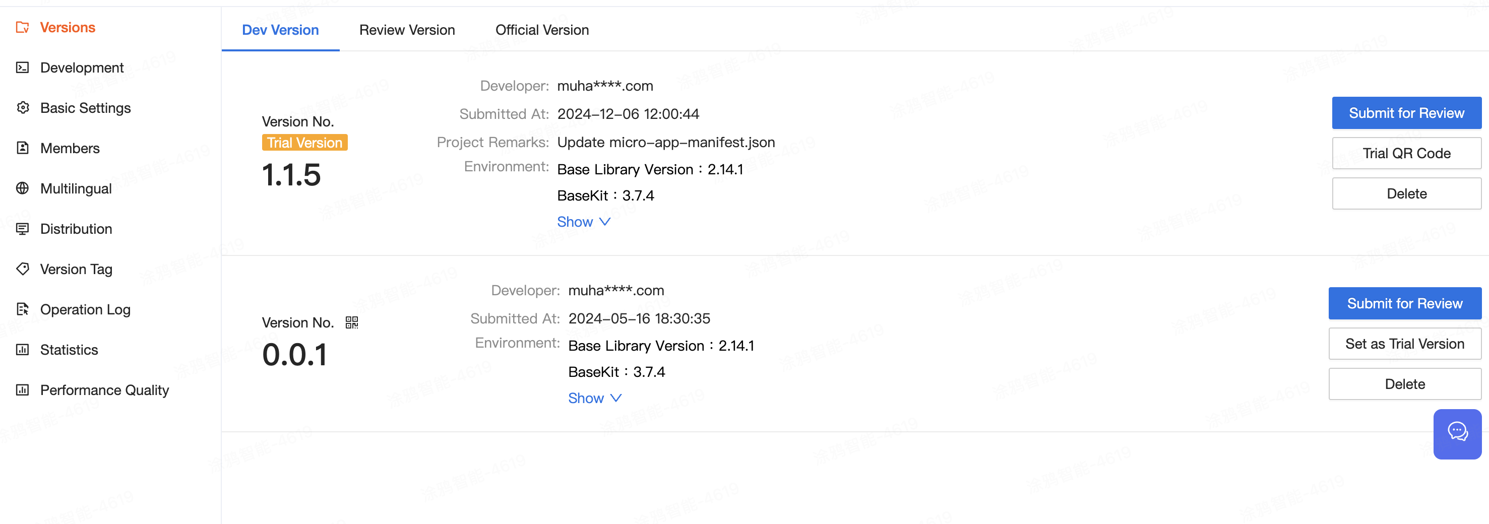
After the package is uploaded, go to Smart MiniApp Developer Platform > Versions to see the uploaded version.
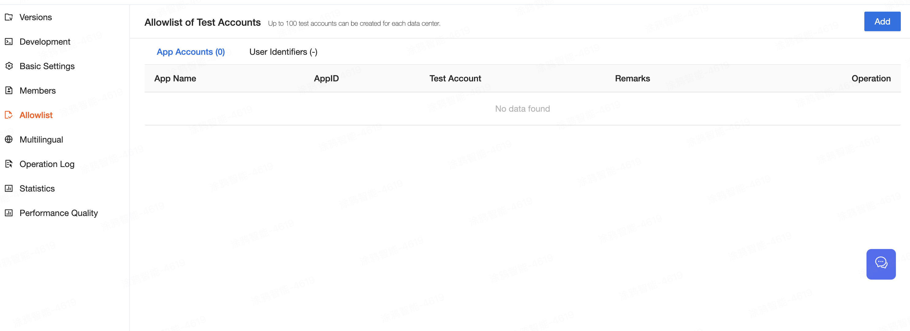
20.2 Add test account to allowlist
- Go to Smart MiniApp Developer Platform > Versions, and set the target miniapp version to the trial version.
- Go to the Allowlist page and add the Smart Life app account.
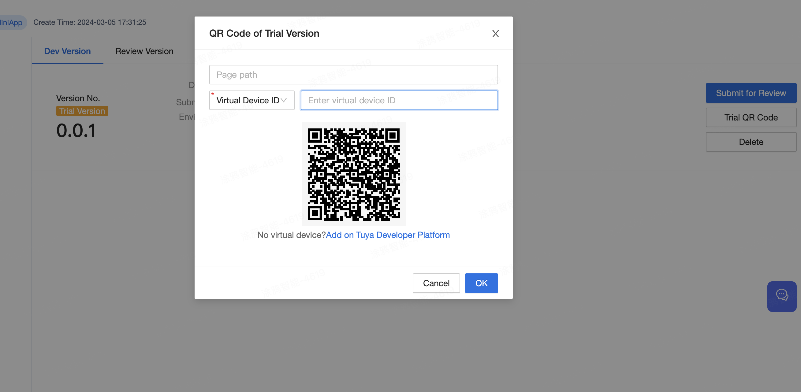
- Find the uploaded version, click Set As Trial Version, and then Trial QR Code to configure the QR code information. The Smart Life app is used to scan the QR code for testing.
20.3 Submit for review and release
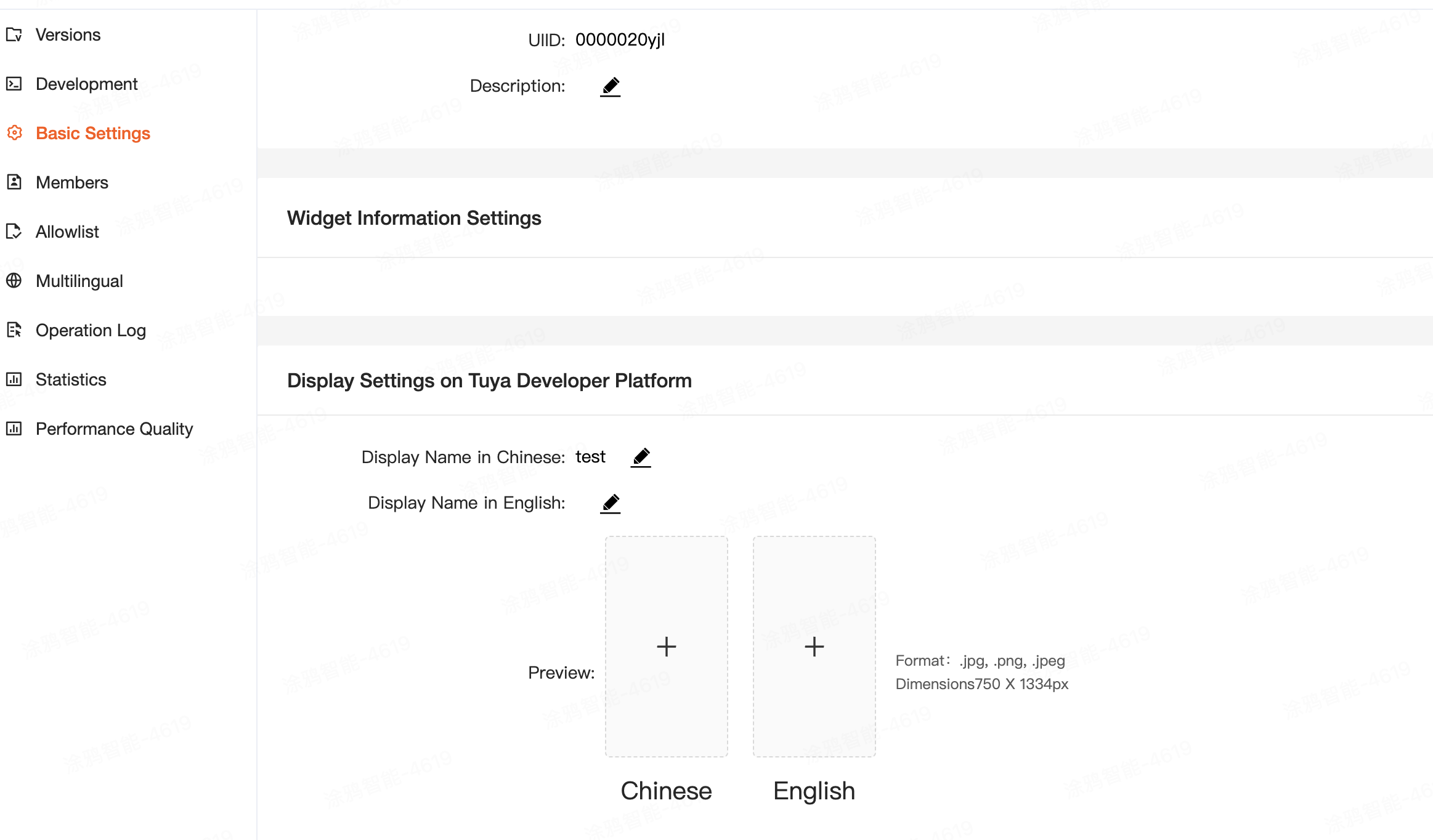
For a panel miniapp that does not belong to an official entity, before you submit the version for review, complete its information to be displayed on the Tuya Developer Platform. For more information, see Submit for Review.
- Congrats! 🎉 You have finished learning this guide.
- If you have any questions, please feel free to contact Tuya MiniApp Team.