This document is intended for developers who understand panel miniapp development, panel miniapp, and product functions. If you have questions about the above knowledge, learn the following prerequisite knowledge. Skip this document if you have mastered the mentioned knowledge.
Relationship learning
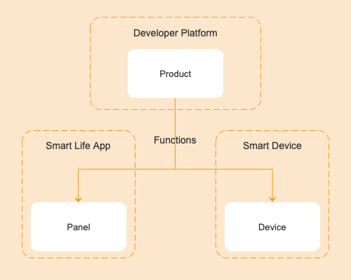
A panel is a product that represents an IoT smart device in the Smart Life app. Before you create a product, you shall understand the definition of the panel and the relationship among the panel, product, and device.
- A panel is an interaction program running on the Smart Life app and OEM app (Tuya custom app) used to control the running of smart devices and display the real-time status of smart devices.
- A product is used to associate the panel with the smart device and describes the product functions, the panel name displayed in the app, and the data points of the smart device.
- A smart device is a device equipped with the smart module of Tuya, with a pasted QR code for users to scan using the Smart Life app to get and install the control panel of the device.
- The relationship among the panel, product, and device is shown in the figure below.
The electrical socket template is developed based on SDM(Smart Device Model). For more information about SDM, see Smart Device Model.
Concepts
Product name: Universal electrical socket
Product introduction
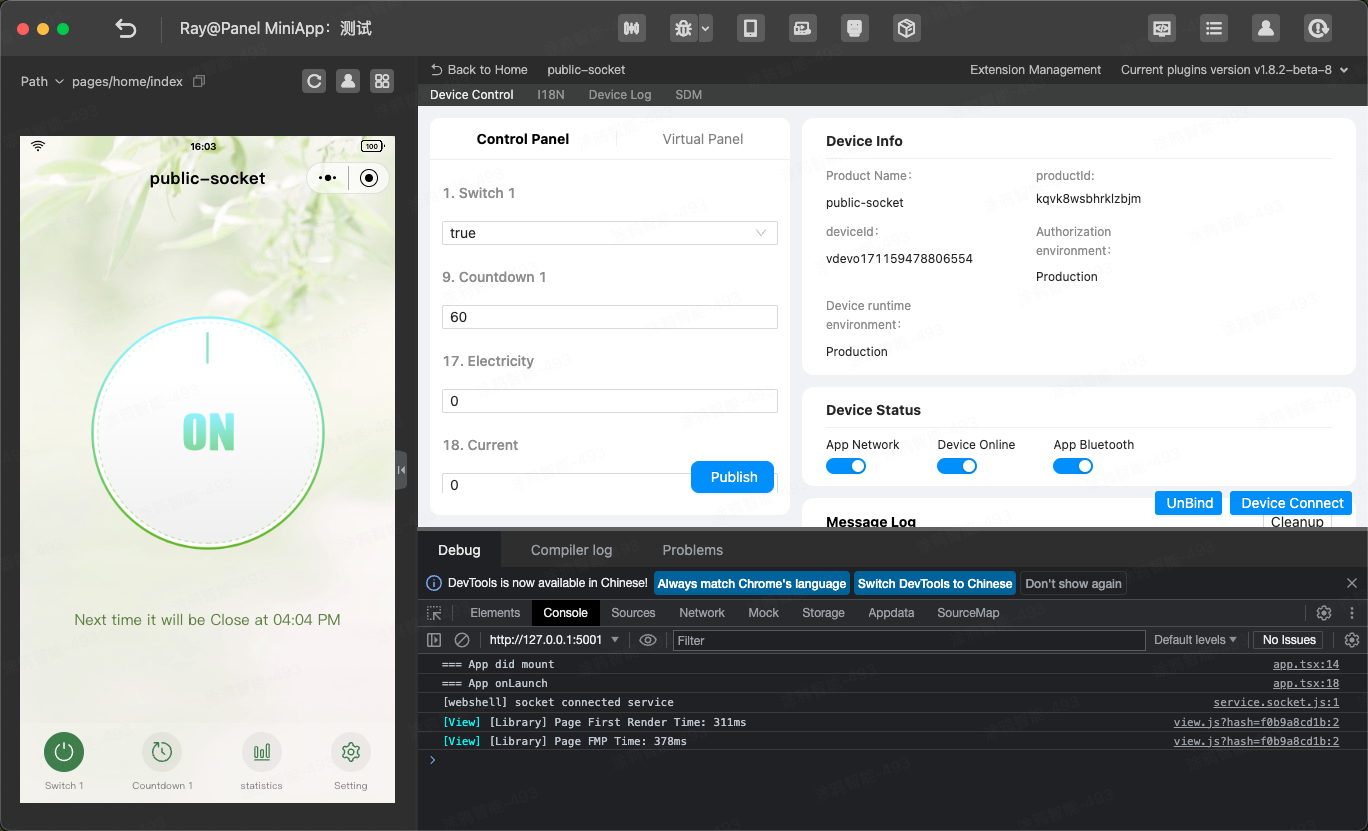
The electrical socket provides the basic function of sockets, such as on/off control, and other functions such as countdown timer disabling, electricity adding, current update, and power. The electrical socket development tutorial helps you develop a panel miniapp to control sockets.
Requirement prototype
- Change the on/off status of
switch_1by tapping on the button in the middle of the homepage.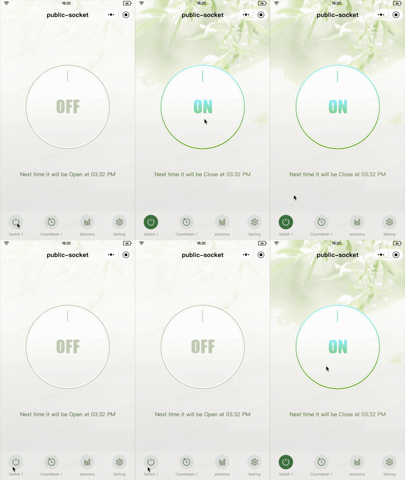
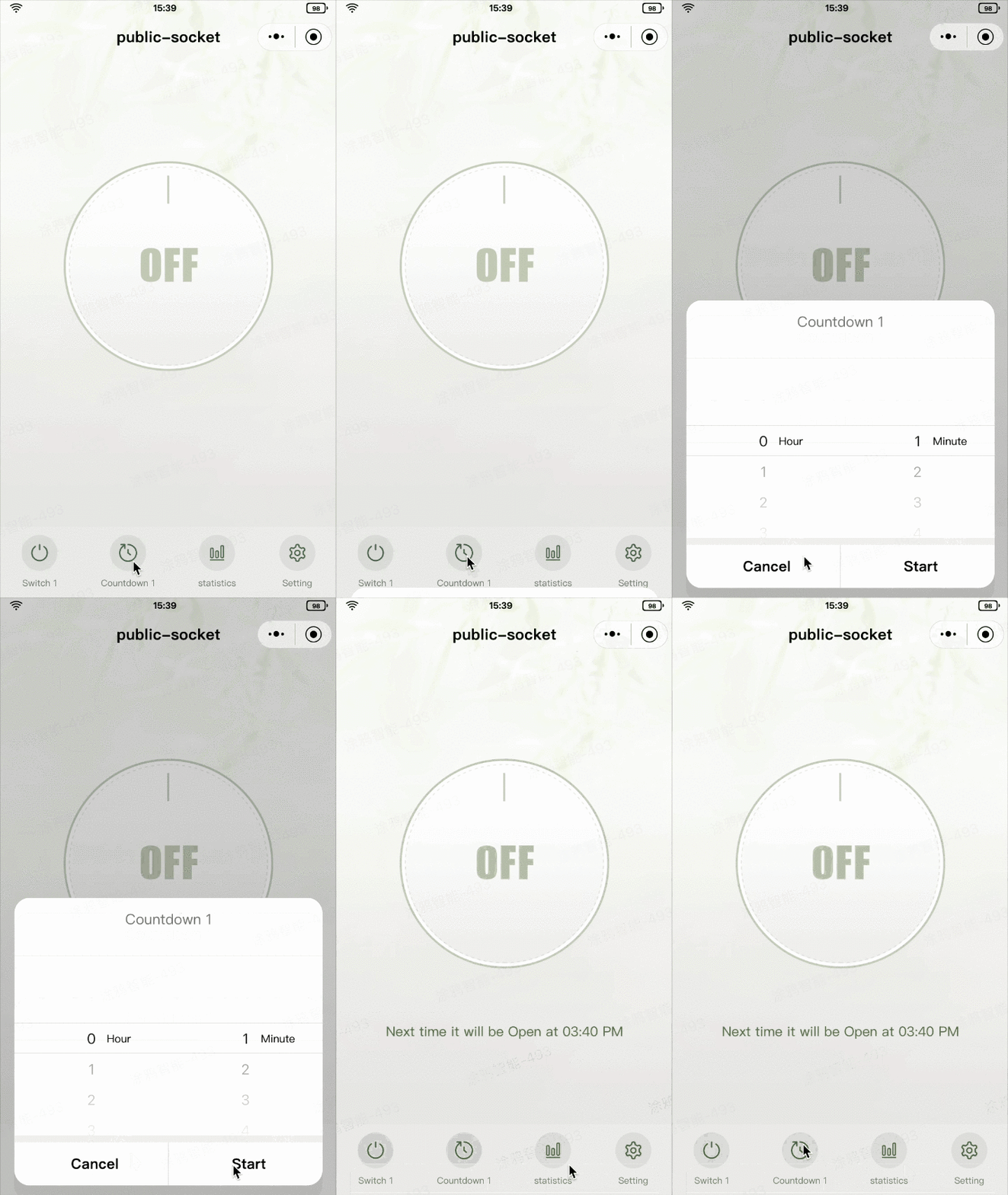
- Display the countdown reminder on the homepage. Display the reminder text based on the on/off status, clock format (12-hour or 24-hour) of the mobile phone, and the value of
countdown_1. If no countdown timer is configured, no reminder is displayed. - Display the countdown dialog box by tapping Countdown 1 at the bottom of the homepage to set the countdown timer. If a countdown timer is configured, this operation allows for disabling the countdown; otherwise, the dialog box is displayed.
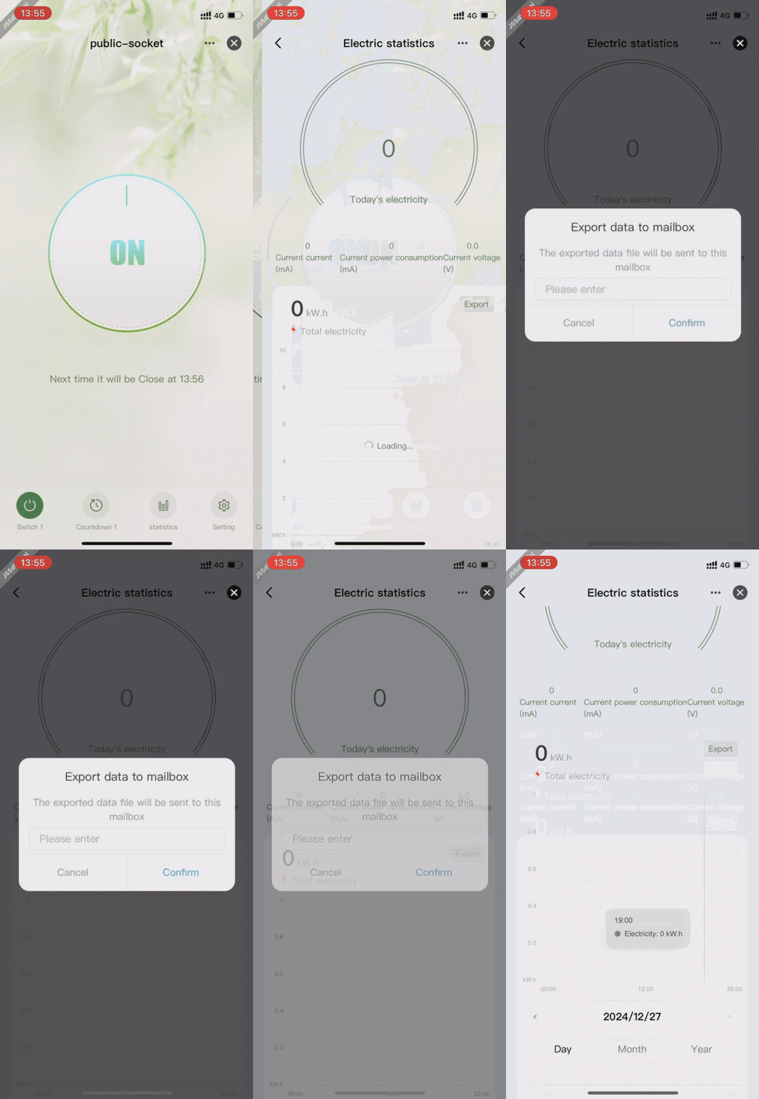
- Enter the Electric Statistics page by tapping Statistics at the bottom of the homepage to check Current power consumption, Current current, Current voltage, Current power, and chart in day/month/year dimensions and export data to a specified email address.
- Enter the Setting page by tapping Setting at the bottom of the homepage to set all
send and report (read-write)data points exceptswitch_1andcountdown_1.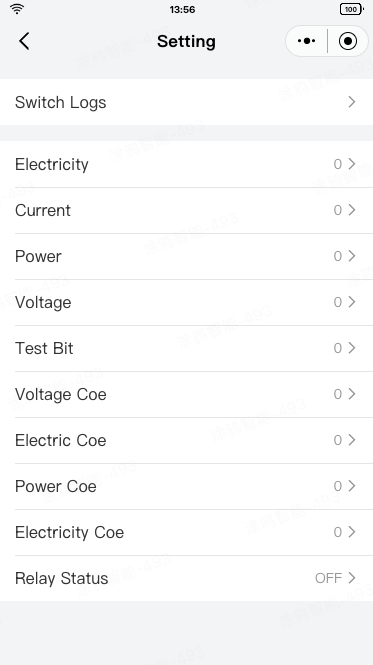
Features
The electrical socket template must have the following data points:
switch_1,
countdown_1,
DP functions
dp function | dpid | code | type | mode | property |
Switch | 1 | switch_1 | Boolean | Send and report (read-write) | - |
Countdown | 9 | countdown_1 | Value | Send and report (read-write) | Value range: 0–86400, interval: 1, multiple: 0, unit: s |
Electricity | 17 | add_ele | Value | Send and report (read-write) | Value range: 0–50000, interval: 100, multiple: 3, unit: kwh |
Current | 18 | cur_current | Value | Send and report (read-write) | Value range: 0–80000, interval: 1, multiple: 0, unit: mA |
Power | 19 | cur_power | Value | Report only (read-only) | Value range: 0–200000, interval: 1, multiple: 1, unit: W |
Voltage | 20 | cur_voltage | Value | Report only (read-only) | Value range: 0–5000, interval: 1, multiple: 1, unit: V |
The data points required by the homepage are listed in the table above.
Create an electricity socket, define the data points, and configure the data points in the panel.
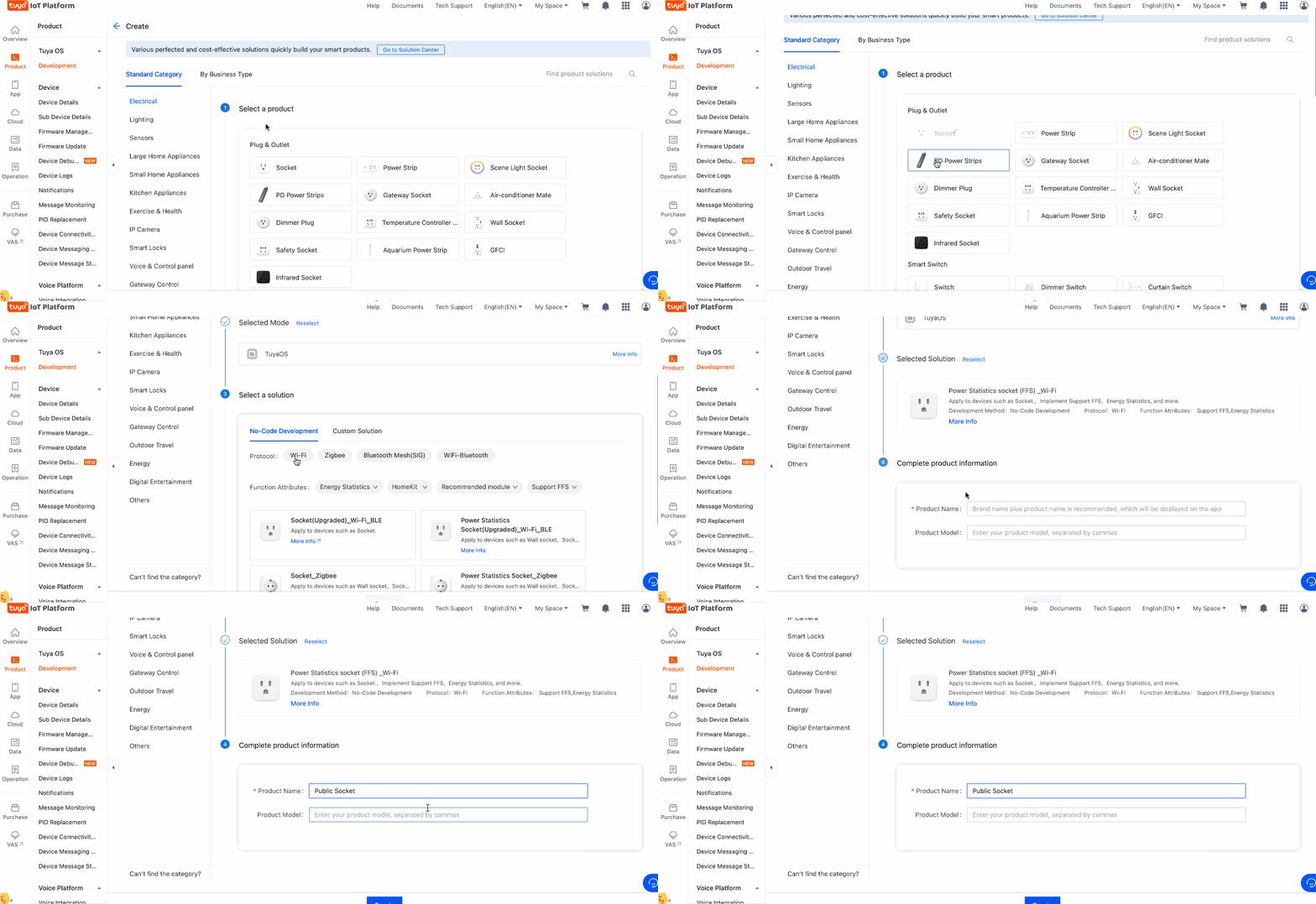
- Log in to Tuya Developer Platform, go to Product > Development, and then click Create on the Product Development page.
- On the Standard Category tab, select Electrical. In the Select a product step, select Socket.
- Select a smart mode and a solution and complete the product information. For example, enter Public Socket for Product Name.
- Click Create.
- In the Add Standard Function window, keep the default settings and click OK.
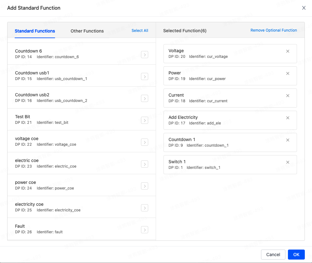
- In the Advanced Functions section, select data points as needed based on the requirements. Enable ElectricityStatisticsBasicEdition.

🎉 By now, an electrical socket named Public Socket is created.
Create panel miniapp on Tuya MiniApp Developer Platform
Log in to Tuya MiniApp Developer Platform to create a panel miniapp.
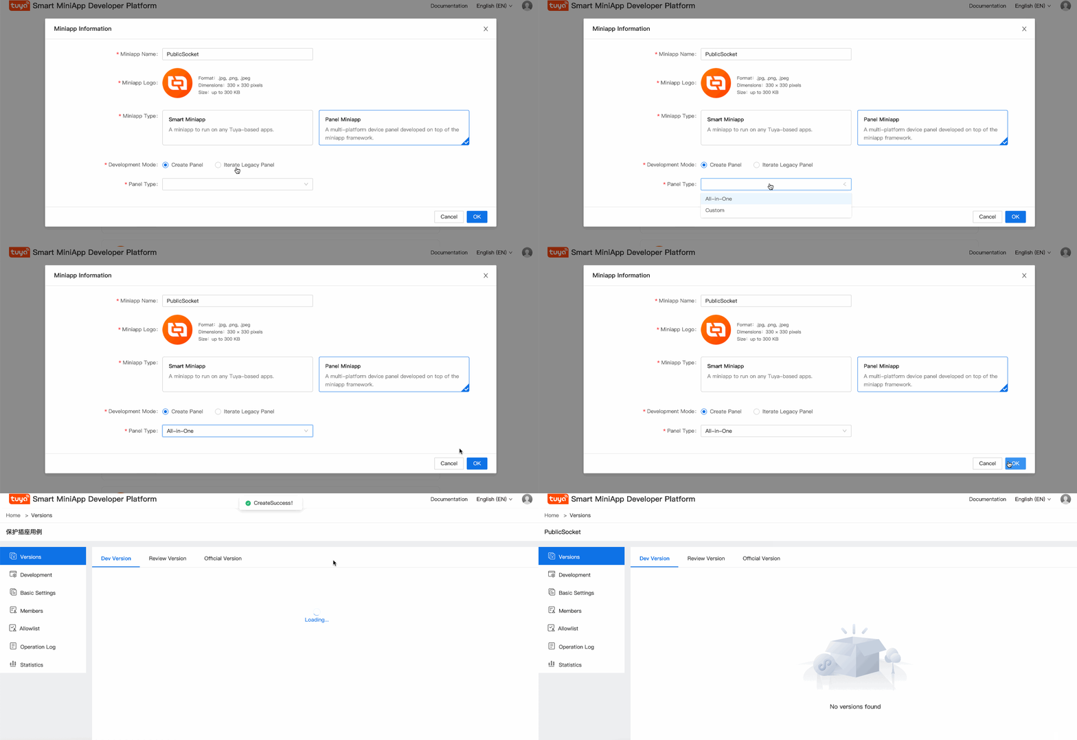
Subscribe to chart and device logging cloud capabilities
Select the created panel miniapp in Tuya MiniApp Developer Platform and click Development to enter the Development page. In the Cloud Capabilities section, find MiniApp Device Logging Capability and MiniApp Chart Capability and click Subscribe Resource Bundle.

Create IDE project
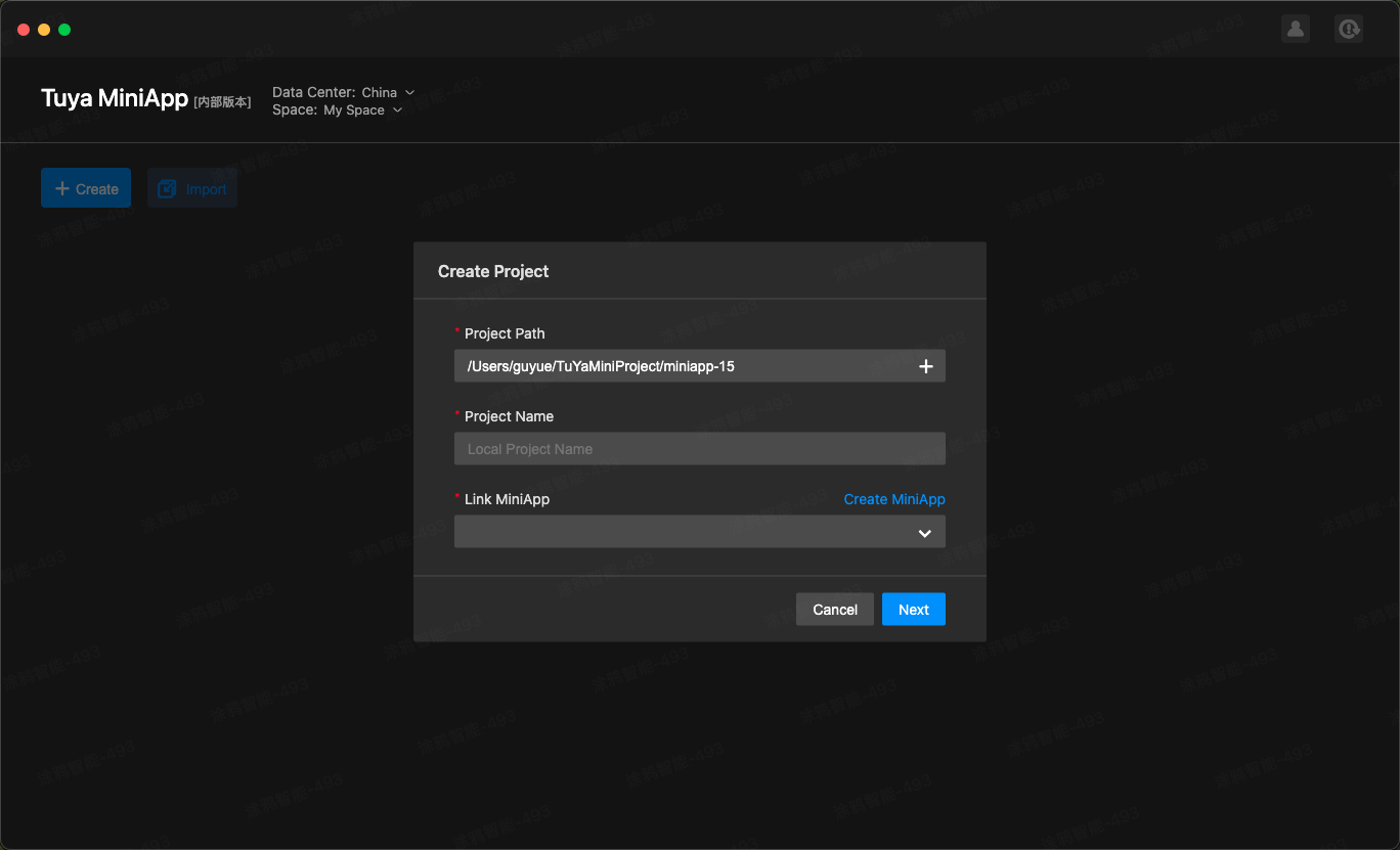
- Open IDE, click Create, enter the project name, associate the project with the created panel miniapp, select Created Product for Debug Product, and click Next.
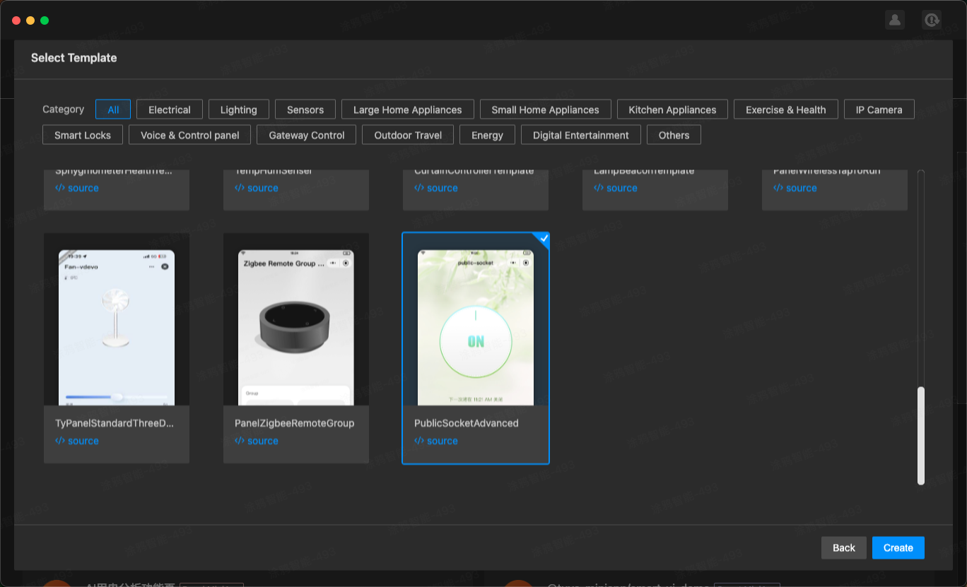
- On the Select Template dialog box, select PublicSocketAdvanced, and click Create.
- Go back to the project management page and select the created project for preview and development.
Project directory
By now, the initialization of the development of a panel miniapp is completed. The introduction to the project directory is as follows.
├── src
│ ├── app.config.ts # Configurations generated automatically.
│ ├── app.tsx # App root component.
│ ├── components # Component directory.
│ ├── constant # Constant directory.
│ ├── devices # Smart device model directory.
│ │ ├── index.ts # Smart device model definition and export.
│ │ └── schema.ts # Description of the DP of the current smart device, which can be generated automatically by IDE.
│ ├── global.config.ts
│ ├── hooks # Custom hooks directory.
│ ├── i18n # Multilingual directory.
│ ├── pages # Page directory.
│ └── routes.config.ts # Route configuration.
│─── typings #Definition directory of business types.
│ └── sdm.d.ts #Definition files of smart device type.
Requirement implementation
Generate SDM schema in IDE for project
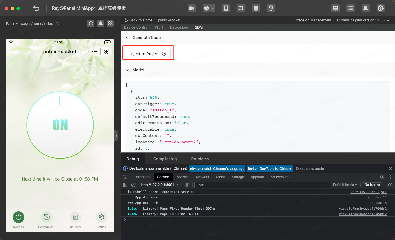
Generate SDM schema for the project to view src/devices/schema.ts.
export const defaultSchema = [
  {
    attr: 1024,
    canTrigger: true,
    code: 'switch_1',
    defaultRecommend: false,
    editPermission: true,
    executable: true,
    extContent: '',
    iconname: 'icon-dp_power2',
    id: 1,
    mode: 'rw',
    name: 'Switch 1',
    property: {
      type: 'bool',
    },
    type: 'obj',
  },
  {
    attr: 1120,
    canTrigger: false,
    code: 'countdown_1',
    defaultRecommend: false,
    editPermission: true,
    executable: false,
    extContent: '',
    iconname: 'icon-dp_time2',
    id: 9,
    mode: 'rw',
    name: 'Switch 1 countdown',
    property: {
      unit: 's',
      min: 0,
      max: 86400,
      scale: 0,
      step: 1,
      type: 'value',
    },
    type: 'obj',
  },
  {
    attr: 1120,
    canTrigger: false,
    code: 'add_ele',
    defaultRecommend: false,
    editPermission: true,
    executable: false,
    extContent: '{"trigger":"direct"}',
    iconname: 'icon-battery',
    id: 17,
    mode: 'rw',
    name: 'Electricity adding',
    property: {
      unit: 'kwh',
      min: 0,
      max: 50000,
      scale: 3,
      step: 100,
      type: 'value',
    },
    type: 'obj',
  },
  {
    attr: 1088,
    canTrigger: true,
    code: 'cur_current',
    defaultRecommend: false,
    editPermission: true,
    executable: false,
    extContent: '',
    iconname: 'icon-Ele',
    id: 18,
    mode: 'ro',
    name: 'Current',
    property: {
      unit: 'mA',
      min: 0,
      max: 80000,
      scale: 0,
      step: 1,
      type: 'value',
    },
    type: 'obj',
  },
  {
    attr: 1088,
    canTrigger: true,
    code: 'cur_power',
    defaultRecommend: false,
    editPermission: true,
    executable: false,
    extContent: '',
    iconname: 'icon-dp_tool',
    id: 19,
    mode: 'ro',
    name: 'Power',
    property: {
      unit: 'W',
      min: 0,
      max: 200000,
      scale: 1,
      step: 1,
      type: 'value',
    },
    type: 'obj',
  },
  {
    attr: 1088,
    canTrigger: true,
    code: 'cur_voltage',
    defaultRecommend: false,
    editPermission: true,
    executable: false,
    extContent: '',
    iconname: 'icon-a_function_turbo',
    id: 20,
    mode: 'ro',
    name: 'Voltage',
    property: {
      unit: 'V',
      min: 0,
      max: 5000,
      scale: 1,
      step: 1,
      type: 'value',
    },
    type: 'obj',
  },
];
Requirement: Change the on/off status of switch_1 by tapping on the button in the middle of the homepage
- Analyze the requirement:
- Add the
on/off buttoncomponent to the homepage.- Display different button icons according to the value sent by
switch_1. - Tap the
on/off buttoncomponent to report the DP value of the on and off events.
- Display different button icons according to the value sent by
- Check whether the DP identifier of the on/off button is
switch_1. If yes, pass this attribute to the component. - Use
usePropsto get the value ofdpsent in real time.Example:import React from 'react'; import { View } from '@ray-js/ray'; import { useProps } from '@ray-js/sdm-react'; export default function () { const switch_1 = useProps((dpState) => dpState.switch_1); return ( <View style={{ flex: 1 }}> <View>switch_1: {switch_1}</View> </View> ); } - Use
useActionsto get the action reported bydp.Example:import React from 'react'; import { View } from '@ray-js/ray'; import { useActions } from '@ray-js/sdm-react'; export default function () { const actions = useActions(); return ( <View style={{ flex: 1 }}> <Button onClick={() => { actions.switch_1.set(false); }} > change action </Button> </View> ); }
- Add the
- Implement the on/off button component based on the analysis.
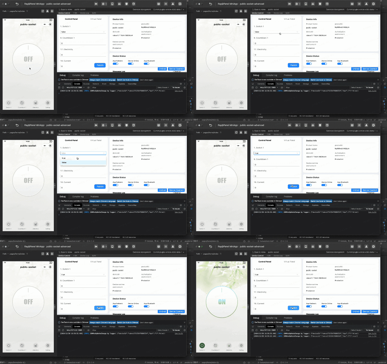
import React from 'react'; import clsx from 'clsx'; import { View } from '@ray-js/ray'; import { DpBooleanAction } from '@tuya-miniapp/sdm'; import { useProps, useActions } from '@ray-js/sdm-react'; import { Icon } from '@/components/icon'; import { icons } from '@/res'; import styles from './index.module.less'; export interface Props { dpCode: string; } export const PowerButton = React.memo<Props>(props => { const { dpCode } = props; const value = useProps(dpState => dpState[dpCode]); const actions = useActions(); if (!dpCode || typeof value !== 'boolean') { return null; } const action = actions[dpCode] as DpBooleanAction; return ( <View className={styles['power-button']} onClick={action.toggle}> <View className={clsx(styles['power-button-content'], { [`${styles['power-button-off']}`]: !value, })} /> <Icon className={styles['power-button-icon']} d={icons.power} size="34px" fill={value ? '#ef550d' : '#ffffff'} /> </View> ); }); - Go to Control Panel > 1. Switch 1 in IDE and set its value to false or true to send or report the value of
dpof the virtual panel. Tap the implemented component and view the IDE control panel status to verify the product functions.
Display countdown reminder on homepage
Display the reminder text based on the on/off status, clock format (12-hour or 24-hour) of the mobile phone, and the value of countdown_1. If no countdown timer is configured, no reminder is displayed.
Create the countdown reminder component and control the displayed content based on the on/off status of switch_1 and the value of countdown_1.
Implement countdown reminder component.
Display countdown dialog box on homepage
Display the countdown dialog box by tapping Countdown 1 at the bottom of the homepage to set the countdown timer. If a countdown timer is configured, this operation allows for disabling the countdown; otherwise, the dialog box is displayed.
- Create the bottom tab component and countdown dialog box component and control the displayed content based on the value of
countdown_1. - Use
useActionsto report the status ofcountdown_1.Implement countdown dialog box component.
Display electric statistics page
Enter the Electric Statistics page by tapping Statistics at the bottom of the homepage to check the current current, voltage, and power and get statistical data.
To get the statistics API, see Statistics.
Display setting page
Enter the Setting page by tapping Setting at the bottom of the homepage to set all send and report (read-write) data points except switch_1 and countdown_1.
- Set all
send and report (read-write)data points on the Setting page. - Use
useDeviceto get all values ofdp.import { useDevice } from '@ray-js/sdm-react'; const { devInfo } = useDevice(); // Get all data points. const dpSchemas = devInfo.schema; - Display different UI and interaction dialog boxes according to the value of
dp.Implement setting page.
Display log page
Enter the Switch Logs page by tapping Switch Logs on the device page. To get the log reporting API, see getAnalyticsLogsStatusLog.