如何基于涂鸦面板 SDK 为智能彩灯产品快速开发 RN 面板
概况
智能灯是一款常见的智能设备,安装智能灯后,用户可以使用手机 App 轻松调整室内颜色和亮度,设置不同的照明场景来轻松创造出温暖、放松、有趣或者鼓舞人心的室内空间。
物料清单
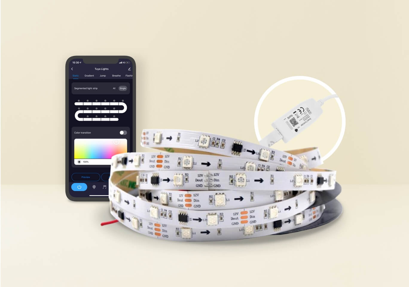
一款五路彩灯设备(可选)
数量:1一款 Powered By Tuya 的五路彩灯设备即可,您也可以前往涂鸦智选平台采购样品。查看详情
步骤
第 1 步:了解智能灯和 RGB 5 路灯
在智能灯具的开发过程中,您会碰到各种各样的某路灯,例如一路灯或者五路灯。不同的数字代表照明产品能实现的功能不同,如下表所示。其中,五路灯有白光和彩光是 2 种模式切换,但不可同时启用。
一路灯 二路灯 三路灯 四路灯 五路灯 亮度 色温+亮度 HSV 亮度+HSV 色温+亮度+HSV 彩光的色彩模型常见的有 RGB 模型和 HSV 模型:
-
RGB 色彩模型
RGB(Red、Green、Blue)色彩模式是一种面向硬件的色彩模型,每个字母的取值为 0~255。RGB都是0时是黑色,都是255时是白色。
-
HSV 色彩模型
HSV(Hue、Saturation、Value)色彩模式是一种面向用户感官的色彩模型,侧重与色彩表示。它比 RGB 更接近人们对彩色的感知经验。
-
色相 H:用角度度量,取值范围为0°~360°,从红色开始按照逆时针方向计算,红色为0°,绿色为120°,蓝色为240°,黄色为60°,青色为180°,品红为300°。
-
饱和度 S:表示色彩的纯度。数值越高颜色则深而艳,数值越低则颜色逐渐变灰,取值范围为0.0~1.0,白色的S=0。
-
明度 V:表示颜色的明亮程度。取值范围为0.0(黑色)~1.0(白色)。

-
-
第 2 步:准备工作
第 3 步:设置功能
创建产品后,您可以为产品设置功能,包括标准功能、自定义功能和云功能。功能点是对以上产品功能的抽象表示,是具体智能设备功能的抽象,用于描述产品功能及其参数。更多详情,请参考 功能定义。
例如,假设某款产品的 PID 为 7z8knex5zdx80***,而且其功能点如下表所示:
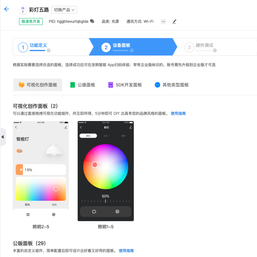
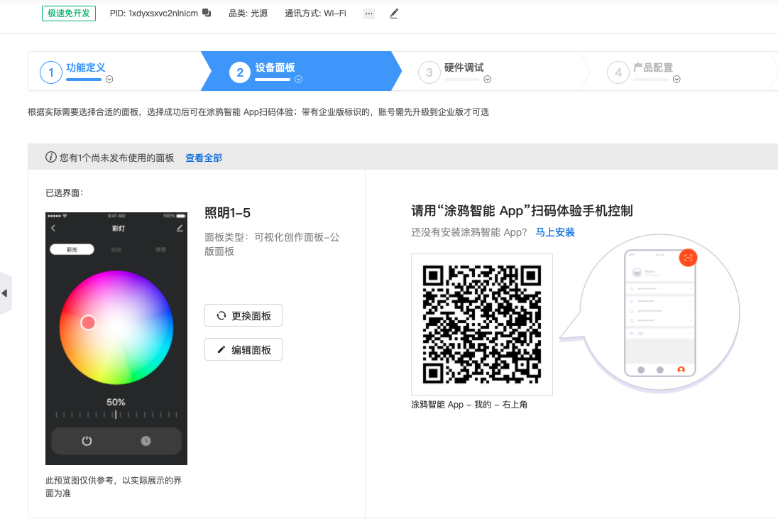
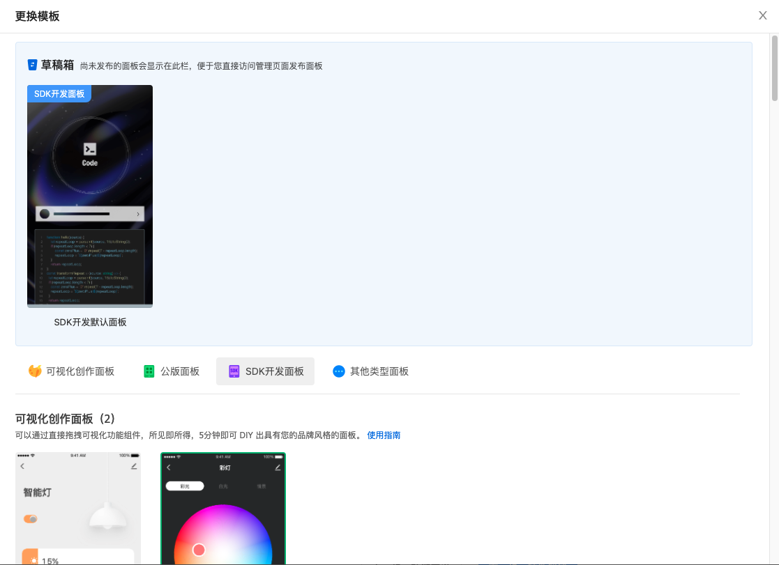
DP ID 功能点 标识符 数据传输类型 功能点类型 功能点属性 20 开关必选 switch_led 可下发可上报 布尔型 21 模式必选 work_mode 可下发可上报 枚举型 枚举值white, colour, scene, music 22 亮度值必选 bright_value 可下发可上报 数值型 数值范围:10-1000, 间距:1, 倍数:0, 单位: 23 冷暖值必选 temp_value 可下发可上报 数值型 数值范围:0-1000, 间距:1, 倍数:0, 单位: 24 彩光必选 colour_data 可下发可上报 字符型 25 场景必选 scene_data 可下发可上报 字符型 26 倒计时剩余时间必选 countdown 可下发可上报 数值型 数值范围:0-86400, 间距:1, 倍数:0, 单位: 27 音乐灯 music_data 只下发 字符型 28 调节必选 control_data 可下发可上报 字符型 29 调试 debug_data 只下发 字符型 第 4 步:选择设备面板
第 5 步:初始化工程
-
安装涂鸦开发工具包
涂鸦提供官方的命令行工具(CLI),和涂鸦的面板定制协作平台深度集成,请务必安装,安装命令如下:
-
MacOS & Linux
curl -fsSL https://raw.githubusercontent.com/tuya/tuya-panel-cli/main/install.sh | sh注意:首次安装需要根据提示设置环境变量。
-
Windows Powershell
iwr https://raw.githubusercontent.com/tuya/tuya-panel-cli/main/install.ps1 -useb | iex说明:安装完成后运行
tuya-panel-cli help,如果展示所有可用命令的帮助信息,则安装成功。注意:
iwr命令在低版本 Powershell 下不可用,请参考 iwr 无法被识别(Windows) 解决。
-
-
初始化模板工程
$ tuya-panel-cli init MyLampApp
$ cd MyLampApp
$ yarn && yarn start
-
第 6 步:调试面板
打开 涂鸦面板-RN App,点击需要调试的虚拟设备的面板进行调试。
注意: 调试时主机和手机的Wi-Fi需保持同步。
-
iOS 调试
- 打开 涂鸦面板-RN App 注册并登录。
- 点击底部栏中的 RN调试,进入 RN 调试设置页面。
- 开启顶部的滑块开启 RN 调试功能,并按照 App 提供的步骤输入 产品 ID、本机调试 ip 地址、本机调试端口 和 bundle (用于载入本地 bundle)。
- 输入完毕后,回到首页进入指定面板后即可载入本地资源包。
- 如需查看调试日志或开启 hot reload,可在面板界面摇一摇进行选择。
-
Android 调试
- 找到下载安装后附带的
com.ty.panel.dev应用。 - 输入开发主机的 IP 地址,输入完毕后必须 点击确认,并打开开关。
- 打开 涂鸦面板-RN App 注册并登录。
- 进入指定面板后,摇一摇弹框选择 reload 将会载入本地资源包。
- 如需查看调试日志或开启 hot reload,也可在面板界面摇一摇进行选择。
- 找到下载安装后附带的
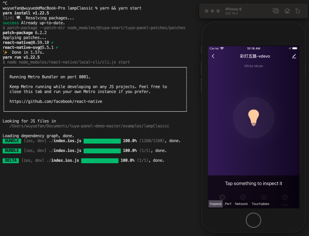
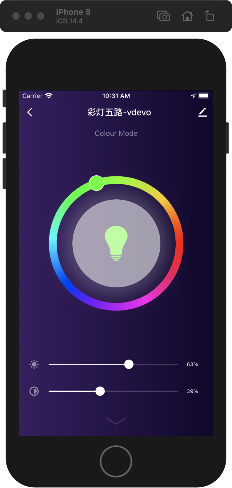
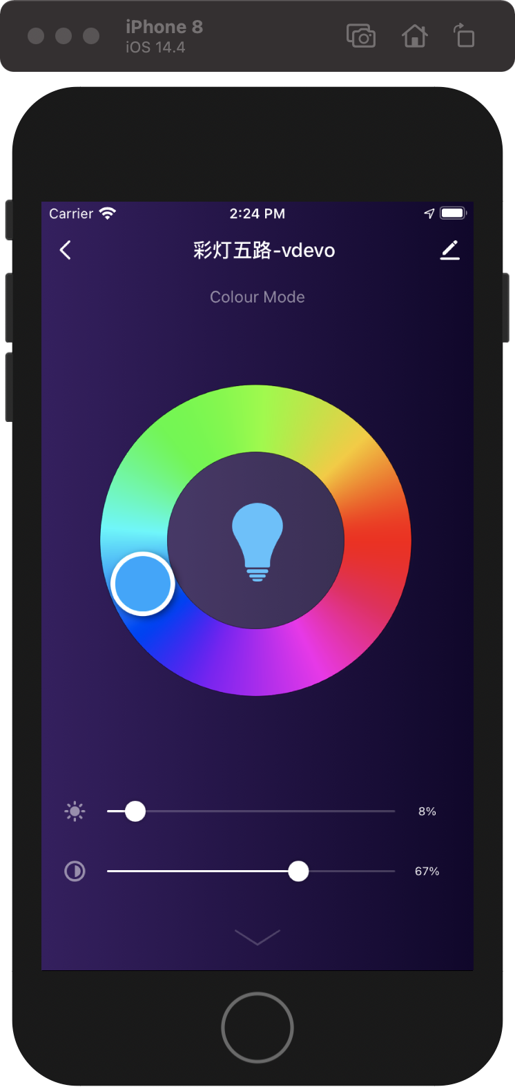
最终模板运行成功的示例可参考下图:
-
第 7 步:进阶开发
本模板工程基于彩灯五路模版:
-
支持以下功能:
- 白光设置
- 彩光设置
- 场景设置
- 云端定时
- 自定义场景属性设定
-
支持以下品类:
-
Wi-Fi
-
蓝牙
-
蓝牙 Mesh
-
Zigbee
-
说明: 此处仅描述脚手架相关的目录,通用目录结构信息参考 RN 0.59 脚手架文档。
├── src
│   ├── api // 放置项目中用到的一系列云端 api
│   ├── components // 放置项目中用到的复用的功能组件
│   ├── composeLayout.tsx // 封装处理了面板内部所需要的一些`设备事件`和`设备信息`
│   ├── config // 放置面板内部一些常用的配置文件
│   ├── containers // 放置项目的各个页面级别的组件
│   ├── i18n // 放置多语言配置文件
│   ├── main.tsx // 项目入口文件, 继承自 `NavigatorLayout`,可通过重写 `hookRoute` 方法将一些必要的配置传入,例如背景、topbar 等;重写 `renderScene` 方法控制路由跳转
│   ├── redux // 放置 redux 相关的一些代码
│   ├── res // 放置本地资源,包括图片,svg path 等
│   └── utils // 放置面板内部会用到的一些常用工具方法等
更换彩光颜色模型示例代码
-
导入需要更换的彩光底图。

-
重写彩光模型代码。
-
定位至彩光模型代码处,即lampClassic -> components -> HuePicker -> index.js。
-
重写代码如下:
	import PropTypes, { number } from 'prop-types';
	import React, { Component } from 'react';
	import { View, Image, PanResponder, StyleSheet, ViewStyle, ViewPropTypes } from 'react-native';
	import { Utils } from 'tuya-panel-kit';

	export default class HuePicker extends Component {
	static propTypes = {
		accessibilityLabel: PropTypes.string,
		style: ViewPropTypes.style,
		disabled: PropTypes.bool,
		radius: PropTypes.number,
		innerRadius: PropTypes.number,
		thumbRadius: PropTypes.number,
		thumbInnerRadius: PropTypes.number,
		RingBackground: PropTypes.oneOfType([PropTypes.number, PropTypes.string, React.ReactElement]),
		hue: PropTypes.number,
		onValueChange: PropTypes.func,
		onComplete: PropTypes.func,
	};

	static defaultProps = {
		accessibilityLabel: 'HuePicker',
		style: null,
		disabled: false,
		radius: 130,
		innerRadius: 70,
		thumbRadius: 25,
		thumbInnerRadius: 20,
		RingBackground: require('./lamp_colorBg.png'),
		hue: 0,
		onValueChange: () => {},
		onComplete: () => {},
	};

	constructor(props) {
		super(props);
const { radius, thumbRadius } = props;
		this.cx = radius - thumbRadius;
		this.cy = radius - thumbRadius;
		// 可拖动圆球至原点的固定距离(令圆球始终在在色环中居中)
		this.fixedLength = radius - this.ringSize * 0.5;
		this._panResponder = PanResponder.create({
		onStartShouldSetPanResponder: this.shouldSetResponder,
		onMoveShouldSetPanResponder: this.shouldSetResponder,
		onPanResponderGrant: this._handleResponderGrant,
		onPanResponderMove: this._handleResponderMove,
		onPanResponderRelease: this._handleResponderRelease,
		onPanResponderTerminationRequest: () => false,
		onPanResponderTerminate: this._handleResponderRelease,
		// onStartShouldSetResponderCapture: () => false,
		onMoveShouldSetPanResponderCapture: () => false,
		});
	}

	componentWillReceiveProps(nextProps) {
		const { radius, innerRadius, thumbRadius } = nextProps;
const {
		radius: prevRadius,
		innerRadius: prevInnerRadius,
		thumbRadius: prevThumbRadius,
		} = this.props;
		if (
		prevRadius !== radius ||
		prevInnerRadius !== innerRadius ||
		prevThumbRadius !== thumbRadius
		) {
		this.cx = radius - thumbRadius;
		this.cy = radius - thumbRadius;
		this.fixedLength = radius - this.ringSize * 0.5;
		}
	}

	// 圆环尺寸
	get ringSize() {
		const { radius, innerRadius } = this.props;
return radius - innerRadius;
	}

	getRadianByCoord(xRelativeOrigin, yRelativeOrigin) {
		const { thumbRadius } = this.props;
		const xRelativeCenter = xRelativeOrigin - this.cx - thumbRadius;
const yRelativeCenter = yRelativeOrigin - this.cy - thumbRadius;
		let rad = Math.atan2(yRelativeCenter, xRelativeCenter);
		if (xRelativeCenter > 0 && yRelativeCenter > 0) rad = Math.PI * 2 - rad;
		if (xRelativeCenter < 0 && yRelativeCenter > 0) rad = Math.PI * 2 - rad;
		if (xRelativeCenter < 0 && yRelativeCenter < 0) rad = Math.abs(rad);
		if (xRelativeCenter > 0 && yRelativeCenter < 0) rad = Math.abs(rad);
		if (xRelativeCenter === 0 && yRelativeCenter > 0) rad = (Math.PI * 3) / 2;
		if (xRelativeCenter === 0 && yRelativeCenter < 0) rad = Math.PI / 2;
		return rad;
	}

	getHueByCoord(xRelativeOrigin, yRelativeOrigin) {
		// 0 ~ 2π
		const rad = this.getRadianByCoord(xRelativeOrigin, yRelativeOrigin);
return (rad * 180) / Math.PI;
	}

	getCoordByHue(hue) {
		const rad = ((360 - hue) * Math.PI) / 180;
		const x = this.cx + this.fixedLength * Math.cos(rad);
const y = this.cy + this.fixedLength * Math.sin(rad);
		return { x, y };
	}

	getColorInfoByHue(hue) {
		const { r, g, b } = Utils.ColorUtils.hsvToRgb(hue, 1, 1);
		return {
	r,
		g,
		b,
		rgbString: `rgb(${r}, ${g}, ${b})`,
		};
	}
	thumbRef;
	thumbInnerRef;
	cx;
	cy;
	fixedLength;
	_panResponder;
	xRelativeOriginStart;
	yRelativeOriginStart;

	shouldSetResponder = e => {
		// eslint-disable-next-line react/destructuring-assignment
		if (this.props.disabled) {
	return false;
		}
		const { locationX, locationY } = e.nativeEvent;
		// 是否在可点击范围内
		const { innerRadius, radius, thumbRadius } = this.props;
		const xRelativeCenter = locationX - this.cx - thumbRadius;
		const yRelativeCenter = locationY - this.cy - thumbRadius;
		const len = Math.sqrt(xRelativeCenter ** 2 + yRelativeCenter ** 2);
		if (len >= innerRadius && len <= radius) {
		return true;
		}
		return false;
	};

	_moveTo(xRelativeOrigin, yRelativeOrigin, callback) {
		const hue = Math.round(this.getHueByCoord(xRelativeOrigin, yRelativeOrigin));
		const { x = 0, y = 0 } = this.getCoordByHue(hue);
const color = this.getColorInfoByHue(hue);
		this.updateThumbStyle({
		transform: [
			{
			translateX: x,
			},
			{
			translateY: y,
			},
		],
		});
		this.updateThumbInnerStyle({
		backgroundColor: color.rgbString,
		});
		typeof callback === 'function' && callback(hue, color);
	}

	_handleResponderGrant = e => {
		const { locationX, locationY } = e.nativeEvent;
		this.xRelativeOriginStart = locationX;
this.yRelativeOriginStart = locationY;
	};

	_handleResponderMove = (e, gestureState) => {
		const { dx, dy } = gestureState;
		const { onValueChange } = this.props;
const xRelativeOrigin = this.xRelativeOriginStart + dx;
		const yRelativeOrigin = this.yRelativeOriginStart + dy;
		this._moveTo(xRelativeOrigin, yRelativeOrigin, onValueChange);
	};

	_handleResponderRelease = (e, gestureState) => {
		const { dx, dy } = gestureState;
		const { onComplete } = this.props;
const xRelativeOrigin = this.xRelativeOriginStart + dx;
		const yRelativeOrigin = this.yRelativeOriginStart + dy;
		// eslint-disable-next-line no-undef
		this._moveTo(xRelativeOrigin, yRelativeOrigin, onComplete);
		this.xRelativeOriginStart = 0;
		this.yRelativeOriginStart = 0;
	};

	updateThumbStyle(style) {
		if (this.thumbRef) {
		this.thumbRef.setNativeProps({ style });
}
	}

	updateThumbInnerStyle(style) {
		if (this.thumbInnerRef) {
		this.thumbInnerRef.setNativeProps({ style });
}
	}

	renderRingBackground() {
		const { radius, RingBackground } = this.props;
		if (typeof RingBackground === 'number') {
	return (
			<Image
			style={{
				width: radius * 2,
				height: radius * 2,
				borderRadius: radius,
			}}
			source={RingBackground}
			/>
		);
		}
		if (React.isValidElement(RingBackground)) {
		return React.cloneElement(RingBackground, {
			style: {
			width: radius * 2,
			height: radius * 2,
			borderRadius: radius,
			...RingBackground.props.style,
			},
		});
		}
	}

	render() {
		const {
		accessibilityLabel,
	style,
		disabled,
		radius,
		thumbRadius,
		thumbInnerRadius,
		hue,
		} = this.props;
		const { x = 0, y = 0 } = this.getCoordByHue(hue);
		const { rgbString } = this.getColorInfoByHue(hue);
		return (
		<View
			accessibilityLabel={accessibilityLabel}
			style={style}
			pointerEvents="box-only"
			{...this._panResponder.panHandlers}
		>
			{/* 圆环 */}
			<View style={[styles.sectionRing, { width: radius * 2, height: radius * 2 }]}>
			{this.renderRingBackground()}
			</View>

			{/* 圆球 */}
			<View
			ref={ref => {
		this.thumbRef = ref;
			}}
			style={[
				styles.sectionThumb,
				{
				width: thumbRadius * 2,
				height: thumbRadius * 2,
				borderRadius: thumbRadius,
				opacity: disabled ? 0 : 1,
				transform: [
					{ translateX: x, },
					{ ranslateY: y, },
				],
				},
			]}
			>
			<View
				ref={ref => {
				this.thumbInnerRef = ref;
				}}
				style={{
				width: thumbInnerRadius * 2,
				height: thumbInnerRadius * 2,
				borderRadius: thumbInnerRadius,
				backgroundColor: rgbString,
				}}
				/>
			</View>
		</View>
		);
	}
	}

	const styles = StyleSheet.create({
	sectionRing: {
		alignItems: 'center',
		justifyContent: 'center',
	},
	sectionThumb: {
		alignItems: 'center',
justifyContent: 'center',
		position: 'absolute',
		backgroundColor: '#fff',
		shadowOffset: { width: 2, height: 2 },
		shadowColor: '#000',
		shadowOpacity: 0.5,
		elevation: 2,
		transform: [
		{ translateX: 0, },
		{ translateY: 0, },
		],
	},
	});
-
-
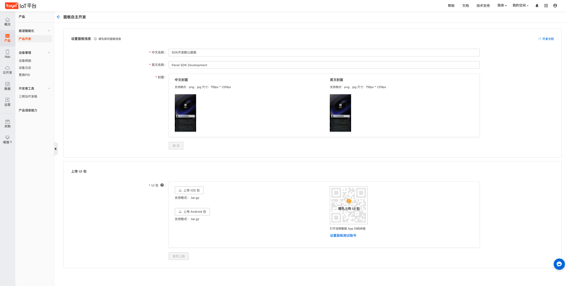
第 8 步:打包上传
-
运行以下命令。
cd MyLampApp
tuya-panel-cli package ./
打包前会对项目的合法性进行一次校验,校验通过才会开始构建。
开始打包时,
tuya-panel-cli会将所选择的项目打包到临时目录,成功后,会自动打开该临时目录。打包会生成 3 个 UI 包, 打出三个包名示例如下:
{name}-android*{rnVersion}*{version}.tar.gz - 安卓面板 UI 包 {name}-ios*{rnVersion}*{version}.tar.gz - 苹果面板 UI 包 {name}-sources.tar.gz - 源码包,不需要进行任何操作说明:打包过程如果遇到错误,请修复工程源码错误后再继续构建。或者求助
developer@tuya.com(请在邮件中附上企业名称和联系方式)。 -
上传对应平台的 UI 包。
-
生成体验二维码。
您可以通过
设置面板测试账号按钮将涂鸦智能 App 的用户账号设置为体验账号。这样,该用户即可通过扫描体验二维码快速体验 UI 资源包。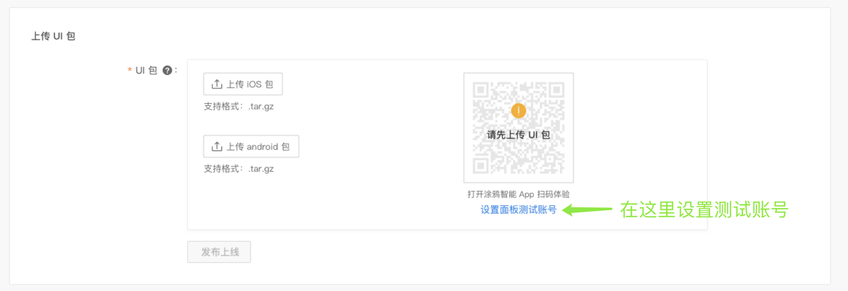
-
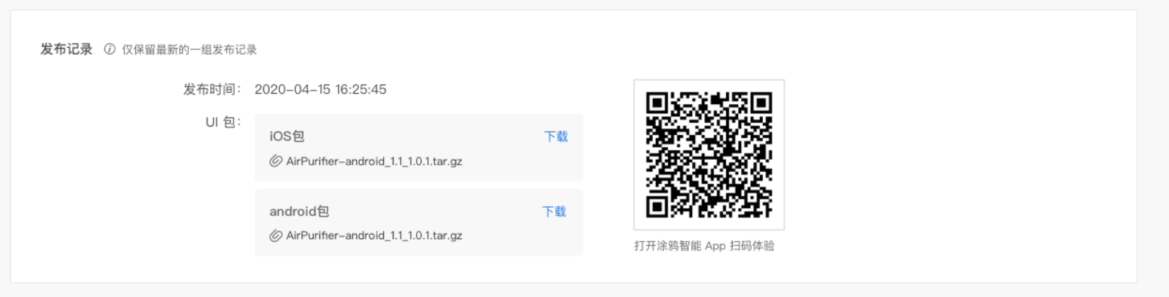
发布上线。
体验无误后,点击发布上线功能,您即可将该 UI 包发布上线。上线后,在页面下方会生成最新一条的 UI 资源包上线记录,便于您实时体验线上版本。
-
该内容对您有帮助吗?
是我要提建议


