Prerequisites
- You have read Ray Novice Village quest and understand the basic knowledge of the Ray framework.
- You have read Use Ray to develop a universal panel and understand the basic knowledge related to Ray panel development.
Building target
Use panel miniapp to build a light source panel supporting standard capabilities of cool white light (C), cool and warm light (CW), colored light (RGB), cool white and colored light (RGBC), and white and colored light (RGBCW) and use smart device models and functional pages to implement the following capabilities:
- Dimming
- Favorite color adding
- Power-off memory
- Do-Not-Disturb
- Light on/off gradual change
- Countdown
- Cloud timing
Learning objectives
- How to create a light source.
- How to use the light source template to initialize a panel.
- How to use a smart device model to quickly implement dimming function.
- How to implement a function for adding colors to favorites.
- How to implement compatibility with C, CW, RGB, RGBC, and RGBCW lights.
- How to use functional pages to quickly implement countdown and timing functions.
Environment preparations
- Smart Life app
- Tuya MiniApp Tools
- Development environment required by the installation of Node Version Manager (NVM) and Node.js (Node.js 16.x and later versions are recommended)
- Yarn (a dependency management tool)
For more information, see Panel MiniApp > Set up environment.
Product name: C, CW, RGB, RGBC, and RGBCW light
Product introduction
The light supports C, CW, RGB, RGBC, and RGBCW modes based on the data points of the white light mode and multicolor light mode.
Definition:
- RGBCW: Supports setting colored light
colour_data, white light brightnessbright_value, and white light color temperaturetemp_value. - RGBC: Supports setting colored light and white light brightness.
- RGB: Supports setting colored light.
- CW: Supports setting white light brightness and white light color temperature.
- C: Supports setting white light brightness.
Requirement prototype
- Switch: Changes the on/off status of
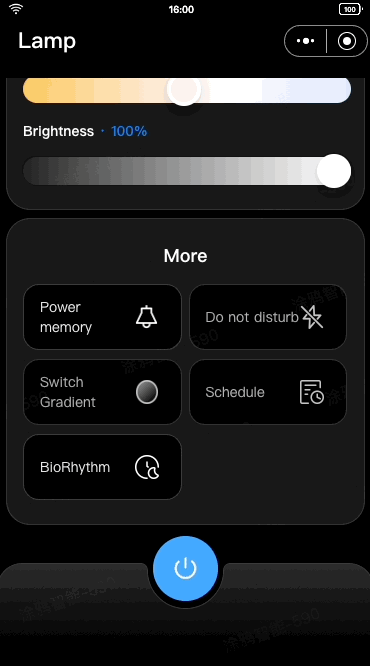
switch_ledby tapping on the button in the middle of the homepage. - Homepage: Displays the dimmer, switch, and other buttons, including power-off memory, do-not-disturb, and light on/off gradual change, based on the data points configured for the product.
- When the
colour_data,bright_value, andtemp_valuedata points are configured, an RGBCW product supporting colored light, white light brightness, and white light color temperature is displayed. - When the
colour_dataandbright_valuedata points are configured, an RGBC product supporting colored light and white light brightness is displayed. - When the
colour_datadata point is configured, an RGB product supporting colored light is displayed. - When the
bright_valueandtemp_valuedata points are configured, a CW product supporting white light brightness and white light color temperature is displayed. - When the
bright_valuedata point is configured, a C product supporting white light brightness is displayed.

- When the
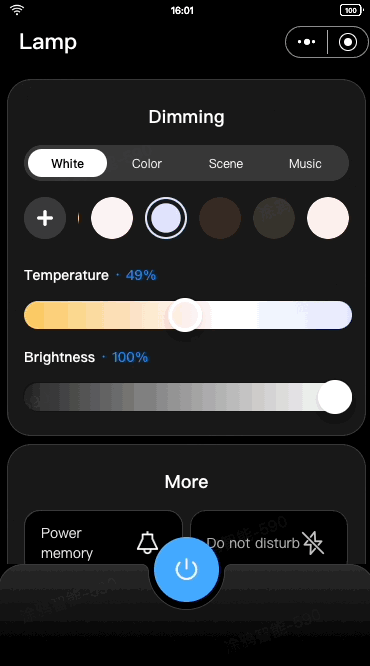
- Multicolor light adjustment:
- The first slider controls hue (0–360).
- The second slider controls saturation (0–1000).
- The third slider controls value (0–1000).
- Data is sent using the
control_datadata point (if configured) at a throttled interval of 300 ms when users hold the slider, and thecolour_datadata point is sent when users drop the slider.
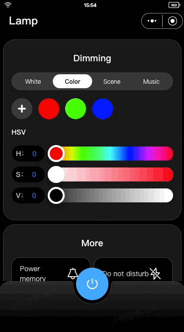
- Favorite color adding:
- Allows users to add up to 8 favorite colors. The red, green, and blue colors are the default colors and cannot be deleted.
- Supports tapping on the delete button to delete a selected non-default color.
- Supports displaying a pop-up window indicating duplicate color adding based on the HSV values stored in the cloud upon adding colors to favorites.
- Supports updating the index value of a selected color based on the current
colour_datadata point.

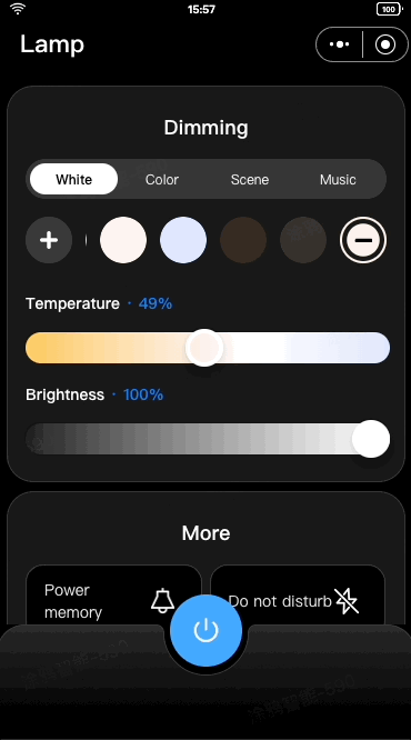
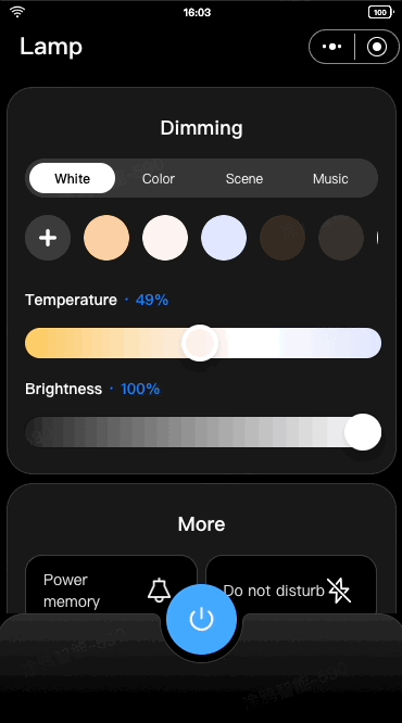
- White light adjustment: The first slider controls color temperature and sends the
temp_valuedata point using thecontrol_datadata point. The second slider controls brightness and sends thebright_valuedata point using thecontrol_datadata point.
- Favorite white light setting adding:
- Allows users to add up to 8 favorite white light settings. The default brightness is 1000, and the default color temperature is 1000, 500, and 0.
- For lights not supporting color temperature adjustment (C and RGBC lights), the default color temperature is 1000, and the default brightness is 1000, 500, and 0.
- Three default settings cannot be deleted. Users can delete a selected non-default setting by tapping on the delete button.
- Supports displaying a pop-up window indicating duplicate setting adding based on the HSV values stored in the cloud upon adding white light settings to favorites. Supports updating the index value of a selected white light setting based on the current
bright_valueandtemp_valuedata points.

- Power-off memory: Allows users to configure whether the device retains its previous settings, such as color, brightness, color temperature, and scene mode, after it powers off and restarts. For the settings to take effect, the current settings must remain unchanged for at least 5 seconds. The panel offers three options:
- Restore memory: Restores the device to the status before the power-off.
- Initial mode: Resets the device to its default settings for color and brightness.
- Customized: Allows users to apply customized color and brightness settings by tapping Customized to set the color and brightness and preview lighting effects in real time. After tapping Save, the color of the icon next to Customized will change to the selected color. By default, the initial color and brightness are displayed unless the settings are customized. For more information, see Lighting Features > Power-off Memory.
- Do-Not-Disturb: Allows users to configure the light state when power is restored after an outage. By default, smart lights turn on when power is restored, which can be disruptive, especially during nighttime. This function enables users to customize the light state to avoid such disturbances. For more information, see Lighting Features > Do-Not-Disturb.

- Light on/off gradual change: Ensures smooth transitions when turning lights on or off through the app. Currently, you can enable this function on Tuya Developer Platform, but the transition duration is fixed and cannot be adjusted. Sudden changes in brightness, such as instantaneous illumination, are dazzling and affect user experience. For example, in hotel scenarios, guests might find abrupt lighting too intense when entering a room.
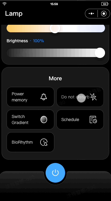
- Cloud timing: Allows users to set custom on/off time and weekly schedules through cloud services, eliminating the need for embedded hardware development. Only the scheduled on/off function is configured on the device, while on/off time and weekly schedules are set in the cloud. Note that cloud timing cannot be enabled together with biorhythm.
- Countdown: Sends the
countdowndata point to the device, and the device automatically turns on or off after a specified duration.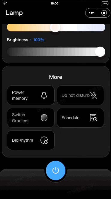
- Biorhythm: Simulates natural variations in light intensity and color temperature throughout the day, offering a lighting experience that mirrors natural daylight. However, it cannot be enabled together with cloud timing. For more information, see Lighting Features > Biorhythm Lighting.
- Scene setting: Allows users to save commonly used lighting schemes as scenes for quick and seamless switching between different lighting schemes.
- Dance to music: Synchronizes lighting with the rhythm of music picked by the mobile phone's microphone and sends color data to the
music_datadata point, creating a vibrant, music-responsive lighting experience.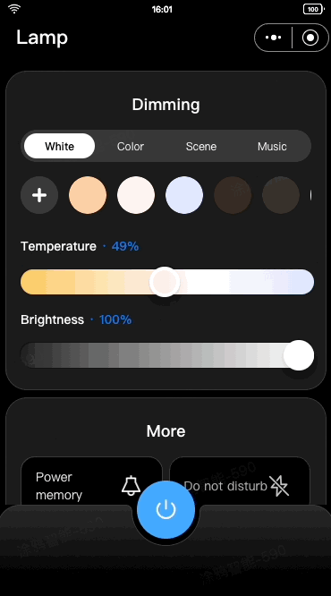
Features
The light source template must have the following data points. Either bright_value or colour_data (both related to dimming) must be included. Additional data points can be selected as needed based on product requirements.
switch_led
work_mode
bright_value
colour_data
DP ID | DP name | Identifier | Data transmission type | Data type | DP property |
20 | Switch | switch_led | Send and report (read-write) | Boolean | - |
21 | Mode | work_mode | Send and report (read-write) | Enum | Enum values: white, colour, scene, music |
22 | White light brightness | bright_value | Send and report (read-write) | Value | Value range: 10–1000, interval: 1, multiple: 0, unit: |
23 | Color temperature | temp_value | Send and report (read-write) | Value | Value range: 0–1000, interval: 1, multiple: 0, unit: |
24 | Multicolor light | colour_data | Send and report (read-write) | String | - |
25 | Scene | scene_data | Send and report (read-write) | String | - |
26 | Countdown | countdown | Send and report (read-write) | Value | Value range: 0–86400, interval: 1, multiple: 0, unit: s |
27 | Dance to music | music_data | Send only (write-read) | String | - |
28 | Real-time adjustment | control_data | Send only (write-read) | String | - |
30 | Biorhythm | rhythm_mode | Send and report (read-write) | Raw | - |
33 | Power-off memory | power_memory | Send and report (read-write) | Raw | - |
34 | Do-Not-Disturb | do_not_disturb | Send and report (read-write) | Boolean | - |
35 | Light on/off gradual change | switch_gradient | Send and report (read-write) | Raw | - |
For data points with the data type of Raw, see the specific protocol for detailed development instructions.

Create a light source, define data points, and configure the data points in the panel.
Log in to Tuya Developer Platform and create the light source.
- Go to Product > Development and click Create on the Product Development page.
- On the Standard Category tab, select Lighting. In the Select a product step, select Light Source. Then, select a smart mode and a solution and complete the product information.
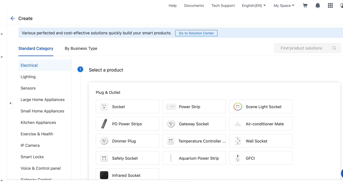
- Click Create.
- In the Add Standard Function window, keep the default settings and click OK. You can select the data points as needed to meet actual requirements during subsequent development.
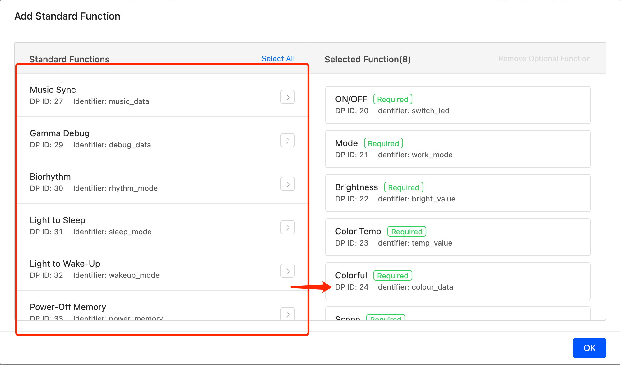
🎉 By now, a light source is created.
Create panel miniapp on Tuya MiniApp Developer Platform
Log in to Tuya MiniApp Developer Platform to create a panel miniapp.
For more information, see Panel MiniApp > Create panel miniapp.
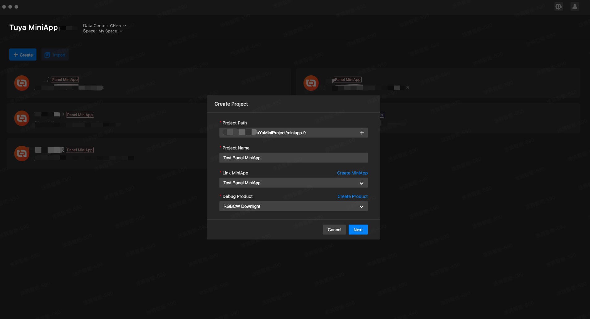
Create project based on template in IDE
For the repository of the light source template, see GitHub Repositories.
- Open IDE, click Create, enter the project name, select the panel miniapp and product to be associated, and click Next.
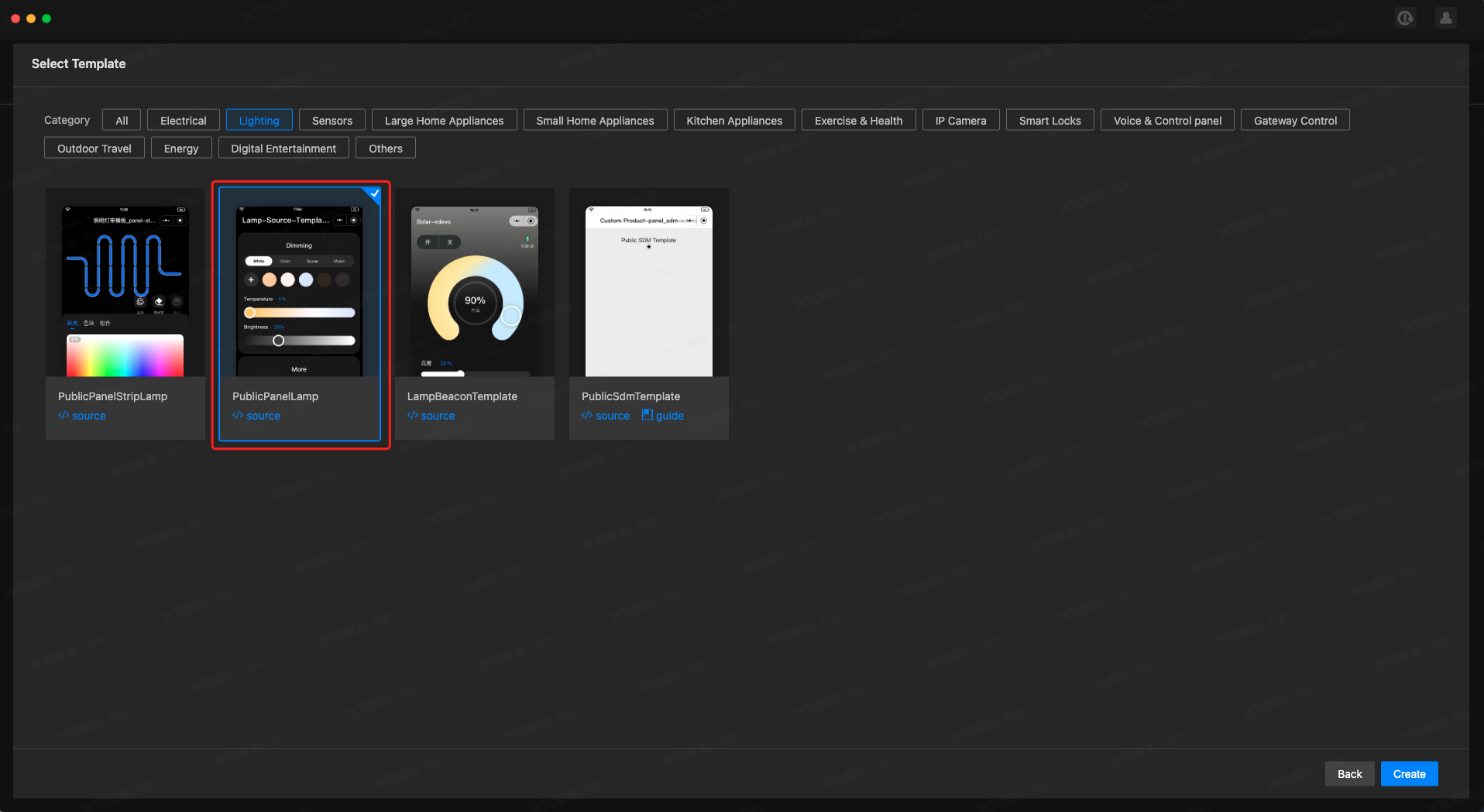
- On the Select Template dialog box, select PublicPanelLamp, and click Create. Then, the dependencies are installed, and the project is created.
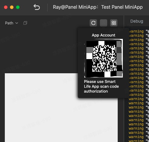
- After entering the development window, click the account icon, and a QR code appears. Scan the QR code using the Tuya Smart Life app to authorize IDE for accessing and controlling the smart device.
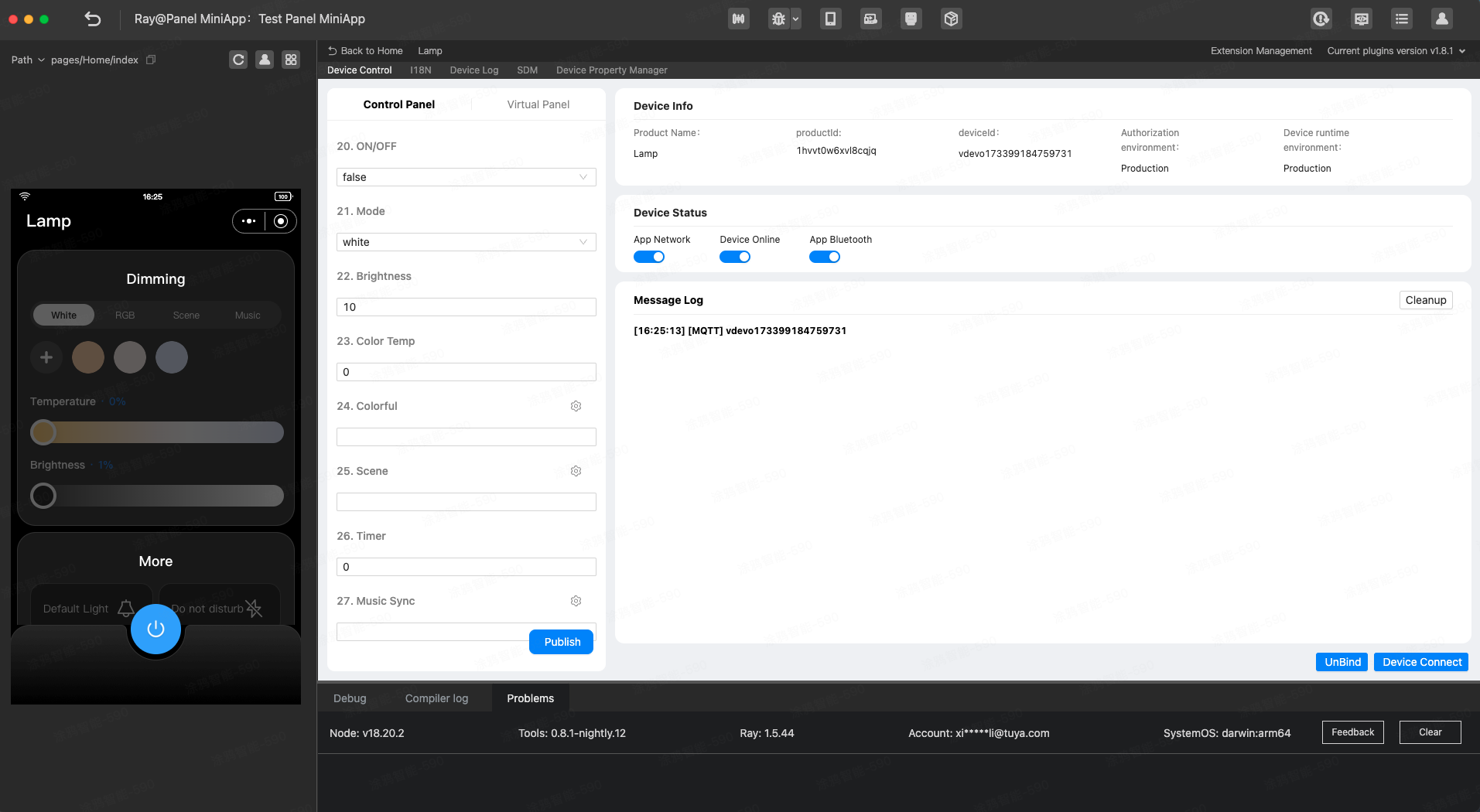
- If the home of the authorized app does not have a device that matches the associated product, manually add a virtual device for debugging in the development environment.

- After the virtual device is added, a message, as shown below, will appear, indicating that the project is created.
Project directory
By now, the initialization of the development of a panel miniapp is completed. Before implementing dimming control, review the introduction to the project directory.
.
├── public          # Static resource directory.
│   └── images
├── ray.config.ts   # Ray configuration file.
├── src
│   ├── api         # Defines general APIs.
│   ├── components  # Defines general components.
│   ├── config      # Defines general configurations.
│   ├── constant    # Defines general constants.
│   ├── devices     # Defines the current device model, used with SDM.
│   ├── hooks       # Defines general hooks.
│   ├── i18n        # Defines multilingual support for the current project.
│   ├── pages       # Defines page components for the current project.
│   ├── redux       # Directory of the status management tool Redux.
│   ├── utils       # Defines general utility methods.
│   ├── app.config.ts # Auto-generated configuration file (do not modify).
│   ├── app.less      # Less configuration for the miniapp.
│   ├── app.tsx       # Root component.
│   ├── composeLayout.tsx # Component for general business logic processing.
│   ├── global.config.ts  # Global configuration file for the miniapp.
│   ├── routes.config.ts  # Route configuration file for the miniapp.
│   └── variables.less    # Less variables for the miniapp.
├── typings               # Definition directory of business types.
│   ├── lamp.d.ts         # Definition files of lighting service general type.
│   ├── sdm.d.ts          # Definition files of smart device type.
Requirement implementation
Generate product definition file (schema)
Reference code: src/devices/schema.ts
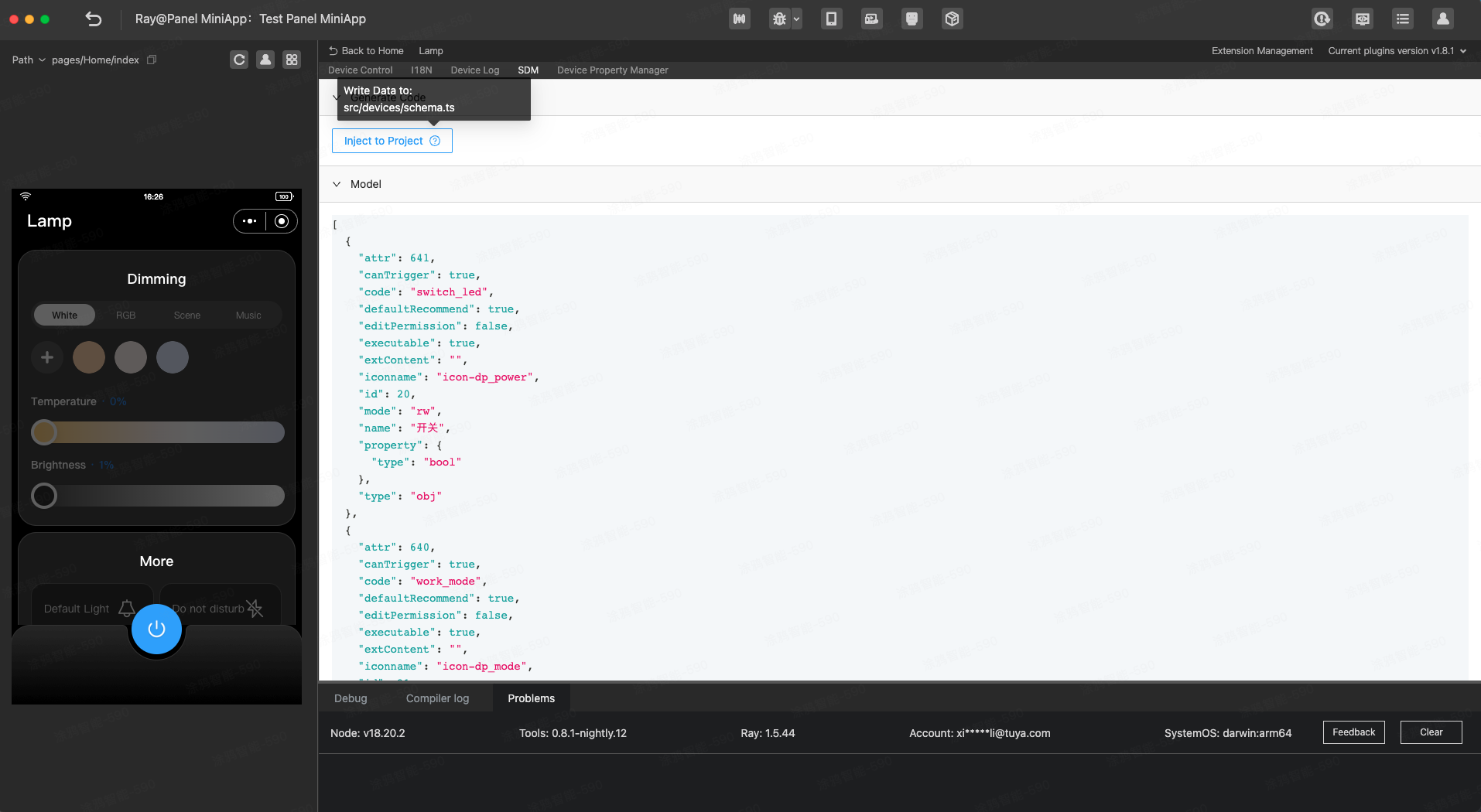
Generate SDM schema for the project by referring to src/devices/schema.ts. Then use hooks such as useProps, useActions, useStructuredProps, and useStructuredActions to enable automatic type inference based on the schema generated by the product definition file.
export const defaultSchema = [
  {
    attr: 641,
    canTrigger: true,
    code: 'switch_led',
    defaultRecommend: true,
    editPermission: false,
    executable: true,
    extContent: '',
    iconname: 'icon-dp_power',
    id: 20,
    mode: 'rw',
    name: 'Switch',
    property: {
      type: 'bool',
    },
    type: 'obj',
  },
  {
    attr: 640,
    canTrigger: true,
    code: 'work_mode',
    defaultRecommend: true,
    editPermission: false,
    executable: true,
    extContent: '',
    iconname: 'icon-dp_mode',
    id: 21,
    mode: 'rw',
    name: 'Mode',
    property: {
      range: ['white', 'colour', 'scene', 'music'],
      type: 'enum',
    },
    type: 'obj',
  },
  // ...
] as const; // Note: Use assertion statements to enhance TypeScript type hints.
Control device on/off status
Reference code: src/components/ControlBar/index.tsx
- Add the on/off button component. Use
usePropsto retrieve the status ofswitch_ledand display different components according to the status. - Use
useActionsto send the status ofswitch_ledwhen the on/off button component is tapped.
Example:
import React from 'react';
import { View } from '@ray-js/ray';
import { useProps, useActions } from '@ray-js/panel-sdk';

export default function() {
  // Get the on/off status of the current device.
  const power = useProps(props => props.switch_led);
  const actions = useActions();

  const handleTogglePower = React.useCallback(() => {
    actions.switch_led.toggle({ throttle: 300 });
  }, []);

  return (
    <View style={{ flex: 1 }}>
      <View>switch_led: {power}</View>
      <View onClick={handleTogglePower}>Tap to change the on/off status.</View>
    </View>
  );
}
Adjust slider to control light color
Reference code: src/pages/Home/index.tsx and src/components/Dimmer/Colour/index.tsx
- Add sliders for color, saturation, and value. Use
useStructuredPropsto get the hue, saturation, and value data fromcolour_data. - Use
useStructuredActionsto send specific data incolour_datawhen the sliders are adjusted.
For more information about the integration, see Smart Device Model > Interceptors > dp-kit.
Example:
import React from 'react';
import { View } from '@ray-js/ray';
import { useProps, useActions } from '@ray-js/panel-sdk';
import {
  LampColorSlider,
  LampSaturationSlider,
  LampBrightSlider,
} from '@ray-js/components-ty-lamp';

export default function() {
  const colour = useStructuredProps(props => props.colour_data);
  const dpStructuredActions = useStructuredActions();

  const handleTouchEnd = React.useCallback(
    (type: 'hue' | 'saturation' | 'value') => {
      return (v: number) => {
        dpStructuredActions[code].set(value, {
          throttle: 300,
          immediate: true,
        });
      };
    },
    [colour]
  );

  return (
    <View style={{ flex: 1 }}>
      <LampColorSlider value={colour?.hue ?? 1} onTouchEnd={handleTouchEnd('hue')} />
      <LampSaturationSlider
        hue={colour?.hue ?? 1}
        value={colour?.saturation ?? 1}
        onTouchEnd={handleTouchEnd('saturation')}
      />
      <LampBrightSlider value={colour?.value ?? 1} onTouchEnd={handleTouchEnd('value')} />
    </View>
  );
}
Query data of favorite colors
Reference code: src/composeLayout.tsx
On the panel, use a custom key in the root component to query the data of favorite colors for the current device. Cache the retrieved data to both the cloud and the app's local storage using the device storage capability by referring to Storage. Use Redux to maintain the global data of favorite colors for convenient reuse across pages and components.
import React, { Component } from 'react';
import { Provider } from 'react-redux';
import { showLoading, hideLoading } from '@ray-js/ray';
import { utils } from '@ray-js/panel-sdk';
import store from '@/redux';
import { devices, dpKit } from '@/devices';
import defaultConfig from '@/config/default';
import { initCloud } from './redux/modules/cloudStateSlice';
import './styles/index.less';
import { CLOUD_DATA_KEYS_MAP } from './constant';

const { defaultColors, defaultWhite } = defaultConfig;

interface Props {
  devInfo: DevInfo;
  extraInfo?: Record<string, any>;
  preload?: boolean;
}

interface State {
  devInfo: DevInfo;
}

const composeLayout = (Comp: React.ComponentType<any>) => {
  return class PanelComponent extends Component<Props, State> {
    async onLaunch() {
      devices.lamp.init();
      devices.lamp.onInitialized(device => {
        dpKit.init(device);
        this.initCloudData();
      });
    }

    /**
     * Initialize cached device data in the cloud and sync the data to Redux.
     */
    async initCloudData() {
      showLoading({ title: '' });
      const storageKeys = [CLOUD_DATA_KEYS_MAP.collectColors, CLOUD_DATA_KEYS_MAP.collectWhites];
      return Promise.all(storageKeys.map(k => devices.lamp.model.abilities.storage.get(k)))
        .then(data => {
          // Use the default value if no data is available in the cloud.
          const cloudData = {
            [CLOUD_DATA_KEYS_MAP.collectColors]: [...defaultColors],
            [CLOUD_DATA_KEYS_MAP.collectWhites]: [...defaultWhite],
          } as Parameters<typeof initCloud>['0'];
          data.forEach((v, i) => {
            const storageKey = storageKeys[i];
            if (v) {
              const value = utils.parseJSON(v);
              cloudData[storageKey] = value?.data?.value;
            }
          });
          store.dispatch(initCloud(cloudData));
          hideLoading();
        })
        .catch(err => {
          console.log('storage.get failed', err);
          hideLoading();
        });
    }

    render() {
      const { extraInfo } = this.props;

      return (
        <Provider store={store}>
          <Comp extraInfo={extraInfo} {...this.props} />
        </Provider>
      );
    }
  };
};

export default composeLayout;
Write data of favorite colors
Reference code: src/components/CollectColors/index.tsx
When adding or removing favorite colors, the corresponding data is sent to the cloud, as shown in the example code below. Redux and StorageAbility are used to manage and maintain global and cloud data of favorite colors.
Note: A maximum of 1,024 characters are allowed for stored device data, and it is recommended not to exceed 256 characters to avoid storage failures.
import React, { useState, useEffect } from 'react';
import _ from 'lodash-es';
import { View, showModal, showToast } from '@ray-js/ray';
import { utils, useSupport } from '@ray-js/panel-sdk';
import { useUnmount } from 'ahooks';
import clsx from 'clsx';
import { useSelector } from 'react-redux';
import Strings from '@/i18n';
import { Button } from '@/components';
import { devices } from '@/devices';
import { CLOUD_DATA_KEYS_MAP } from '@/constant';
import { ReduxState, useAppDispatch } from '@/redux';
import {
  selectActiveIndex,
  updateColorIndex,
  updateWhiteIndex,
} from '@/redux/modules/uiStateSlice';
import {
  selectCollectColors,
  updateCollectColors,
  updateCollectWhites,
} from '@/redux/modules/cloudStateSlice';
import styles from './index.module.less';

const { hsv2rgbString, brightKelvin2rgb } = utils;

const MAX_LENGTH = 8;
const MIN_LENGTH = 3;

interface IProps {
  showAdd?: boolean;
  style?: React.CSSProperties;
  addStyle?: React.CSSProperties;
  disable?: boolean;
  isColor: boolean;
  colourData: COLOUR;
  brightness: number;
  temperature: number;
  chooseColor: (v: COLOUR & WHITE) => void;
  addColor?: () => void;
  deleteColor?: (v: any) => void;
}

export const CollectColors = (props: IProps) => {
  const {
    isColor,
    chooseColor,
    addColor,
    addStyle,
    deleteColor,
    showAdd = true,
    disable = false,
    colourData,
    brightness,
    temperature,
    style,
  } = props;
  const [animate, setAnimate] = useState(false);
  const support = useSupport();
  const dispatch = useAppDispatch();
  const activeIndex = useSelector((state: ReduxState) => selectActiveIndex(state, isColor));
  const collectColors = useSelector((state: ReduxState) => selectCollectColors(state, isColor));

  useEffect(() => {
    if (isColor) {
      const newColorIndex = collectColors?.findIndex(item => {
        const { hue: h, saturation: s, value: v } = item;
        const { hue, saturation, value } = colourData;
        return h === hue && saturation === s && value === v;
      });
      newColorIndex ! == activeIndex && dispatch(updateColorIndex(newColorIndex));
    } else if (support.isSupportTemp()) {
      const newWhiteIndex = collectColors?.findIndex(item => {
        const { brightness: b, temperature: t } = item;
        return b === brightness && t === temperature;
      });
      newWhiteIndex ! == activeIndex && dispatch(updateWhiteIndex(newWhiteIndex));
    } else {
      const newWhiteIndex = collectColors?.findIndex(item => {
        const { brightness: b } = item;
        return b === brightness;
      });
      newWhiteIndex ! == activeIndex && dispatch(updateWhiteIndex(newWhiteIndex));
    }
  }, [colourData, temperature, brightness, isColor, collectColors]);

  useUnmount(() => {
    setAnimate(false);
  });

  const handleAddColor = () => {
    if (activeIndex > -1) {
      showModal({
        title: Strings.getLang('repeatColor'),
        cancelText: Strings.getLang('cancel'),
        confirmText: Strings.getLang('confirm'),
      });
    } else {
      const newList = [...collectColors, isColor ? { ...colourData } : { brightness, temperature }];
      const storageKey = isColor
        ? CLOUD_DATA_KEYS_MAP.collectColors
        : CLOUD_DATA_KEYS_MAP.collectWhites;
      devices.lamp.model.abilities.storage
        .set(storageKey, newList)
        .then(() => {
          if (isColor) {
            dispatch(updateColorIndex(newList.length - 1));
            dispatch(updateCollectColors(newList as ReduxState['cloudState']['collectColors']));
          } else {
            dispatch(updateWhiteIndex(newList.length - 1));
            dispatch(updateCollectWhites(newList as ReduxState['cloudState']['collectWhites']));
          }
        })
        .catch(err => {
          showToast({ title: Strings.getLang('addColorFailed') });
          console.log('storage.save addColor failed', err);
        });
    }
    addColor?.();
  };
  const handleDeleteColor = item => {
    const newList = _.cloneDeep(collectColors);
    if (activeIndex > -1) {
      newList.splice(activeIndex, 1);
      const storageKey = isColor
        ? CLOUD_DATA_KEYS_MAP.collectColors
        : CLOUD_DATA_KEYS_MAP.collectWhites;
      devices.lamp.model.abilities.storage
        .set(storageKey, newList)
        .then(() => {
          if (isColor) {
            dispatch(updateColorIndex(-1));
            dispatch(updateCollectColors(newList as ReduxState['cloudState']['collectColors']));
          } else {
            dispatch(updateWhiteIndex(-1));
            dispatch(updateCollectWhites(newList as ReduxState['cloudState']['collectWhites']));
          }
        })
        .catch(err => {
          console.log('storage.save deleteColor failed', err);
        });
    }
    deleteColor?.(item);
  };

  const handleChoose = (item, index) => {
    if (!disable) {
      chooseColor(item);
      if (isColor) dispatch(updateColorIndex(index));
      else dispatch(updateWhiteIndex(index));
      setAnimate(true);
    }
  };

  let isAddEnabled = collectColors.length < MAX_LENGTH && showAdd;
  if (!isColor && !support.isSupportTemp()) isAddEnabled = false; // You cannot add favorite colors when the white light mode is selected, and only brightness can be set.

  return (
    <View className={styles.row} style={style}>
      {isAddEnabled && (
        <Button
          img="/images/add_icon.png"
          imgClassName={styles.icon}
          className={clsx(styles.button, styles.add)}
          style={addStyle}
          onClick={handleAddColor}
        />
      )}
      <View
        className={styles.colorRow}
        style={{
          marginLeft: isAddEnabled ? 108 : 0,
        }}
      >
        <View style={{ display: 'flex' }}>
          {collectColors?.map((item, index) => {
            const isActive = index === activeIndex;
            const bg = isColor
              ? hsv2rgbString(
                  item.hue,
                  item.saturation / 10,
                  (200 + 800 * (item.value / 1000)) / 10
                )
              : brightKelvin2rgb(
                  200 + 800 * (item.brightness / 1000),
                  support.isSupportTemp() ? item.temperature : 1000,
                  { kelvinMin: 4000, kelvinMax: 8000 }
                );
            return (
              <View
                key={index}
                className={`${styles.circleBox} ${styles.button}`}
                style={{
                  marginRight: index === collectColors.length - 1 ? 0 : '24rpx',
                  border: isActive ? `4rpx solid ${bg}` : 'none',
                  background: 'transparent',
                  opacity: disable ? 0.4 : 1,
                }}
                onClick={() => handleChoose(item, index)}
              >
                <View
                  className={styles.circle}
                  style={{
                    backgroundColor: bg,
                    transform: `scale(${isActive ? 0.7 : 1})`,
                    transition: animate ? 'all .5s' : 'none',
                  }}
                />
                {index + 1 > MIN_LENGTH && isActive && (
                  <Button
                    img="/images/delete_icon.png"
                    imgClassName={styles.deleteIcon}
                    className={clsx(styles.button, styles.noBg)}
                    onClick={() => handleDeleteColor(item)}
                  />
                )}
              </View>
            );
          })}
        </View>
      </View>
    </View>
  );
};
Reference code: src/components/Dimmer/White/index.tsx
The useSupport hook allows you to determine whether specific functions, such as color temperature and brightness adjustment, are supported by the current device. This enables dynamic adaptation of UI components. In the example code, the isSupportTemp method is used to control whether the color temperature slider is rendered. If the device does not have the color temperature data point, the slider will be hidden.
Note: Before using useSupport, ensure SmartSupportAbility is included in the device definition directory. For more information, see src/devices/index.ts.
import React from 'react';
import { View } from '@ray-js/ray';
import { useProps, useActions, useSupport } from '@ray-js/panel-sdk';
import { LampTempSlider } from '@ray-js/components-ty-lamp';

export default function SupportDemo() {
  const support = useSupport();
  const temperature = useProps(dpState => dpState.temp_value);
  const actions = useActions();

  const handleTouchEnd = React.useCallback(temp => {
    actions.temp_value.set(temp);
  }, []);

  return (
    <View style={{ flex: 1 }}>
      {support.isSupportTemp() && (
        <LampTempSlider value={temperature} onTouchEnd={handleTouchEnd} />
      )}
    </View>
  );
}
To develop a panel that is adaptable for C, CW, RGB, RGBC, and RGBCW lights, use useSupport to identify the functions supported by the current device based on the product definitions for these lights and then render UI components based on the supported functions.
Configure countdown and timing page
Reference code: src/global.config.ts
Inject the functionalPages configuration item into global.config.ts to specify the appid for the timing and countdown page. This implements jumping to the corresponding page with a single line of code.
import { GlobalConfig } from '@ray-js/types';

export const tuya = {
  window: {
    backgroundColor: 'black',
    navigationBarTitleText: '',
    navigationBarBackgroundColor: 'white',
    navigationBarTextStyle: 'black',
  },
  functionalPages: {
    // Timing and countdown page
    rayScheduleFunctional: {
      appid: 'tyjks565yccrej3xvo',
    },
  },
};

const globalConfig: GlobalConfig = {
  basename: '',
};

export default globalConfig;
Jump to countdown and timing page
Reference code:
Use the navigateTo method for the direct jump to the timing and countdown page, as shown in the example code below. The openScheduleFunctional method is used to enable quick jumping to the functional page.
import { navigateTo } from '@ray-js/ray';
import { devices } from '@/devices';
import { getCachedLaunchOptions } from '@/api/getCachedLaunchOptions';
import { lampSchemaMap } from '@/devices/schema';

const { deviceId, groupId } = getCachedLaunchOptions()?.query ?? {};

export const openScheduleFunctional = async () => {
  const { support } = devices.lamp.model.abilities;
  const supportCountdown = support.isSupportDp(lampSchemaMap.countdown.code);
  const supportCloudTimer = support.isSupportCloudTimer();
  const supportRctTimer = false;
  const url = `functional://rayScheduleFunctional/home?deviceId=${deviceId ||
    ''}&groupId=${groupId ||
    ''}&cloudTimer=${supportCloudTimer}&rtcTimer=${supportRctTimer}&countdown=${supportCountdown}`;
  navigateTo({
    url,
    success(e) {
      console.log('navigateTo openScheduleFunctional success', e);
    },
    fail(e) {
      console.log('navigateTo openScheduleFunctional fail', e);
    },
  });
};
- Congratulations! 🎉 You have finished this tutorial.
- If you have any questions, contact the Tuya Smart MiniApp team. Here are some related knowledge links for your reference.