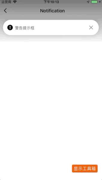
NotificationLegacy 通知栏
更新时间:2021-04-22 10:21:28LLM 副本以 Markdown 格式查看下载 PDF
简介
NotificationLegacy 通知显示栏可以为您显示成功、警告和错误三类信息。
Notice: 组件原名为
Notification, @2.0.0-rc.2 版本更名为NotificationLegacy。
代码演示
说明:详细示例可参考 Demo。
警告通知
import React, { Component } from "react";
import { View, StyleSheet } from "react-native";
import { Button, TopBar, NotificationLegacy } from "tuya-panel-kit";

export default class NotificationScene extends Component {
  state = {
    visible: true,
  };

  _handleClose = () => {
    this.setState({ visible: false });
  };

  render() {
    return (
      <View style={styles.container}>
        {this.state.visible && (
          <NotificationLegacy
            style={styles.notification}
            message="I am Notification"
            onClose={this._handleClose}
          />
        )}
        {!this.state.visible && (
          <Button
            text="显示Notification"
            textStyle={{ marginTop: 12, fontSize: 24, color: "#000" }}
            onPress={() => this.setState({ visible: true })}
          />
        )}
      </View>
    );
  }
}

const styles = StyleSheet.create({
  container: {
    flex: 1,
  },

  notification: {
    position: "absolute",
    top: -TopBar.height,
    left: 0,
    right: 0,
  },
});
交互演示
API
style
容器样式
| 类型 | 必传 | 默认值 |
|---|---|---|
| ViewPropTypes.style | 否 | null |
icon
自定义IconPath。
| 类型 | 必传 | 默认值 |
|---|---|---|
string |
否 | null |
variant
通知栏类型。
| 类型 | 必传 | 默认值 |
|---|---|---|
success warningerror |
否 | warning |
enableClose
是否显示关闭按钮,若为 false ,则会隐藏关闭按钮并在 autoCloseTime 后自动触发 onClose 回调。
| 类型 | 必传 | 默认值 |
|---|---|---|
boolean |
否 | true |
autoCloseTime
自动关闭通知栏时间,仅在 enableClose 为 false 时生效。
| 类型 | 必传 | 默认值 |
|---|---|---|
number |
否 | 1500 |
message
通知文案。
| 类型 | 必传 | 默认值 |
|---|---|---|
string |
否 | '' |
onClose
点击关闭按钮时的回调。
| 类型 | 必传 | 默认值 |
|---|---|---|
() => void |
否 | null |
onPress
说明: @2.0.0-rc.2 版本加入该属性。
点击全部区域的回调。
| 类型 | 必传 | 默认值 |
|---|---|---|
() => void |
否 | null |
children
子元素。
| 类型 | 必传 | 默认值 |
|---|---|---|
any |
否 | null |
theme
通知栏的主题配置。
| 类型 | 必传 | 默认值 |
|---|---|---|
INotificationTheme |
否 | {} |
interface INotificationTheme {
  background: ColorPropType;
  text: ColorPropType;
  successIcon: ColorPropType;
  noticeIcon: ColorPropType;
  errorIcon: ColorPropType;
  closeIcon: ColorPropType;
  radius: number;
}
该内容对您有帮助吗?
是意见反馈该内容对您有帮助吗?
是意见反馈
关注“涂鸦智能”
涂鸦服务尽在掌握

关注“全球智能商业”
第一时间获取物联网资讯


