进度环组件
更新时间:2021-08-12 23:56:51LLM 副本以 Markdown 格式查看下载 PDF
Progess
组件描述
运动类进度环组件,常用于展示步数目标以及进度,中间内容区域可以自定义。
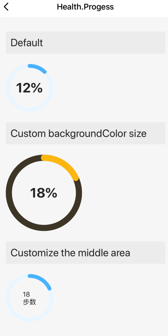
组件预览图
组件属性
| 字段名 | 类型 | 描述 | 默认值 |
|---|---|---|---|
| size | number | 进度环的大小 | 100 |
| percent | number | 进度环百分比 | 0 |
| color | string | 进度环颜色 | #56C0FF |
| backgroundColor | string | 底层环的背景颜色 | #EEF8FF |
| textRender | function | 自定义中间文字区域的渲染函数 | (percent: number) => |
使用示例
import React, { Component } from 'react';
import { View, StyleSheet } from 'react-native';
import { Utils, TYText } from 'tuya-panel-kit';
import { Progess } from '@tuya/tuya-panel-health-sdk';
import Section from '../Section';

const { convertX: cx } = Utils.RatioUtils;

const lang = {
  en: {
    dsc_default: 'Default',
    dsc_custom: 'Custom backgroundColor size',
    dsc_custom2: 'Customize the middle area',
  },
  zh: {
    dsc_default: '默认效果',
    dsc_custom: '自定义颜色,大小',
    dsc_custom2: '自定义中间区域',
  },
};
const getLang = key => {
  return lang.en[key];
};

export default class Index extends Component {
  state = {};

  handleStop = () => {};

  render() {
    return (
      <View style={{ flex: 1, padding: cx(20) }}>
        <Section title={getLang('dsc_default')}>
          <Progess percent={12} />
        </Section>
        <Section title={getLang('dsc_custom')}>
          <Progess percent={18} size={160} color="#FFC204" backgroundColor="#4E4532" />
        </Section>
        <Section title={getLang('dsc_custom2')}>
          <Progess
            percent={18}
            textRender={percent => (
              <View>
                <TYText>{percent}</TYText>
                <TYText>步数</TYText>
              </View>
            )}
          />
        </Section>
      </View>
    );
  }
}

const styles = StyleSheet.create({});
该内容对您有帮助吗?
是意见反馈该内容对您有帮助吗?
是意见反馈
关注“涂鸦智能”
涂鸦服务尽在掌握

关注“全球智能商业”
第一时间获取物联网资讯


