Develop RN Panels for Smart Lights by Using Tuya Panel SDK

Overview
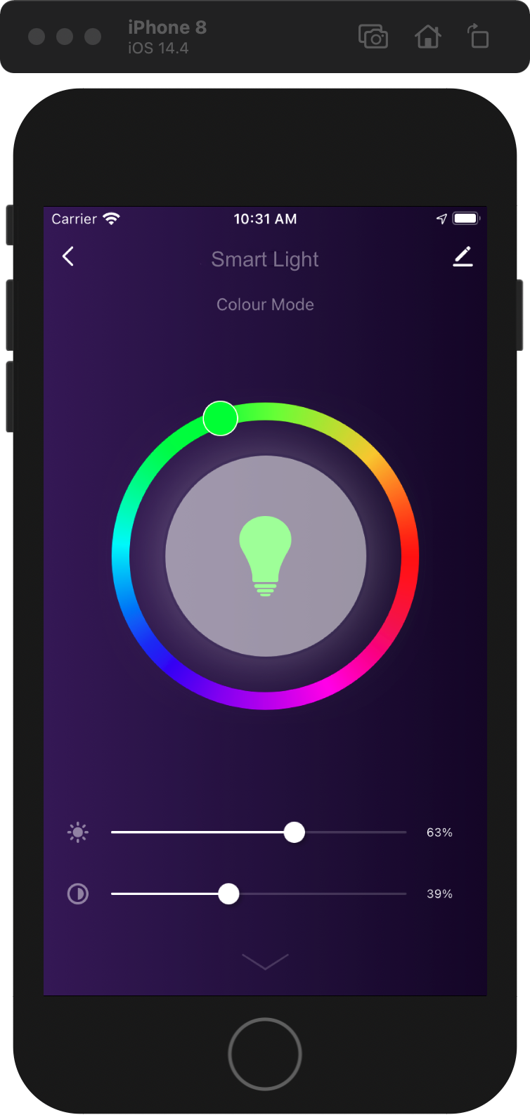
With a smart light app, users can take full control of smart lights in their homes. Change the brightness and colors of lights and personalize lighting ambiance with just a few taps.
Materials
White and colored light (optional)
Count:1Any Powered by Tuya lights are applicable. Find more in our TuyaGo.more
Steps
Step 1: What is a smart light?
Tuya provides five types of smart lights in terms of color temperature and colors. The white and colored light (RGBCW) can switch between white light mode and colored light mode. Note that both modes cannot be enabled simultaneously.
Cool white light Cool and warm white light (CW) Colored light (RGB) Cool white and colored light (RGBC) White and colored light (RGBCW) Adjustable brightness Adjustable color temperature and brightness Changeable colors Adjustable brightness and changeable colors Adjustable color temperature and brightness and changeable colors RGB and HSV are the most widely used color models.
-
RGB color model
The RGB (red, green, blue) color model is an additive color model in which red, green, and blue light are added together in various ways to reproduce a broad array of colors. The main purpose of the RGB color model is for the sensing, representation, and display of images in electronic systems. Each component is an integer value from 0 to 255. White is represented by 255, 255, 255, and black is represented by 0, 0, 0.
-
HSV color model
HSV (hue, saturation, value) is a color model that specifies colors based on the dimensions of color most intuitive to human cognition. It is an alternative representation of the RGB color model and more closely aligns with the way human vision perceives color-making attributes.
-
Hue is the angle counterclockwise around the color cone, representing the actual color itself. Its value ranges from 0° to 360°, typically 0° is red, 60° yellow, 120° green, 180° cyan, 240° blue, and 300° magenta.
-
Saturation represents the vibrancy of the color. It is the distance from the center of a circular cross-section of the cone. Its value ranges from 0.0 to 1.0, where 0.0 is a shade of grey and 1.0 is the full color.
-
Value is the brightness of the color. Its value ranges from 0.0 (black) to 1.0 (white).

-
-
Step 2: Preparation
You need to get the following steps ready before you get into developing a smart light app.
-
Log in to the Tuya IoT Platform.
-
Select a product category.
-
Select a product.
-
Complete the basic information about the product.
For more information, see Create Products.
-
Select and download development tools.
-
Set up an integrated development environment (IDE).
For more information, see Build Development Environment.
-
Step 3: Set functions
After you create a product, you can set functions for this product, including standard functions, custom functions, and cloud functions. The data point (DP) is the abstraction of a smart device function. It represents product functions and parameters. For more information, see Function Definition.
For example, suppose the PID of a product is
7z8knex5zdx80***, and its DPs are as follows:DP ID DP Identifier Data type DP type DP property 20 On/off (required) switch_led Send and report Boolean 21 Mode (required) work_mode Send and report Enum The values include white, color, scene, and music. 22 Brightness (required) bright_value Send and report Integer The value ranges from 10 to 1000, with a pitch of 1 and a scale of 0. 23 Color temperature (required) temp_value Send and report Integer The value ranges from 0 to 1000, with a pitch of 1 and a scale of 0. 24 Colorful (required) colour_data Send and report Character 25 Scene (required) scene_data Send and report Character 26 Timer (required) countdown Send and report Integer The value ranges from 0 to 86400, with a pitch of 1 and a scale of 0. 27 Music sync music_data Send only Character 28 Real-time adjustment (required) control_data Send and report Character 29 Debug debug_data Send only Character Step 4: Select a panel
For more information about the concept of the panel, see Terms. For more information about panel types, see Design App UI.
-
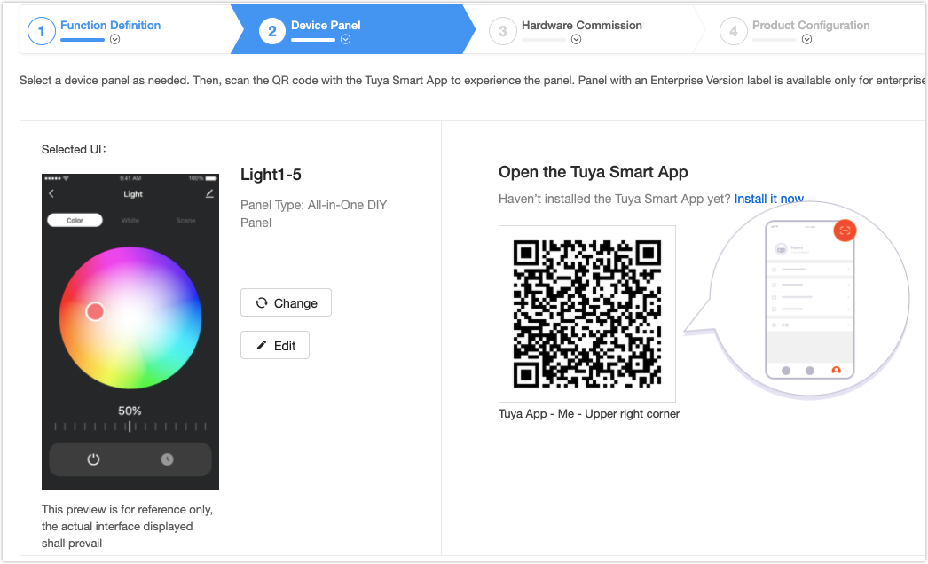
Select a desired panel.
Note: Templates marked with Enterprise version are only available for an enterprise account. You can upgrade your account and explore more templates.

-
Scan the QR code with the Tuya Smart app to add the virtual device to the app.
-
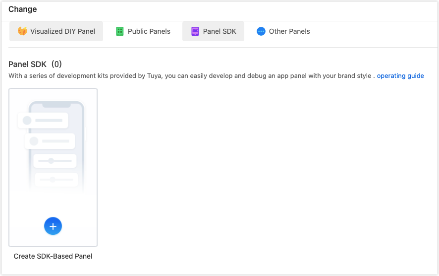
Click Change and select Panel SDK.
-
Step 5: Initialize project
-
Install Tuya development kit
Tuya provides an official command line interface (CLI) that is integrated with Tuya’s Panel Studio. Make sure to install this tool for efficient development. The installation command is as follows.
-
macOS and Linux
curl -fsSL https://raw.githubusercontent.com/tuya/tuya-panel-cli/main/install.sh | shNote: If this is your first installation, set up the environment variable as per the instruction.
-
Windows PowerShell
iwr https://raw.githubusercontent.com/tuya/tuya-panel-cli/main/install.ps1 -useb | iexRun
tuya-panel-cli helpto see if all available commands are printed to determine whether the installation is successful.Note: The
iwrcommand cannot run on early versions of PowerShell. To resolve this problem, see iwr cannot be recognized on Windows.
-
-
Initialize the template project
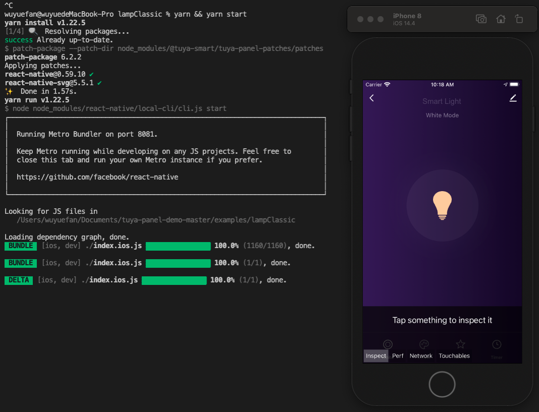
$ tuya-panel-cli init MyLampApp
$ cd MyLampApp
$ yarn && yarn start
-
Step 6: Debug panel
Open the RN Panel Dev app to scan the QR code and add the target virtual device to the app.
Note: Your host machine and mobile phone must be connected to the same Wi-Fi network.
-
Debugging for iOS
- Open the RN Panel Dev app, register, and log in.
- Click RN Debug in the bottom bar to enter the RN debugging setting page.
- Enable the RN debugging function at the top center of the page. Enter the product ID, local debugging IP address, local debugging port, and bundle (used to load the local bundle).
- After the setting is completed, return to the homepage and enter the designated panel to load the local resource bundle.
- To view the debug log or enable
hot reload, open the panel interface, and shake your mobile phone.
-
Debugging for Android
- Find the
com.ty.panel.devapplication. - Enter the IP address of the host machine, click OK, and then turn it on.
- Open the RN Panel Dev app, register, and log in.
- In the designated panel, shake your mobile phone and select reload in the prompt to load the local resource bundle.
- To view the debug log or enable
hot reload, open the panel interface, and shake your mobile phone.
- Find the
The following figure shows a successful run.
-
Step 7: Advanced development
This template is based on the template for white and colored light.
-
The following functions are supported:
- White light
- Colored light
- Scenes
- Cloud timing
- Custom scene attributes
-
The template project supports the following protocols:
-
Wi-Fi
-
Bluetooth
-
Bluetooth mesh
-
Zigbee
-
Note: This section only describes the directories related to the scaffold. For more information about the general directory structure, see RN 0.59 TS Template.
├── src
│   ├── api // Place a series of cloud APIs used in the project.
│   ├── components // Place reusable functional components used in the project.
│   ├── composeLayout.tsx // Encapsulate device events and device information required in the panel.
│   ├── config // Place frequently-used configuration files.
│   ├── containers // Place page-level components of the project.
│   ├── i18n // Place configuration files for multiple languages.
│   ├── main.tsx // The project entry files that are inherited from NavigatorLayout. Rewrite the hookRoute method to define necessary configurations, such as the background and top bar. Rewrite the renderScene method to control routing jump.
│   ├── redux // Place codes related to redux.
│   ├── res // Place local resources, such as pictures and SVG path.
│   └── utils // Place common tools and methods that are used on the panel.
Rewrite sample code for color model
-
Import an image for color model.

-
Rewrite sample code.
-
Go to the code block of the color model, that is
lampClassic -> components -> HuePicker -> index.js. -
The following code block shows how to create the class and implement the required functions:
	import PropTypes, { number } from 'prop-types';
	import React, { Component } from 'react';
	import { View, Image, PanResponder, StyleSheet, ViewStyle, ViewPropTypes } from 'react-native';
	import { Utils } from 'tuya-panel-kit';

	export default class HuePicker extends Component {
	static propTypes = {
		accessibilityLabel: PropTypes.string,
		style: ViewPropTypes.style,
		disabled: PropTypes.bool,
		radius: PropTypes.number,
		innerRadius: PropTypes.number,
		thumbRadius: PropTypes.number,
		thumbInnerRadius: PropTypes.number,
		RingBackground: PropTypes.oneOfType([PropTypes.number, PropTypes.string, React.ReactElement]),
		hue: PropTypes.number,
		onValueChange: PropTypes.func,
		onComplete: PropTypes.func,
	};

	static defaultProps = {
		accessibilityLabel: 'HuePicker',
		style: null,
		disabled: false,
		radius: 130,
		innerRadius: 70,
		thumbRadius: 25,
		thumbInnerRadius: 20,
		RingBackground: require('./lamp_colorBg.png'),
		hue: 0,
		onValueChange: () => {},
		onComplete: () => {},
	};

	constructor(props) {
		super(props);
const { radius, thumbRadius } = props;
		this.cx = radius - thumbRadius;
		this.cy = radius - thumbRadius;
		// Define a fixed distance from the drawable ball to the origin so that the ball is always centered in the color wheel.
		this.fixedLength = radius - this.ringSize * 0.5;
		this._panResponder = PanResponder.create({
		onStartShouldSetPanResponder: this.shouldSetResponder,
		onMoveShouldSetPanResponder: this.shouldSetResponder,
		onPanResponderGrant: this._handleResponderGrant,
		onPanResponderMove: this._handleResponderMove,
		onPanResponderRelease: this._handleResponderRelease,
		onPanResponderTerminationRequest: () => false,
		onPanResponderTerminate: this._handleResponderRelease,
		// onStartShouldSetResponderCapture: () => false,
		onMoveShouldSetPanResponderCapture: () => false,
		});
	}

	componentWillReceiveProps(nextProps) {
		const { radius, innerRadius, thumbRadius } = nextProps;
const {
		radius: prevRadius,
		innerRadius: prevInnerRadius,
		thumbRadius: prevThumbRadius,
		} = this.props;
		if (
		prevRadius !== radius ||
		prevInnerRadius !== innerRadius ||
		prevThumbRadius !== thumbRadius
		) {
		this.cx = radius - thumbRadius;
		this.cy = radius - thumbRadius;
		this.fixedLength = radius - this.ringSize * 0.5;
		}
	}

	// The wheel size.
	get ringSize() {
		const { radius, innerRadius } = this.props;
return radius - innerRadius;
	}

	getRadianByCoord(xRelativeOrigin, yRelativeOrigin) {
		const { thumbRadius } = this.props;
		const xRelativeCenter = xRelativeOrigin - this.cx - thumbRadius;
const yRelativeCenter = yRelativeOrigin - this.cy - thumbRadius;
		let rad = Math.atan2(yRelativeCenter, xRelativeCenter);
		if (xRelativeCenter > 0 && yRelativeCenter > 0) rad = Math.PI * 2 - rad;
		if (xRelativeCenter < 0 && yRelativeCenter > 0) rad = Math.PI * 2 - rad;
		if (xRelativeCenter < 0 && yRelativeCenter < 0) rad = Math.abs(rad);
		if (xRelativeCenter > 0 && yRelativeCenter < 0) rad = Math.abs(rad);
		if (xRelativeCenter === 0 && yRelativeCenter > 0) rad = (Math.PI * 3) / 2;
		if (xRelativeCenter === 0 && yRelativeCenter < 0) rad = Math.PI / 2;
		return rad;
	}

	getHueByCoord(xRelativeOrigin, yRelativeOrigin) {
		// 0 to 2 Pi
		const rad = this.getRadianByCoord(xRelativeOrigin, yRelativeOrigin);
return (rad * 180) / Math.PI;
	}

	getCoordByHue(hue) {
		const rad = ((360 - hue) * Math.PI) / 180;
		const x = this.cx + this.fixedLength * Math.cos(rad);
const y = this.cy + this.fixedLength * Math.sin(rad);
		return { x, y };
	}

	getColorInfoByHue(hue) {
		const { r, g, b } = Utils.ColorUtils.hsvToRgb(hue, 1, 1);
		return {
	r,
		g,
		b,
		rgbString: `rgb(${r}, ${g}, ${b})`,
		};
	}
	thumbRef;
	thumbInnerRef;
	cx;
	cy;
	fixedLength;
	_panResponder;
	xRelativeOriginStart;
	yRelativeOriginStart;

	shouldSetResponder = e => {
		// eslint-disable-next-line react/destructuring-assignment
		if (this.props.disabled) {
	return false;
		}
		const { locationX, locationY } = e.nativeEvent;
		// Whether the motion event is within the touchable area.
		const { innerRadius, radius, thumbRadius } = this.props;
		const xRelativeCenter = locationX - this.cx - thumbRadius;
		const yRelativeCenter = locationY - this.cy - thumbRadius;
		const len = Math.sqrt(xRelativeCenter ** 2 + yRelativeCenter ** 2);
		if (len >= innerRadius && len <= radius) {
		return true;
		}
		return false;
	};

	_moveTo(xRelativeOrigin, yRelativeOrigin, callback) {
		const hue = Math.round(this.getHueByCoord(xRelativeOrigin, yRelativeOrigin));
		const { x = 0, y = 0 } = this.getCoordByHue(hue);
const color = this.getColorInfoByHue(hue);
		this.updateThumbStyle({
		transform: [
			{
			translateX: x,
			},
			{
			translateY: y,
			},
		],
		});
		this.updateThumbInnerStyle({
		backgroundColor: color.rgbString,
		});
		typeof callback === 'function' && callback(hue, color);
	}

	_handleResponderGrant = e => {
		const { locationX, locationY } = e.nativeEvent;
		this.xRelativeOriginStart = locationX;
this.yRelativeOriginStart = locationY;
	};

	_handleResponderMove = (e, gestureState) => {
		const { dx, dy } = gestureState;
		const { onValueChange } = this.props;
const xRelativeOrigin = this.xRelativeOriginStart + dx;
		const yRelativeOrigin = this.yRelativeOriginStart + dy;
		this._moveTo(xRelativeOrigin, yRelativeOrigin, onValueChange);
	};

	_handleResponderRelease = (e, gestureState) => {
		const { dx, dy } = gestureState;
		const { onComplete } = this.props;
const xRelativeOrigin = this.xRelativeOriginStart + dx;
		const yRelativeOrigin = this.yRelativeOriginStart + dy;
		// eslint-disable-next-line no-undef
		this._moveTo(xRelativeOrigin, yRelativeOrigin, onComplete);
		this.xRelativeOriginStart = 0;
		this.yRelativeOriginStart = 0;
	};

	updateThumbStyle(style) {
		if (this.thumbRef) {
		this.thumbRef.setNativeProps({ style });
}
	}

	updateThumbInnerStyle(style) {
		if (this.thumbInnerRef) {
		this.thumbInnerRef.setNativeProps({ style });
}
	}

	renderRingBackground() {
		const { radius, RingBackground } = this.props;
		if (typeof RingBackground === 'number') {
	return (
			<Image
			style={{
				width: radius * 2,
				height: radius * 2,
				borderRadius: radius,
			}}
			source={RingBackground}
			/>
		);
		}
		if (React.isValidElement(RingBackground)) {
		return React.cloneElement(RingBackground, {
			style: {
			width: radius * 2,
			height: radius * 2,
			borderRadius: radius,
			...RingBackground.props.style,
			},
		});
		}
	}

	render() {
		const {
		accessibilityLabel,
	style,
		disabled,
		radius,
		thumbRadius,
		thumbInnerRadius,
		hue,
		} = this.props;
		const { x = 0, y = 0 } = this.getCoordByHue(hue);
		const { rgbString } = this.getColorInfoByHue(hue);
		return (
		<View
			accessibilityLabel={accessibilityLabel}
			style={style}
			pointerEvents="box-only"
			{...this._panResponder.panHandlers}
		>
			{/* Wheel */}
			<View style={[styles.sectionRing, { width: radius * 2, height: radius * 2 }]}>
			{this.renderRingBackground()}
			</View>

			{/* Ball */}
			<View
			ref={ref => {
		this.thumbRef = ref;
			}}
			style={[
				styles.sectionThumb,
				{
				width: thumbRadius * 2,
				height: thumbRadius * 2,
				borderRadius: thumbRadius,
				opacity: disabled ? 0 : 1,
				transform: [
					{ translateX: x, },
					{ ranslateY: y, },
				],
				},
			]}
			>
			<View
				ref={ref => {
				this.thumbInnerRef = ref;
				}}
				style={{
				width: thumbInnerRadius * 2,
				height: thumbInnerRadius * 2,
				borderRadius: thumbInnerRadius,
				backgroundColor: rgbString,
				}}
				/>
			</View>
		</View>
		);
	}
	}

	const styles = StyleSheet.create({
	sectionRing: {
		alignItems: 'center',
		justifyContent: 'center',
	},
	sectionThumb: {
		alignItems: 'center',
justifyContent: 'center',
		position: 'absolute',
		backgroundColor: '#fff',
		shadowOffset: { width: 2, height: 2 },
		shadowColor: '#000',
		shadowOpacity: 0.5,
		elevation: 2,
		transform: [
		{ translateX: 0, },
		{ translateY: 0, },
		],
	},
	});
-
-
Step 8: Package and upload
-
Run the command below.
cd MyLampApp
tuya-panel-cli package ./
The building process will start only after the project validation is completed.
tuya-panel-kit-cliwill pack the selected project into a temporary directory in the beginning, and then it will automatically open the temporary directory when the process is completed.The packaging will generate three UI packages. Examples of three package names are as follows:
{name}-android*{rnVersion}*{version}.tar.gz Panel UI package for Android {name}-ios*{rnVersion}*{version}.tar.gz Panel UI package for iOS {name}-sources.tar.gz Source packageNote: If errors occur in the packaging process, fix the source code errors, and then rebuild the project. Or you can turn to
developer@tuya.comfor help with your company name and contact information attached in your email. -
Upload UI package.
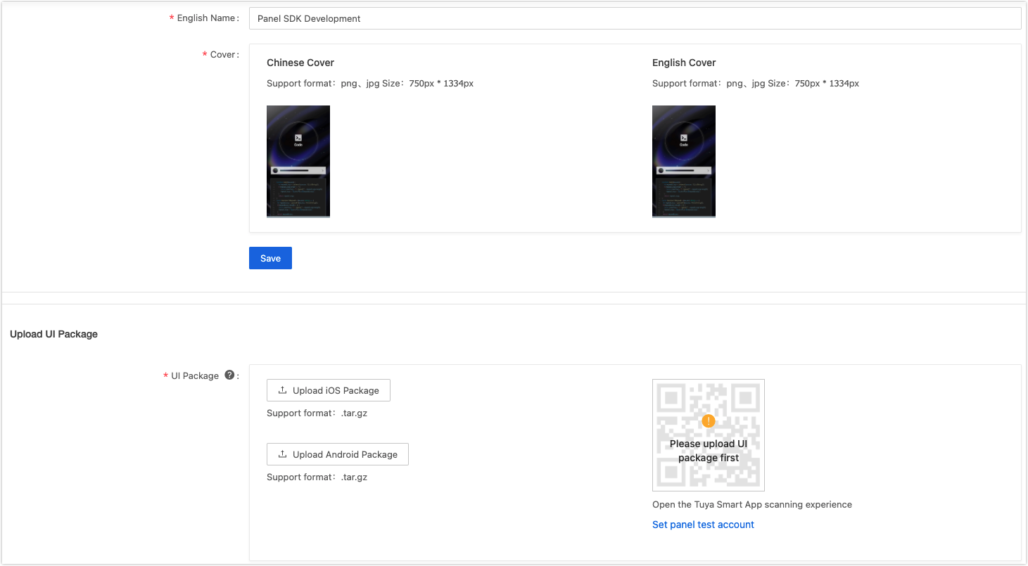
-
Generate a QR code.
You can click
Set panel test accountto set Tuya Smart app accounts for testing purposes. And you can quickly experience the UI package by scanning the QR code.
-
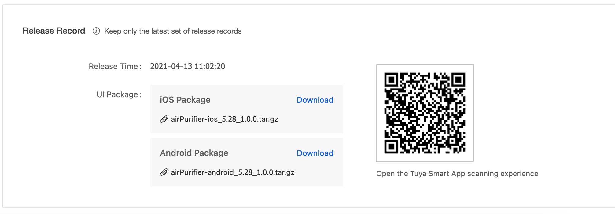
Publish and go online.
Click Publish Online to publish the UI packages after preview. After it is published online, an online record of the latest UI package will be generated at the bottom of the page.
-
Is this page helpful?
YesSuggestions


