Week Selector
Last Updated on : 2021-12-10 06:25:31
WeekSelection
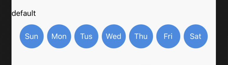
Preview
| Field name | Type | Description | Default value |
|---|---|---|---|
| weekDay | string | The selected date. | - |
| disable | boolean | Specifies whether to disable the component. | - |
| themeColor | string | The theme color. | #338CE5 |
| defaultColor | string | The default color. | #DdDdD6 |
| style | ViewStyle | The style of the component. | - |
| selectedWeekStyle | ViewStyle | The style of an active date. | - |
| weekStyle | ViewStyle | The style of the week. | - |
| selectedWeekTextStyle | TextStyle | The text style of a selected date. | - |
| weekTextStyle | TextStyle | The default text style. | - |
| defaultFirstDay | number | The sequence number of a date. | 0 |
| onWeekChange | ()=> void | The button tap event. | - |
Example
import { WeekSelection } from '@tuya/tuya-panel-lock-sdk';

<WeekSelection
  weekDay={'1111111'}
  defaultFirstDay={2}
  onWeekChange={params => this.onWeekChange(params)}
/>
Is this page helpful?
YesFeedbackIs this page helpful?
YesFeedbackMarketing Cooperation
Business Cooperation
Customer Service
Media Inquiry


