This document is targeted at developers who are already familiar with Panel MiniApp Development. You should have a good understanding of what a Panel MiniApp and Product Features are. If you have any inquiries about these concepts, we suggest reviewing some preliminary materials. If you are already familiar, you may skip this document.
Understanding Relationships
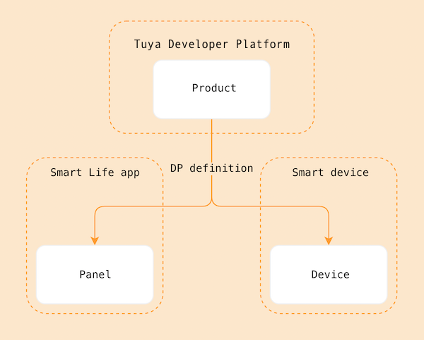
The panel, as the IoT smart device in the App terminal, is a product form you should understand before creating new products.
- A
Panelis a user interface program that runs on theSmart Life AppandOEM App (Tuya Customized App)to controlSmart Devicesand to display real-time status of these devices. - A
Productlinks thePanelwithSmart Devices. It describes its features and determines the name displayed on the panel in the App along with the features available on the smart devices. - A
Smart Deviceis equipped withTuya Smart Moduleand often includes a QR code on the device. Scanning the QR code using theSmart Life Appinstalls the device's controlPanelon the App. - You can refer to the diagram below for the relationship between
Product,Panel, andDevice.
The IPC General Template is developed using SDM(Smart Device Model). You can view more about SDM here
Relevant Concepts
Product Name: Smart Camera
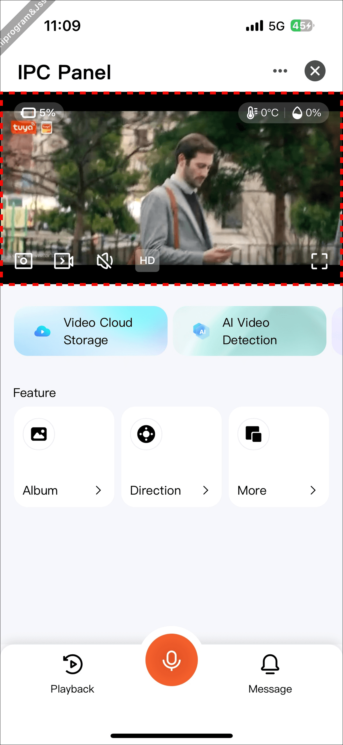
Requirement Prototype
- Theme Switching: Supports light and dark themes, follows App theme automatically
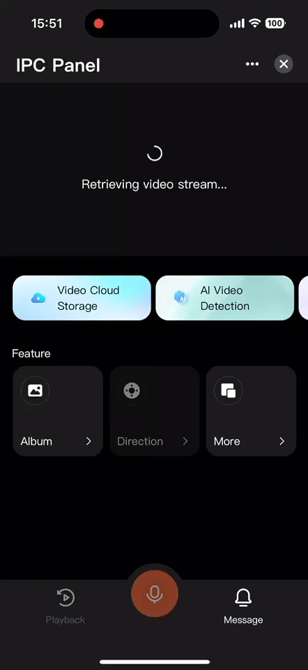
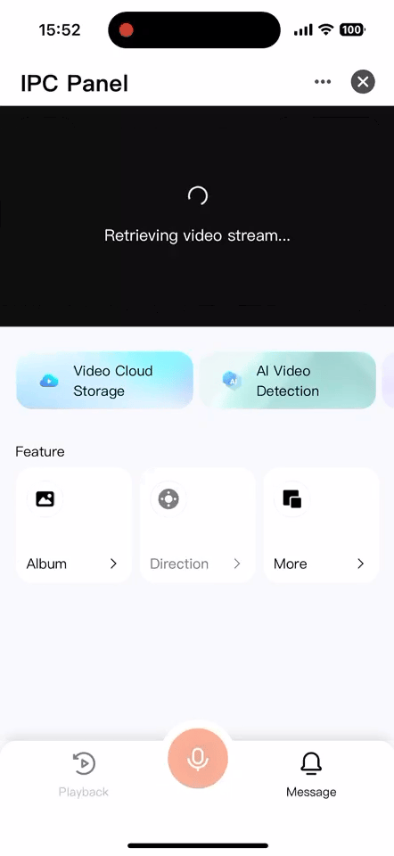
- Player Module: Supports preview, record, screenshot, intercom, audio, battery, landscape modes
- Operation Module: Configurable service marketing information and product operation content
- Functional Entry: Configurable display for camera important functional entrances such as album, gimbal, etc.
- More Functions: Configurable features such as privacy mode, WDR, cruising, light switch, etc.
- Quick Action Bar: Configurable functions like playback, intercom, messaging, etc.
Dark Theme
Light Theme
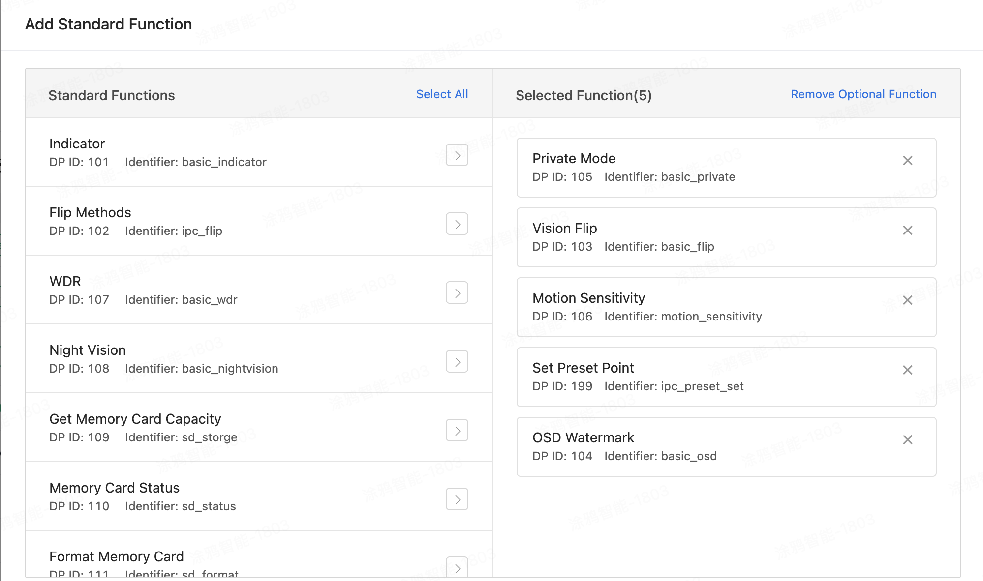
Firstly, create a camera-type product, define which functionality points the product has, and implement these functionality points in the panel.
Go to the IoT Platform, select Product Menu, Product Development, Create Product, choose Standard Category -> Camera -> Pan-Tilt Camera:
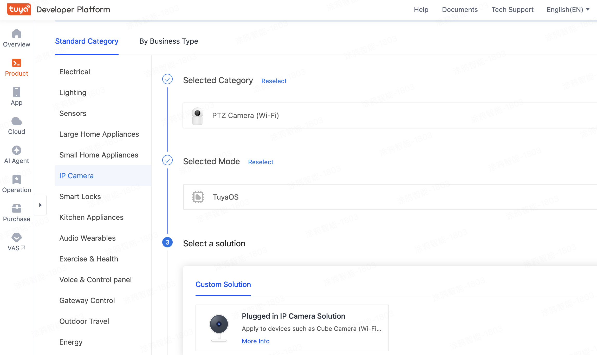
Select functionality points based on your needs. Unselected features do not affect video preview.
1. Create a Panel MiniApp on Developer Platform
Panel MiniApp development is done through the MiniApp Developer Platform, please visit MiniApp Developer Platform to register and log in.
Detailed instructions can be found under Panel MiniApp > Create Panel MiniApp.
2. Initialize Project Using Template on IDE
Open the IDE and create a Panel MiniApp project based on the IPC General Template. This is done in the Tuya MiniApp IDE.
Detailed instructions can be found under Panel MiniApp > Initialize Project.
3. Import Project from Template Repository
You can also pull the template source code from the GitHub repository and import it into IDE:
🔗 Template Repository Address:
https://github.com/Tuya-Community/tuya-ray-materials
Steps:
# Clone the template repository

git clone https://github.com/Tuya-Community/tuya-ray-materials.git

# Navigate to IPC General Template directory

cd ./template/PublicPanelIpc
Next Steps:
- Open IDE
- Import the PublicPanelIpc directory as project source
- Associate it with the MiniApp and corresponding product created on the developer platform
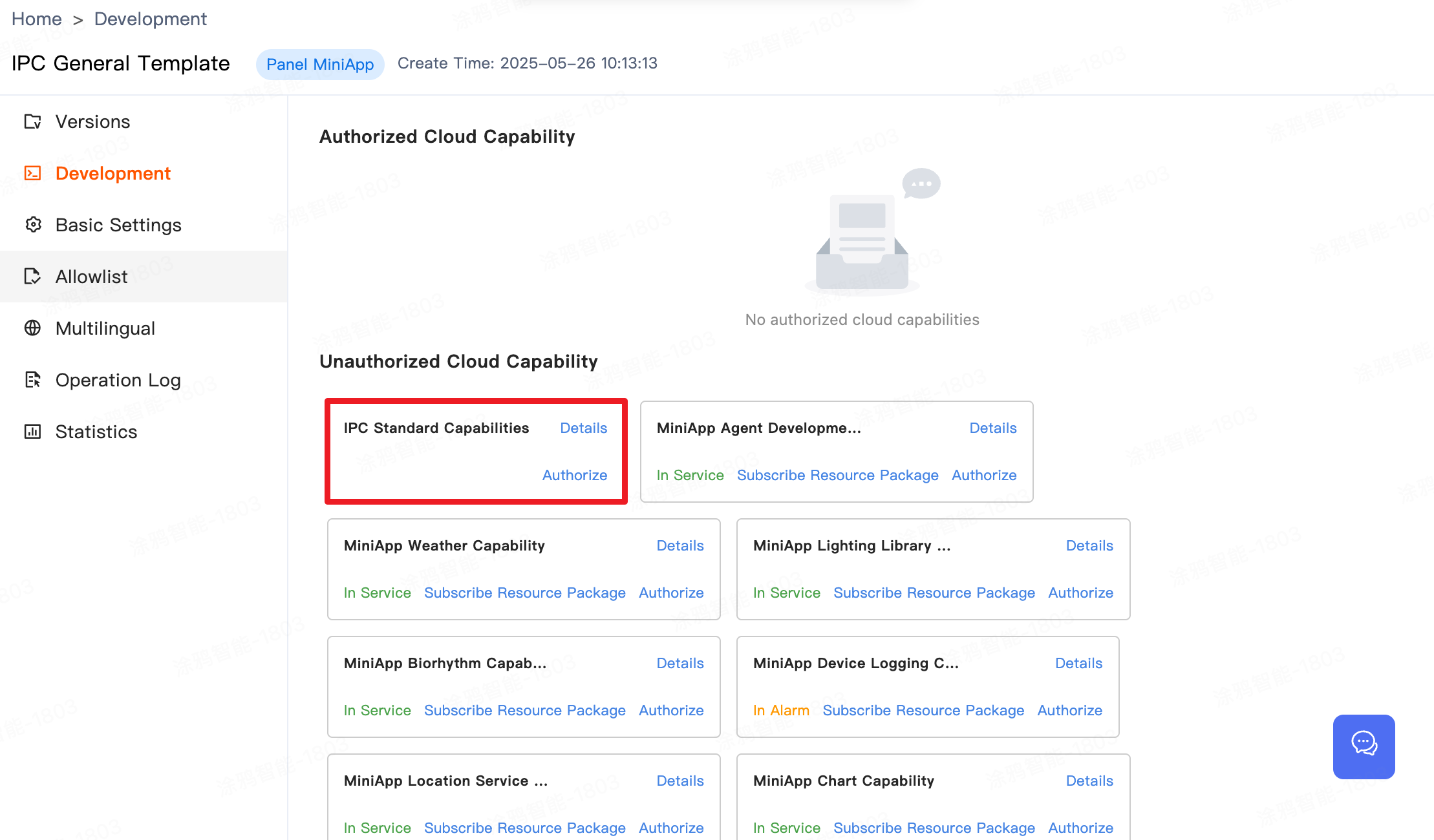
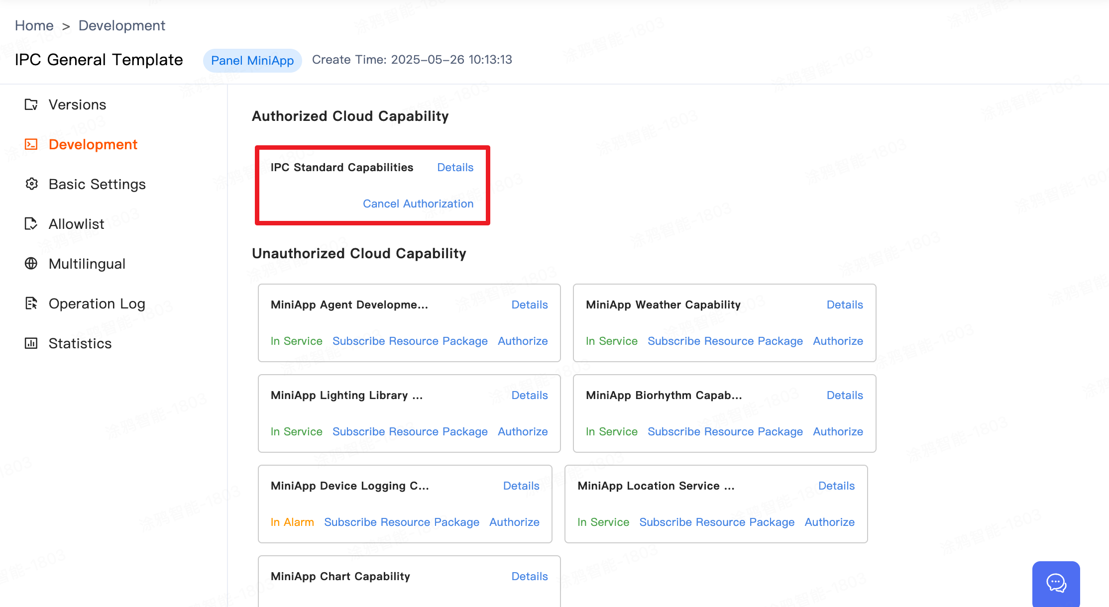
Next, you need to complete the authorization for IPC Standard Capability on the MiniApp Developer Platform to ensure that the cloud services within the template can be used normally.
On the MiniApp Developer Platform => Development Settings => Authorized Cloud Abilities, it is necessary to include IPC Standard Capability. If not listed, manually authorize from the unauthorized cloud abilities list.
In the above steps, we initialized a Panel MiniApp development template and authorized the IPC Standard Capability. Below is the project structure.
├── src
│ ├── api # API directory
│ ├── app.config.ts # Auto-generated configuration
│ ├── app.tsx # Root component of the App
│ ├── components # Components directory
│ ├── constant # Constants directory
│ ├── context # Custom context directory
│ ├── config # Configuration files directory
│ ├── devices # Smart device model directory
│ │ ├── index.ts # Defines and exports smart device model
│ │ └── schema.ts # Description of current smart device DP functionality points, auto-generated by IDE
│ ├── entities # Functional modules TS definitions
│ ├── features # Functional module logic definitions
│ ├── hooks # Custom hooks directory
│ ├── i18n # Multilingual directory
│ ├── pages # Pages directory
│ ├── redux # State management
│ ├── res # Images and resources directory
│ │ ├── iconfont # Built-in Icons
│ │ ├── image # Image directory
│ │ └── index
│ ├── styles # Global styles file
│ ├── types # Custom type definitions file
│ ├── utils # Utility library
│ ├── global.config.ts
│ └── routes.config.ts # Routing configuration
│─── typings # Business type definitions directory
│ └── sdm.d.ts # Smart device type definitions file
1. Region:
- Available in all regions
2. App Version:
- Tuya App, Smart Life App v6.5.0 and above
3. Kit Dependencies:
- BaseKit: 3.0.0
- MiniKit: v3.0.1
- DeviceKit: v4.11.8
- BizKit: v4.12.1
- HomeKit: 3.0.2
- IPCKit: 6.4.11
- baseversion: v2.27.3
4. Component Dependencies:
- @ray-js/ipc-player-integration: "^0.0.5" Integration Player
- @ray-js/ray-ipc-half-horizontal-drag: "" Half-screen Banner Operation Component
- @ray-js/ipc-ptz-zoom: "^0.0.2" Pan-Tilt Control and Zoom Component
- @ray-js/ray-ipc-decrypt-image: "^0.0.4" AES Encrypted Image Decryption Component
- @ray-js/ray-ipc-collect-edit: "^0.0.1" Collection Point Edit Component
- @ray-js/delay-loading: "^0.0.2" Loading Threshold Component
- @ray-js/ray-ipc-utils: "^1.1.1" Utility Library (Jump to Album, Signal Strength Acquisition, Intercom Capability Judgement, etc.)
This section primarily introduces how to use the Integration Player Component in the template to implement the video display area.
Example Code
import { useEffect } from 'react';
import { useCtx, Features, IPCPlayerIntegration } from '@ray-js/ipc-player-integration';

const Home = props => {

  // Use useCtx to get the player instance associated context information

  const instance = useCtx({
      devId: props.location.query.deviceId, // Device ID
  });

  // Initialize built-in features of the integration player, if not called, built-in controls will not be displayed

  useEffect(() => {
    Features.initPlayerWidgets(instance, {
      verticalResolutionCustomClick: false,
      hideHorizontalMenu: false,
    });
  }, []);

  // Integration Player Component Introduction

  <View className={Styles.playerContainer}>
    <IPCPlayerIntegration
      instance={instance}  // Pass in player instance
      devId={devInfo.devId}   // Device ID
      onPlayStatus={onPlayStatus}  // Simplified listener for player status (0: Connecting 1: Previewing)
      privateState={dpState.basic_private || false}   // Whether privacy mode is enabled
      deviceOnline={devInfo.isOnline} // Device online status
      brandColor={brandColor}  // Brand color
      playerFit='contain'  // Fill mode for portrait mode, options are: contain | cover
      landscapeMode="standard"  // Fill mode for landscape mode: standard | fill
      extend={{
        ptzControllable: true  // Whether to enable PTZ control for the player
      }}
    />
  </View>
}

export default Home;
.playerContainer {
    width: 100%;
    height: calc(100vw * 9 / 16);
  }
This section introduces the implementation of the operation promotion area in the template, realizing the operation promotion Banner.
Built-in Data
The template's built-in operation promotion data aligns with the current corresponding app operation configuration. The retrieval method is as follows:
Note: If the highlighted area is not displayed, first check step 5 for IPC Standard Capability authorization on the MiniApp Developer Platform. If authorized properly, it indicates no operational configuration in the current app. For related configuration needs, please contact the app operational personnel.
import { getVasServiceConfigList } from '@ray-js/ray';

type GetServiceHallSettingParams = {
  type: 0; // Fixed value
  instanceId: string; // Device UUID
  homeId: string; // Home ID
};

export function getServiceHallSetting(params: GetServiceHallSettingParams) {
  return getVasServiceConfigList(params);
}
Custom Data
You can also customize the input data according to your product needs using the half-screen component or develop your own solution.
import { useState } from 'react';
import HalfHorizontalDrag from '@ray-js/ray-ipc-half-horizontal-drag';

const Vas = props => {

  const goTo = (data) => {
	 console.log(data, 'data')
  }

  // Demo data for the operation area

  const bannerData = [
	  {
		title: 'Title 1',
		icon: <Image src={iconUrl} style={{ width: '40rpx', height: '40rpx' }} />,
		tag: 'Tag Description',
		tagStyle: {
		  color: '#ffffff',
		  backgroundColor: '#ff0000'
		},
		style: {
			color: '#ffffff'
		},
		backgroundImage: imageUrl
		background: '#ffffff',
		onClick: () => goTo()
	  }
   ];

	return (
		<View>
			<HalfHorizontalDrag style={{ height: '110rpx', paddingLeft: '16rpx' }} data={bannerData} />
		</View>
	)

}
export default Vas;
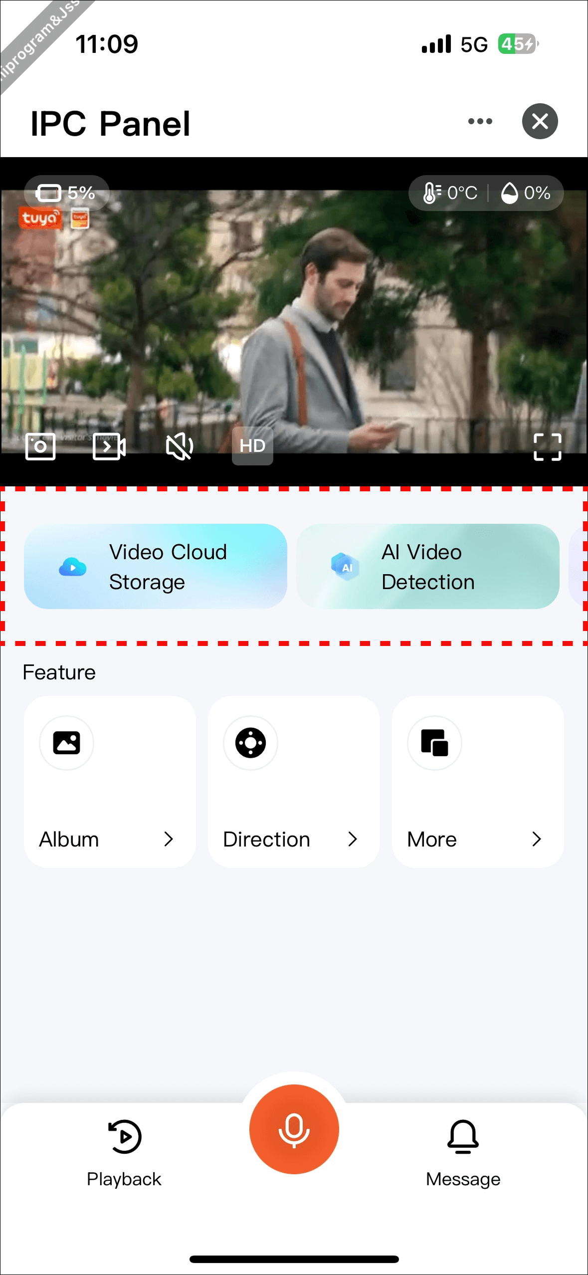
This section mainly introduces the configuration data parsing of key functional areas in the template. For details, please refer to the following interface definitions.
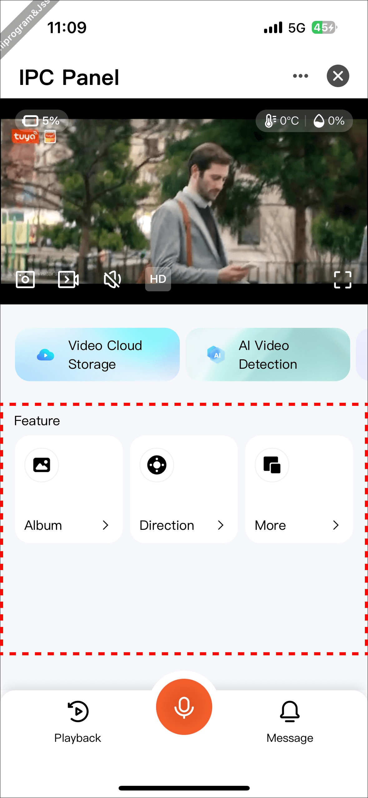
Code Location: components/layout-feature
Configuration Item FeatureMenu Interface Definition
Field Name | Type | Required | Description |
|
| Yes | Function identifier |
|
| Yes | Function name |
|
| Yes | Function icon |
|
| Yes | Click event |
|
| No | Whether available offline, highest priority |
|
| No | Whether available when not in preview mode; guaranteed available during preview mode |
|
| Yes | Whether to display |
|
| Yes | Whether to display the icon (not actually used currently) |
|
| No | DP value |
|
| No | DPCode identifier |
|
| No | Whether to listen for DP changes |
|
| No | DP change callback, used with |
|
| No | Marks whether it has been clicked to prevent duplicate clicks |
|
| Yes | Feature type, see enum below |
|
| No | Native page path (used when |
|
| No | Component identifier (used when |
|
| No | Mini program page path (used when |
|
| No | Initialize DP value |
|
| No | Async condition to determine visibility, logic can be written |
|
| No | Async condition to determine icon visibility (not actually used currently) |
FeatureType Enum Description
Enum Value | Meaning |
| Boolean type |
| Enum type |
| Popup component type |
| Navigate to mini program |
| Navigate to native page |
This section mainly introduces the configuration data parsing of the bottom quick feature area in the template. Details are as follows.
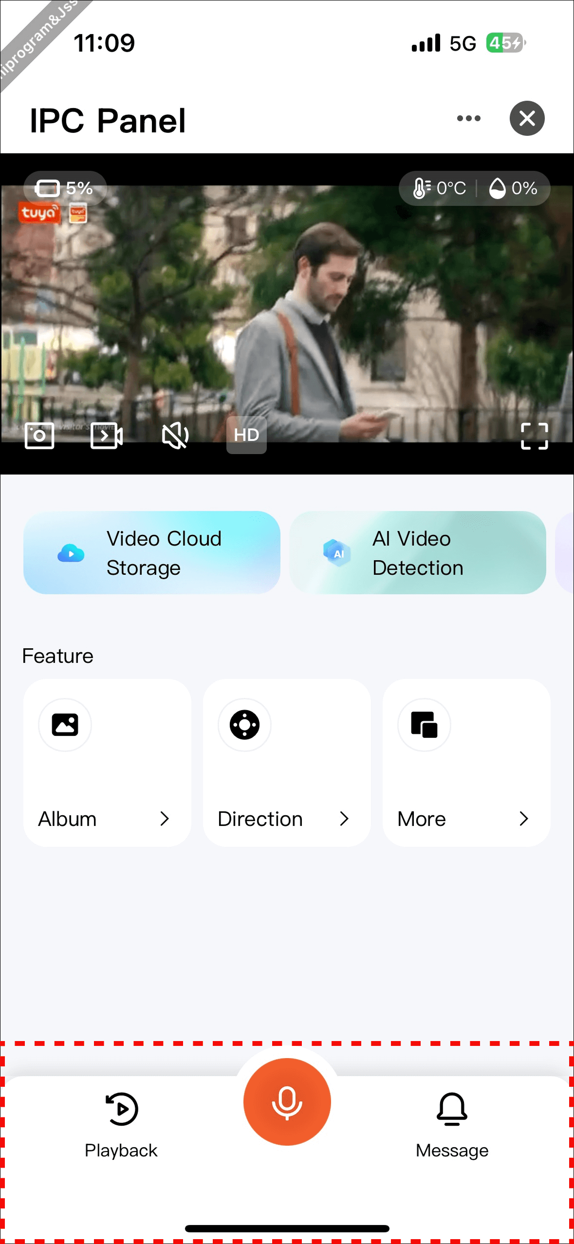
Code Location: components/feature-tab-bar
Configuration Item TabBar Interface Definition
Field Name | Type | Required | Description |
|
| Yes | Function identifier |
|
| Yes | Function name |
|
| Yes | Function icon |
|
| Yes | Click event |
|
| No | Whether available offline, highest priority |
|
| No | Whether available when not in preview mode; guaranteed available during preview mode |
|
| Yes | Whether to display |
|
| Yes | Whether to display the icon (not actually used currently) |
|
| No | Native page path |
|
| No | Whether it is the center icon (only one allowed) |
|
| No | Async condition to determine visibility, logic can be written |
- Congratulations 🎉 on completing this tutorial!
- If you have any questions, you can contact the Tuya Smart Mini Program team for feedback.