滑动条
更新时间:2021-06-08 07:03:05LLM 副本以 Markdown 格式查看下载 PDF
TYIpcProgressBar 基于基础组件 Slider 做进一步封装,扩展自定义标题、单位及百分比。
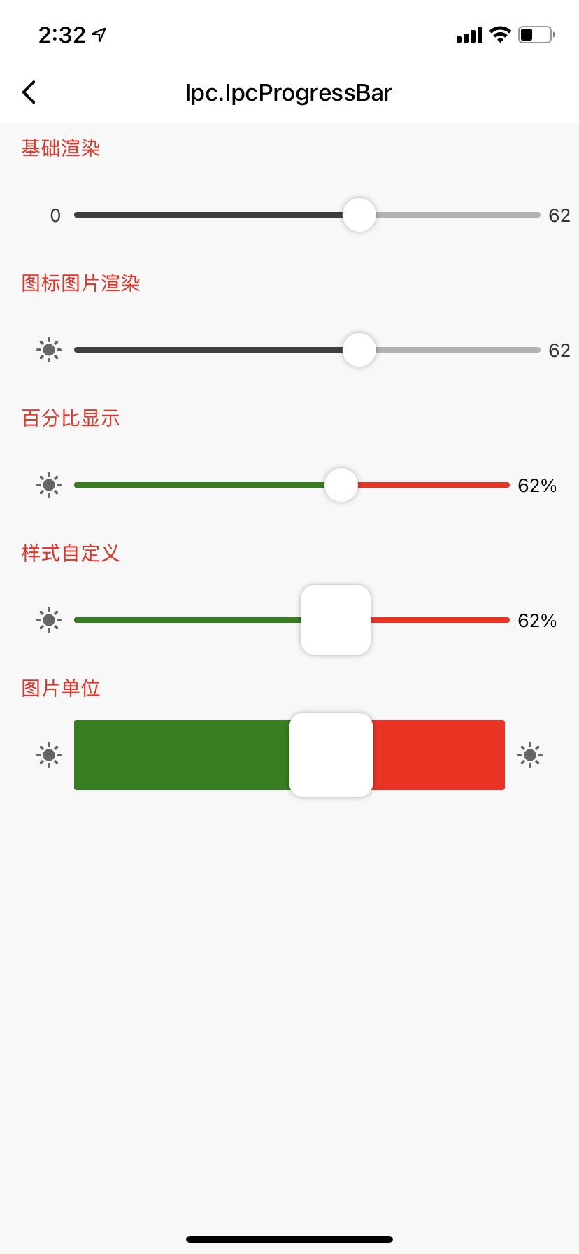
示图展示
组件属性
| 字段名 | 类型 | 描述 | 默认值 |
|---|---|---|---|
| onValueChange | func | 滑动值变更回调 | undefined |
| onSlidingComplete | func | 滑动结束回调 | undefined |
| barData | BarDataProps(参考 BarDataProps 属性说明) |
滑动条数据 | { key: 'key1', value: 0, min: 0, max: 100 } |
| containerStyle | ViewStyle | 容器样式 | {} |
| barContainStyle | ViewStyle | 滑动条容器样式 | {} |
| iconTitleBoxStyle | ViewStyle | 滑动标题容器样式 | {} |
| iconTitleTextStyle | TextStyle | 滑动标题文本样式 | {} |
| iconImageStyle | ImageStyle | 滑动标题图片样式 | {} |
| percentUnitBoxStyle | ViewStyle | 百分比或自定义容器样式 | {} |
| unitTextStyle | TextStyle | 百分比或自定义文本样式 | {} |
| customUnitImageBoxStyle | ViewStyle | 自定义单位图片容器样式 | {} |
| customUnitImageStyle | ImageStyle | 自定义单位图片样式 | {} |
| noPrecentBoxStyle | ViewStyle | 默认数值文本容器样式 | {} |
| noPrecentTextStyle | ImageStyle | 默认数值文本样式 | {} |
| sliderStyle | ViewStyle | 滑动条样式 | {} |
| sliderProperty | Object | 继承基础组件Slider属性 | {} |
BarDataProps 属性说明
| 属性 | 类型 | 是否必传 | 描述 | 默认值 |
|---|---|---|---|---|
| key | string | 是 | 自定义key值 | key1 |
| value | number | 是 | 当前数值 | 0 |
| min | number | 是 | 最小值 | 0 |
| max | number | 是 | 最大值 | 100 |
| disabled | boolean | 否 | 是否禁用 | false |
| maxColor | string | 否 | 大于当前值的颜色 | #eee |
| minColor | boolean | 否 | 小于当前值的颜色 | #eee |
| maxColor | string | 否 | 大于当前值的颜色 | #eee |
| showPercentUnit | boolean | 否 | 是否显示单位百分比 | false |
| noTitle | boolean | 否 | 是否不展现标题 | false |
| noUnit | boolean | 否 | 是否不展现单位 | false |
| customUnitText | string | 否 | 自定义单位文本 | undefined |
| customUnitImage | image | 否 | 自定义单位图标 | undefined |
使用示例
import { TYIpcProgressBar } from '@tuya/tuya-panel-ipc-sdk';
...
  const defaultBarData1 = {
    key: 'example1',
    value: 0,
    min: 0,
    max: 100,
    disabled: false,
    // noTitle: true,
    // noUnit: true,
 };
 ...
 const [barData1, setBarData1] = useState(defaultBarData1);

 const onValueChange = (value: number, key: string) => {
    const newBarData1 = { ...barData1, ...{ value } };
    setBarData1(newBarData1);
  };

  const onSlidingComplete = (value: number, key: string) => {
    const newBarData1 = { ...barData1, ...{ value } };
    setBarData1(newBarData1);
  };


   <TYIpcProgressBar
      onValueChange={onValueChange}
      onSlidingComplete={onSlidingComplete}
      barData={barData1}
      // 继承基础组件 Slider
      sliderProperty={{
         trackStyle: { height: 50 },
         thumbStyle: {width: 60, height: 60}
      }}
   />
该内容对您有帮助吗?
是意见反馈该内容对您有帮助吗?
是意见反馈
关注“涂鸦智能”
涂鸦服务尽在掌握

关注“全球智能商业”
第一时间获取物联网资讯


