设备列表组件
更新时间:2021-09-17 01:09:15LLM 副本以 Markdown 格式查看下载 PDF
设备列表组件
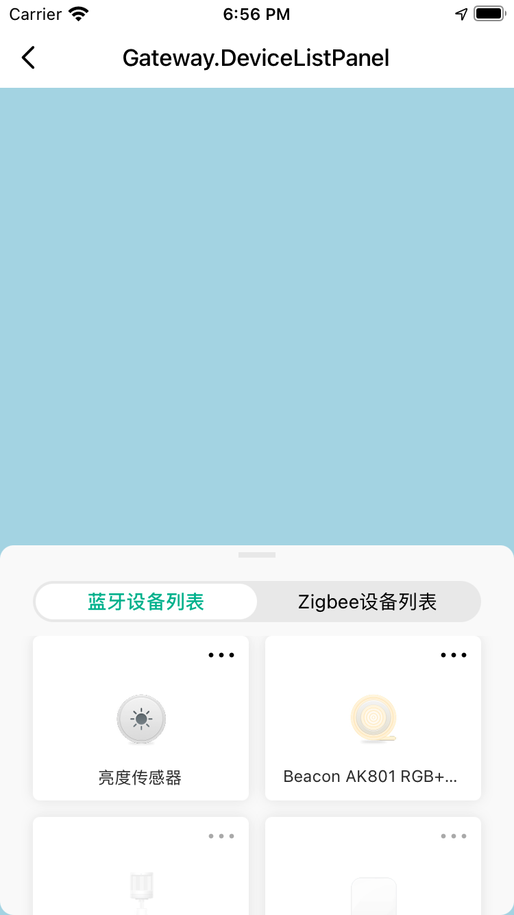
组件预览图
组件属性
| 字段名 | 类型 | 描述 | 默认值 |
|---|---|---|---|
| dataSource | Array<DevInfo> | 设备列表数据源 | [] |
| tabs | Array |
切换设备列表的tab配置 | 无 |
| panelStyle | StyleProp<ViewStyle> | 可拖拽面板的样式 | {} |
| containerStyle | StyleProp<ViewStyle> | 组件最外层容器样式 | {} |
| tabBarStyle | StyleProp<ViewStyle> | 组件tabBar的样式 | {} |
| highestPosition | number | 可拖拽面板拖到顶时,距离顶部的距离 | 0 |
| initialPosition | number | 可拖拽面板的初始位置 | 屏幕高度的一半 |
| autoShrinkDistance | number | 自动吸顶或者吸底的距离 | 50 |
| isShowIconMore | boolean | 设备是否显示右上角的更多图标 | true |
| initialTab | string | 初始选中的tabBar的key | 无 |
| children | React.ReactNode | 子节点 | 无 |
| ListEmptyComponent | React.ComponentType<any> | React.ReactElement | null | 列表为空时显示的组件 | {} |
| onIconMorePress | function | 设备右上角的“更多”图标点击事件 | 无 |
| onTabChange | function | tab切换事件 | 无 |
| customRenderItem | ListRenderItem |
自定义设备项渲染函数 | 无 |
| customRenderTabBar | function | 自定义TabBar渲染函数 | 无 |
| customRenderList | function | 自定义设备列表渲染函数 | 无 |
使用示例
import React, { FC, useState, useEffect } from 'react';
import { DeviceListPanel, GatewayUtils } from '@tuya/tuya-panel-gateway-sdk';
import { DevInfo, TopBar } from 'tuya-panel-kit';

const { getAllSubDevList } = GatewayUtils;

const Example: FC = () => {
  const tabConfig = [
    {
      key: '0',
      title: 'Bluetooth device list',
      activeTextStyle: { color: '#00B996' },
      textStyle: { color: '#000' },
    },
    {
      key: '1',
      title: 'Zigbee device list',
      activeTextStyle: { color: '#00B996' },
      textStyle: { color: '#000' },
    },
  ];

  const [deviceList, setDeviceList] = useState<Array<DevInfo>>([]);

  useEffect(() => {
    getDeviceList();
  }, []);

  const getDeviceList = async () => {
    const list = await getAllSubDevList();
    setDeviceList(list);
  };

  return (
    <DeviceListPanel tabs={tabConfig} highestPosition={TopBar.height} dataSource={deviceList} />
  );
};
该内容对您有帮助吗?
是意见反馈该内容对您有帮助吗?
是意见反馈
关注“涂鸦智能”
涂鸦服务尽在掌握

关注“全球智能商业”
第一时间获取物联网资讯


