设置密码组件
更新时间:2021-08-10 01:51:41LLM 副本以 Markdown 格式查看下载 PDF
设置密码组件
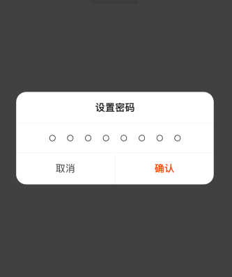
组件预览图
组件属性
| 字段名 | 类型 | 描述 | 默认值 |
|---|---|---|---|
| keyboardType | KeyboardType | 输入框的keyboardType属性值 | 'numeric' |
| passwordLength | number | 密码长度 | 4(建议范围 4-8 ) |
| normalDotColor | string | 未输入密码状态下,圆圈的颜色 | 'transparent' |
| activedDotColor | string | 输入密码后,圆圈的颜色 | '#333' |
| containerStyle | StyleProp<ViewStyle> | 最外层容器的样式 | {} |
| passwordRowStyle | StyleProp<ViewStyle> | 密码所在行的样式 | {} |
| dotStyle | StyleProp<ViewStyle> | 圆圈的样式 | {} |
| dotMarginHorizontal | number | 圆圈的marginHorizontal值 | 10 |
| renderPasswordItem | (key: number, index: number) => JSX.Element | null; | 自定义密码项的渲染方法 | null |
| onChangeText | (value: string) => string | null | 输入框的onChangeText事件 | null |
| title | string | 弹窗标题 | ‘设置密码’ |
| cancelText | string | 取消按钮的文字 | ‘取消’ |
| confirmText | string | 确认按钮的文字 | ‘确认’ |
| onConfirm | () => void | 确认按钮点击回调 | () => Dialog.close() |
| onCancel | () => void | 取消按钮点击回调 | () => Dialog.close() |
| dialogOption | DialogCustomProps | Dialog.custom方法的第一个参数 | 无 |
| dialogElseOption | DialogElse | Dialog.custom方法的第二个参数 | 无 |
使用示例
import { SetPasswordModal } from '@tuya/tuya-panel-gateway-sdk';
import { TYSdk, Dialog } from 'tuya-panel-kit';

// 正常使用
SetPasswordModal.show({});

// 设置密码长度
SetPasswordModal.show({
    passwordLength: 8,
});

// 设置激活状态的圆圈背景色
SetPasswordModal.show({
    activedDotColor: 'pink',
});

// 设置确认的回调
SetPasswordModal.show({
  onConfirm: () => {
     Dialog.close();
     setTimeout(() => {
        TYSdk.mobile.simpleTipDialog('设置成功', () => {} )
      }, 300);
    },
});
该内容对您有帮助吗?
是意见反馈该内容对您有帮助吗?
是意见反馈
关注“涂鸦智能”
涂鸦服务尽在掌握

关注“全球智能商业”
第一时间获取物联网资讯


