Circular Progress Bar
Last Updated on : 2021-08-12 23:47:20Copy for LLMView as MarkdownDownload PDF
Progress
Description
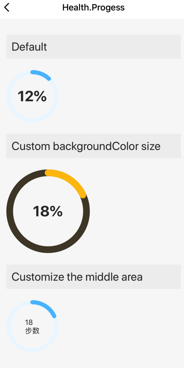
A circular progress bar component applies to fitness products. It can be used to show the expected number of steps and progress. The central content area can be customized.
Preview
Properties
| Field name | Data type | Description | Default value |
|---|---|---|---|
| size | number | The size of the circular progress bar. | 100 |
| percent | number | The percentage that is displayed by the circular progress bar. | 0 |
| color | string | The color of the circular progress bar. | #56C0FF |
| backgroundColor | string | The background color of the circular progress bar. | #EEF8FF |
| textRender | function | The function to render the custom text area in the middle. | (percent: number) => |
Example
import React, { Component } from 'react';
import { View, StyleSheet } from 'react-native';
import { Utils, TYText } from 'tuya-panel-kit';
import { Progess } from '@tuya/tuya-panel-health-sdk';
import Section from '../Section';

const { convertX: cx } = Utils.RatioUtils;

const lang = {
  en: {
    dsc_default: 'Default',
    dsc_custom: 'Custom backgroundColor size',
    dsc_custom2: 'Customize the middle area',
  },
  zh: {
    dsc_default: 'Default effect',
    dsc_custom: 'Custom color and size',
    dsc_custom2: 'Custom middle area',
  },
};
const getLang = key => {
  return lang.en[key];
};

export default class Index extends Component {
  state = {};

  handleStop = () => {};

  render() {
    return (
      <View style={{ flex: 1, padding: cx(20) }}>
        <Section title={getLang('dsc_default')}>
          <Progess percent={12} />
        </Section>
        <Section title={getLang('dsc_custom')}>
          <Progess percent={18} size={160} color="#FFC204" backgroundColor="#4E4532" />
        </Section>
        <Section title={getLang('dsc_custom2')}>
          <Progess
            percent={18}
            textRender={percent => (
              <View>
                <TYText>{percent}</TYText>
                <TYText>Steps</TYText>
              </View>
            )}
          />
        </Section>
      </View>
    );
  }
}

const styles = StyleSheet.create({});
Is this page helpful?
YesFeedbackIs this page helpful?
YesFeedbackMarketing Cooperation
Business Cooperation
Customer Service
Media Inquiry


