Percentage Bar
Last Updated on : 2021-08-12 23:47:02Copy for LLMView as MarkdownDownload PDF
BarPercent
Description
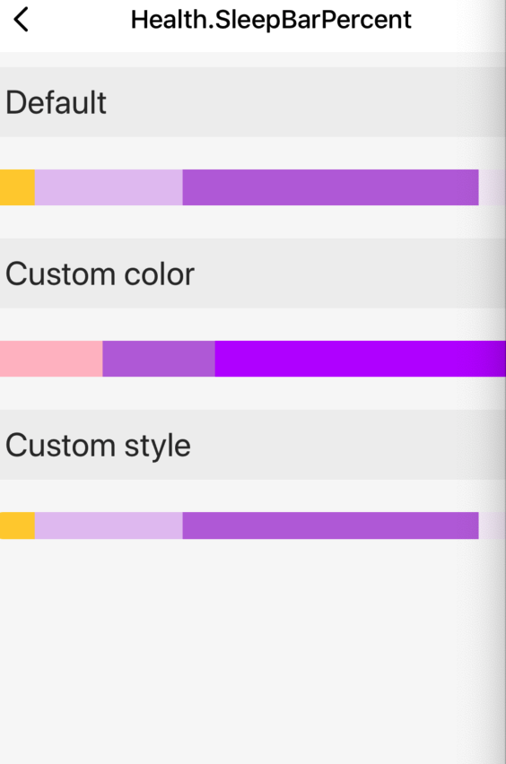
The percentage bar component BarPercent applies to the interval distribution of sleep stages by time.
Preview
Properties
| Field name | Data type | Description | Default value |
|---|---|---|---|
| data | Data[] | The data source to be distributed on the bar. | null |
| style | StyleProp |
The style of the outermost container. |
Example
import React, { Component } from 'react';
import { View, ScrollView, Image } from 'react-native';
import { Utils } from 'tuya-panel-kit';
import { BarPercent } from '@tuya/tuya-panel-health-sdk';
import Section from '../Section';

const { convertX: cx } = Utils.RatioUtils;

const lang = {
  en: {
    dsc_default: 'Default',
    dsc_custom: 'Custom color',
    dsc_custom_style: 'Custom style',
  },
  zh: {
    dsc_default: 'Default effect',
    dsc_custom: 'Custom color',
    dsc_custom_style: 'Custom style',
  },
};

const getLang = key => {
  return lang.en[key];
};

const sleepDuration = [
  {
    label: 'Wake up',
    key: 'Wake',
    value: 200,
    color: 'pink',
  },
  {
    label: 'Light sleep',
    key: 'Light',
    value: 200,
    color: '#BF73DE',
  },
  {
    label: 'Deep sleep',
    key: 'Deep',
    value: 600,
    color: '#C00AFF',
  },
];

export default class Index extends Component {
  state = {};

  render() {
    return (
      <View style={{ flex: 1 }}>
        <Section title={getLang('dsc_custom_style')}>
          <View>
            <BarPercent
              data={sleepDuration}
              style={{
                height: 18,
                borderRadius: 12,
                overflow: 'hidden',
              }}
            />
          </View>
        </Section>
      </View>
    );
  }
}
Is this page helpful?
YesFeedbackIs this page helpful?
YesFeedbackMarketing Cooperation
Business Cooperation
Customer Service
Media Inquiry


