单键组件
更新时间:2021-06-11 08:28:26LLM 副本以 Markdown 格式查看下载 PDF
PressKey
预览效果
组件属性
| 字段名 | 类型 | 描述 | 默认值 |
|---|---|---|---|
| radius | number | 按键圆角 | 34 |
| padding | number | 按键内边距 | 4 |
| height | number | 按键高 | 68 |
| width | number | 按键宽 | 68 |
| bgColor | string | 按键激活时的背景色 | 'rgb(255,255,255)' |
| activeBgColor | string | 按键按下后的背景色 | 'rgb(250,250,250)' |
| disabledBgColor | string | 按键未激活时的背景色 | 'rgb(250,250,250)' |
| contentColor | string | 按键激活时的内容颜色 | rgba(122,123,136,1)’ |
| disabledContentColor | string | 按键未激活时的内容颜色 | 'rgba(122,123,136,0.5)' |
| content | Element | 按键自定义内容 | ull |
| contentStyle | StyleProp |
按键内容样式 | null |
| onPress | function | 按键短按触发事件 | null |
| onLongPress | function | 按键长按触发事件 | null |
| style | StyleProp |
按键内部样式 | null |
| outStyle | StyleProp |
按键外部样式 | null |
| outBgColor | string | 外边框背景色 | 'rgb(246, 246, 246)' |
| tip | string | 提示文字 | '' |
| tipStyle | StyleProp |
提示文字样式 | null |
| status | boolean | 按键激活状态 | false |
| repeat | boolean | 按键长按时,是否连续重复触发 | false |
| repeatIntervalTime | number | 连续重复触发时间间隔 | 300 |
| icon | string | Icon path属性 | '' |
| img | ImageSourcePropType | 按键图片 | null |
| imgStyle | StyleProp |
图片样式 | null |
| iconSize | number | icon尺寸大小 | 20 |
| text | string | 按键显示文字 | '' |
| textStyle | StyleProp |
按键显示文字样式 | null |
| useART | boolean | 基础组件IconFont的useART属性 | false |
| alwaysPress | boolean | 按键处于未激活状态时,短按事件仍可点击触发 | false |
| loading | boolean | 是否展示loading效果 | false |
| loadingContent | Element | 自定义loading内容 | null |
使用示例
import React, { FC } from 'react';
import { PressKey } from 'tuya-panel-remote-sdk'
import { Utils } from 'tuya-panel-kit';
const { convertX: cx } = Utils.RatioUtils;
const img = require('./res/add.png');
const loading = require('./res/loading.png');
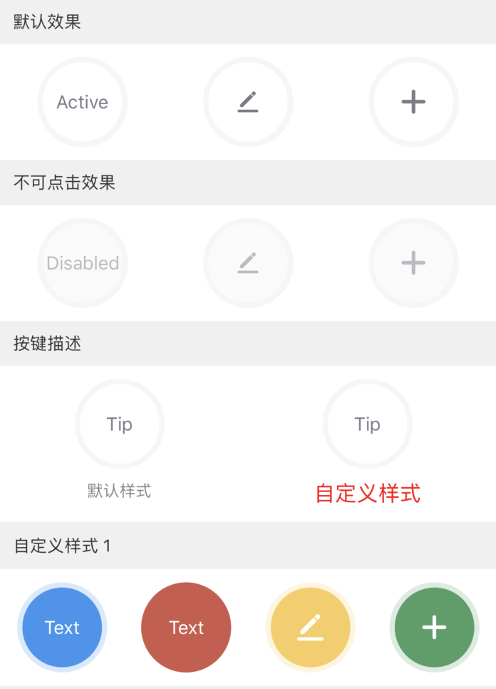
// 默认效果
<PressKey text="Active" status={true} />
<PressKey icon={svgs.pen} iconSize={cx(16)} status={true} />
<PressKey img={img} status={true} imgStyle={{ width: cx(20) }} />
// 不可点击效果
<PressKey text="Disabled" />
<PressKey icon={svgs.pen} iconSize={cx(16)} status={false} />
<PressKey img={img} status={false} />
// 按键描述
<PressKey text="Tip" status={true} tip="默认样式" />
<PressKey
text="Tip"
status={true}
tip="自定义样式"
tipStyle={{ color: 'red', fontSize: cx(16) }}
/>
// 自定义样式1
<PressKey
text="Text"
contentColor="white"
status={true}
bgColor="rgb(61,147,239)"
activeBgColor="rgba(61,147,239,0.5)"
outBgColor="rgba(61,147,239,0.2)"
/>
<PressKey
padding={0}
text="Text"
contentColor="white"
status={true}
bgColor="rgb(206,89,75)"
activeBgColor="rgba(206,89,75,0.5)"
/>
<PressKey
icon={svgs.pen}
contentColor="white"
status={true}
bgColor="rgb(249,206,94)"
activeBgColor="rgba(249,206,94,0.5)"
outBgColor="rgba(249,206,94,0.2)"
/>
<PressKey
img={img}
contentColor="white"
status={true}
bgColor="rgb(76,159,102)"
activeBgColor="rgba(76,159,102,0.5)"
outBgColor="rgba(76,159,102,0.2)"
/>
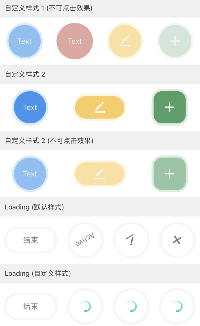
// 自定义样式1(不可点击效果)
<PressKey
text="Text"
bgColor="rgb(61,147,239)"
disabledBgColor="rgba(61,147,239,0.5)"
outBgColor="rgba(61,147,239,0.2)"
disabledContentColor="#F0F0F0"
/>
<PressKey
padding={0}
text="Text"
bgColor="rgb(206,89,75)"
disabledBgColor="rgba(206,89,75,0.5)"
disabledContentColor="#F0F0F0"
/>
<PressKey
icon={svgs.pen}
contentColor="white"
bgColor="rgb(249,206,94)"
disabledBgColor="rgba(249,206,94,0.5)"
outBgColor="rgba(249,206,94,0.2)"
disabledContentColor="#F0F0F0"
/>
<PressKey
img={img}
contentColor="white"
bgColor="rgb(76,159,102)"
activeBgColor="rgba(76,159,102,0.5)"
disabledBgColor="rgba(76,159,102,0.2)"
disabledContentColor="#F0F0F0"
/>
// 自定义样式2
<PressKey
text="Text"
textStyle={{ color: 'white' }}
status={true}
bgColor="rgb(61,147,239)"
activeBgColor="rgba(61,147,239,0.5)"
outBgColor="rgba(61,147,239,0.2)"
/>
<PressKey
width={cx(100)}
height={cx(50)}
icon={svgs.pen}
contentColor="white"
status={true}
bgColor="rgb(249,206,94)"
activeBgColor="rgba(249,206,94,0.5)"
outBgColor="rgba(249,206,94,0.2)"
/>
<PressKey
radius={cx(20)}
img={img}
contentColor="white"
status={true}
bgColor="rgb(76,159,102)"
activeBgColor="rgba(76,159,102,0.5)"
outBgColor="rgba(76,159,102,0.2)"
/>
// 自定义样式2(不可点击效果)
<PressKey
text="Text"
bgColor="rgb(61,147,239)"
disabledBgColor="rgba(61,147,239,0.5)"
outBgColor="rgba(61,147,239,0.2)"
disabledContentColor="#F0F0F0"
/>
<PressKey
width={cx(100)}
height={cx(50)}
icon={svgs.pen}
contentColor="white"
bgColor="rgb(249,206,94)"
disabledBgColor="rgba(249,206,94,0.5)"
outBgColor="rgba(249,206,94,0.2)"
disabledContentColor="#F0F0F0"
/>
<PressKey
radius={cx(20)}
img={img}
contentColor="white"
bgColor="rgb(76,159,102)"
disabledBgColor="rgba(76,159,102,0.5)"
outBgColor="rgba(76,159,102,0.2)"
disabledContentColor="#F0F0F0"
/>
// Loading(默认样式)
<PressKey
width={cx(100)}
height={cx(50)}
onPress={() => this.setState({ loading1: !this.state.loading1 })}
text={loading1 ? "开始" : "结束"}
status={true}
/>
<PressKey text="Active" status={true} loading={loading1} />
<PressKey icon={svgs.pen} iconSize={cx(16)} status={true} loading={loading1} />
<PressKey img={img} status={true} imgStyle={{ width: cx(20) }} loading={loading1} />
// Loading(自定义样式)
<PressKey
width={cx(100)}
height={cx(50)}
onPress={() => this.setState({ loading2: !this.state.loading2 })}
text={loading2 ? "开始" : "结束"}
status={true}
/>
<PressKey
text="Active"
status={true}
loading={loading2}
loadingContent={<Image source={loading} />}
/>
<PressKey
icon={svgs.pen}
iconSize={cx(16)}
status={true}
loading={loading2}
loadingContent={<Image source={loading} />}
/>
<PressKey
img={img}
status={true}
imgStyle={{ width: cx(20) }}
loading={loading2}
loadingContent={<Image source={loading} />}
/>
该内容对您有帮助吗?
是意见反馈该内容对您有帮助吗?
是意见反馈
关注“涂鸦智能”
涂鸦服务尽在掌握

关注“全球智能商业”
第一时间获取物联网资讯


