方向盘组件
更新时间:2021-06-11 08:28:33LLM 副本以 Markdown 格式查看下载 PDF
CircleHandle
预览效果
组件属性
| 字段名 | 类型 | 描述 | 默认值 |
|---|---|---|---|
| radius | number | 按键半径 | 100 |
| padding | number | 按键内边距 | 4 |
| bgColor | {top: string, bottom: string,left: string,right: string,center: string} | 按键激活时的背景色 | {top: '#FFFFFF', bottom: '#FFFFFF',left: '#FFFFFF',right: '#FFFFFF',center: '#FFFFFF'} |
| activeBgColor | {top: string, bottom: string,left: string,right: string,center: string} | 按键按下后的背景色 | {top: '#FAFAFA', bottom: '#FAFAFA',left: '#FAFAFA',right: '#FAFAFA',center: '#FAFAFA'} |
| disabledBgColor | {top: string, bottom: string,left: string,right: string,center: string} | 按键未激活时的背景色 | {top: '#FAFAFA', bottom: '#FAFAFA',left: '#FAFAFA',right: '#FAFAFA',center: '#FAFAFA'} |
| onPress | {top: function, bottom: function,left: function,right: function,center: function} | 按键短按触发事件 | {top: null, bottom: null,left: null,right: null,center: null} |
| onLongPress | {top: function, bottom: function,left: function,right: function,center: function} | 按键长按触发事件 | {top: null, bottom: null,left: null,right: null,center: null} |
| keyContent | {top: Element, bottom: Element,left: Element,right: Element,center: Element} | 按键自定义内容 | {top: null, bottom: null,left: null,right: null,center: null} |
| offset | number | 各方位按键内容与组件边框的距离 | 18 |
| pointRadius | number | 默认按键内容中圆点的半径 | 2 |
| contentHeight | number | 自定义内容高度 | 20 |
| contentWidth | number | 自定义内容宽度 | 50 |
| style | StyleProp |
按键内部样式 | null |
| outBgColor | string | 外边框背景色 | 'rgb(246, 246, 246)' |
| centerStyle | StyleProp |
按键内部样式 | null |
| centerRadius | number | 中心按键半径 | 40 |
| centerText | string | 中心按键文字 | 'OK' |
| centerTextStyle | StyleProp |
中心按键文字样式 | Null |
| tip | {top: string, bottom: string,left: string,right: string,center: string} | 提示文字 | {top: '', bottom: '',left: '',right: '',center: ''} |
| tipStyle | StyleProp |
提示文字样式 | null |
| status | {top: boolean, bottom: boolean,left: boolean,right: boolean,center: boolean} | 按键激活状态 | {top: false, bottom: false,left: false,right: false,center: false} |
| repeat | {top: boolean, bottom: boolean,left: boolean,right: boolean,center: boolean} | 按键长按时,是否连续重复触发 | {top: false, bottom: false,left: false,right: false,center: false} |
| repeatIntervalTime | number | 连续重复触发时间间隔 | 300 |
| pointColor | string | 默认按键内容中圆点的颜色 | '#7A7B88' |
| loading | {top: boolean, bottom: boolean,left: boolean,right: boolean,center: boolean} | 是否展示loading效果 | {top: false, bottom: false,left: false,right: false,center: false} |
| loadingContent | Element | 自定义loading内容 | null |
使用示例
import React, { FC } from 'react';
import { PressKey, CircleHandle } from 'tuya-panel-remote-sdk'
import { Utils } from 'tuya-panel-kit';
const { convertX: cx } = Utils.RatioUtils;
const img = require('./res/add.png');
const loadingImg = require('./res/loading.png');
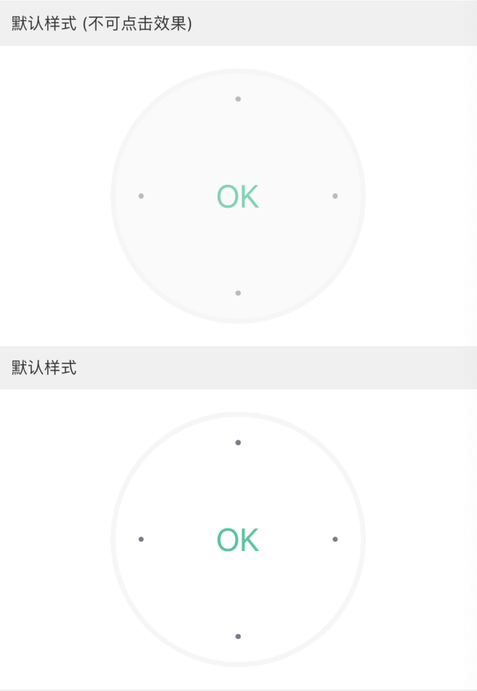
// 默认样式(不可点击效果)
<CircleHandle />
// 默认样式
<CircleHandle
status={{
top: true,
bottom: true,
left: true,
right: true,
center: true,
}}
/>
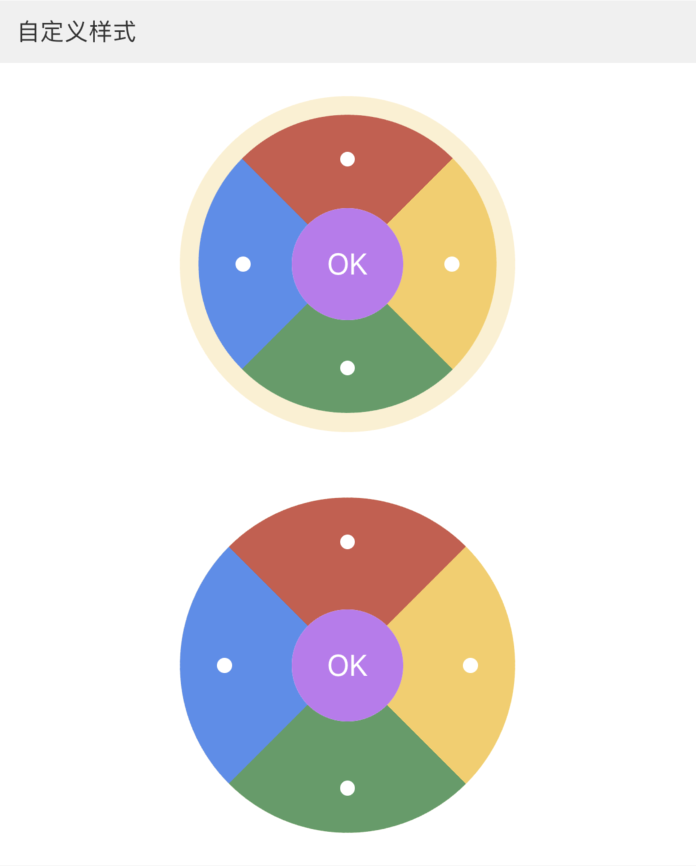
// 自定义样式
<CircleHandle
padding={cx(10)}
outBgColor="rgba(246,206,95,0.3)"
radius={cx(90)}
centerRadius={cx(30)}
offset={cx(20)}
pointColor="#FFF"
pointRadius={cx(4)}
centerTextStyle={{ fontSize: cx(16), color: 'white' }}
bgColor={{
top: 'rgba(206,89,75,1)',
right: 'rgba(246,206,95,1)',
bottom: 'rgba(85,158,101,1)',
left: 'rgba(87,140,238,1)',
center: 'rgba(194,117,241,1)',
}}
activeBgColor={{
top: 'rgba(206,89,75,0.5)',
right: 'rgba(246,206,95,0.5)',
bottom: 'rgba(85,158,101,0.5)',
left: 'rgba(87,140,238,0.5)',
center: 'rgba(194,117,241,0.7)',
}}
disabledColor={{
center: 'red',
}}
status={{
top: true,
bottom: true,
left: true,
right: true,
center: true,
}}
/>
<CircleHandle
padding={0}
centerTextStyle={{ fontSize: cx(16), color: 'white' }}
outBgColor="rgba(246,206,95,0.3)"
radius={cx(90)}
centerRadius={cx(30)}
offset={cx(20)}
pointColor="#FFF"
pointRadius={cx(4)}
bgColor={{
top: 'rgba(206,89,75,1)',
right: 'rgba(246,206,95,1)',
bottom: 'rgba(85,158,101,1)',
left: 'rgba(87,140,238,1)',
center: 'rgba(194,117,241,1)',
}}
activeBgColor={{
top: 'rgba(206,89,75,0.5)',
right: 'rgba(246,206,95,0.5)',
bottom: 'rgba(85,158,101,0.5)',
left: 'rgba(87,140,238,0.5)',
center: 'rgba(194,117,241,0.7)',
}}
status={{
top: true,
bottom: true,
left: true,
right: true,
center: true,
}}
/>
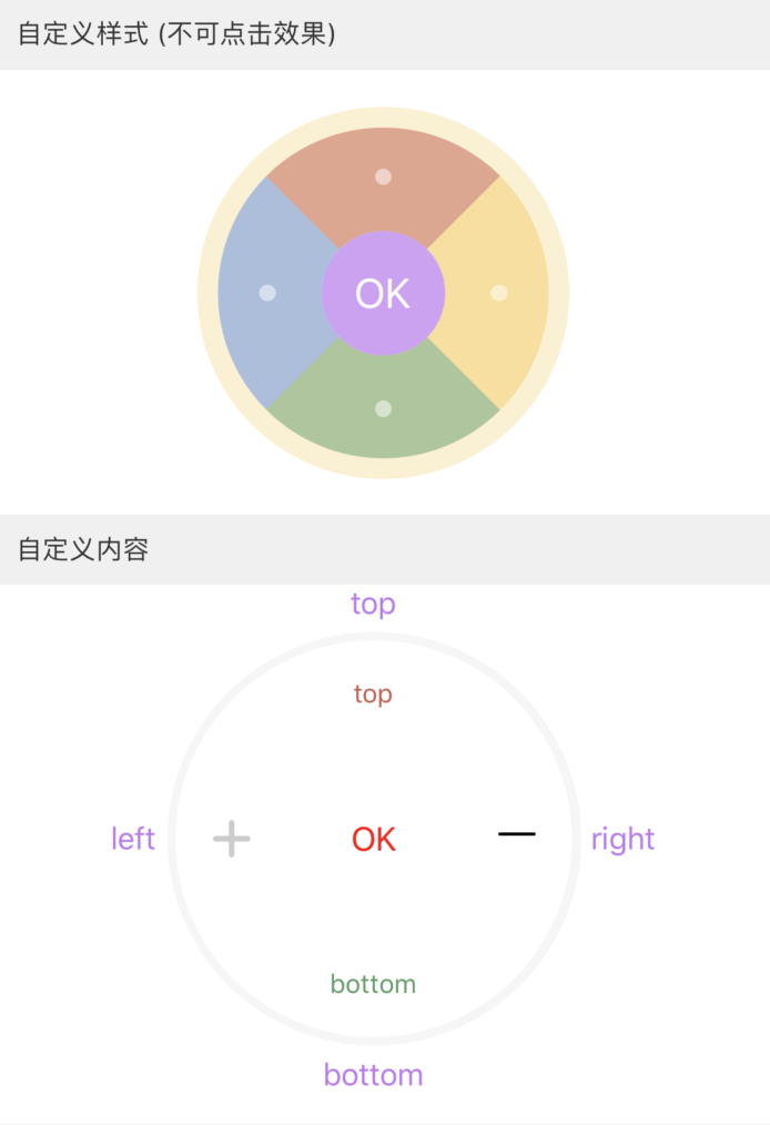
// 自定义样式(不可点击效果)
<CircleHandle
padding={cx(10)}
outBgColor="rgba(246,206,95,0.3)"
radius={cx(90)}
centerRadius={cx(30)}
offset={cx(20)}
pointColor="#FFF"
pointRadius={cx(4)}
centerTextStyle={{ fontSize: cx(20), color: '#FFF' }}
status={{
top: false,
bottom: false,
left: false,
right: false,
center: false,
}}
centerStatus={false}
disabledBgColor={{
top: 'rgba(206,89,75,0.5)',
right: 'rgba(246,206,95,0.5)',
bottom: 'rgba(85,158,101,0.5)',
left: 'rgba(87,140,238,0.5)',
center: 'rgba(194,117,241,0.7)',
}}
tipStyle={[styles.centerText, { fontSize: cx(15) }]}
/>
<CircleHandle
centerTextStyle={{ fontSize: cx(16), color: 'red' }}
keyContent={{
top: <TYText style={{ color: 'rgba(206,89,75,1)' }}>top</TYText>,
right: <IconFont d={icon.minus} size={cx(18)} />,
bottom: <TYText style={{ color: 'rgba(85,158,101,1)' }}>bottom</TYText>,
left: <Image source={img} style={{ tintColor: '#CCC' }} />,
}}
tip={{
top: 'top',
right: 'right',
bottom: 'bottom',
left: 'left',
}}
tipStyle={{ color: 'rgba(194,117,241,1)' }}
status={{
top: true,
bottom: true,
left: true,
right: true,
center: true,
}}
/>
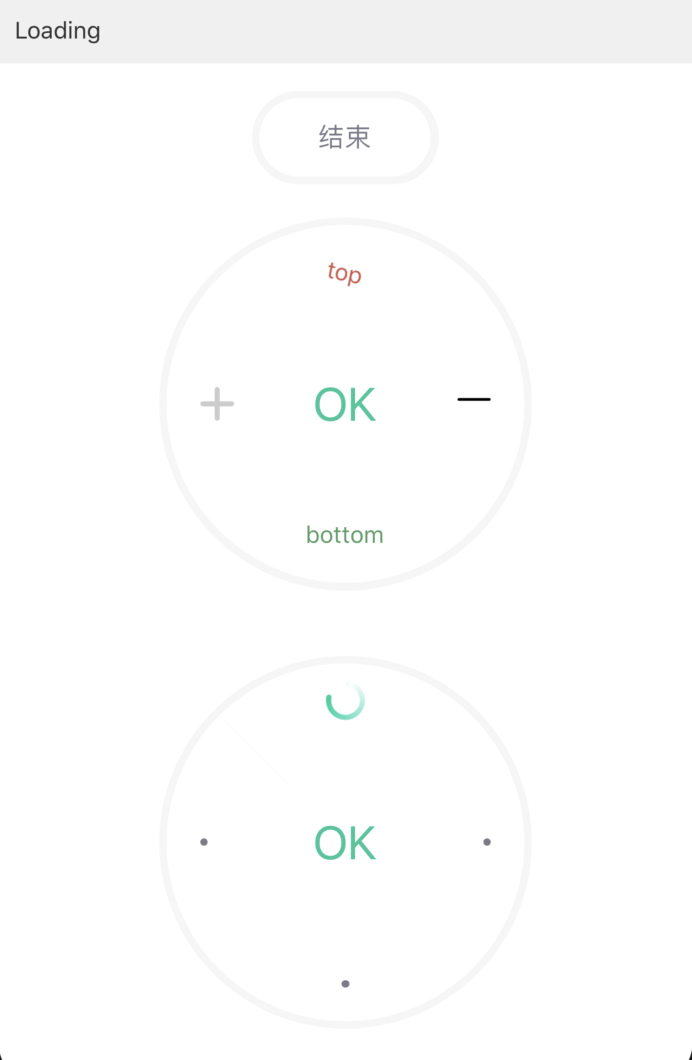
// Loading
<PressKey
width={cx(100)}
height={cx(50)}
onPress={() =>
this.setState({
loading: !this.state.loading,
isFirst: loading ? !isFirst : isFirst,
})
}
text={loading ? "结束" : "开始"}
status={true}
/>
<CircleHandle
loading={{ top: loading && isFirst, center: loading && !isFirst }}
keyContent={{
top: <TYText style={{ color: 'rgba(206,89,75,1)' }}>top</TYText>,
right: <IconFont d={icon.minus} size={cx(18)} />,
bottom: <TYText style={{ color: 'rgba(85,158,101,1)' }}>bottom</TYText>,
left: <Image source={img} style={{ tintColor: '#CCC' }} />,
}}
status={{
top: true,
bottom: true,
left: true,
right: true,
center: true,
}}
/>
<CircleHandle
loading={{ top: loading && isFirst, center: loading && !isFirst }}
loadingContent={<Image source={loadingImg} />}
status={{
top: true,
bottom: true,
left: true,
right: true,
center: true,
}}
/>
该内容对您有帮助吗?
是意见反馈该内容对您有帮助吗?
是意见反馈
关注“涂鸦智能”
涂鸦服务尽在掌握

关注“全球智能商业”
第一时间获取物联网资讯


