Animation Header
Last Updated on : 2021-12-22 09:34:53Copy for LLMView as Markdown
AnimatedHeader
The animation header component AnimatedHeader is used to show a header for a list of animations. Users can tap the icon on the right of the header to display the list.
Preview
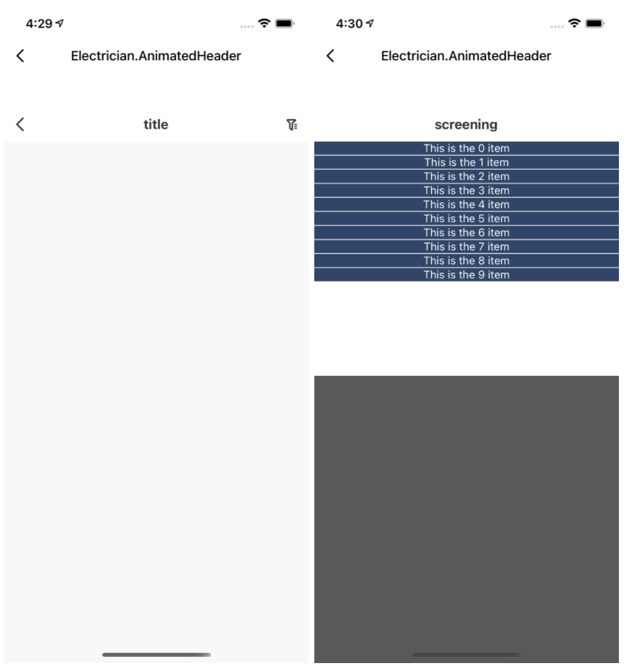
Properties
| Field name | Data type | Description | Default value |
|---|---|---|---|
| title | String | The title. | 'title' |
| animateTitle | String | The title of an animation. | 'screening' |
| maxHeight | Number | The upper limit of height. | 300 |
| tintColor | String | The color of the icon. | '#272929' |
| rightDisable | Boolean | Specifies whether the right-side icon is supported. | false |
| speed | Number | The speed of the animation. | 200 |
| content | Func | The content of the animation. | null |
| iconPath | String | The URL of the icon. | null |
| headerTextColor | String | The color of the text. | '#333333' |
| onClose | Func | Specifies whether an animation is disabled. | null |
Example
import React from 'react';
import _times from 'lodash/times';
import { View, Text, TouchableOpacity } from 'react-native';
import { AnimatedHeader } from '@tuya/tuya-panel-electrician-sdk';

const Scene = () => (
  <View style={{ flex: 1, alignItems: 'center', backgroundColor: 'grey' }}>
    <AnimatedHeader
      rightDisable={false}
      content={() =>
        _times(10, d => (
          <TouchableOpacity
            key={d}
            style={{
              backgroundColor: '#304567',
              marginBottom: 1,
            }}
            onPress={() => AnimatedHeader.close()}
          >
            <Text style={{ color: '#FFFFFF', textAlign: 'center' }}>This is the {d} item</Text>
          </TouchableOpacity>
        ))
      }
    />
  </View>
);

export default Scene;
Is this page helpful?
YesFeedbackIs this page helpful?
YesFeedbackMarketing Cooperation
Business Cooperation
Customer Service
Media Inquiry


