Slider with Tooltip
Last Updated on : 2021-08-02 10:10:18Copy for LLMView as MarkdownDownload PDF
SettingSlider
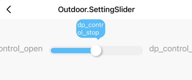
Preview
Properties
| Field name | Type | Description | Default value |
|---|---|---|---|
| themeColor | string | The theme color. | "#57BCF" |
| code | string | dp code | null |
| value | number | string | The current value. | 0 |
| step | number | The number of sliding steps. | 1 |
| range | any[] | The value range of the tick marks. | [] |
| type | string | The type of data point (DP). Valid values: value | enum. |
"value" |
| onValueChange | (backValue: string | number) => void | The callback that is executed when the slider is moved. | (v)=> {range[+v]} |
| onValueConfrim | (backValue: string | number) => void | The callback that is executed when the slider setting is confirmed. | (v)=> {range[+v]} |
Example
import React from 'react';
import { SettingSlider } from '@tuya/tuya-panel-outdoor-sdk';

const SettingSliderView = () => {
  return (
   <SettingSlider
          code="control"
          range={['open', 'stop', 'close']}
          value="close"
          type="enum"
          step={1}
          themeColor="#57BCFB"
          onValueConfrim={() => {}}
     />
  );
};
export default SettingSliderView;
Is this page helpful?
YesFeedbackIs this page helpful?
YesFeedbackMarketing Cooperation
Business Cooperation
Customer Service
Media Inquiry


