Gradient and Shadowed Progress Bar
Last Updated on : 2021-08-02 10:10:27Copy for LLMView as MarkdownDownload PDF
ShadowCircleProgress
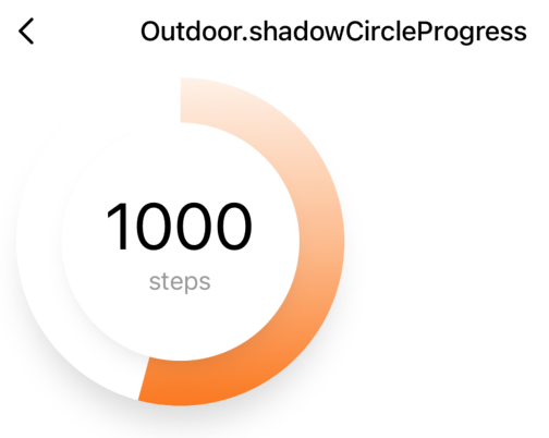
Preview
Properties
| Field name | Type | Description | Default value |
|---|---|---|---|
| themeColor | string | The theme color. | "#FB7319’" |
| circleWidth | number | The width. | 206 |
| scaleHeight | number | The height of the slider track. | 25 |
| progressValue | number | The specific value that is indicated by the slider. | 0 |
| shadowWidth | number | The width of the shadow. | 7 |
| title | string | number | The value that is displayed at the center of the circle. This is also the title of the slider. | "" |
| titleSize | number | The font size of the title. | cx(36) |
| title | string | number | The value that is displayed at the center of the circle. This is also the title of the slider. | "" |
| disabled | boolean | Specifies whether to disable sliding. | true |
| onValueChange | () => void | The callback that is executed when the slider is moved. | null |
| onSlidingComplete | () => void | The callback that is executed when the slider setting is confirmed. | null |
Example
import React from 'react';
import { View } from 'react-native';
import { ShadowCircleProgress } from '@tuya/tuya-panel-outdoor-sdk';

const CircleProgress = () => {
  return (
  <View style={{ flex: 1, backgroundColor: '#FFF', paddingTop: 10 }}>
        <ShadowCircleProgress
          themeColor="#FB7319"
          unit="steps"
          title={1000}
          disabled={false}
          progressValue={Math.random() * 100}
        />
    </View>
  );
};
export default CircleProgress;
Is this page helpful?
YesFeedbackIs this page helpful?
YesFeedbackMarketing Cooperation
Business Cooperation
Customer Service
Media Inquiry


