Sectional Scrollable Dialog
Last Updated on : 2021-12-22 09:34:53Copy for LLMView as Markdown
SwipePop
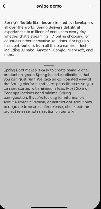
The sectional scrollable dialog component SwipePop allows users to scroll the lower section of the overall component.
Properties
| Field name | Data type | Description | Default value |
|---|---|---|---|
| topBar | ReactNode | Required, the top bar. | None |
| header | ReactNode | Required, the header of the page. | None |
| bottom | ReactNode | Required, the bottom of the page. | None |
| arrowColor | String | Optional, the color of the arrow. | rgba(0,0,0,0.4) |
Example
import React from 'react';
import { SwipePop } from '@tuya/tuya-panel-outdoor-sdk';

 <SwipePop
    arrowColor="#111"
    header={<Header />}
    topBar={<Top />}
    bottom={<Bottom />}
  />
Is this page helpful?
YesFeedbackIs this page helpful?
YesFeedbackMarketing Cooperation
Business Cooperation
Customer Service
Media Inquiry


