Widget
A widget is an extension of miniapp development. You can build a widget in a similar development mode to miniapps. After a miniapp is distributed to an app, the widget is displayed on the app. Compared with a miniapp, a widget is more lightweight, convenient, and suitable to be displayed.
Features
Widgets can be integrated into miniapps and native pages. Widgets for miniapps are displayed as dialog boxes. Widgets for native pages are displayed as dialog boxes, components, and page elements. The specific pattern of a widget is subject to your customization.
Examples
The extensive use of widgets on Tuya-enabled mobile apps improves user interaction and enhances the overall user experience.
Example 1:

Example 2:

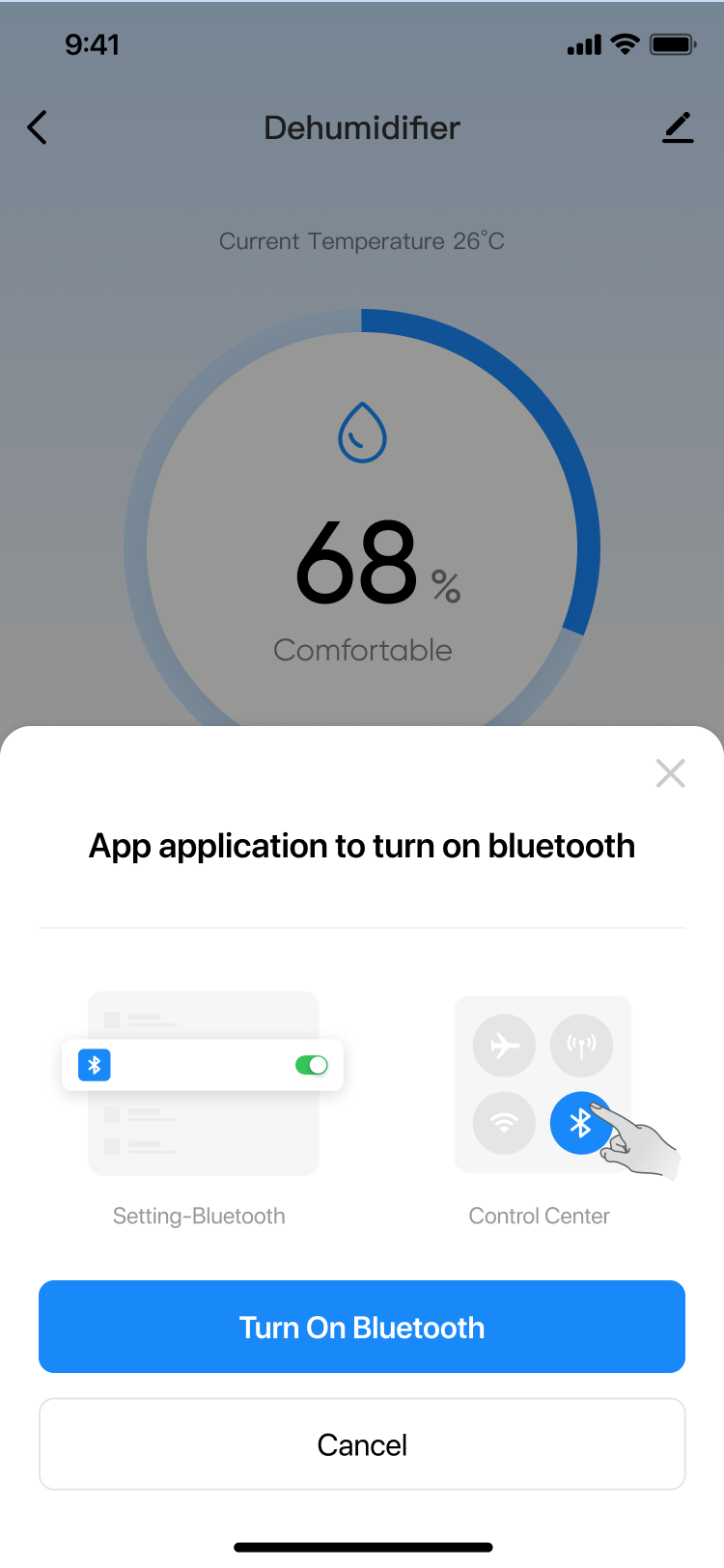
Example 1: Pop up a dialog widget in the RN panel to ask the user for permission. You can also apply this widget to a miniapp without reinventing the wheel.
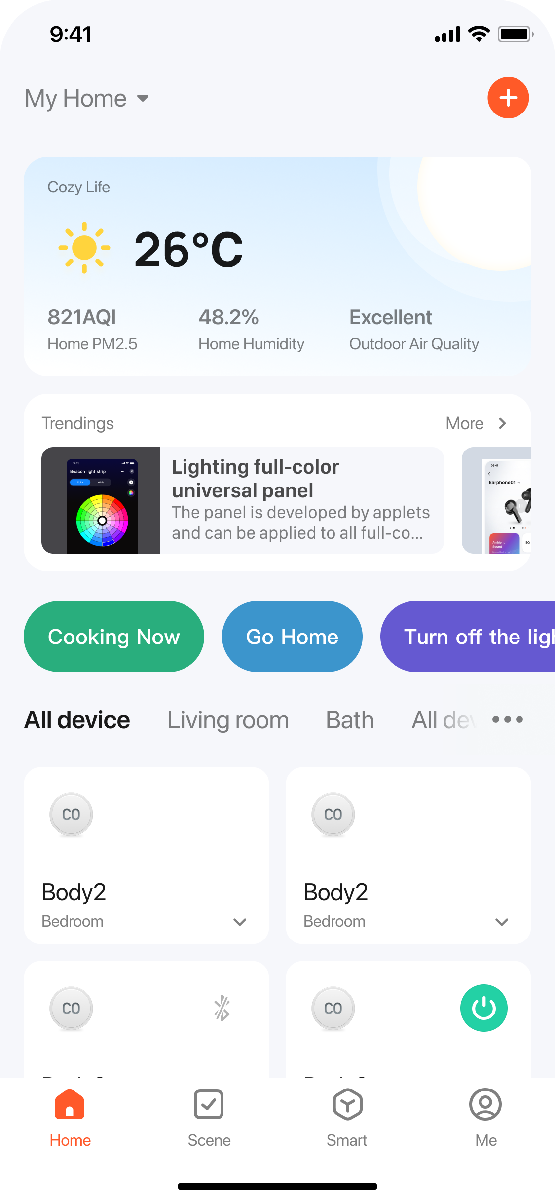
Example 2: Embed a view widget on the home page to present marketing campaign information. The view widget can be updated on the fly, making content adjustments simple.
APIs
Create dialog box widget
Similar to ActionSheet, a dialog box widget is overlaid on top of a page.
/// Create and display a dialog box widget.
/// - Parameters:
///   - view: Display the parent view of the widget.
///   - url: The URL of the widget. See the parameter description for the format.
- (UIView *)showWidgetDialogInView:(nonnull UIView *)view url:(nonnull NSString *)url;

/// Create and display a dialog box widget.
/// - Parameters:
///   - view: Display the parent view of the widget.
///   - url: The URL of the widget. See the parameter description for the format.
///   - dismissCallback: The callback to invoke when the widget is dismissed.
- (UIView *)showWidgetDialogInView:(nonnull UIView *)view url:(nonnull NSString *)url dismissCallback:(nullable void(^)(void))dismissCallback;
Example
[[ThingMiniAppClient widgetClient] showWidgetDialogInView:self.view url:@"godzilla://tyvr5foscvxwog5byi/cards/info/index?miniWidgetStyle=0.52"];

// Receive the widget dismissing callback.
[[ThingMiniAppClient widgetClient] showWidgetDialogInView:self.view url:@"godzilla://tyvr5foscvxwog5byi/cards/info/index?miniWidgetStyle=0.52" dismissCallback:^{
    NSLog(@"Widget dismissed");
}];
Create view widget
Similar to View, a view widget can be displayed as a component and a page element on native pages. The specific pattern of the widget is subject to your customization.
/// Create a view widget.
/// - Parameter url: The URL of the widget. See the parameter description for the format.
- (UIView *)createWidgetViewWithUrl:(nonnull NSString *)url;

/// Create a view widget. When multiple URLs are passed in, multiple widgets are grouped in a view.
/// - Parameter urls: The array of widget URLs. See the parameter description for the format.
- (UIView *)createWidgetViewWithMultiUrls:(nonnull NSArray<NSString *> *)urls;
Example
// After the widgetView instance is generated, its width and height will be set accordingly.
UIView *widgetView = [[ThingMiniAppClient widgetClient] createWidgetViewWithUrl:@"godzilla://tyvr5foscvxwog5byi/cards/info/index?miniWidgetStyle=0.52"];
[self.view addSubview:widgetView];
Dismiss dialog box widget
Typically, the frontend dismisses a dialog box widget by calling a method. You can also use the following method to enable the client to trigger the dismissing action.
/// The dialog box widget is dismissed.
/// - Parameter view: The widget instance returned when a dialog box widget is created.
- (void)dismissWidgetDialog:(nonnull UIView *)view;
Example
UIView *view = [[ThingMiniAppClient coreClient] showWidgetDialogInView:self.view url:@"godzilla://tyvr5foscvxwog5byi/"];
[[ThingMiniAppClient widgetClient] dismissWidgetDialog:view];
Preload widget
Preload a widget at the right time to accelerate the startup of the widget.
/// Preload widget
/// - Parameter appId: The appId of the widget, which is the appId of the miniapp.
- (void)preloadWidgetWithAppId:(nonnull NSString *)appId;

/// Preload widget
/// - Parameters:
///   - appId: The appId of the widget, which is the appId of the miniapp.
///   - completeCallback: Preloading completion callback.
- (void)preloadWidgetWithAppId:(nonnull NSString *)appId completeCallback:(nullable void(^)(BOOL success, NSError *error))completeCallback;
Example
[[ThingMiniAppClient widgetClient] preloadWidgetWithAppId:@"tyvr5foscvxwog5byi" completeCallback:^(BOOL success, NSError *error) {
    if (success) {
        NSLog(@"Preloaded succeeded");
    } else {
        NSLog(@"Preload failed");
    }
}];
Parameter description
When you create a widget, set a URL for the widget in the format of godzilla://miniprogramId/widget/card/index?miniWidgetStyle=large&miniVersionType=release.
The URL is a standard path format that includes basic information about the widget. Below is the description of the URL parameters:
scheme: Set it togodzilla.host: TheappIdof the widget, which is theappIdof the miniapp.path: The path through which the widget page is opened. If you do not set the value, the page indicated byentryPagePathin the widget configuration file will be opened.query: The parameters that are required for opening the widget. For more information, seequery.
Parameters of query
-
miniWidgetStyle: The style of the widget. Valid values:small: The aspect ratio is 1:1 and the width is half of the screen width.middle(default value): The aspect ratio is 1:2, and the width is the same as the screen width.large: The aspect ratio is 2:2. Both the width and height are equal to the screen dimensions.custom: The custom aspect ratio, based on the screen width. The height is the screen width multiplied bycustom.
-
miniAppVersion: The version number of the widget. It defaults to the latest version number. -
miniVersionType: The type of version for the widget. Valid values:preview: The preview version, used to preview the widget during the development stage.release(default value): The official version, deployed to the production environment.
-
miniPosition: The location of the dialog box widget to be displayed on the screen. Valid values:bottom(default value): Bottom of the screen.top: Top of the screen.
-
miniAutoDismiss: Specifies whether to dismiss the dialog box widget automatically when users tap the overlay. Valid values:true(default value): Dismiss the dialog box widget automatically when users tap the overlay.false: Not dismiss the dialog box widget automatically when users tap the overlay. You call a method to manually dismiss the widget.
-
miniAutoCache: Specifies whether the widget is automatically cached. Valid values:true(default value): The widget is automatically cached. Thus, the snapshot is displayed in priority when the widget appears next time.false: The widget is not automatically cached. Thus, the widget is loaded to be displayed next time.
-
Other parameters: In addition to the preceding parameters, you can pass in more business parameters. The widget gets the following parameters from
Widget.onLoad.Parameter name Required Remarks Example miniWidgetStyleYes When you set the value to custom, the aspect ratio of the widget is required.miniWidgetStyle=1.5 miniAppVersionNo This parameter is not required when the latest value is pulled. miniAppVersion=2.0.0 miniVersionTypeNo Set the value to releaseor leave it empty when you launch the widget.miniVersionType=release miniPositionNo Set the location of the dialog box widget to be displayed on the screen. It defaults to bottom.miniPosition=bottom miniAutoDismissNo This parameter is required if the dialog box widget is not automatically dismissed when users tap the overlay. miniAutoDismiss=false miniAutoCacheNo This parameter is required if the cached snapshot is not displayed in priority for the widget. miniAutoCache=false
Is this page helpful?
YesFeedbackIs this page helpful?
YesFeedback


