Top Bar Component with Arc
Last Updated on : 2021-07-03 05:02:12Copy for LLMView as MarkdownDownload PDF
Top bar component with arc
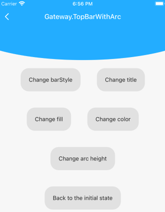
Preview
Properties
| Field name | Type | Description | Default value |
|---|---|---|---|
| title | string | The title of the top bar. | 'Top bar with arc' |
| color | string | The font and icon color of the top bar. | '#FFF' |
| onBack | () => void | The tapping event of the Back button on the top bar. | () => TYSdk.Navigator.pop() |
| barStyle | 'default' | 'light-content' | 'dark-content' | The value of barStyle for the status bar. |
'light-content' |
| topBarParams | TopBarProps | The properties of the top bar. | {} |
| fill | string | The fill color. | '#27b6ff' |
| arcWidth | number | The width of the arc. | The width of the screen. |
| arcHeight | number | The height of the arc. | 80 |
| renderStatusBar | () => JSX.Element | null | The rendering function of the status bar. | null |
| renderTopBar | () => JSX.Element | null | The rendering function of the top bar. | null |
| renderArc | () => JSX.Element | null | The rendering function of the arc. | null |
Example
import { TopBarWithArc } from '@tuya/tuya-panel-gateway-sdk';

// Normal use.
<TopBarWithArc  />

// Modify `barStyle`.
<TopBarWithArc barStyle="dark-content" />

// Modify the title.
<TopBarWithArc title="Custom title" />

// Modify the fill color.
<TopBarWithArc fill="pink" />

// Modify the height of the arc.
<TopBarWithArc arcHeight={60} />
Is this page helpful?
YesFeedbackIs this page helpful?
YesFeedbackMarketing Cooperation
Business Cooperation
Customer Service
Media Inquiry


