Single Key
Last Updated on : 2021-06-25 10:44:12Copy for LLMView as MarkdownDownload PDF
PressKey
Previews
Properties
| Field name | Type | Description | Default value |
|---|---|---|---|
| radius | number | The radius of a key. | 34 |
| padding | number | The inner margin of a key. | 4 |
| height | number | The height of a key. | 68 |
| width | number | The width of a key. | 68 |
| bgColor | string | The background color of an active key. | 'rgb(255,255,255)' |
| activeBgColor | string | The background color that is displayed when a key is pressed. | 'rgb(250,250,250)' |
| disabledBgColor | string | The background color of an inactive key. | 'rgb(250,250,250)' |
| contentColor | string | The content color of an active key. | rgba(122,123,136,1)’ |
| disabledContentColor | string | The content color of an inactive key. | 'rgba(122,123,136,0.5)' |
| content | Element | The custom content of a key. | ull |
| contentStyle | StyleProp |
The content style of a key. | null |
| onPress | function | The trigger event of a short press. | null |
| onLongPress | function | The trigger event of a long press. | null |
| style | StyleProp |
The internal style of a key. | null |
| outStyle | StyleProp |
The external style of a key. | null |
| outBgColor | string | The background color of a border. | 'rgb(246, 246, 246)' |
| tip | string | The tooltip text. | '' |
| tipStyle | StyleProp |
The style of the tooltip text. | null |
| status | boolean | The active status of a key. | false |
| repeat | boolean | Specifies whether to enable repeated triggers for a long press. | false |
| repeatIntervalTime | number | The interval of repeated triggers. | 300 |
| icon | string | The property of icon path. | '' |
| img | ImageSourcePropType | The image of a key. | null |
| imgStyle | StyleProp |
The style of an image. | null |
| iconSize | number | The size of an icon. | 20 |
| text | string | The text of a key. | '' |
| textStyle | StyleProp |
The style of key text. | null |
| useART | boolean | The useART property of the basic component IconFont. |
false |
| alwaysPress | boolean | Specifies that a short press event can still be triggered when you press an inactive key. | false |
| loading | boolean | Specifies whether to show the loading effect. | false |
| loadingContent | Element | The custom loading content. | null |
Example
import React, { FC } from 'react';
import { PressKey } from 'tuya-panel-remote-sdk'
import { Utils } from 'tuya-panel-kit';
const { convertX: cx } = Utils.RatioUtils;
const img = require('./res/add.png');
const loading = require('./res/loading.png');
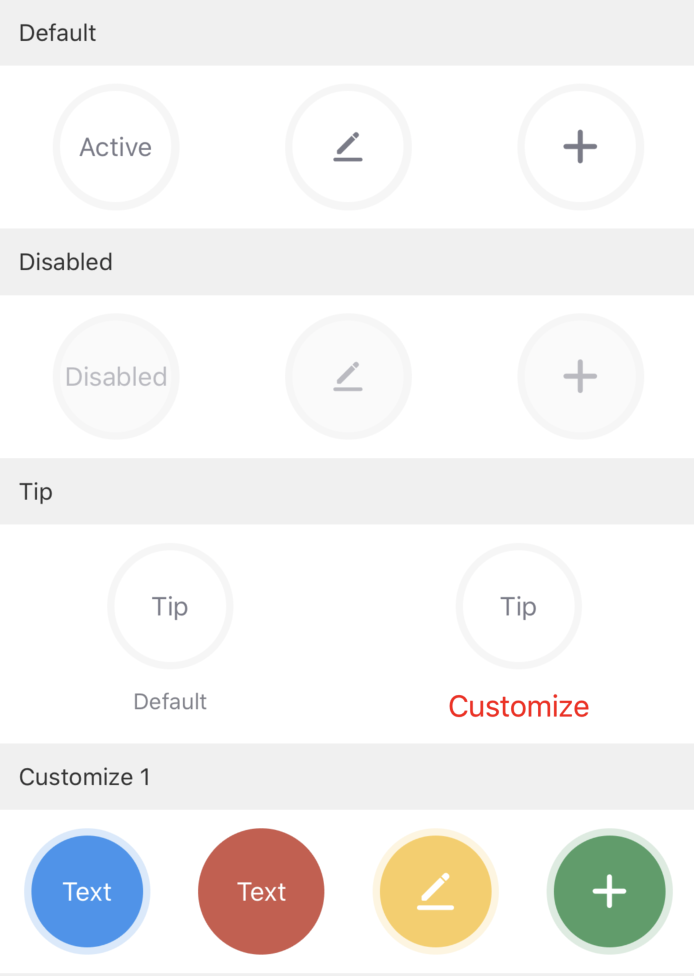
// The default effect.
<PressKey text="Active" status={true} />
<PressKey icon={svgs.pen} iconSize={cx(16)} status={true} />
<PressKey img={img} status={true} imgStyle={{ width: cx(20) }} />
// The disabled effect.
<PressKey text="Disabled" />
<PressKey icon={svgs.pen} iconSize={cx(16)} status={false} />
<PressKey img={img} status={false} />
// The key description.
<PressKey text="Tip" status={true} tip="Default style" />
<PressKey
text="Tip"
status={true}
tip="Custom style"
tipStyle={{ color: 'red', fontSize: cx(16) }}
/>
// Custom style 1
<PressKey
text="Text"
contentColor="white"
status={true}
bgColor="rgb(61,147,239)"
activeBgColor="rgba(61,147,239,0.5)"
outBgColor="rgba(61,147,239,0.2)"
/>
<PressKey
padding={0}
text="Text"
contentColor="white"
status={true}
bgColor="rgb(206,89,75)"
activeBgColor="rgba(206,89,75,0.5)"
/>
<PressKey
icon={svgs.pen}
contentColor="white"
status={true}
bgColor="rgb(249,206,94)"
activeBgColor="rgba(249,206,94,0.5)"
outBgColor="rgba(249,206,94,0.2)"
/>
<PressKey
img={img}
contentColor="white"
status={true}
bgColor="rgb(76,159,102)"
activeBgColor="rgba(76,159,102,0.5)"
outBgColor="rgba(76,159,102,0.2)"
/>
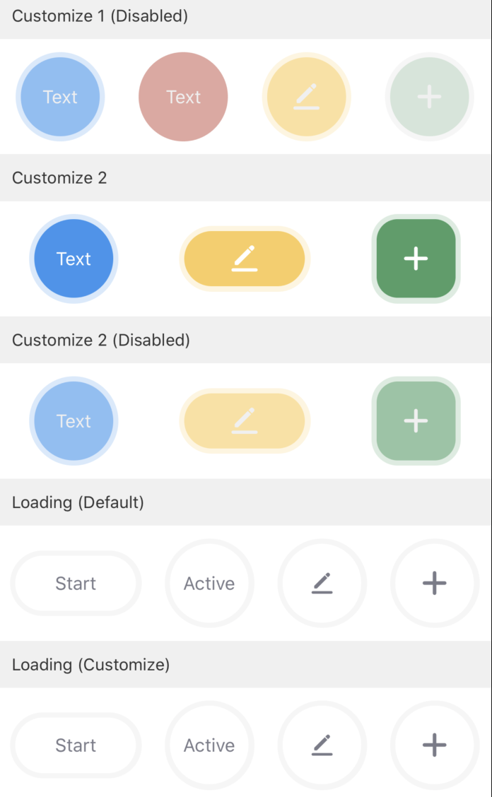
// Custom style 1 (disabled)
<PressKey
text="Text"
bgColor="rgb(61,147,239)"
disabledBgColor="rgba(61,147,239,0.5)"
outBgColor="rgba(61,147,239,0.2)"
disabledContentColor="#F0F0F0"
/>
<PressKey
padding={0}
text="Text"
bgColor="rgb(206,89,75)"
disabledBgColor="rgba(206,89,75,0.5)"
disabledContentColor="#F0F0F0"
/>
<PressKey
icon={svgs.pen}
contentColor="white"
bgColor="rgb(249,206,94)"
disabledBgColor="rgba(249,206,94,0.5)"
outBgColor="rgba(249,206,94,0.2)"
disabledContentColor="#F0F0F0"
/>
<PressKey
img={img}
contentColor="white"
bgColor="rgb(76,159,102)"
activeBgColor="rgba(76,159,102,0.5)"
disabledBgColor="rgba(76,159,102,0.2)"
disabledContentColor="#F0F0F0"
/>
// Custom style 2
<PressKey
text="Text"
textStyle={{ color: 'white' }}
status={true}
bgColor="rgb(61,147,239)"
activeBgColor="rgba(61,147,239,0.5)"
outBgColor="rgba(61,147,239,0.2)"
/>
<PressKey
width={cx(100)}
height={cx(50)}
icon={svgs.pen}
contentColor="white"
status={true}
bgColor="rgb(249,206,94)"
activeBgColor="rgba(249,206,94,0.5)"
outBgColor="rgba(249,206,94,0.2)"
/>
<PressKey
radius={cx(20)}
img={img}
contentColor="white"
status={true}
bgColor="rgb(76,159,102)"
activeBgColor="rgba(76,159,102,0.5)"
outBgColor="rgba(76,159,102,0.2)"
/>
// Custom style 2 (disabled)
<PressKey
text="Text"
bgColor="rgb(61,147,239)"
disabledBgColor="rgba(61,147,239,0.5)"
outBgColor="rgba(61,147,239,0.2)"
disabledContentColor="#F0F0F0"
/>
<PressKey
width={cx(100)}
height={cx(50)}
icon={svgs.pen}
contentColor="white"
bgColor="rgb(249,206,94)"
disabledBgColor="rgba(249,206,94,0.5)"
outBgColor="rgba(249,206,94,0.2)"
disabledContentColor="#F0F0F0"
/>
<PressKey
radius={cx(20)}
img={img}
contentColor="white"
bgColor="rgb(76,159,102)"
disabledBgColor="rgba(76,159,102,0.5)"
outBgColor="rgba(76,159,102,0.2)"
disabledContentColor="#F0F0F0"
/>
// Loading (default style)
<PressKey
width={cx(100)}
height={cx(50)}
onPress={() => this.setState({ loading1: !this.state.loading1 })}
text={loading1 ? "Start" : "Stop"}
status={true}
/>
<PressKey text="Active" status={true} loading={loading1} />
<PressKey icon={svgs.pen} iconSize={cx(16)} status={true} loading={loading1} />
<PressKey img={img} status={true} imgStyle={{ width: cx(20) }} loading={loading1} />
// Loading (custom style)
<PressKey
width={cx(100)}
height={cx(50)}
onPress={() => this.setState({ loading2: !this.state.loading2 })}
text={loading2 ? "Start" : "Stop"}
status={true}
/>
<PressKey
text="Active"
status={true}
loading={loading2}
loadingContent={<Image source={loading} />}
/>
<PressKey
icon={svgs.pen}
iconSize={cx(16)}
status={true}
loading={loading2}
loadingContent={<Image source={loading} />}
/>
<PressKey
img={img}
status={true}
imgStyle={{ width: cx(20) }}
loading={loading2}
loadingContent={<Image source={loading} />}
/>
Is this page helpful?
YesFeedbackIs this page helpful?
YesFeedbackMarketing Cooperation
Business Cooperation
Customer Service
Media Inquiry


