Circle Handle
Last Updated on : 2021-06-25 10:41:23Copy for LLMView as MarkdownDownload PDF
CircleHandle
Preview
Property
| Code | Type | Description | Default value |
|---|---|---|---|
| radius | number | Radius | 100 |
| padding | number | Key padding | 4 |
| bgColor | {top: string, bottom: string,left: string,right: string,center: string} | The background color when the key is active | {top: '#FFFFFF', bottom: '#FFFFFF',left: '#FFFFFF',right: '#FFFFFF',center: '#FFFFFF'} |
| activeBgColor | {top: string, bottom: string,left: string,right: string,center: string} | The background color after the key is pressed | {top: '#FAFAFA', bottom: '#FAFAFA',left: '#FAFAFA',right: '#FAFAFA',center: '#FAFAFA'} |
| disabledBgColor | {top: string, bottom: string,left: string,right: string,center: string} | The background color when the key is not active | {top: '#FAFAFA', bottom: '#FAFAFA',left: '#FAFAFA',right: '#FAFAFA',center: '#FAFAFA'} |
| onPress | {top: function, bottom: function,left: function,right: function,center: function} | Key short press trigger event | {top: null, bottom: null,left: null,right: null,center: null} |
| onLongPress | {top: function, bottom: function,left: function,right: function,center: function} | Key long press trigger event | {top: null, bottom: null,left: null,right: null,center: null} |
| keyContent | {top: Element, bottom: Element,left: Element,right: Element,center: Element} | The custom content of a key. | {top: null, bottom: null,left: null,right: null,center: null} |
| offset | number | Custom content of the key | 18 |
| pointRadius | number | The radius of the default dot in the key | 2 |
| contentHeight | number | Customize content height | 20 |
| contentWidth | number | Customize content width | 50 |
| style | StyleProp |
The inner style of the key | null |
| outBgColor | string | Outer border background color | 'rgb(246, 246, 246)' |
| centerStyle | StyleProp |
Center key style | null |
| centerRadius | number | Center key radius | 40 |
| centerText | string | Center text | 'OK' |
| centerTextStyle | StyleProp |
Center text style | Null |
| tip | {top: string, bottom: string,left: string,right: string,center: string} | Tip words | {top: '', bottom: '',left: '',right: '',center: ''} |
| tipStyle | StyleProp |
The style of the tip | null |
| status | {top: boolean, bottom: boolean,left: boolean,right: boolean,center: boolean} | Key activation state | {top: false, bottom: false,left: false,right: false,center: false} |
| repeat | {top: boolean, bottom: boolean,left: boolean,right: boolean,center: boolean} | When the key is pressed for a long time, whether it is triggered continuously and repeatedly | {top: false, bottom: false,left: false,right: false,center: false} |
| repeatIntervalTime | number | Repeated trigger intervals | 300 |
| pointColor | string | The color of the default dot in the key | '#7A7B88' |
| loading | {top: boolean, bottom: boolean,left: boolean,right: boolean,center: boolean} | Loading | {top: false, bottom: false,left: false,right: false,center: false} |
| loadingContent | Element | The content of the customized loading | null |
Usage
import React, { FC } from 'react';
import { PressKey, CircleHandle } from 'tuya-panel-remote-sdk'
import { Utils } from 'tuya-panel-kit';
const { convertX: cx } = Utils.RatioUtils;
const img = require('./res/add.png');
const loadingImg = require('./res/loading.png');
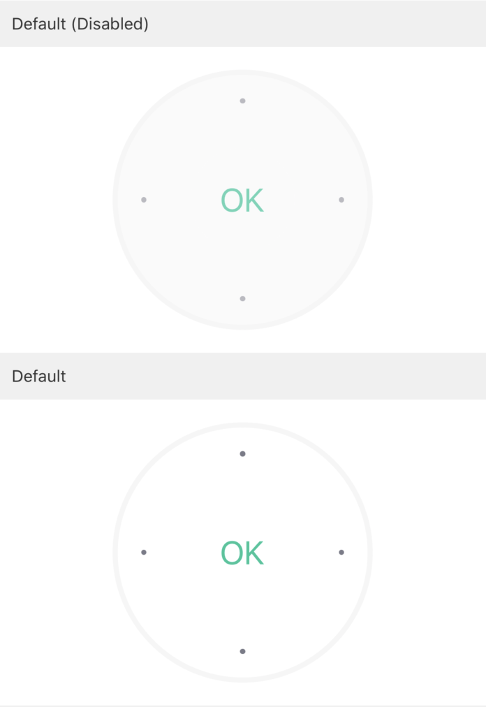
// Default (disabled)
<CircleHandle />
// Default
<CircleHandle
status={{
top: true,
bottom: true,
left: true,
right: true,
center: true,
}}
/>
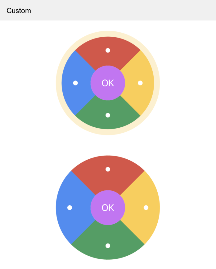
// Customize
<CircleHandle
padding={cx(10)}
outBgColor="rgba(246,206,95,0.3)"
radius={cx(90)}
centerRadius={cx(30)}
offset={cx(20)}
pointColor="#FFF"
pointRadius={cx(4)}
centerTextStyle={{ fontSize: cx(16), color: 'white' }}
bgColor={{
top: 'rgba(206,89,75,1)',
right: 'rgba(246,206,95,1)',
bottom: 'rgba(85,158,101,1)',
left: 'rgba(87,140,238,1)',
center: 'rgba(194,117,241,1)',
}}
activeBgColor={{
top: 'rgba(206,89,75,0.5)',
right: 'rgba(246,206,95,0.5)',
bottom: 'rgba(85,158,101,0.5)',
left: 'rgba(87,140,238,0.5)',
center: 'rgba(194,117,241,0.7)',
}}
disabledColor={{
center: 'red',
}}
status={{
top: true,
bottom: true,
left: true,
right: true,
center: true,
}}
/>
<CircleHandle
padding={0}
centerTextStyle={{ fontSize: cx(16), color: 'white' }}
outBgColor="rgba(246,206,95,0.3)"
radius={cx(90)}
centerRadius={cx(30)}
offset={cx(20)}
pointColor="#FFF"
pointRadius={cx(4)}
bgColor={{
top: 'rgba(206,89,75,1)',
right: 'rgba(246,206,95,1)',
bottom: 'rgba(85,158,101,1)',
left: 'rgba(87,140,238,1)',
center: 'rgba(194,117,241,1)',
}}
activeBgColor={{
top: 'rgba(206,89,75,0.5)',
right: 'rgba(246,206,95,0.5)',
bottom: 'rgba(85,158,101,0.5)',
left: 'rgba(87,140,238,0.5)',
center: 'rgba(194,117,241,0.7)',
}}
status={{
top: true,
bottom: true,
left: true,
right: true,
center: true,
}}
/>
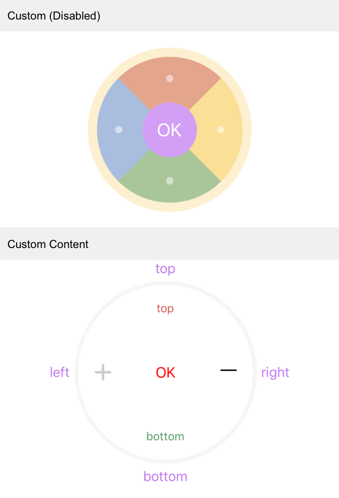
// Customize (disabled)
<CircleHandle
padding={cx(10)}
outBgColor="rgba(246,206,95,0.3)"
radius={cx(90)}
centerRadius={cx(30)}
offset={cx(20)}
pointColor="#FFF"
pointRadius={cx(4)}
centerTextStyle={{ fontSize: cx(20), color: '#FFF' }}
status={{
top: false,
bottom: false,
left: false,
right: false,
center: false,
}}
centerStatus={false}
disabledBgColor={{
top: 'rgba(206,89,75,0.5)',
right: 'rgba(246,206,95,0.5)',
bottom: 'rgba(85,158,101,0.5)',
left: 'rgba(87,140,238,0.5)',
center: 'rgba(194,117,241,0.7)',
}}
tipStyle={[styles.centerText, { fontSize: cx(15) }]}
/>
<CircleHandle
centerTextStyle={{ fontSize: cx(16), color: 'red' }}
keyContent={{
top: <TYText style={{ color: 'rgba(206,89,75,1)' }}>top</TYText>,
right: <IconFont d={icon.minus} size={cx(18)} />,
bottom: <TYText style={{ color: 'rgba(85,158,101,1)' }}>bottom</TYText>,
left: <Image source={img} style={{ tintColor: '#CCC' }} />,
}}
tip={{
top: 'top',
right: 'right',
bottom: 'bottom',
left: 'left',
}}
tipStyle={{ color: 'rgba(194,117,241,1)' }}
status={{
top: true,
bottom: true,
left: true,
right: true,
center: true,
}}
/>
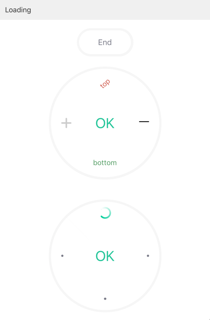
// Loading
<PressKey
width={cx(100)}
height={cx(50)}
onPress={() =>
this.setState({
loading: !this.state.loading,
isFirst: loading ? !isFirst : isFirst,
})
}
text={loading ? "End" : "Start"}
status={true}
/>
<CircleHandle
loading={{ top: loading && isFirst, center: loading && !isFirst }}
keyContent={{
top: <TYText style={{ color: 'rgba(206,89,75,1)' }}>top</TYText>,
right: <IconFont d={icon.minus} size={cx(18)} />,
bottom: <TYText style={{ color: 'rgba(85,158,101,1)' }}>bottom</TYText>,
left: <Image source={img} style={{ tintColor: '#CCC' }} />,
}}
status={{
top: true,
bottom: true,
left: true,
right: true,
center: true,
}}
/>
<CircleHandle
loading={{ top: loading && isFirst, center: loading && !isFirst }}
loadingContent={<Image source={loadingImg} />}
status={{
top: true,
bottom: true,
left: true,
right: true,
center: true,
}}
/>
Is this page helpful?
YesFeedbackIs this page helpful?
YesFeedbackMarketing Cooperation
Business Cooperation
Customer Service
Media Inquiry


