Device Item
Last Updated on : 2022-03-08 02:35:22Copy for LLMView as MarkdownDownload PDF
RollerAnimate
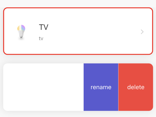
Preview
Properties
| Field name | Type | Description | Default value |
|---|---|---|---|
| height | StyleProp | component height | cx(110) |
| width | number | component width | screenWidth * 0.92 |
| icon | number | string | React.ReactNode | left icon | null |
| iconStyle | StyleProp<ImageStyle> | left icon style | null |
| title | string | title | null |
| titleStyle | StyleProp<TextStyle> | title style | null |
| subTitle | string | subtitle | null |
| subTitleStyle | StyleProp<TextStyle> | subtitle style | null |
| extra | React.ReactNode | custom content on the right | null |
| swipeContent | any | side swipe content | null |
| swipeContentButtonWidth | number | side slip distance | cx(80) |
| style | StyleProp<ViewStyle> | component style | null |
| rightIcon | number | string | React.ReactNode | right icon | arrow |
| rightIconStyle | StyleProp<ImageStyle> | right icon style | null |
| enableSwipe | boolean | whether to start sliding | ios:true android:false |
| disabled | boolean | whether to disable | false |
| showRightArrow | boolean | whether to show the right arrow | true |
| showShadow | boolean | whether to show shadows | true |
| onScroll | function | side slip trigger event | null |
| onPress | function | short press trigger event | null |
| onLongPress | function | long press trigger event | null |
| content | React.ReactNode | customize container content | null |
Example
import { DeviceItem } from 'tuya-panel-remote-sdk'

class Index extends Component {
  render() {
    return  <DeviceItem
          title="Title"
          subTitle="SubTitle"
          style={{ marginBottom: cx(20), borderColor: 'red', borderWidth: cx(2) }}
        />
  }
}
Is this page helpful?
YesFeedbackIs this page helpful?
YesFeedbackMarketing Cooperation
Business Cooperation
Customer Service
Media Inquiry


