Search Bar
Last Updated on : 2022-03-04 15:14:52Copy for LLMView as MarkdownDownload PDF
SearchInput
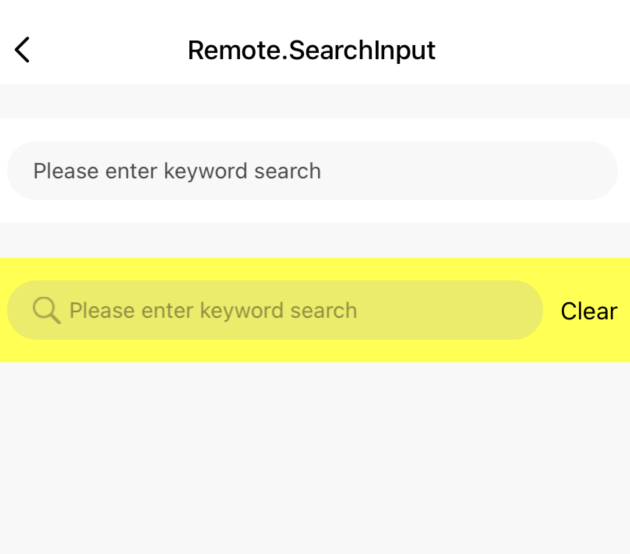
Preview
Properties
| Field name | Type | Description | Default value |
|---|---|---|---|
| style | StyleProp | The style of the component. | null |
| inputStyle | StyleProp | The style of the search box. | null |
| onChange | void | The search event that occurs in the search box. | null |
| allowClear | Boolean | Specifies whether to show a reset button. Default value: false. |
false |
| placeholder | string | The placeholder text in the search box. | Search by keyword |
| placeholderTextColor | string | The font color of the placeholder text in the search box. |
rgba(0,0,0,0.7) |
| onCancel | void | The reset event. | null |
| showSearchIcon | Boolean | Specifies whether to show a search icon. | null |
| searchImageStyle | ImageStyle | The style of the search icon. | null |
| searchIcon | string | The custom search icon. | null |
| defaultValue | string | The default value in the search box. | null |
| resetValue | string | The custom text on the reset button. Enter up to 12 characters. | Reset |
| resetTextStyle | StyleProp | The style of the custom text on the reset button. | null |
| resetTouchableStyle | StyleProp | The style of the reset button. | null |
Example
import { SearchInput } from '@tuya/tuya-panel-remote-sdk'

class SearchInput extends Component {
  render() {
    <View>
        <SearchInput  />
      </View>
  }
}
Is this page helpful?
YesFeedbackIs this page helpful?
YesFeedbackMarketing Cooperation
Business Cooperation
Customer Service
Media Inquiry


