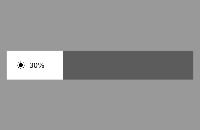
矩形亮度百分比滑动条
更新时间:2021-12-16 03:48:22LLM 副本以 Markdown 格式查看下载 PDF
BrightRectSlider
示图展示
组件简介
BrightRectSlider部分属性继承自数值滑动条NumberSlider
组件属性
| 字段名 | 类型 | 描述 | 默认值 |
|---|---|---|---|
| value | Number | 当前值 | 0 |
| min | Number | 允许滑动的最小值 | 0 |
| max | Number | 允许滑动的最大值 | 1000 |
| step | Number | 滑动时的步长 | 1 |
| disabled | Bool | 是否禁用 | false |
| trackColor | String | 轨道颜色 | 'rgba(0,0,0,.4)' |
| tintColor | String | 激活的轨道颜色 | '#fff' |
| invalidSwipeDistance | Number | 滑动生效的开始距离 | 7 |
| clickEnabled | Bool | 是否可以点击选择 | true |
| trackSlideEnabled | Bool | 是否可以能过轨道直接滑动 | false |
| showTint | Bool | 是否显示激活轨道 | true |
| direction | String | 滑动方向 'horizontal' 或 'vertical' |
'horizontal' |
| reverse | Bool | 是否反向滑动 当为水平滑动条时,默认滑条的最小值在左边,设置reverse = true后,最小值在右边 当为垂直滑动条时,默认滑条的最小值在下边,设置reverse = true后,最小值在上边 |
false |
| showAnimation | Bool | 使用动画显示 | true |
| thumbTouchSize | Obj | 拖动时,滑动的有效触控区大小 | { width: 40, height: 40 } |
| accessibilityLabel | String | 测试标位 | 'numberSlider' |
| thumbLimitType | String | 滑块的可滑动范围类型 inner 为滑动范围为滑块内,滑动不会超出轨道的范围 outer 为滑动范围可超出轨道范围,滑动时滑块中心位置可与轨道的边重叠 |
'inner' |
| onGrant | Func | 滑动开始事件 | 无 |
| onMove | Func | 滑动中事件 | 无 |
| onRelease | Func | 滑动结束事件 | 无 |
| onPress | Func | 点击事件 当 clickEnabled = true时,有效 |
无 |
| onChange | Func | 值改变时间 用户主动交互时,如果滑动条的数据值有变化,会触发此事件 |
无 |
| onThumbChange | Func | 滑块变动时触发事件,回调包含两个参数offset, value offset为滑块的相对轨道最小值一端的偏移量 value为滑块位置对应的数据值 |
无 |
| formatPercent | Func | 百分比格式化方法 | 无 |
| iconSize | Number | 图标大小 | 24 |
| iconColor | String | 图标颜色 | '#000' |
| percentStyle | Style | 百分比样式 | 无 |
| outPercentColor | String | 激活区外百分比颜色 | '#fff' |
使用示例
import React, { Component } from 'react';
import { View } from 'react-native';
import { BrightRectSlider } from '@tuya/tuya-panel-lamp-sdk';

export default class Scene extends Component {
  render() {
    return (
      <View style={{ flex: 1, alignItems: 'center', justifyContent: 'center' }}>
        <BrightRectSlider value={800} onMove={v => console.log('onMove', v)} />
      </View>
    );
  }
}
该内容对您有帮助吗?
是意见反馈该内容对您有帮助吗?
是意见反馈
关注“涂鸦智能”
涂鸦服务尽在掌握

关注“全球智能商业”
第一时间获取物联网资讯


