Grid List
Last Updated on : 2021-09-14 05:34:40Copy for LLMView as MarkdownDownload PDF
This topic describes the properties and example of the IP camera (IPC) grid list component TYIpcGridList. You can set the number of buttons to be displayed on each row. The component automatically displays all buttons evenly with the same width.
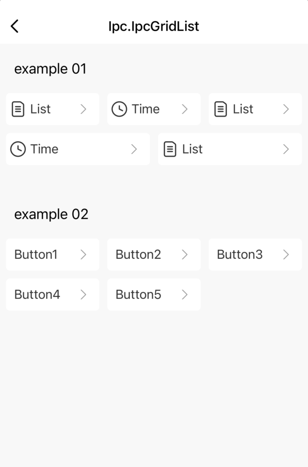
Preview
Properties and methods
| Field | Description | Required | Type | Default value |
|---|---|---|---|---|
| data | The source data. | Yes | Array | |
| rowNumber | The number of buttons on each row. | No | number | 3 |
| containerHorizontalWidth | The padding value of the container in the horizontal direction. | No | number | 10 |
| containerVerticalWidth | The padding value of the container in the vertical direction. | No | number | 10 |
| marginHorizontalWidth | The margin value of the buttons in the horizontal direction. | No | number | 5 |
| marginVerticalWidth | The margin value of the buttons in the vertical direction. | No | number | 5 |
| renderItem | The rendering function of the buttons. | Yes | Function | |
| isCover | If the number of buttons on the last row is not the value of rowNumber, these buttons are evenly distributed on the last row. |
No | bool | false |
| keyExtractor | The key value of each button. | No | Function | |
| onPress | The button tap event. | No | Function |
Example
import { TYIpcGridList } from '@tuya/tuya-panel-ipc-sdk';
import React from 'react';
import { View, Text, StyleSheet } from 'react-native';

interface itemInterface {
  item: any;
  index: number;
  buttonWidth: number;
}

const IpcGridList: React.FunctionComponent = () => {
  const handlePress = (item: { name: string }) => {
    console.log('click', item.name);
  };

  const renderButton = () => {
    const renderItem = (itemObj: itemInterface) => {
      const { item } = itemObj;
      return (
        <View style={styles.button}>
          <Text style={styles.text}>{item.name}</Text>
        </View>
      );
    };

    const data = [
      { name: 'Button1' },
      { name: 'Button2' },
      { name: 'Button3' },
      {
        name: 'Button4',
        prop: { disabled: true }
        // The `prop` property in the source data indicates the properties that are inherited by the buttons in the component.
      },
      { name: 'Button5' },
    ];

    return (
      <TYIpcGridList
        onPress={handlePress}
        keyExtractor={(item: { name: string }) => item.name}
        containerVerticalWidth={10}
        data={data}
        renderItem={renderItem}
        rowNumber={2}
      />
    );
  };

  return (
    <View style={styles.container}>
      {renderButton()}
    </View>
  );
};

const styles = StyleSheet.create({
  button: {
    alignItems: 'center',
    backgroundColor: '#fff',
    borderRadius: 5,
    flexDirection: 'row',
    height: 40,
    justifyContent: 'space-between',
    paddingLeft: 5,
    paddingRight: 5,
  },
  container: {
    backgroundColor: '#f8f8f8',
    flex: 1,
  },
  text: {
    color: '#333',
    fontSize: 16,
    marginLeft: 5,
  },
});

export default IpcGridList;
Is this page helpful?
YesFeedbackIs this page helpful?
YesFeedbackMarketing Cooperation
Business Cooperation
Customer Service
Media Inquiry


