Progress Bar
Last Updated on : 2021-06-08 07:08:16Copy for LLMView as MarkdownDownload PDF
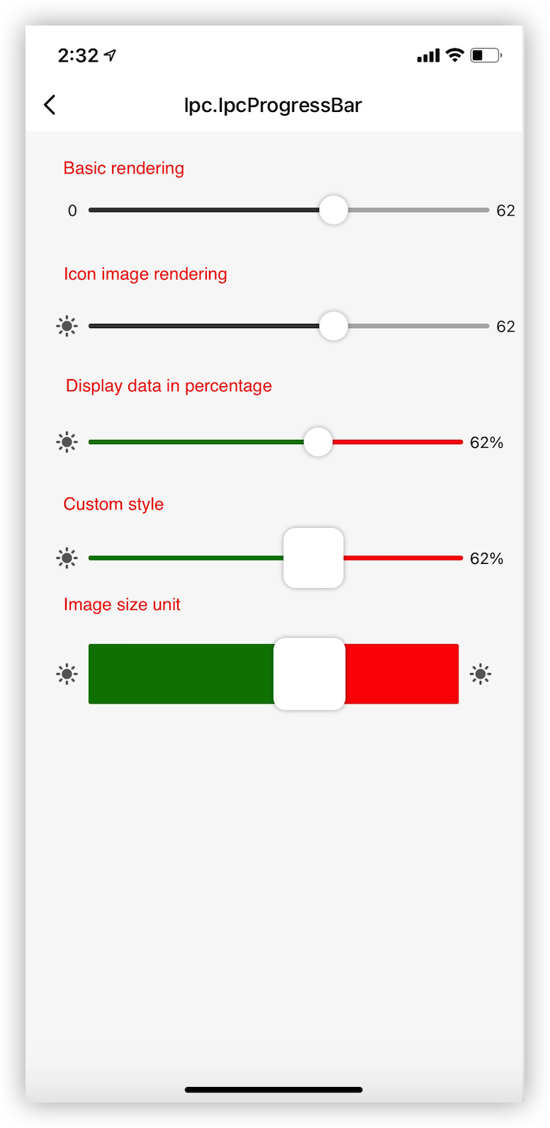
TYIpcProgressBar is encapsulated based on the basic component Slider, and extends the features of custom titles, units, and percentages.
Preview
Properties
| Field name | Data type | Description | Default value |
|---|---|---|---|
| onValueChange | func | The callback of value changes on the slider. | undefined |
| onSlidingComplete | func | The callback that is used when sliding is stopped. | undefined |
| barData | BarDataProps (see properties of BarDataProps) |
The data of the slider. | { key: 'key1', value: 0, min: 0, max: 100 } |
| containerStyle | ViewStyle | The style of the container. | {} |
| barContainStyle | ViewStyle | The style of the slider container. | {} |
| iconTitleBoxStyle | ViewStyle | The style of the slider title container. | {} |
| iconTitleTextStyle | TextStyle | The style of the slider title text. | {} |
| iconImageStyle | ImageStyle | The style of the slider title icon. | {} |
| percentUnitBoxStyle | ViewStyle | The style of the percentage or custom container. | {} |
| unitTextStyle | TextStyle | The style of the percentage or custom text. | {} |
| customUnitImageBoxStyle | ViewStyle | The style of the custom unit icon container. | {} |
| customUnitImageStyle | ImageStyle | The style of the custom unit icon. | {} |
| noPrecentBoxStyle | ViewStyle | The style of the default numeric text container. | {} |
| noPrecentTextStyle | ImageStyle | The style of the default numeric text. | {} |
| sliderStyle | ViewStyle | The style of the slider. | {} |
| sliderProperty | Object | Inherits the properties of the basic component Slider. |
{} |
Properties of BarDataProps
| Attribute | Data type | Required | Description | Default value |
|---|---|---|---|---|
| key | string | Yes | The custom key. | key1 |
| value | number | Yes | The current value. | 0 |
| min | number | Yes | The minimum value. | 0 |
| max | number | Yes | The maximum value. | 100 |
| disabled | boolean | No | Indicates whether this component is disabled. | false |
| maxColor | string | No | The color value that is larger than the current value. | #eee |
| minColor | boolean | No | The color value that is smaller than the current value. | #eee |
| maxColor | string | No | The color value that is larger than the current value. | #eee |
| showPercentUnit | boolean | No | Specifies whether to display the percentage of each unit. | false |
| noTitle | boolean | No | Specifies whether to hide the title. | false |
| noUnit | boolean | No | Specifies whether to hide the unit. | false |
| customUnitText | string | No | Customizes the unit text. | undefined |
| customUnitImage | image | No | Customizes the unit icon. | undefined |
Example
import { TYIpcProgressBar } from '@tuya/tuya-panel-ipc-sdk';
...
  const defaultBarData1 = {
    key: 'example1',
    value: 0,
    min: 0,
    max: 100,
    disabled: false,
    // noTitle: true,
    // noUnit: true,
 };
 ...
 const [barData1, setBarData1] = useState(defaultBarData1);

  const onValueChange = (value: number, key: string) => {
    const newBarData1 = { ...barData1, ...{ value } };
    setBarData1(newBarData1);
  };

    const onSlidingComplete = (value: number, key: string) => {
    const newBarData1 = { ...barData1, ...{ value } };
    setBarData1(newBarData1);
  };


   <TYIpcProgressBar
      onValueChange={onValueChange}
      onSlidingComplete={onSlidingComplete}
      barData={barData1}
      // Inherits the basic component `Slider`.
      sliderProperty={{
         trackStyle: { height: 50 },
         thumbStyle: {width: 60, height: 60}
      }}
   />
Is this page helpful?
YesFeedbackIs this page helpful?
YesFeedbackMarketing Cooperation
Business Cooperation
Customer Service
Media Inquiry


