Grid Menu
Last Updated on : 2021-04-23 12:22:59Copy for LLMView as MarkdownDownload PDF
TYIpcGrid is used to set the scrolling down function of a grid menu. You can dynamically control the number of menus in each row.
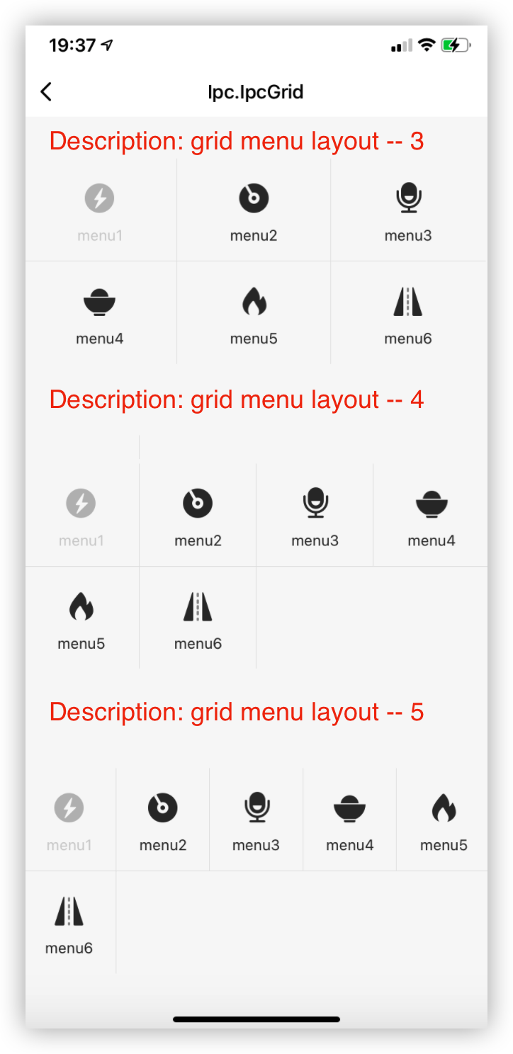
Preview
Properties
| Field name | Type | Description | Default value |
|---|---|---|---|
| containerStyle | ViewStyle | The style of the container. | 1 |
| data | Array | The data in the menu bar. | [] |
| rowNumber | number | The number of menus per row. | 4 |
| borderWidth | number | The stroke width of the menu. | 0.5 |
| hoverBgcColor | string | The hover background color of the icon. | '#e5e5e5' |
| activeColor | string | The active color. | '#fc2f07' |
| onPress | func | The click event of a switch button. | (key: string, itemData? : any) => void; |
| onPressIn | func | The pressIn event of a switch button. |
(key: string, itemData? : any) => void; |
| onPressOut | func | The pressOut event of a switch button. |
(key: string, itemData? : any) => void; |
| scrollProps | Object | The attributes inherited from ScrollView. |
{} |
| scrollEnabled | Boolean | Specifies whether scrolling is enabled in a container. | true |
| gridPaddingVertical | number | The vertical padding of each grid icon. | 15 |
| gridMenuItemStyle | ViewStyle | The container style of each submenu. | {} |
| gridTextBoxStyle | ViewStyle | The container style of the menu text. | {} |
| gridTextStyle | TextStyle | The style of the menu text. | {} |
| gridImgStyle | ImageStyle | The style of each icon | {} |
Example
import { TYIpcGrid } from '@tuya/tuya-panel-ipc-sdk';
...

   const gridData = [
    {
      key: 'menu1',   // The unique value of `key`.
      imgSource: Res.dpAntiFlicker, // The local image.
      imgTitle: 'menu1', // The menu text.
      disabled: true,    // Specifies whether to disable the menu icon.
      hidden: false,    // Specifies whether to hide the menu icon.
    },
    {
      key: 'menu2',
      imgSource: Res.dpCruise,
      imgTitle: 'menu2',
      disabled: false,
      hidden: false,
    },
    ...
  ];

  <TYIpcGrid data={gridData} rowNumber={5} />
Is this page helpful?
YesFeedbackIs this page helpful?
YesFeedbackMarketing Cooperation
Business Cooperation
Customer Service
Media Inquiry


