Reorderable Drag-and-Drop Component
Last Updated on : 2021-08-12 23:01:24Copy for LLMView as MarkdownDownload PDF
This topic describes the properties and example of the IP camera (IPC) reorderable drag-and-drop component TYIpcDragSort.
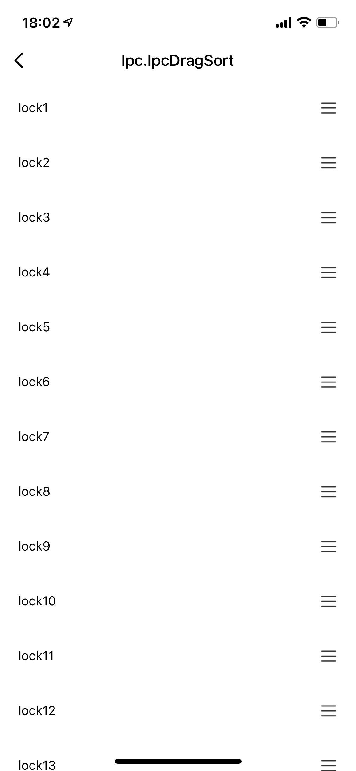
Preview
Properties and methods
| Field | Description | Required | Data type | Default value |
|---|---|---|---|---|
| containerStyle | The style of the outermost container for the component. | No | ViewStyle | {} |
| orderContain | The style of each container. | No | ViewStyle | {} |
| orderWidth | The width of a drag-and-drop icon. | No | number | 44 |
| icon | The drag-and-drop icon. | No | ReactNode | The default image icon. |
| itemHeight | The height of a container. | No | number | 60 |
| data | The data to be sorted. | Yes | Array | |
| touchPosition | The position of a drag-and-drop icon. | No | left or right | right |
| onOrder | The event that is triggered after sorting. | Yes | Function | |
| renderItem | The method to render sorted items. | Yes | Function | |
| onScroll | The scroll event of a container. | No | Function | () => {} |
| getListRef | Returns the Document Object Model (DOM) method of a container. | No | Function | () => {} |
Example
import { TYIpcDragSort } from '@tuya/tuya-panel-ipc-sdk';
import { View, Text } from 'react-native';
import { useState } from 'react';

// Generates the sorting data.
const arr = [];
for (let i = 1; i < 20; i++) {
  arr.push({
    id: i,
    name: `lock${i}`,
  });
}
const [list, setList] = useState(arr);

// Updates the current state after sorting.
const order = (data: any) => {
  setList(data.list);
};

// Renders the sorted items.
const _renderItem = (item: any) => {
  return (
    <View style={{ height: itemHeight }}>
      <Text style={{ color: '#000' }}>{item.name}</Text>
    </View>
  );
};

// The height of sorted containers.
const itemHeight = 60;

return (
  <View style={{ flex: 1 }}>
    <TYIpcDragSort
      itemHeight={itemHeight}
      onOrder={order}
      data={list}
      renderItem={_renderItem}
      orderWidth={60}
    />
  </View>
);
Is this page helpful?
YesFeedbackIs this page helpful?
YesFeedbackMarketing Cooperation
Business Cooperation
Customer Service
Media Inquiry


