App Music Card
Last Updated on : 2023-05-29 10:11:59Copy for LLMView as MarkdownDownload PDF
AppMusicCard
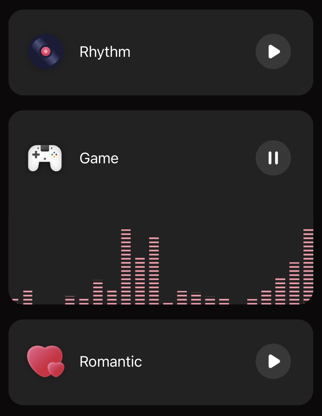
Preview
Properties
| Field name | Type | Description | Default value |
|---|---|---|---|
| style | List | The style of the component. | None |
| theme | { isDarkTheme: boolean; themeColor: string; background: string; fontColor: string } | The theme. | None |
| isColourExist | Boolean | Specifies whether to support the colored mode. | true |
| isTempExist | Boolean | Specifies whether to support the white color mode. | true |
| dataSource | [{ id: number; mode: number; title: string; icon: ImageSourcePropType; colorArea? : AppleMusicColorAreaType[] }] | Sets the metadata for the card. | [{id: 0, mode: 1, title: 'Music'}, {id: 1, mode: 0, title: 'Match'}, {id: 2, mode: 0, title: 'Game'}, {id: 3, mode: 1, title: 'Romance'}] |
| onPlay | () => void | The callback to invoke when a start or pause button event occurs. | None |
| onMusicDataPut | (data: { mode: number; hue: number; saturation: number; value: number; brightness: number; temperature: number }) => void | The callback to invoke when a music value is sent. | None |
Example
import { AppMusicCard } from '@tuya/tuya-panel-lamp-sdk'

const AppMusicCards = () => (
  <AppMusicCard
    style={{ alignSelf: 'center' }}
    theme={{
      isDarkTheme,
      themeColor: '#1082fe',
      background: isDarkTheme ? '#222222' : '#fff',
      fontColor: isDarkTheme ? '#fff' : '#000',
    }}
  />
);
Is this page helpful?
YesFeedbackIs this page helpful?
YesFeedbackMarketing Cooperation
Business Cooperation
Customer Service
Media Inquiry


