Tab Bar
Last Updated on : 2022-01-07 02:53:32Copy for LLMView as MarkdownDownload PDF
The tab bar component TabsBar is used to generate a tab bar. You can pass in an array of data to implement this feature.
TabsBar
-
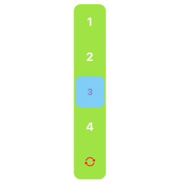
Vertical
-
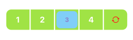
Horizontal
Common properties
| Field name | Data type | Description | Default value |
|---|---|---|---|
| horizontal | Boolean | Specifies whether to use a horizontal tab bar. | true |
| dataSource | { label: string; value: string / number; unSelectedIcon?: ReactNode }[] | The data source. | None |
| itemStyle | ViewStyle | The style of each option. | {} |
| value | String/Number | The custom value. | undefined |
| defaultValue | String/Number | The default value. | undefined |
| disabled | Boolean | Specifies whether to disable this component. | false |
| disabledOpacity | Number | The opacity of the disabled component. | 0.6 |
| divider | Boolean | Specifies whether to use a divider. | true |
| dividerStyle | ViewStyle | The style of the divider. | {} |
| style | ViewStyle | The style of the container. | {} |
| activeItemStyle | ViewStyle | The style of an active option. | {} |
| textStyle | TextStyle | The style of the text. | {} |
| activeTextStyle | TextStyle | The text style of an active option. | {} |
| onChange | (value: string / number) => void | The callback that is executed when users switch between the options. | ()=>{} |
Example
import React, { useState } from 'react';
import { StyleSheet } from 'react-native';
import { Utils } from 'tuya-panel-kit';
import { TabsBar } from '@tuya/tuya-panel-lamp-sdk';

const { convertX: cx } = Utils.RatioUtils;
const RadioScene = () => {
  const [radioValue, setRadioValue] = useState<string | number>('TEST0');

  const dataList = [
    ...Array.from('4321').map(i => ({
      label: `${5 - +i}`,
      value: `TEST${5 - +i}`,
    })),
  ];
  return (
    <TabsBar
      dataSource={dataList}
      onChange={(e: number | string) => {
        setRadioValue(e);
      }}
      dividerStyle={styles.dividerStyle}
      value={radioValue}
      style={styles.style}
      activeItemStyle={styles.activeItemStyle}
      textStyle={styles.textStyle}
      activeTextStyle={styles.activeTextStyle}
    />
  );
};
const styles = StyleSheet.create({
  activeItemStyle: {
    backgroundColor: '#87cefa',
    borderRadius: cx(10),
  },
  activeTextStyle: {
    color: '#87ce',
    fontSize: cx(15),
    fontWeight: '700',
  },
  dividerStyle: {
    backgroundColor: '#fff',
    height: '100%',
    width: cx(3),
  },
  style: {
    backgroundColor: '#a6e22e',
    borderRadius: cx(12),
    borderWidth: 0,
    height: cx(50),
    marginTop: cx(20),
    width: cx(300),
  },

  textStyle: {
    color: '#fff',
    fontSize: cx(20),
    fontWeight: '700',
  },
});
export default RadioScene;
Is this page helpful?
YesFeedbackIs this page helpful?
YesFeedbackMarketing Cooperation
Business Cooperation
Customer Service
Media Inquiry


