Countdown Picker
Last Updated on : 2022-05-07 06:22:34Copy for LLMView as MarkdownDownload PDF
CountdownPicker
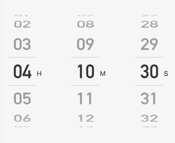
Preview
Properties
| Field name | Type | Description | The default value. |
|---|---|---|---|
| style | ViewStyle | The overall style of the component, such as the width, height, and center-aligned options. | None |
| innerRef | React.Ref<{ value: number }> | The ref attribute of the component. |
None |
| hourLabel | string | The hour label. | H |
| minuteLabel | string | The minute label. | M |
| secondLabel | string | The second label. | S |
| defaultValue | number | The default value. | 0 |
| value | number | The current value. | None |
| onChange | (value: number) => void | The callback of value changes. | None |
Example
import { CountdownPicker } from '@tuya/tuya-panel-lamp-sdk'

const CountdownPickers = () => (
  <CountdownPicker
    hourLabel="H"
    minuteLabel="M"
    secondLabel="S"
    defaultValue={1}
  />
);
Is this page helpful?
YesFeedbackIs this page helpful?
YesFeedbackMarketing Cooperation
Business Cooperation
Customer Service
Media Inquiry


