Common Timers
Last Updated on : 2022-01-28 00:33:57Copy for LLMView as MarkdownDownload PDF
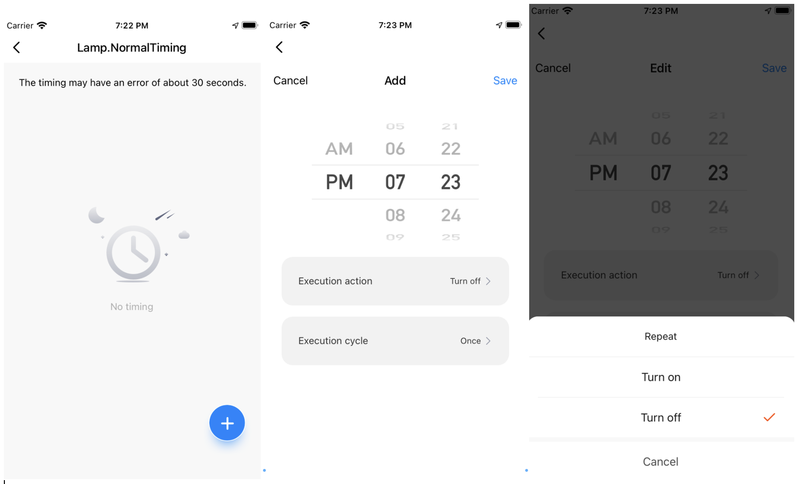
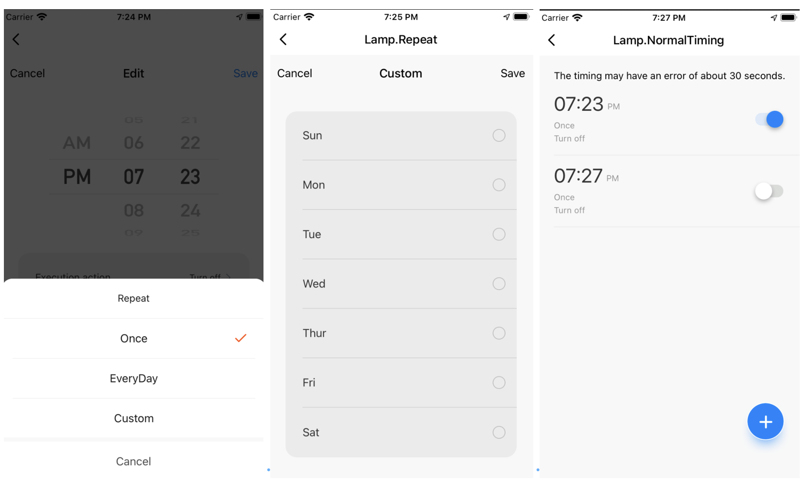
The NormalTiming object provides three components: Timer (a list of timers), AddTimer (add a timer), and Repeat (set a repetitive cycle). This simplifies the comprehensive interactive process to add, edit, select, or delete timers, and set a repetitive cycle. Cloud-based timers can be configured and saved to smart devices and the cloud using API requests in the cloud.
Preview


Timer
Properties
| Field name | Required | Data type | Description | Default value |
|---|---|---|---|---|
| navigation | No | StackNavigationProp | The information about route-based navigation. | None |
| route | Yes | RouteProp | The theme information specified by themeConfig and route information specified by timerConfig. |
None |
Properties of themeConfig:
| Field name | Required | Data type | Description | Default value |
|---|---|---|---|---|
| themeColor | No | String | The theme color. | '#1082fe' |
| fontColor | No | String | The font color. | '#626982' |
| backgroundColor | No | String | The background color. | '#fff' |
| noTimerTintColor | No | String | The fill color used instead of a timer image. | 'rgba(0, 0, 0, 0.3)' |
| scrollViewContentStyle | No | Style | The style of the timer list specified by ScrollView. |
None |
| timerStyle | No | Style | The style of a single timer item. | None |
| singleTimePickerStyle | No | SingleTimePickerProps | The style of the time picker. | Reference: Time Picker |
| rowStyle | No | Style | The style of the row. | {backgroundColor: 'rgba(0, 0, 0, 0.05)' } |
| weekOptionStyle | No | Style | The style of a custom cycle. | {centerBgc: 'rgba(0, 0, 0, 0.05)', borderBottomColor:'rgba(0, 0, 0, 0.1)', borderColor: 'rgba(0, 0, 0, 0.2)', } |
| switchOptionStyle | No | Style | The style of a timer switch. | style: {}, size: { activeSize: cx(24), width: cx(40), height: cx(18), margin: 0, }, tintColor: 'rgba(0, 21, 0, 0.12)', thumbTintColor: '#ffffff', thumbStyle:{}, onThumbBorderColor:'#ffffff', offThumbBorderColor: 'rgba(0, 21, 0, 0.12)', |
Properties of timerConfig
| Field name | Required | Data type | Description | Default value |
|---|---|---|---|---|
| addTimerRouter | No | String | Adds or edits a timer route. | None |
| openLampRouter | No | String | The route to run a timer for turning on a light. | None |
| weeksRouter | No | String | The route of a custom cycle. | None |
| useNavigation | No | Boolean | Specifies whether to use the new route for navigation. | By default, the new route navigation method React Navigation is used. Otherwise, navigation is implemented by TYSdk,Navigator. |
| is24Hour | No | Boolean | Specifies whether to use the 24-hour clock format. | false |
| limit | No | Number | The maximum number of timers that can be displayed simultaneously. | 30 |
| checkConflict | No | Boolean | Specifies whether conflicts between timers are checked in the cloud. | 1 |
| renderAddButtonElement | No | Element | Customizes the button to add a timer. | None |
| renderSwipeDelElement | No | Element | Customizes the swipeout action. | None |
| renderHeaderElement | No | Element | Customizes the header of a timer page. | None |
| customAddTimer | No | Func | Customizes the event of tapping to add a timer. | None |
AddTimer
Properties
| Field name | Required | Data type | Description | Default value |
|---|---|---|---|---|
| navigation | No | StackNavigationProp | The information about route-based navigation. | None |
| route | Yes | RouteProp | The route properties are listed in the following table. | None |
Properties of route
| Field name | Required | Data type | Description | Default value |
|---|---|---|---|---|
| timerId | No | String | The ID of a timer. | '' |
| isAdd | Yes | Boolean | Specifies whether to add a timer. | true |
| currTimerData | Yes | Object | The data of the current timer. | {hour: 12, minute: 0, weeks: [0, 0, 0, 0, 0, 0, 0, 0], dpPowerValue: false, hue: 0, saturation: 1000, value: 1000, brightness: 1000, temperature: 500, workMode: 'colour', } |
| onBack | No | Func | Returns the callback event. | None |
| onSave | No | Func | Saves the callback event. | None |
| customAddTimerSave | No | Func | The event of adding and saving a custom page. | None |
| customAddTimerBack | No | Func | The event of returning a new custom page. | None |
| customAddTimerDelete | No | Func | The event of deleting a new custom page. | None |
| themeColor | No | String | The theme color. | '#1082fe' |
| fontColor | No | String | The font color. | '#626982' |
| backgroundColor | No | String | The background color. | '#fff' |
| singleTimePickerStyle | No | SingleTimePickerProps | The style of the time picker. | Reference: Time Picker |
| rowStyle | No | Style | The style of the row. | {backgroundColor: 'rgba(0, 0, 0, 0.05)' } |
| weekOptionStyle | No | Style | The style of a custom cycle. | {centerBgc: 'rgba(0, 0, 0, 0.05)', borderBottomColor:'rgba(0, 0, 0, 0.1)', borderColor: 'rgba(0, 0, 0, 0.2)', } |
| openLampRouter | No | String | The route to run a timer for turning on a light. | None |
| weeksRouter | No | String | The route of a custom cycle. | None |
| useNavigation | No | Boolean | Specifies whether to use the new route for navigation. | By default, the new route is used. Otherwise, navigation is implemented by TYSdk, Navigator. |
| is24Hour | No | Boolean | Specifies whether to use the 24-hour clock format. | false |
| limit | No | Number | The maximum number of timers that can be displayed simultaneously. | 30 |
| checkConflict | No | Boolean | Specifies whether conflicts between timers are checked in the cloud. | 1 |
Repeat
Properties
| Field name | Required | Data type | Description | Default value |
|---|---|---|---|---|
| navigation | No | StackNavigationProp | The information about route-based navigation. | None |
| route | Yes | RouteProp | The route properties are listed in the following table. | None |
Properties of route
| Field name | Required | Data type | Description | Default value |
|---|---|---|---|---|
| weeks | Yes | number[] | The repetitive cycle of the timer. | [0, 0, 0, 0, 0, 0, 0] |
| onChange | Yes | Func | Saves the callback event. | None |
| themeColor | Yes | String | The theme color. | '#1082fe' |
| backgroundColor | Yes | String | The background color. | '#fff' |
| useNavigation | No | Boolean | Specifies whether to use the new route for navigation. | By default, the new route is used. Otherwise, navigation is implemented by TYSdk, Navigator. |
| weekOptionStyle | No | Style | The style of a custom cycle. | {centerBgc: 'rgba(0, 0, 0, 0.05)', borderBottomColor:'rgba(0, 0, 0, 0.1)', borderColor: 'rgba(0, 0, 0, 0.2)', } |
| switchOptionStyle | No | Style | The style of a timer switch. | style: {}, size: { activeSize: cx(24), width: cx(40), height: cx(18), margin: 0, }, tintColor: 'rgba(0, 21, 0, 0.12)', thumbTintColor: '#ffffff', thumbStyle:{}, onThumbBorderColor:'#ffffff', offThumbBorderColor: 'rgba(0, 21, 0, 0.12)', |
Example
Route configuration file routers.js
Use TYSdk.Navigator to implement route-based navigation.
import NormalTimingScene from './NormalTiming';
import AddTimerScene from './NormalTiming/addTimer';
import RepeatScene from './NormalTiming/repeat';
import TestWhiteScene from './NormalTiming/white';

const mainRouter = [
  {
    id: 'main',
    Scene: NormalTimingScene,
  },
  {
    id: 'addTimer',
    Scene: AddTimerScene,
  },
  {
    id: 'repeat',
    Scene: RepeatScene,
  },
  {
    id: 'testWhite',
    Scene: TestWhiteScene,
  },
];
NormalTIming/index.tsx
import React from 'react';
import { NormalTiming } from '@tuya/tuya-panel-lamp-sdk';

const { Timer } = NormalTiming;

const NormalTimingScene: React.FC<any> = () => {
  const themeConfig = {};
  const timerConfig = {
    addTimerRouter: 'addTimer',
    weeksRouter: 'repeat',
    openLampRouter: 'testWhite',
    useNavigation: false,// Uses `TYSdk.Navigator` to enable route-based navigation.
  };

  const route = {
    params: {
      timerConfig,
      themeConfig,
    },
  };
  return <Timer route={route} navigation={navigation} />;
};
export default NormalTimingScene;
NormalTIming/addTimer.tsx
import React from 'react';
import { NormalTiming } from '@tuya/tuya-panel-lamp-sdk';

const { AddTimer } = NormalTiming;

const AddTimerScene: React.FC<any> = props => {
  const themeConfig = {
    rowStyle: {
      backgroundColor: 'rgba(0,0,0,0.05)',
    },
  };
  const route = {
    params: {
      ...themeConfig,
      ...props,
    },
  };

  return <AddTimer route={route} />;
};

export default AddTimerScene;
NormalTIming/repeat.tsx
import React from 'react';
import { NormalTiming } from '@tuya/tuya-panel-lamp-sdk';

const { Repeat } = NormalTiming;

const RepeatScene: React.FC<any> = props => {
  const route = {
    params: {
      weekOptionStyle: {
        centerBgc: 'rgba(0,0,0,0.05)',
        borderBottomColor: 'rgba(0,0,0,0.1)',
        borderColor: 'rgba(0,0,0,0.2)',
      },
      ...props,
    },
  };

  return <Repeat route={route} />;
};
export default RepeatScene;
NormalTIming/white.tsx
import React from 'react';
import { View } from 'react-native';
import { TYSdk,TYText, Button} from 'tuya-panel-kit';

const TestWhiteScene: React.FC<any> = route => {
 const handleSave = () => {
    TYSdk.Navigator.pop();
    if (route.handleOpenSave) {
      route.handleOpenSave({
        workMode: 'white',
        hue: 10,
        saturation: 1000,
        value: 10,
        brightness: 500,
        temperature: 100,
      });
    }
  };

  return (
    <View style={styles.main}>
      <TYText>White Light Page</TYText>
      <Button
        size={24}
        text='Save'
        onPress={handleSave}
      />
    </View>
  );
};
export default TestWhiteScene;
Is this page helpful?
YesFeedbackIs this page helpful?
YesFeedback


