Week Selector
Last Updated on : 2021-09-30 11:19:54Copy for LLMView as MarkdownDownload PDF
WeekGroup
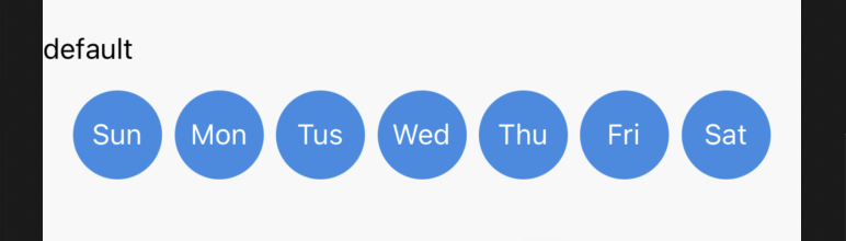
Preview
Properties
| Field name | Type | Description | Default value |
|---|---|---|---|
| style | ViewStyle | The component style. | None |
| theme | { fontSize? : number; fontColor? : string; iconSize? : number; bgWidth? : number; bgHeight? : number; bgColor? : string; margin? : number[]; iconColor? : string; bgRadius? : number } | The theme configuration. | None |
| background | string | The background color of the selector. | None |
| activeColor | string | The background color of an active button. | #1082FE |
| size | number | The size of a button. | 40 |
| accessibilityLabel | string | The test identification. | 'WeekGroup' |
| disabled | boolean | Specifies whether to disable a button. | false`` |
| defaultValue | number[] | The default value. | [0,0,0,0,0,0,0] |
| value | number[] | The current value. | None |
| onChange | (value: number[]) => void | The callback of value changes. | None |
Example
import { WeekGroup } from 'tuya-panel-lamp-sdk'

const WeekGroups = () => (
  <WeekGroup
    style={{ width: '100%' }}
    background="#323131"
    activeColor="#1082FE"
    theme={{ fontColor: '#fff' }}
    defaultValue={_.times(7, () => _.random(0, 1))}
  />
);
Is this page helpful?
YesFeedbackIs this page helpful?
YesFeedbackMarketing Cooperation
Business Cooperation
Customer Service
Media Inquiry


