Time Text Format
Last Updated on : 2022-04-02 05:50:16Copy for LLMView as MarkdownDownload PDF
TimeFormatComponent
Overview
TimeFormatComponent includes the following two components:
- Time point text format component:
TimeFormatComponent.SingleTime - Period text format component:
TimeFormatComponent.RangeTime
Common properties
| Field name | Data type | Description | Default value |
|---|---|---|---|
| is24Hour | Bool | Specifies whether to use the 24-hour clock format. | false |
| amText | String | The text that means the morning. | "AM" |
| pmText | String | The text that means the afternoon. | "PM" |
| itemStyle | Style | The style of each item. | {} |
| unitStyle | Style | The style of the unit. | {} |
| timeStyle | Style | The style of the time. | {} |
Time point text format properties
The following table describes the component <TimeFormatComponent.SingleTime />.
| Field name | Data type | Description | Default value |
|---|---|---|---|
| time | Number | The time. | 720 |
Period text format properties
The following table describes the component <TimeFormatComponent.RangeTime />.
| Field name | Data type | Description | Default value |
|---|---|---|---|
| startTime | Number | The start time. | 60 |
| endTime | Number | The end time. | 120 |
| is24HourTextStyle | Style | The text style of the time in the 24-hour clock format. | {} |
| contentStyle | Style | The style of the outermost container. | {} |
| isEllipsis | Bool | Specifies whether to replace the overflowing text with an ellipsis when the maximum length of a text field is exceeded. | false |
| isEllipsisStyle | Style | The style of the overflowing text. | {} |
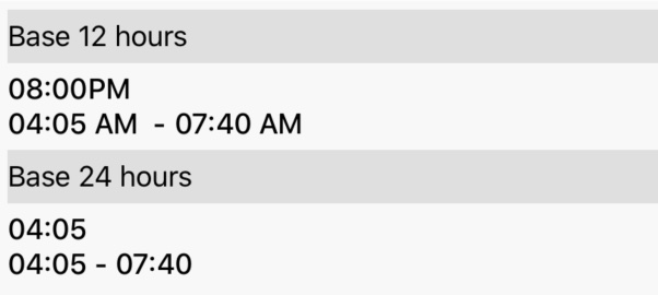
Example
import React from 'react';
import { TimeFormatComponent } from '@tuya/tuya-panel-lamp-sdk';

const { RangeTime, SingleTime } = TimeFormatComponent;

const TimeFormatComponentScene: React.FC<any> = () => {
  return (
    <>
      <SingleTime
        time={1200}
        is24Hour={false}
      />
      <RangeTime
        startTime={245}
        endTime={460}
      />
    </>
  );
};
export default TimeFormatComponentScene;
Is this page helpful?
YesFeedbackIs this page helpful?
YesFeedbackMarketing Cooperation
Business Cooperation
Customer Service
Media Inquiry


