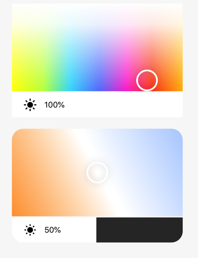
Rectangular Color and Brightness Picker
Last Updated on : 2021-12-16 02:33:18Copy for LLMView as MarkdownDownload PDF
RectColorAndBrightPicker
Overview
RectColorAndBrightPicker includes the following three components:
- The color picker
RectColorAndBrightPicker.ColourPicker - The white picker
RectColorAndBrightPicker.WhitePicker - The brightness slider
RectColorAndBrightPicker.BrightnessSlider
Common properties
| Field name | Type | Description | Default value |
|---|---|---|---|
| bgs | Array | The gradient background. | [] |
| thumbComponent | Func | The thumb component. | Thumb |
| disabled | Bool | Specifies whether to disable the component. | false |
| thumbSize | Number | The thumb size. | 38 |
| touchThumbSize | Number | The radius of the touchable area for the thumb. | 60 |
| showThumbWhenDisabled | Bool | Specifies whether to display the thumb when the picker is disabled. | true |
| clickEnabled | Bool | Specifies whether the thumb is moved after the picker is tapped. | true |
| lossShow | Bool | Specifies whether the color of the thumb can be specified. If the value is set to true, lossSliderColor takes effect and the thumb color and brightness are changed as specified. |
false |
| lossColor | String | The color of the thumb. | 'rgba(0,0,0,0.2)' |
| thumbImg | Any | The image of the thumb. | require('./res/thumb-mask.png') |
| onGrant | Func | The event in which the thumb starts to move. | None |
| onMove | Func | The event in which the thumb is moving. | None |
| onRelease | Func | The event in which the thumb is stopped. | None |
| onPress | Func | The event in which the track is touched. | None |
Color picker properties
The following table describes the properties of the component <RectColorAndBrightPicker.ColourPicker />.
| Field name | Type | Description | Default value |
|---|---|---|---|
| style | Style | The style of the component. | None |
| rectStyle | Style | The style of the color selection rectangle. | None |
| value | Obj | The current value. | { hue: 0, saturation: 1000, value: 1000 } |
| hueOffset | Number | The hue offset. | 60 |
| brightOption | Obj | The brightness of the slider. | {} |
| hideBright | Bool | Specifies whether to hide the brightness option. | false |
| lossSliderColor | String | The color of the brightness slider when lossShow is set to true. |
'rgba(255,255,255,0.4)' |
| bgs | Array | The color options of the picker. | The following example shows the default color options of the picker. |
| onGrant | Func | The event in which the thumb starts to move. | None |
| onMove | Func | The event in which the thumb is moving. | None |
| onRelease | Func | The event in which the thumb is stopped. | None |
| onPress | Func | The event in which the track is touched. | None |
Default color options of the picker:
[
  {
    colors: [
      { offset: '0%', stopColor: '#FFFC00', stopOpacity: 1 },
      { offset: '18%', stopColor: '#C3FF45', stopOpacity: 1 },
      { offset: '34%', stopColor: '#39DDFC', stopOpacity: 1 },
      { offset: '51%', stopColor: '#6382FC', stopOpacity: 1 },
      { offset: '67%', stopColor: '#FF3FD5', stopOpacity: 1 },
      { offset: '82%', stopColor: '#FE491F', stopOpacity: 1 },
      { offset: '100%', stopColor: '#FFB900', stopOpacity: 1 },
    ],
  },
  {
    x2: '0%',
    y2: '100%',
    colors: [
      { offset: '0%', stopColor: '#fff', stopOpacity: 1 },
      { offset: '24%', stopColor: '#fff', stopOpacity: 0.9 },
      { offset: '100%', stopColor: '#fff', stopOpacity: 0 },
    ],
  },
]
White picker properties
The following table describes the properties of the component <RectColorAndBrightPicker.WhitePicker />.
| Field name | Type | Description | Default value |
|---|---|---|---|
| style | Style | The style of the component. | None |
| rectStyle | Style | The style of the color selection rectangle. | None |
| storageKey | String | The key that is used to locally store the location of the thumb. | None |
| value | Obj | The current value. | { brightness: 500, temperature: 500 } |
| brightOption | Obj | The brightness of the slider. | {} |
| hideBright | Bool | Specifies whether to hide the brightness option. | false |
| lossSliderColor | String | The color of the brightness slider when lossShow is set to true. |
'rgba(255,255,255,0.4)' |
| direction | String | The arrangement of the white picker:
|
'leftBottom' |
| bgs | Array | The color options of the picker. | The following example shows the default color options of the picker. |
| onGrant | Func | The event in which the thumb starts to move. | None |
| onMove | Func | The event in which the thumb is moving. | None |
| onRelease | Func | The event in which the thumb is stopped. | None |
| onPress | Func | The event in which the track is touched. | None |
Default color options of the picker:
[
  { offset: '0%', stopColor: '#FF9F3E', stopOpacity: 1 },
  { offset: '50%', stopColor: '#FFFFFF', stopOpacity: 1 },
  { offset: '53%', stopColor: '#FFFFFF', stopOpacity: 1 },
  { offset: '100%', stopColor: '#B4D0FF', stopOpacity: 1 },
]
Properties of the horizontal brightness slider
The following table describes the properties of the component <RectColorAndBrightPicker.BrightnessSlider />.
| Field name | Type | Description | Default value |
|---|---|---|---|
| style | Style | The style of the component. | None |
| formatPercent | Func | The calculation in percent. | None |
| value | Number | The current value. | 0 |
| min | Number | The minimum value. | 10 |
| max | Number | The maximum value. | 1000 |
| minPercent | Number | The minimum percent. | 1 |
| disabled | Bool | Specifies whether to disable the component. | false |
| fontColor | String | The font color of the percent. | '#000' |
| trackColor | String | The color of the track. | '#313131' |
| activeColor | String | The color of the active track. | '#fff' |
| invalidSwipeDistance | Number | The minimum distance in which sliding changes the brightness setting. | 7 |
| clickEnabled | Bool | Specifies whether the thumb is moved after the picker is tapped. | false |
| onGrant | Func | The event in which the thumb starts to move. | None |
| onMove | Func | The event in which the thumb is moving. | None |
| onRelease | Func | The event in which the thumb is stopped. | None |
| onPress | Func | The event in which the track is touched. | None |
Example
import React, { PureComponent } from 'react';
import { View } from 'react-native';
import { RectColorAndBrightPicker } from '@tuya/tuya-panel-lamp-sdk';

export default class Scene extends PureComponent {
  render() {
    return (
      <View style={{ flex: 1, alignItems: 'center', justifyContent: 'center' }}>
        <View style={{ width: 300, height: 200, marginBottom: 20 }}>
          <RectColorAndBrightPicker.ColourPicker
            value={{
              hue: 0,
              saturation: 1000,
              value: 1000,
            }}
            onMove={v => {
              console.log('onMove', v);
            }}
          />
        </View>
        <View style={{ width: 300, height: 200, borderRadius: 20, overflow: 'hidden' }}>
          <RectColorAndBrightPicker.WhitePicker
            value={{ brightness: 500, temperature: 500 }}
            onMove={v => {
              console.log('onMove', v);
            }}
          />
        </View>
      </View>
    );
  }
}
Is this page helpful?
YesFeedbackIs this page helpful?
YesFeedbackMarketing Cooperation
Business Cooperation
Customer Service
Media Inquiry


