Music Drawer
Last Updated on : 2022-01-07 02:53:32Copy for LLMView as MarkdownDownload PDF
The drawer container component MusicDrawer is used to implement music player features. For example, you can pass in an array of data and specify a target index. This way, music options can be selected or canceled in the container. An external listener can be registered to listen for the index changes and trigger further actions.
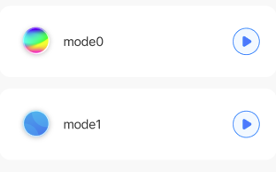
MusicDrawer
-
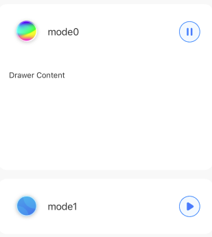
Inactive status:
-
Uneven distributed:
-
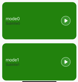
Custom style:
Common properties
| Field name | Data type | Description | Default value |
|---|---|---|---|
| height | Number | The default height of the component. | 102 |
| styles | Object | The object of the overall style. | None |
| value | Array | The data. | [] |
| activeIndex | Number | The default active index. | [] |
| onPress | ()=>void | The button tapping event. | None |
| renderActiveContent | (val: string | number) => ReactNode | None |
| onChangeIndex | (index: number) => void; | Listens for the index changes. | [] |
| animateDuration | number | The duration of the animation. | 300 |
| animateEasing | 'linear' 'bounce' 'ease' 'quad' | The process of the animation. | 'linear' |
Properties of styles
| Field name | Data type | Description | Default value |
|---|---|---|---|
| containerStyle | StyleProp |
The style of the container. | None |
| contentStyle | StyleProp |
The style of the content. | None |
| titleStyle | StyleProp |
The style of the title. | None |
| subTitleStyle | StyleProp |
The style of the subtitle. | None |
| leftIconStyle | StyleProp |
The style of the left icon. | None |
| rightIconStyle | StyleProp |
The style of the right icon. | None |
| leftIconBoxStyle | StyleProp |
The style of the left icon container. | None |
| rightIconBoxStyle | StyleProp |
The style of the right icon container. | None |
Properties of value
| Field name | Data type | Description | Default value |
|---|---|---|---|
| id | String | The key of content. | None |
| leftIconSource | ImageSourcePropType | The source of the left icon. | None |
| rightIconSource | Object | The source of the right icon. This is an object. | None |
| title | String | The content of the headline. | None |
| subTitle | String | The content of the subtitle. | None |
Properties of rightIconSource
| Field name | Data type | Description | Default value |
|---|---|---|---|
| startIcon | ImageSourcePropType | The source of the right start icon. | None |
| stopIcon | ImageSourcePropType | The source of the right stop icon. | None |
| normalIcon | ImageSourcePropType | The unified source of the right icon, no matter whether it is a start or stop icon. | None |
Example
import React, { useState } from 'react';
import { View, StyleSheet } from 'react-native';
import { MusicDrawer } from '@tuya/tuya-panel-lamp-sdk';
import { TYText } from 'tuya-panel-kit';
import Res from './res';

const MusicDrawers: React.FC = () => {
  const videoListData = ['multi', 'single'];
  const [activeVideoIndex, setActiveVideoIndex] = useState(-1);
  const DrawerData = videoListData.map((item, index) => ({
    id: item,
    leftIconSource: Res[`mode${index + 1}`],
    title: `${getLang('mode')}${index}`,
    rightIconSource: {
      stopIcon: Res.stopIconLight,
      startIcon: Res.startIconLight,
    },
  }));

  const renderActiveContent = (key: string) => {
    if (key === 'multi') {
      return (
        <View style={styles.imgCard} pointerEvents="none">
          <TYText style={{ padding: 20 }}>{getLang('drawerContent')}</TYText>
        </View>
      );
    }
    return (
      <View style={{ height: 50 }} pointerEvents="none">
        <TYText style={{ padding: 20 }}>{`${getLang('drawerContent')}2`}</TYText>
      </View>
    );
  };

  return (
    <View style={styles.container}>
        <MusicDrawer
          value={DrawerData}
          styles={{
            containerStyle: styles.videoContainer,
            contentStyle: styles.videoContent,
            titleStyle: styles.text,
            rightIconBoxStyle: styles.musicBtn,
            leftIconBoxStyle: styles.videoImg,
          }}
          activeIndex={activeVideoIndex}
          onPress={() => console.log('press')}
          onChangeIndex={setActiveVideoIndex}
          height={100}
          renderActiveContent={renderActiveContent}
        />
    </ScrollView>
  );
};

const styles = StyleSheet.create({
  container: {
    flex: 1,
  },
  imgCard: {
    height: 200,
    overflow: 'hidden',
    width: '100%',
  },
  musicBtn: {
    backgroundColor: 'rgba(255,255,255,0.1)',
    borderRadius: 19,
    borderWidth: 0,
    marginRight: 24,
  },
  text: { fontSize: 18 },
  title: {
    marginVertical: 10,
    paddingLeft: 15,
  },
  videoContainer: {
    borderRadius: 16,
    marginBottom: 16,
  },
  videoContent: {
    backgroundColor: '#fff',
    borderRadius: 16,
    paddingLeft: 14,
  },
  videoImg: {
    height: 52,
    marginHorizontal: 12,
    width: 52,
  },
});

export default MusicDrawers;
Is this page helpful?
YesFeedbackIs this page helpful?
YesFeedbackMarketing Cooperation
Business Cooperation
Customer Service
Media Inquiry


