Theme Color
Last Updated on : 2026-01-12 03:04:02download
This topic describes how to configure the theme color of a microapp and toggle between dark mode and light mode.
Toggle between color modes
In your microapp, you can toggle between dark mode and light mode to configure the theme color. You can choose the desired theme mode on the Tuya Developer Platform. The microapp at runtime depends on the mode you have selected.
When developing in local mode, you can specify the theme mode after the microapp starts, helping develop an application of the desired theme color.
-
The microapp starts in light mode by default.
package.json - scriptslooks like this:"start": "micro-script start --main" -
To start the microapp in dark mode, change the start command into the following one:
"start": "MICRO_THEME=dark micro-script start --main"The style of common content such as the background and border is set to match the color value of the selected mode.

Development example
For custom-developed content or a custom color scheme, you can write the less style code of the specific mode in the style file under src/styles. This helps you implement the adaptation to changes in theme colors.
API description
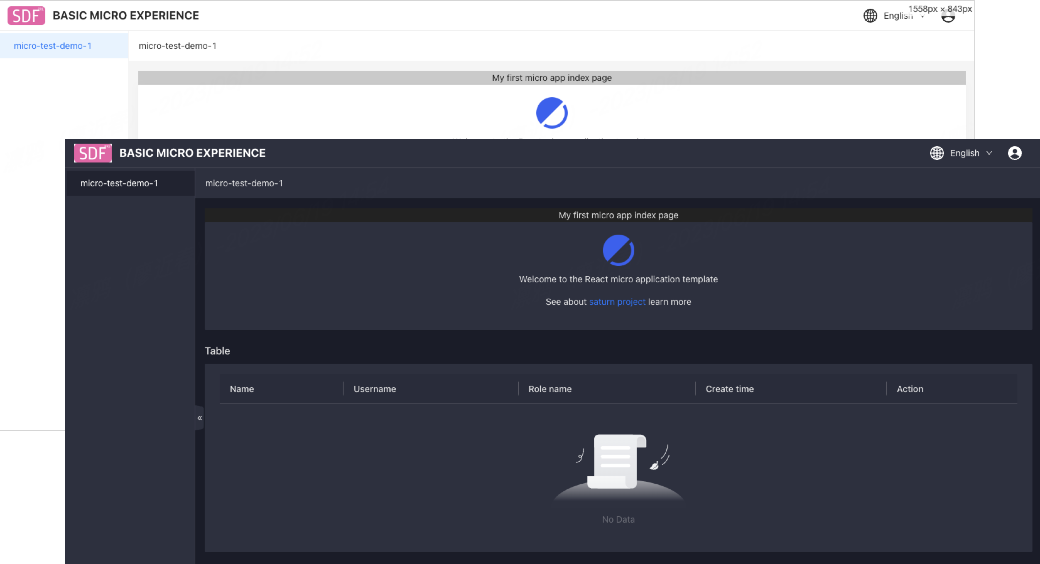
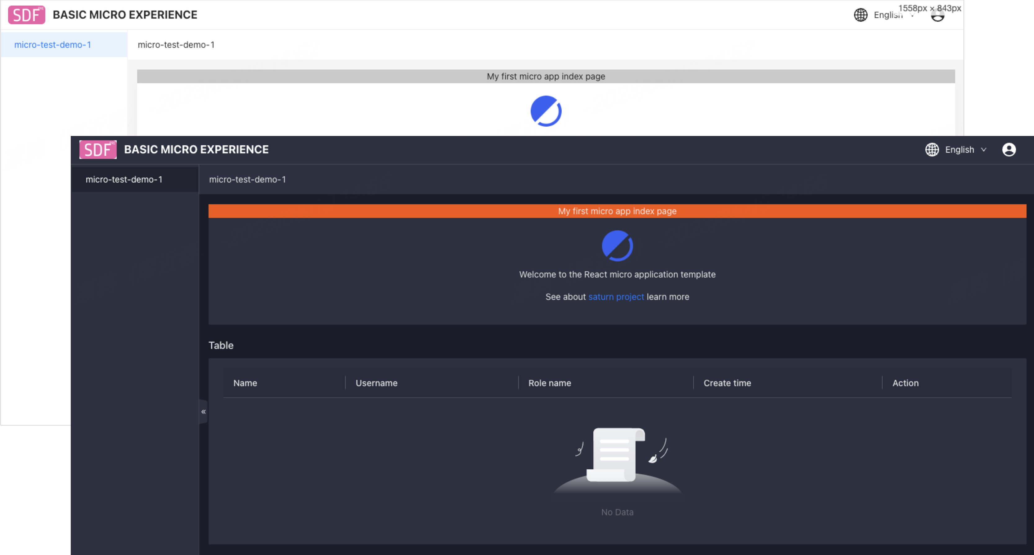
The microapp has a div element with an orange background in dark mode and a light gray background in light mode.
Feature implementation
-
Define the style variables and variable values in light and dark modes in the
src/light.lessandsrc/dark.lessstyle files respectively.-
src/light.less:@MyComponentBackgroundColor: rgb(202, 202, 202); -
src/dark.less:@MyComponentBackgroundColor: rgb(202, 202, 202);
-
-
Then, output variables in the
src/global.lessfile.src/dark.less:body { --my-component-background-color: @MyComponentBackgroundColor; } -
After you define the variables, reference the variables directly in the
cssstyle file of the page or component./src/pages/index.module.less:.my-component-bg { background-color: var(--my-component-background-color); } -
On the page, import the color mode:
import styled from './index.module.less'; <div id="style-test" className={styled['my-component-bg']}> my first micro app. </div>; -
After you complete the above development steps, the element
id="style-test"can help you show an orange background in dark mode and a light gray background in light mode.
Is this page helpful?
YesFeedbackIs this page helpful?
YesFeedback


