Responsive Layouts
The information priority and layout compatibility are important factors that you must consider when you design app panels. An ideal layout brings excellent visual effect and user experience. This can increase the popularity of your app.
In the Panel Studio, common layout styles are available. You can configure the preferred panel with a few simple steps.
Common layout styles
The following table lists multiple predefined layouts and a blank layout. You can customize the blank layout.
| Layout style | Layout effect | Description |
|---|---|---|
| Full-screen scroll | 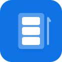 |
Applies to the waterfall global scroll style. |
| Partial scroll | 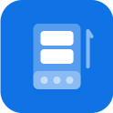 |
The upper section scrolls and the bottom section is pinned to the edge. |
| Pinned bottom | 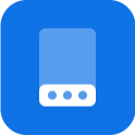 |
The bottom is pinned to the edge on different screens. |
| Pinned top | 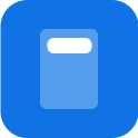 |
The top is pinned to the edge and the other sections scroll. |
| Scrollable bottom | 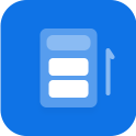 |
The top is pinned to the edge on different screens. |
| Blank | 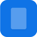 |
Supports customized layouts. |
To configure these layouts and achieve the required effect, you can customize the layout settings.
Responsive layouts
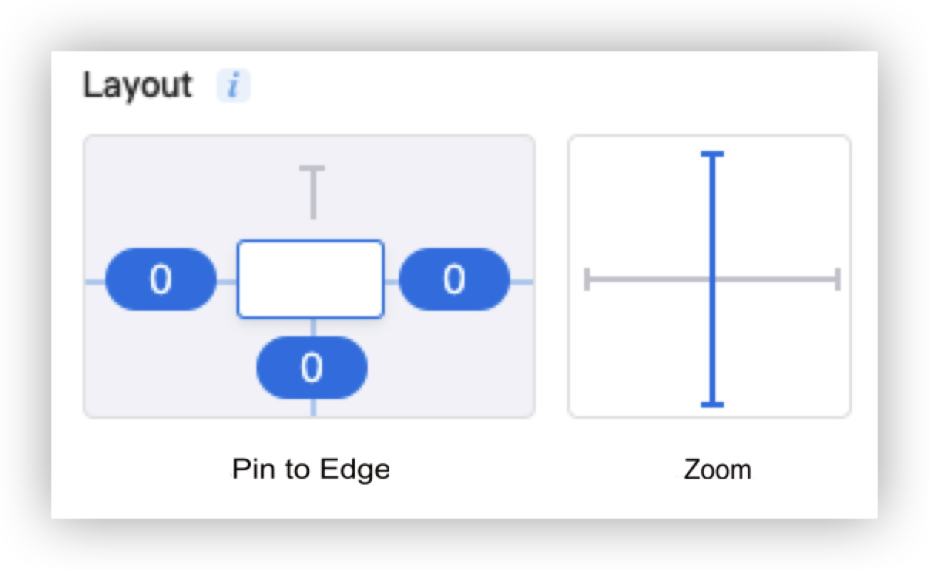
In the Panel Studio, you can customize the following layout settings to support different screen sizes: Pin to Edge and Zoom.
-
Pin to Edge: supports the margin settings in a layout. The top margin is the distance between the top edge of a component and the top edge of the canvas or a frame. The definition is similar to the bottom margin, left margin, and right margin. If the dimensions of the mobile screen are changed, the margins can be proportionally scaled based on specific settings.
-
Zoom: The aspect ratio of a component is fixed. The aspect ratio is the ratio of width to height. If the dimensions of the mobile screen are increased, the component is enlarged with the specified aspect ratio.
-
The following options are available for settings:
- Pin to Edge: Pin to Top, Pin to Bottom, Pin to Left, and Pin to Right.
- Zoom: Horizontal Zoom and Vertical Zoom.
Scenarios
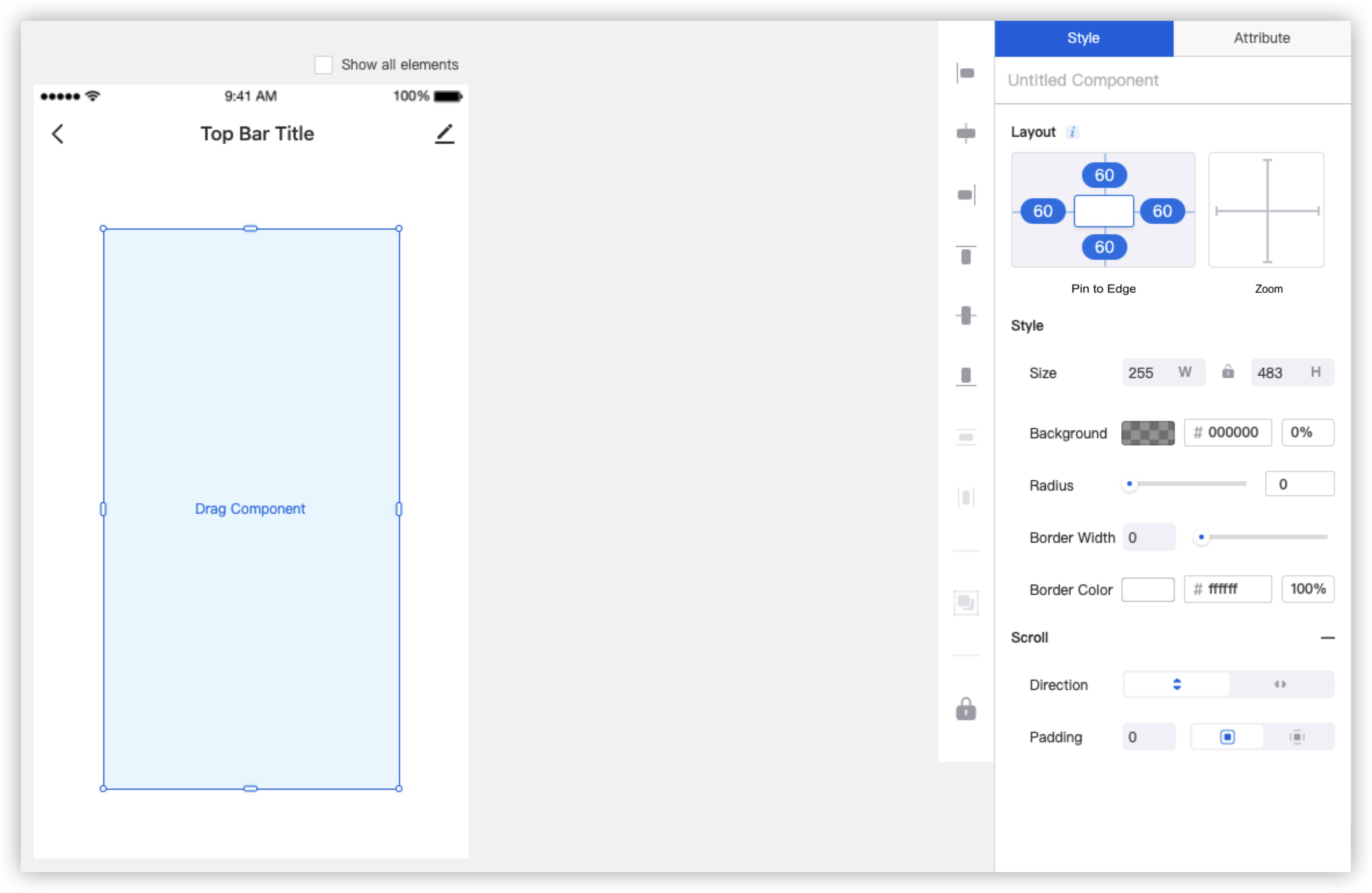
To apply the layout settings, perform the following steps:
- Drag the Scroll layout to the canvas.
- Select the Scroll layout, and set each value of Pin to Left, Pin to Right, Pin to Top, and Pin to Bottom for the layout to 60.
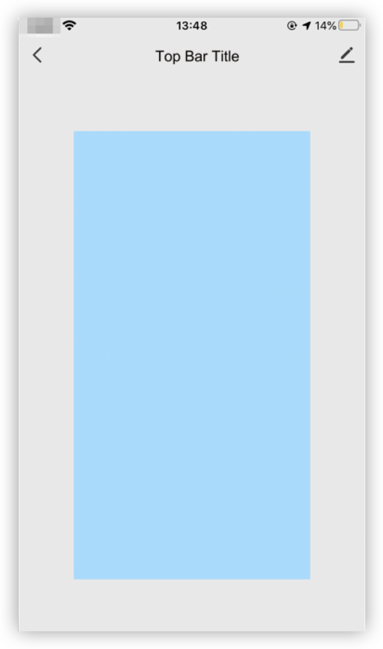
- Click Preview in the top right corner of the page and scan the QR code that appears to preview the layout effect. The following table shows the effect on different mobile phone screens, such as the screens of iPhone 6S and iPhone XS Max:
| Layout setting | iPhone 6S | iPhone XS Max |
|---|---|---|
 |
 |
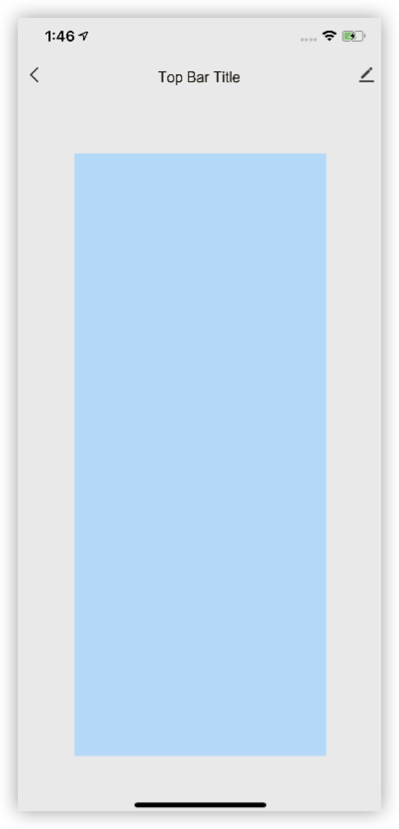 |
In this example, four margin options are set to the same value. The display effect of the component varies on different mobile phone screens, iPhone 6S and iPhone XS Max. The horizontal effect is similar. However, in terms of the vertical effect, iPhone XS Max shows a higher component than iPhone XS.
In this case, four margins are proportionally scaled.
This configuration style applies to images and layout components such as frames, stacks, and scrolls.
Combinations of layout options
You can combine different layout options to achieve the required effects.
Layout options can be divided into horizontal and vertical groups. The following list shows three attributes that are included in each group:
- Horizontal group: Pin to Left, Pin to Right, and Horizontal Zoom.
- Vertical group: Pin to Top, Pin to Bottom, and Vertical Zoom.
Each combination of layout options must include two horizontal attributes and two vertical attributes. For example, the following attributes can be combined: Pin to Left, Pin to Right, Pin to Bottom, and Vertical Zoom.
The following list shows the available horizontal and vertical combinations:
- Horizontal: Pin to Left and Vertical Zoom, Pin to Right and Horizontal Zoom, Pin to Left and Pin to Right.
- Vertical: Pin to Top and Vertical Zoom, Pin to Bottom and Vertical Zoom, Pin to Top and Pin to Bottom.
Predefined layout settings
The Panel Studio provides predefined layouts. The following table lists common option combinations for the predefined layouts.
| Layout style | Layout effect | Description | Combination of layout options |
|---|---|---|---|
| Full-screen scroll | |
Applies to the waterfall global scroll style. | Full-screen scroll: Set each value of Pin to Left, Pin to Right, Pin to Top, and Pin to Bottom to 0. |
| Partial scroll | |
The upper section scrolls and the bottom section is pinned to the edge. | Top scroll: Set each value of Pin to Left, Pin to Right, and Pin to Top to 0. Bottom stack: Set each value of Pin to Left, Pin to Right, and Pin to Bottom to 0. |
| Pinned bottom | |
The bottom is pinned to the edge on different screens. | Top stack: Set each value of Pin to Left, Pin to Right, and Pin to Top to 0. Bottom stack: Set each value of Pin to Left, Pin to Right, and Pin to Bottom to 0. |
| Pinned top | |
The top is pinned to the edge and the other sections scroll. | Top stack: Set each value of Pin to Left, Pin to Right, and Pin to Top to 0. Bottom stack: Set each value of Pin to Left, Pin to Right, and Pin to Bottom to 0. |
| Scrollable bottom | |
The top is pinned to the edge on different screens. | Top stack: Set each value of Pin to Left, Pin to Right, and Pin to Top to 0. Bottom stack: Set each value of Pin to Left, Pin to Right, and Pin to Bottom to 0. |
| Blank | |
Supports customized layouts. | Full-screen frame: Set each value of Pin to Left, Pin to Right, Pin to Top, and Pin to Bottom to 0. You can drag the component to customize the layout options. |
Is this page helpful?
YesFeedbackIs this page helpful?
YesFeedback


