Basic Map
Overview
A basic map component displays geographic data by combining two-dimensional outline maps and online map services. You can edit map styles based on geographic information sub-components such as basemap, scatter, and flight layers.
Moreover, this component supports map interaction modes such as hovering, dragging, single-clicking to drill down, and double-clicking to focus.
Component structure
A basic map is composed of a parent component and sub-components. The rendering of the sub-component is overlaid on the parent component. You can define the configuration items depending on actual scenarios.
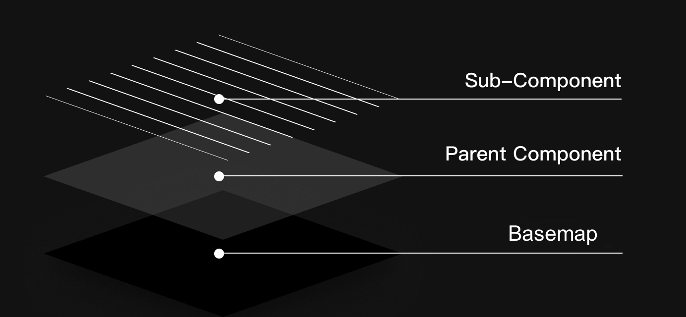
Structure diagram
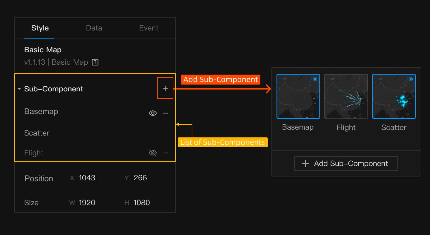
Sub-component diagram
Component configuration
Parent component style
In the Style tab, you can set up component attributes, basic settings, map styles, and interaction settings.
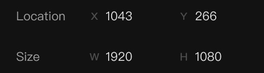
Attribute
| Item | Description |
|---|---|
| Position |
|
| Size |
|
Attribute panel
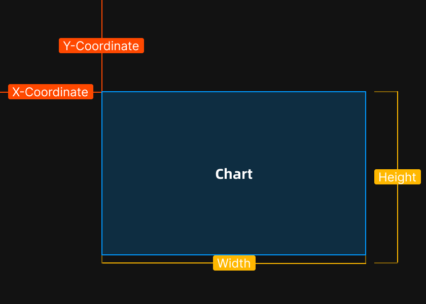
Diagram of position and size
Basic configuration
| Item | Description |
|---|---|
| Map extent | Data can be retrieved at four levels, including China, province, city, and district. |
| Map center | The latitude and longitude of the center within the visible range on the initial map. |
| Zoom level | The size of the initial map. |
Map style
| Item | Description |
|---|---|
| Fill color | Set the map color, including solid color and linear gradient color. You can set the overall transparency if a solid color is selected and adjust the gradient angle if a linear gradient color is selected. |
| Stroke | Set the stroke width and color for each area. |
| Shadow | Set the shadow parameters of the overall map. |
Basemap sub-component style
By default, the online tile map is displayed at the bottom of the map layer after being added. You can choose from multiple styles, and customize your favorite style.
Basic settings
| Item | Description |
|---|---|
| Style | You can choose from 11 styles. |
| Style—custom | Make API calls to request AutoNavi custom map styles, and configure the key and style ID in the AutoNavi custom map application. |
Scatter sub-component style
It is used to represent dots on a map. You can set the dot styles for different data types.
Scatter type
| Item | Description |
|---|---|
| General dot | The returned location information is displayed on the map. |
| Dot with variable size | The returned location information is displayed on the map. The dot size dynamically changes with the data. |
| Custom | With the variant of a general dot, you can customize image uploading and set personalized dot icons. |
General dot—scatter style
| Item | Description |
|---|---|
| Dot radius | Set the dot radius. Unit: pixels. |
| Stroke width | Set the stroke width of a dot. |
| Color attribute |
|
| Overlay |
|
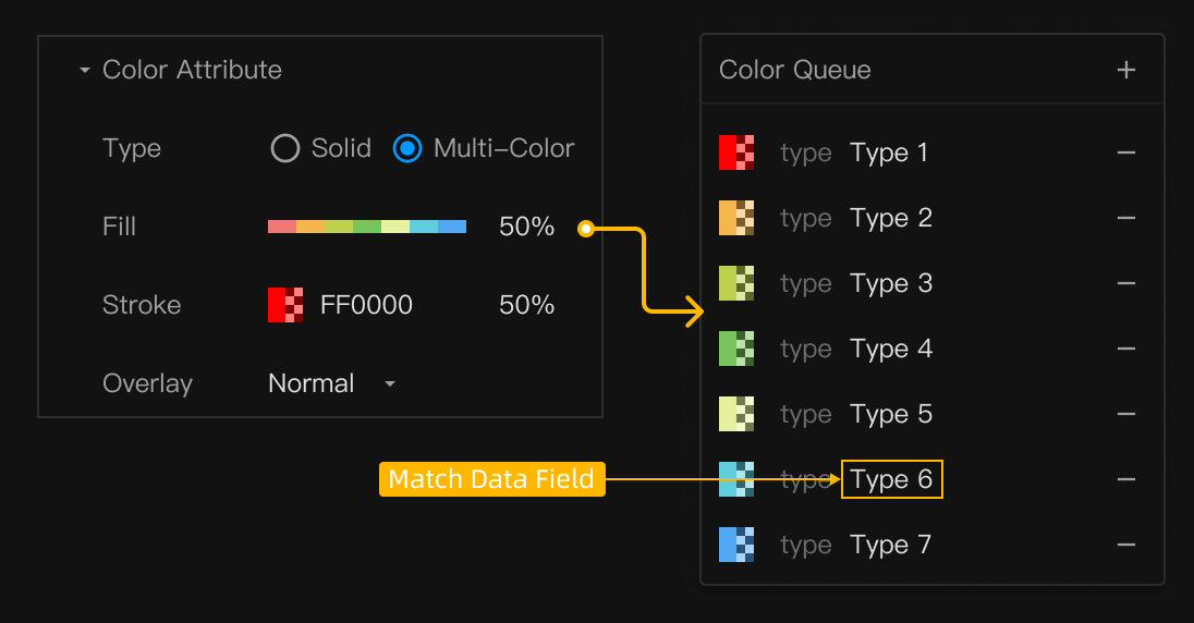
Diagram of multi-color panel
Dot with variable size—scatter style
| Item | Description |
|---|---|
| Dot radius | Set the minimum and maximum radius of a dot, corresponding to the minimum and maximum value in the data. Unit: pixels. |
| Stroke width | Set the stroke width of a dot. |
| Color attribute |
|
| Overlay |
|
Custom—scatter style
| Item | Description |
|---|---|
| Image size | Set the image size. Unit: px. |
| Overlay |
|
Flight sub-component style
Flight is used to represent the relationship and connection of two geographical things, or population migration, logistics origin and destination, and more.
Flight style
| Item | Description |
|---|---|
| Flight length | Set the total length of a flight. Unit: meter. |
| Flight width | Set the width of a flight. Unit: meter. |
| Relative height | Set the height of the midpoint on a flight. Unit: meter. |
| Color attribute |
|
Animation settings
Set the flying speed of a flight.
Data configuration
Scatter map
Component data format—scatter
| Field | Description |
|---|---|
| lng | Short for longitude. |
| lat | Short for latitude. |
| type | The type. |
| value | The value. |
Sample data
[
  {
    "value": 77,
    "type": "Type 3",
    "lng": 109.883809,
    "lat": 29.08545
  },
  {
    "value": 42,
    "type": "Type 1",
    "lng": 105.134251,
    "lat": 30.452189
  },
  {
    "value": 16,
    "type": "Type 7",
    "lng": 104.923959,
    "lat": 26.052122
  }
]
Flight map
Component data format—flight
| Field | Description |
|---|---|
| fromLng | The longitude of the start point. |
| fromLat | The latitude of the start point. |
| toLng | The longitude of the end point. |
| toLat | The latitude of the end point. |
| type | The type. |
Sample data
[
 {
    "type": "Outflow",
    "fromLng": 116.419371,
    "fromLat": 39.91347,
    "toLng": 86.095104,
    "toLat": 39.81725
  },
  {
    "type": "Outflow",
    "fromLng": 116.419371,
    "fromLat": 39.91347,
    "toLng": 85.153658,
    "toLat": 33.864962
  },
  {
    "type": "Outflow",
    "fromLng": 116.419371,
    "fromLat": 39.91347,
    "toLng": 121.856834,
    "toLat": 39.22046
  }
]
Data configuration items
| Item | Description |
|---|---|
| Data source | Select a data source. |
| Scheduled refresh | Set the time interval of data requests. |
Is this page helpful?
YesFeedbackIs this page helpful?
YesFeedback


