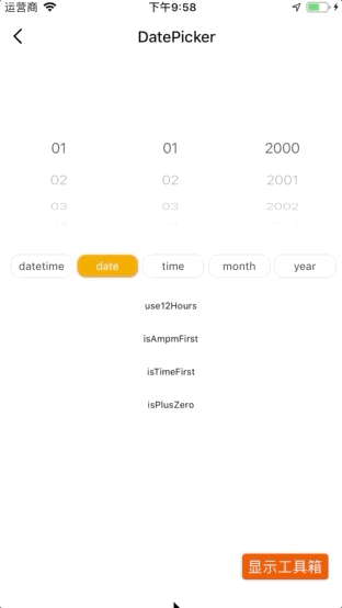
DatePicker
In the Tuya device control panel, choosing a time and date is a common requirement. DatePicker is a flexible multi-mode component to select the time and date.
Code demo
Note: for more information, see DatePicker Demo.
Controlled
During selection, DatePicker returns the currently selected value as the onDateChange callback parameter. The value of DatePicker depends on the passed-in date, so we need to manually re-pass the returned value to the component to complete the selection.
In the example below, DatePicker is a controlled component. See Forms for an explanation of the controlled component.
import React from 'react';
 import { View } from 'react-native';
 import { DatePicker } from 'tuya-panel-kit';

export default class DatePickerDemo extends React.PureComponent {
  constructor(props) {
    super(props);
    this.state = {
      selectDate: new Date();
    }
  }
  render() {
    return (
      <View style={styles.wrApper}>
        <DatePicker
          date={this.state.selectDate}
          onDateChange={selectDate => this.setState({ selectDate })}
          style={styles.datePickerStyle}
        />
      </View>
    )
  }
 }
Uncontrolled
In the example below, DatePicker is an uncontrolled component. For more information, see Uncontrolled Components.
The value of DatePicker depends on the internal state.
import React from "react";
 import { View } from "react-native";
 import { DatePicker } from "tuya-panel-kit";

const DatePickerDemo = () => (
  <View style={styles.wrApper}>
    <DatePicker
      defaultDate={new Date()}
      onDateChange={(date) => console.log(date)}
      style={styles.datePickerStyle}
    />
  </View>
 );
Interaction demo
API
style
Specify the container style to encapsulate datePicker.
| Type | Required |
|---|---|
| ViewPropTypes.style | No |
mode
The selection type of the selector.
date: select the date (year, month, and day).time: select the time (hour and minute).datetime: select the date and time (year, month, day, hour, and minute).year: select the year (year).month: select the month (year and month).
| Type | Required |
|---|---|
enum: 'date', 'time', 'datetime', 'year', 'month' |
No |
loop
Select whether picker loops.
| Type | Required | Default value |
|---|---|---|
bool |
No | false |
pickerFontColor
Font color in picker.
| Type | Required | Default value |
|---|---|---|
| ColorPropType | No | #333 |
date
The currently selected value determines that this attribute is the controlled component.
| Type | Required |
|---|---|
Date |
No |
defaultDate
The value selected by default.
| Type | Required |
|---|---|
Date |
No |
minDate
Set the minimum selectable value.
| Type | Required | Default value |
|---|---|---|
Date |
No | 2000/01/01 |
maxDate
Set the maximum selectable value.
| Type | Required | Default value |
|---|---|---|
Date |
No | 2030/12/31 |
use12Hours
Specify whether it is 12-hour system.
| Type | Required | Default value |
|---|---|---|
bool |
No | false |
isAmpmFirst
Select whether the morning or afternoon column is the first selected column. It only takes effect when use12Hours is true.
| Type | Required | Default value |
|---|---|---|
bool |
No | false |
isTimeFirst
Specify whether the hour and minute options are before year, month, and day.
| Type | Required | Default value |
|---|---|---|
bool |
No | false |
locale
Multilingual settings.
cn: Chinese, displayed with units.en: English, displayed without units.ILocale: multilingual object, which can copy the language value corresponding to the default key.
interface ILocale {
  am? : string;
  pm? : string;
  year? : string;
  month? : string;
  day? : string;
  hour? : string;
  minute? : string;
 }
| Type | Required | Default value |
|---|---|---|
enum: 'cn', 'en' |
ILocale | No |
dateSortKeys
The sorting rule of year, month and day options. It is year/month/day by default. ['month', 'day', 'year'] sorting rule is month/day/year.
| Type | Required | Default value |
|---|---|---|
Array |
No | null |
onValueChange
Perform this callback when an item is selected. It is called with the following parameters.
value: the selectedvalue.index: the column in which the change value is located in thedatePicker.
| Type | Required |
|---|---|
(value, index) => void |
No |
onDateChange
Perform this callback when an item is selected. It is called with the following parameters.
- date: the full date or time after the change.
| Type | Required |
|---|---|
(date) => void |
No |
Is this page helpful?
YesFeedbackIs this page helpful?
YesFeedback


