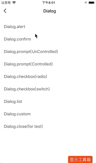
Dialog
Dialog is a collection of a series of commonly used dialog boxes, which are accompanied by fade-in and fade-out animation effects by default. It is used to display some components similar to Native effects.
Code demo
For more information, see Dialog Demo.
Alert box
Dialog.alert({
  title: "Title",
  subTitle: "Subtitle",
  confirmText: "Confirm",
  onConfirm: (data, { close }) => {
      close();
  },
 });
Prompt box
Dialog.confirm({
  title: "Title",
  subTitle: "Subtitle",
  cancelText: "Cancel",
  confirmText: "Confirm",
  onConfirm: (data, { close }) => {
    close();
  },
 });
Input dialog box
// Uncontrolled input box
  Dialog.prompt({
  title: "Uncontrolled input box",
  subTitle: "Subtitle",
  cancelText: "Cancel",
  confirmText: "Confirm",
  defaultValue: this.state.promptUnControlled,
  placeholder: "Password",
  onConfirm: (text, { close }) => {
    console.log("uncontrolled text :", text);
    this.setState({ promptUnControlled: text });
    close();
  },
 });

// Controlled input box
 Dialog.prompt({
  title: "Controlled input box",
  subTitle: "Subtitle",
  cancelText: "Cancel",
  confirmText: "Confirm",
  value: this.state.promptControlled,
  placeholder: "Password",
  onChangeText: (text) => {
    // Use value props to make prompt a controlled component and control the content of its input box
    const t = +text;
    if (typeof t === "number" && ! Number.isNaN(t)) {
      return text;
    }
  },
  onConfirm: (text, { close }) => {
    console.log('controlled text :', text);
    this.setState({ promptControlled: text });
    if (text.length < 2) {
     return;
    }
    close();
  },
 });
Checkbox
Dialog.checkbox({
  title: "Required",
  cancelText: "Cancel",
  confirmText: "Confirm",
  type: "radio",
  value: this.state.checkValueRadio,
  dataSource: [
    {
      value: "code1",
      title: "Sensor selection",
    },
    {
      value: "code2",
      title: "Room sensor calibration",
    },
    {
      value: "code3",
      title: "Floor sensor calibration",
      iconSize: 24,
      Icon: "warning",
      reverse: true,
      hideOnUnselect: true,
    },
  ],
  onConfirm: (value, { close }) => {
    this.setState({ checkValueRadio: value });
    close();
  },
 });
List dialog box
A list dialog box pops up.
Dialog.list({
  title: 'This is the title',
  subTitle: 'This is the content',
  dataSource: new Array(6).fill(1).map((_, idx) => ({
  title: idx === 0 ? 'Click me to close' : `Option${idx}`,
  onPress: () => {
     idx === 0 && Dialog.close();
     console.log('Press', idx);
   },
  })),
  cancelText: 'Cancel',
  confirmText: 'Confirm',
  onConfirm: (value, { close }) => {
    close();
  },
 });
Custom dialog box
A custom content dialog box pops up.
Dialog.custom({
  title: "Custom",
  cancelText: "Cancel",
  confirmText: "Confirm",
  content: (
    <View
      style={{ height: 300, alignItems: "center", justifyContent: "center" }}
    >
      <Text style={{ fontSize: 32, color: "#000" }}>Custom content</Text>
    </View>
  ),
  onConfirm: (value, { close }) => {
    close();
  },
 });
Interaction demo
API
Besides close, the first parameter of the Dialog API is props of the corresponding component, and the second parameter is props of Modal. For example, Dialog.someMethod(props: Object, modalProps? : Object)
Dialog general properties
| Property | Description | Type | Default value | Required |
|---|---|---|---|---|
| style | Container style. | ViewPropTypes.style | null | No |
| headerStyle | Header style | ViewPropTypes.style | null | No |
| title | Title | string |
null | Yes |
| titleStyle | Title style | Text.propTypes.style | null | No |
| titleNumberOfLines | An ellipsis is shown if the title exceeds the specified number of lines | number |
2 | Yes |
| subTitle | Subtitle | string |
null | No |
| subTitleStyle | Subtitle style | Text.propTypes.style | null | No |
| footerWrapperStyle | Footer wrapper style | ViewPropTypes.style | null | No |
| cancelText | Cancellation text | string |
'' |
No |
| cancelTextStyle | Cancellation text style | Text.propTypes.style | null | No |
| confirmText | Confirmation text | string |
'' |
No |
| confirmTextStyle | Confirmation text style | Text.propTypes.style | null | No |
| onCancel | Callback of clicking the cancel button | function |
null | No |
| onConfirm | Callback of clicking the confirm button | function |
null | No |
| motionType | Animation type | string |
ScaleFadeIn |
No |
| motionConfig | Animation configuration | object |
null | No |
Dialog.alert
Alert box. The alert box only contains the confirm button, not the cancel button. alert does not contain cancel related properties, such as cancelText, cancelTextStyle, and onCancel. For other properties, see Dialog general properties.
Dialog.confirm
Prompt box. The prompt box adds a cancel button on the basis of the alert box. For more information, see Dialog general properties.
Dialog.prompt
Input dialog box. For more information, see Dialog general properties. Dialog.prompt inherits from TextInput, so prompt also contains TextInput Prop and the following properties:
| Property | Description | Type | Default value | Required |
|---|---|---|---|---|
| showHelp | Whether to show the help button | boolean |
false |
No |
| onHelpPress | Callback of clicking the help button | () => void | null | No |
| inputWrapperStyle | TextInput wrapper style | ViewPropTypes.style | null | No |
| inputStyle | TextInput style | TextInput.propTypes.style | null | No |
Dialog.checkbox
Radio button or checkbox. For more information, see Dialog general properties. In the Dialog.checkbox, each checkbox item inherits from CheckboxItem, so checkbox also contains CheckboxItem Prop and the following properties:
| Property | Description | Type | Default value | Required |
|---|---|---|---|---|
| type | Style of the checkbox | radio | switch |
radio |
No |
| value | Checkbox value. The single-selection type must be string or number, and the multiple-selection type is array. |
string | number | array |
null | Yes |
| maxItemNum | Scroll if the data source exceeds the maximum number | number |
5 |
No |
| dataSource | Data source of the checkbox | Object | null | No |
| onChange | Callback of changing the checkbox | value => void |
null | No |
Dialog.custom
Custom dialog box. For more information, see Dialog general properties. Dialog.custom also contains the following properties:
| Property | Description | Type | Default value | Required |
|---|---|---|---|---|
| header | Custom header | ReactElement | Function | null |
| footer | Custom footer | ReactElement | Function | null |
| content | Custom content | any |
null | Yes |
Dialog.close
Close the current dialog box.
Is this page helpful?
YesFeedbackIs this page helpful?
YesFeedback


