Navigation Layout
Overview
NavigatorLayout is a basic layout that supports navigation routing and can easily handle switching between panel pages. Navigator used at the underlying architecture of NavigatorLayout is a component that organizes and manages the associations, nesting relationships, and transitions between multiple pages in the Tuya device control panel. For more information about Navigator, see Navigator.
Procedure
The procedure to use NavigatorLayout are as follows:
- Write
Reactcomponents and inheritNavigatorLayoutprovided bytuya-panel-kit. - Rewrite the
renderScenemethod to render the user pages and return a validReactcomponent. - Rewrite the
hookRoutemethod to achieve finer routing control.
Code demo
Jump between two pages
-
First define the routing configuration, and then write the components inherited from
NavigatorLayout. The code logic is as follows:-
Define the routing tables (
routers) of the two pages,page1andpage2. -
Obtain the
Navigatorand the information about the current routing object with therenderScenemethod. -
When rendering the page, look up the corresponding page in the routing table according to the ID of the current route.
Note: if there is no corresponding page, the default homepage will be rendered.
import React from "react"; import { StyleSheet } from "react-native"; import { NavigatorLayout } from "tuya-panel-kit"; import Page from "./page"; import Home from "./home"; const routers = [ { id: "page1", title: "page1", Scene: (props) => <Page {...props} num={1} />, }, { id: "page2", title: "page2", Scene: (props) => <Page {...props} num={2} />, }, ]; export default class MainLayout extends NavigatorLayout { // eslint-disable-next-line hookRoute(route) { const theRoute = routers.find((r) => r.id === route.id); return { ...route, topbarStyle: { backgroundColor: "#ff6024" }, showOfflineView: true, title: route.id === "main" ? "Basic Jump Usage" : theRoute.title, }; } renderScene(route, navigator) { let Scene = <Home navigator={navigator} />; const router = routers.find((r) => r.id === route.id); if (router && router.Scene) { const Component = router.Scene; Scene = <Component navigator={navigator} {...route} />; } return Scene; } } -
-
Create the implementation of
pageandhome.-
page// page.js import React from "react"; import { View, Text, StyleSheet } from "react-native"; import { Button } from "tuya-panel-kit"; // eslint-disable-next-line export default ({ num, navigator }) => ( <View style={[styles.container, styles.center]}> <Text style={styles.welcomeTxt}>This is Page {num}</Text> <Button style={styles.btnStyle} onPress={() => navigator.pop()}> <Text style={styles.navTxt}>Click to go back!</Text> </Button> </View> ); -
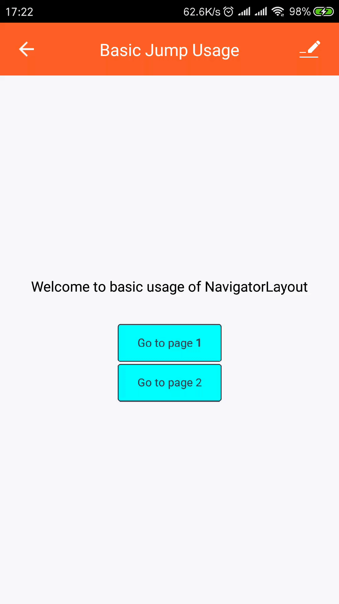
home// home.js import React from "react"; import { View, StyleSheet, Text } from "react-native"; import { Button } from "tuya-panel-kit"; // eslint-disable-next-line export default ({ navigator }) => ( <View style={[styles.container, styles.center]}> <Text style={styles.welcomeTxt}> Welcome to basic usage of NavigatorLayout </Text> {[1, 2].map((v) => ( <Button style={styles.btnStyle} key={v} onPress={() => navigator.push({ id: `page${v}` })} > <Text style={styles.navTxt}>Go to page {v}</Text> </Button> ))} </View> );
-
-
Achieve the jump between pages.
- Jump to the target page: the
pushmethod ofNavigator. - Return to a page:
popmethod.
- Jump to the target page: the
-
Run
yarn startunder the project directory, and enter the corresponding debugging address in the app. Then, you can view the page jump effect on the app.
Note: for the demo, see NavigatorLayout.
Custom transition animation effect
-
Default configuration of page transition animation
const SceneConfigs = { ...Navigator.SceneConfigs.HorizontalSwipeJump, gestures: { pop: { ...Navigator.SceneConfigs.FloatFromRight.gestures.pop, }, }, }; -
Configuration of custom animation effect
Configuration of custom animation can achieve the following effects:
- Page jumps by horizontal swipe related with platforms.
- Return to the previous page by swiping from right to left.
import React from 'react'; import { View, StyleSheet, Text } from 'react-native'; import { Button } from 'tuya-panel-kit'; import { Navigator } from 'react-native-deprecated-custom-components'; const sceneConfig = { ...Navigator.SceneConfigs.HorizontalSwipeJump, gestures: { pop: { ...Navigator.SceneConfigs.FloatFromRight.gestures.pop, }, }, }; const RouterConfig = [ { txt: `VerticalUpSwipeJump to page 1`, transition: { ...sceneConfig, ...Navigator.SceneConfigs.VerticalUpSwipeJump } }, { txt: `SwipeFromLeft to page 2`, transition: { ...sceneConfig, ...Navigator.SceneConfigs.SwipeFromLeft } } ]; // eslint-disable-next-line export default ({ navigator }) => ( <View style={[styles.container, styles.center]}> <Text style={styles.welcomeTxt}> Screen Transition Example! </Text> { [1, 2].map(v => ( <Button style={styles.btnStyle} key={v} onPress={() => navigator.push({ id: `page${v}`, sceneConfigs: RouterConfig[v 1].transition, })} ><Text style={styles.navTxt}>{RouterConfig[v 1].txt}</Text> </Button> )) } </View> ); -
VerticalUpSwipeJumpandSwipeFromLefteffect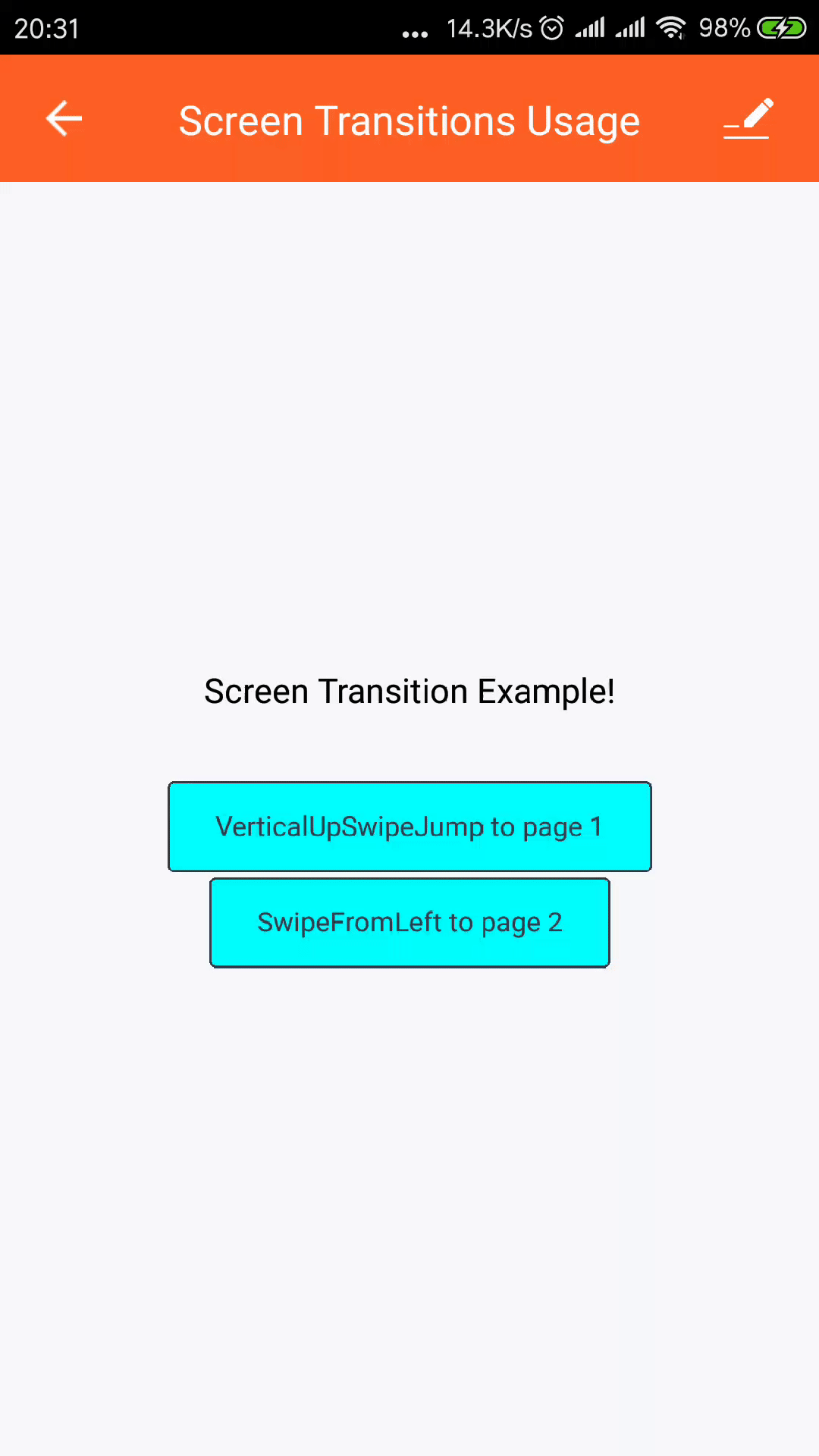
Note: for more information about custom transition animation, see Scene Transitions.
API
renderScene(route, navigator) page rendering component
- route: an ordinary object, which contains parameters for rendering. The parameters can be obtained by custom components for rendering. Generally,
routewill have at least the following parameters:- id: the ID of the current page.
- title: the title of the current page displayed in the
TopBar. - topbarStyle: the style of the
TopBaron the current page. The style oftopbarStyleis a JS object, and the value range is from the allowed values inReact NativeStyleSheet. - background: used to render the page background, which can be a picture or a gradient.
- backgroundColor: background color, which can only be a valid
ReactNativecolor value string. - style:
FullViewbackground style. - hideFullView: whether to hide
FullView. - renderFullView: the rendering function, usually used with
hideFullViewto allow users to renderFullView. - hideTopBar: whether to hide
TopBar. - OfflineView: offline view component, used to customize the offline view. It needs to be a compatible React component.
- showOfflineView: control whether to hide the offline view. It is usually set to
falseduring development and debugging.
- navigator: for more information about
navigatorAPI, see Navigator Methods.
Note: the user needs to decide which subpage to render according to the value of the
routeobject. The return value ofrenderScenemust be a valid React component, which will be used to render the current routed page.
hookRoute(route) modifies route parameters
hookRoute function is used to modify the parameter values used for rendering in the route. route properties are the same as the route in the renderScene. You can set your own parameters.
Definition of PropTypes passed-in properties
Note: the following is the original
devInfodefinition. For the convenience of developers, thedevInfoin the template provided by Tuya has been optimized.
devInfo is a normal JS object, which contains a lot of device information, including but not limited to the following fields:
-
name: device name.
-
productId: product ID.
-
uiId: panel ID corresponding to the current product.
-
homeId: family ID to which the device belongs.
-
bv: hardware baseline version.
-
devId: device ID.
-
gwId: gateway ID. If it indicates the device,
devIdis usually equal togwId. -
ability: only used by Bluetooth devices. If it is a single-point Bluetooth device, the value is 5.
-
attribute: the ability mark of the product to which the device belongs. It usually indicates whether to activate certain services, such as Alexa voice control.
-
isOnline: specify whether it is online.
-
isLocalOnline: specify whether the local area network (LAN) is online.
-
isShare: specify whether to share the device.
-
isVDevice: specify whether it is a demo device.
-
networkType: the online type of the device.
-
schema: the data point (DP) definition of the product to which the device belongs. For more information about DP definition, see Terms.
-
capability: the capability type of the device, indicating the capabilities supported by the device. For example, it supports Zigbee, infrared, and Bluetooth. For more examples, see the following table.
Type Wi-Fi Wired cable GPRS NB-IoT Bluetooth LE Bluetooth LE mesh Zigbee Infrared 433 SIG mesh Bit 0 1 2 3 10 11 12 13 14 15 Capability 1 2 4 8 1024 2048 4096 8192 16384 32768
Is this page helpful?
YesFeedbackIs this page helpful?
YesFeedback


