Progress
Overview
Progress component is used to display the progress of a task. You can control the current progress value through gestures.
Note: this component is added in the @2.0.0-rc.2 version.
Code demo
Note: for more information, see Demo.
Basic use
/* eslint-disable react/prefer-stateless-function */

import React from "react";
 import { View } from "react-native";
 import { Progress } from "tuya-panel-kit";

class ProgressScene extends React.PureComponent {
  constructor(props) {
    super(props);
    this.state = {
      value: 50,
    };
  }
  render() {
    return (
      <View style={{ flex: 1, justifyContent: "center", alignItems: "center" }}>
        <Progress scaleHeight={2} />
        <Progress
          style={{ marginTop: 30 }}
          foreColor={{
            "0%": "#1381FB",
            "100%": "#00C36C",
          }}
          needMaxCircle={true}
          startColor="#1381FB"
          thumbRadius={4}
          value={this.state.value}
          startDegree={135}
          andDegree={270}
          stepValue={10}
          onValueChange={(v) => {
            console.log(v);
            this.setState({ value: v });
          }}
        />
        <Progress
          style={{ marginTop: 30 }}
          startDegree={270}
          andDegree={360}
          min={0}
          max={100}
          value={25}
          thumbRadius={3}
          needMaxCircle={true}
          needMinCircle={true}
          foreColor="#135381"
          stepValue={5}
        />
      </View>
    );
  }
 }

export default ProgressScene;
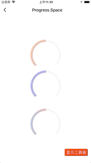
Spacing form
/* eslint-disable react/prefer-stateless-function */
 import React from "react";
 import { View } from "react-native";
 import { Progress } from "tuya-panel-kit";

class ProgressGradientScene extends React.PureComponent {
  constructor(props) {
    super(props);
    this.state = {
      value: 50,
    };
  }
  render() {
    return (
      <View style={{ flex: 1, justifyContent: "center", alignItems: "center" }}>
        <Progress.Space />
        <Progress.Space
          foreColor="blue"
          stepValue={5}
          value={this.state.value}
          onValueChange={(v) => {
            console.log(v);
            this.setState({ value: v });
          }}
        />
        <Progress.Space
          style={{ marginTop: 30 }}
          foreColor={{ "0%": "#1356A1", "100%": "#E71D2B" }}
        />
      </View>
    );
  }
 }

export default ProgressGradientScene;
Interaction demo
API-General
style
The style of the progress bar.
| Type | Required | Default value |
|---|---|---|
| ViewPropTypes.style | No | null |
value
The current value of the progress bar.
| Type | Required | Default value |
|---|---|---|
Number |
No | 50 |
startDegree
The start degree. The degree of clockwise operation, starting from the three o’clock position.
| Type | Required | Default value |
|---|---|---|
Number |
No | 135 |
andDegree
The number of degrees added to the starting degree.
| Type | Required | Default value |
|---|---|---|
Number |
No | 270 |
min
The minimum value of the progress, in degrees.
| Type | Required | Default value |
|---|---|---|
Number |
No | 0 |
max
The maximum value of the progress, in degrees.
| Type | Required | Default value |
|---|---|---|
Number |
No | 100 |
stepValue
The step length of the progress bar.
| Type | Required | Default value |
|---|---|---|
Number |
No | 0 |
backStrokeOpacity
Opacity greater than the specific value.
| Type | Required | Default value |
|---|---|---|
Number |
No | 1 |
foreStrokeOpacity
Opacity less than the specific value.
| Type | Required | Default value |
|---|---|---|
Number |
No | 1 |
scaleHeight
The rendering height of the progress bar, in px.
| Type | Required | Default value |
|---|---|---|
Number |
No | 9 |
disabled
Whether you can swipe with gestures.
| Type | Required | Default value |
|---|---|---|
Bool |
No | false |
foreColor
The color less than the specific value.
| Type | Required | Default value |
|---|---|---|
string │ object │ Array<{ "offset": "string", "stopColor": "string", "stopOpacity": "string" }> |
No | #FF4800 |
onValueChange
The callback of the value change.
| Type | Required | Default value |
|---|---|---|
Func |
No | () => {} |
onSlidingComplete
Callback of ending the slide.
| Type | Required | Default value |
|---|---|---|
Func |
No | () => {} |
x1
The x-axis coordinate of the starting point of gradient.
| Type | Required | Default value |
|---|---|---|
String |
No | "0%" |
x2
The x-axis coordinate of the ending point of gradient.
| Type | Required | Default value |
|---|---|---|
String |
No | "100%" |
y1
The y-axis coordinate of the starting point of gradient.
| Type | Required | Default value |
|---|---|---|
String |
No | "0%" |
y2
The y-axis coordinate of the ending point of gradient.
| Type | Required | Default value |
|---|---|---|
String |
No | "0%" |
renderCenterView
Custom content in the center of the ring.
| Type | Required | Default value |
|---|---|---|
Element |
No | null |
pointerEvents
The supported range of gesture operation.
| Type | Required | Default value |
|---|---|---|
'box-none' │ 'none' │ 'box-only' │ 'auto' |
No | box-none |
API – Progress
thumbFill
The fill color of the progress thumb.
| Type | Required | Default value |
|---|---|---|
String |
No | #fff |
thumbStroke
The stroke color of the progress thumb.
| Type | Required | Default value |
|---|---|---|
String |
No | #fff |
thumbStrokeWidth
The stroke width of the progress thumb.
| Type | Required | Default value |
|---|---|---|
Number |
No | 2 |
thumbRadius
The radius of the progress thumb.
| Type | Required | Default value |
|---|---|---|
Number |
No | 2 |
needMaxCircle
Whether to set the progress thumb of the maximum value.
| Type | Required | Default value |
|---|---|---|
Bool |
No | false |
needMinCircle
Whether to set the progress thumb of the minimum value.
| Type | Required | Default value |
|---|---|---|
Bool |
No | false |
startColor
The color of the ring at the starting point when the track is less than 360 degrees.
| Type | Required | Default value |
|---|---|---|
String |
No | "#FF4800" |
endColor
The color of the ring at the ending point when the track is less than 360 degrees.
| Type | Required | Default value |
|---|---|---|
String |
No | "#FF4800" |
API - Progress.Space
scaleNumber
The number of rendering lines of the progress bar.
| Type | Required | Default value |
|---|---|---|
Number |
No | 120 |
Is this page helpful?
YesFeedbackIs this page helpful?
YesFeedback


