Custom App Tools
This topic describes how to use Custom App Tools to develop your own branded apps.
What are Custom App Tools?
Custom App Tools are provided for you to quickly customize the UI configurations of an OEM app. Tuya improves the open app customization framework and capabilities, and enables settings tailored to your needs, in terms of theme color schemes, style skins, page and component styles, and product features. Tuya also provides multiple templates of app styles and themes to support quick settings.
Custom App Tools are the choice of price performance to build a smart app that meets your needs in brand expression, category features, and app positioning.
Subscription
You can subscribe to Custom App Tools in either of the following methods:
- Purchase Custom App Tools.
- Upgrade to or subscribe to the OEM App Advanced edition that includes Custom App Tools and other value-added services. This is a more cost-efficient purchase.
Benefits
The benefits of Custom App Tools are described in details in the following table.
| Feature | Free benefit | Customization benefit |
|---|---|---|
| Style template | Only support the Generic template. | Support multiple templates, such as Tool Purpose and Mall Purpose. |
| Theme style | Only support Classic White. | Support multiple styles, as shown in this figure: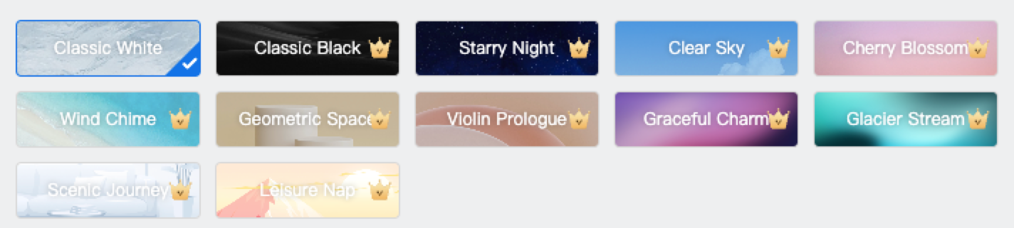 |
| Theme color | Support a solid color. | Support global adaptation. |
| Background color | Support a solid color. | Support global adaptation. |
| Dark mode | Not supported. | Supported. |
| Page component: Home | Only support one component skin. |
|
| Page component: Pairing Devices | Support the standard view, tiled view, and list view. | Support the standard view, tiled view, and list view. |
| Page component: Scene | Only support one component skin. | Support multiple component skins and background image replacement. |
| Page component: Me | Only support one component skin and the default avatar. | Support multiple component skins and background image replacement. |
| Page component: Tab Icon | Replace tab icons and set font colors of active tab labels. | Replace tab icons and set font colors of active tab labels. |
| Page component: Login/Register | Only support one component skin and replace the logo of the Login/Register page. | Support multiple component skins, replace the logo of the Login/Register page, and replace the background image. |
| Page component: Splash Screen | Upload one image or merge images. | Upload one image or merge images. |
| Custom details | Only support empty state images. | Support empty state images, text color schemes, right-angle or round corner setting of components, and custom color schemes of element cards. |
Usage
Set app icon
- Only square images in the
.pngformat are supported. Do not upload images with transparent backgrounds. Otherwise, a display error might occur. - The dimensions must be 1024 × 1024 pixels.
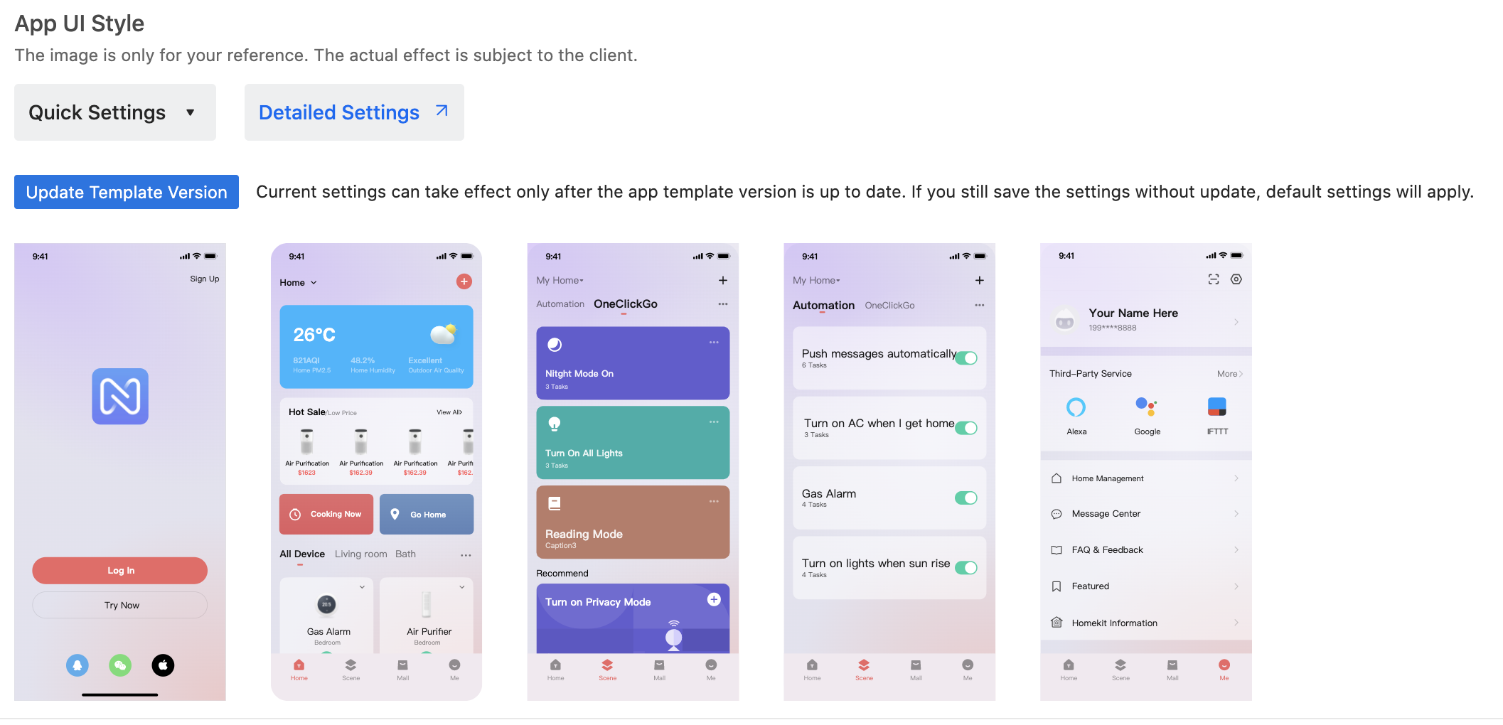
Quick settings
-
Go to Tuya Developer Platform > App > OEM App > App Creation, find the target app, and click Configure > Step 1 Customize UI > Quick Settings to display the Style Template and Theme Style sections.
-
Select the desired style and theme and preview the settings at the bottom of the page.
Detailed settings
Overview
-
Click Detailed Settings to navigate to the Custom App Tools.
-
These tools help you configure custom theme colors, background colors, pages, components, and more personalized app UI elements.
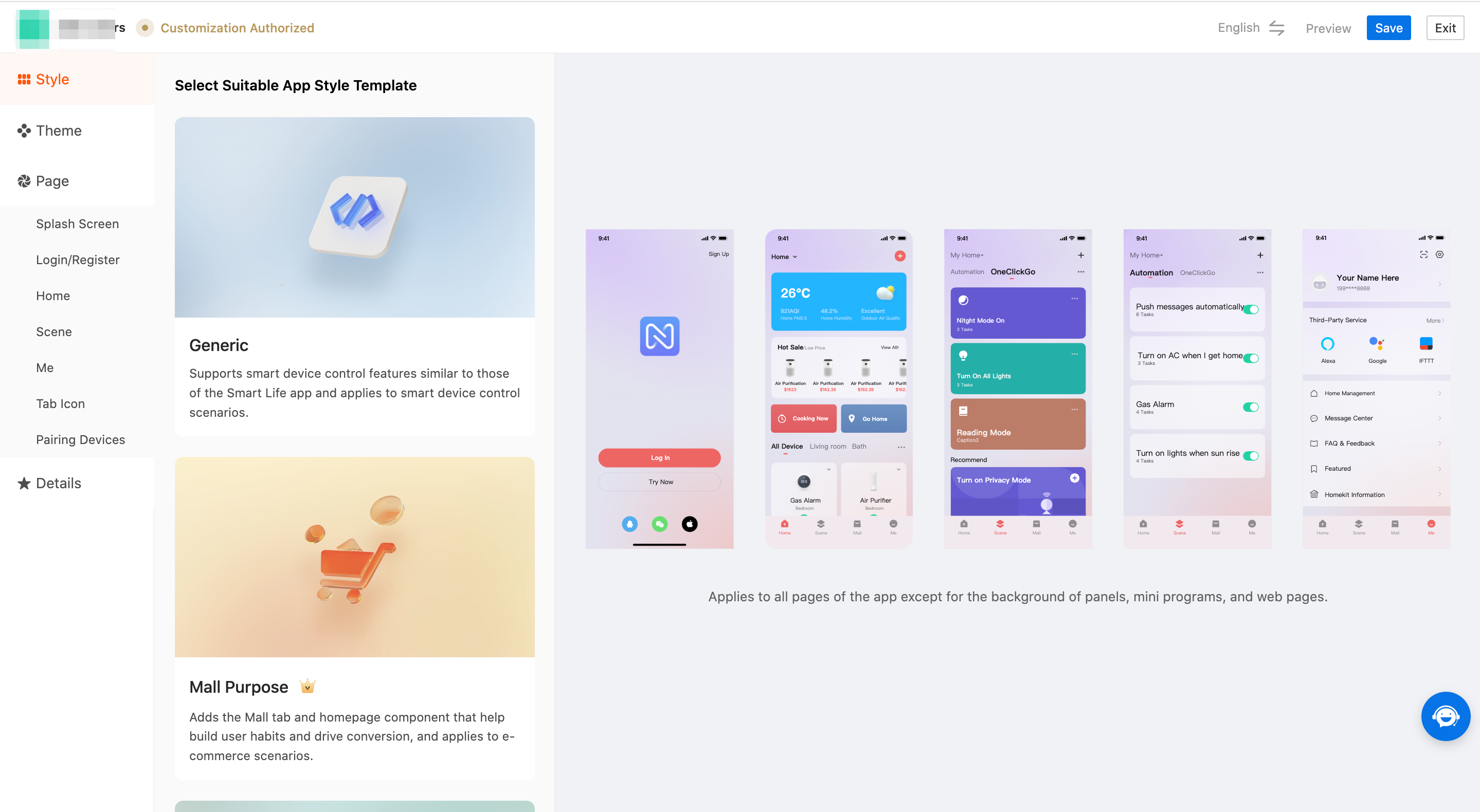
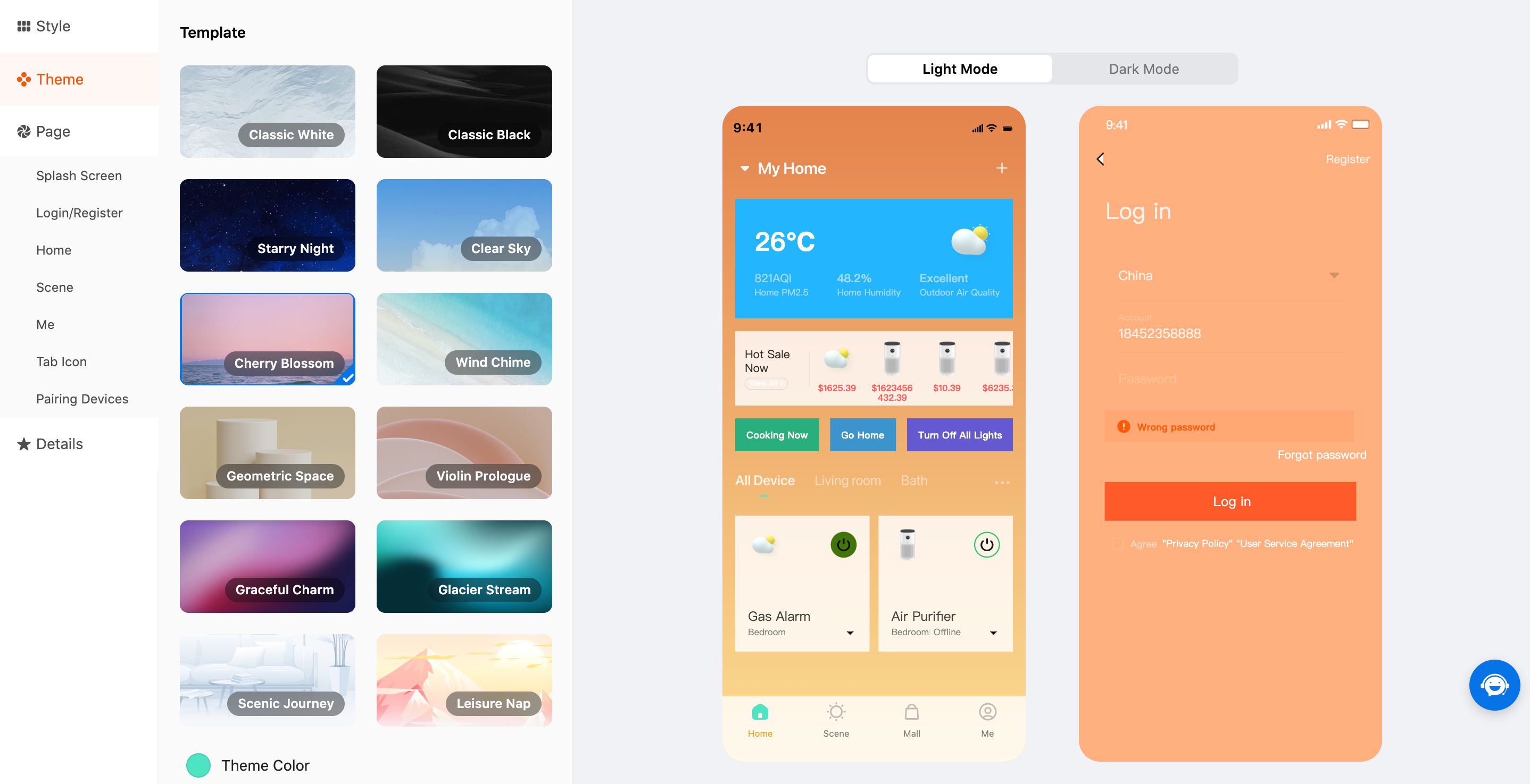
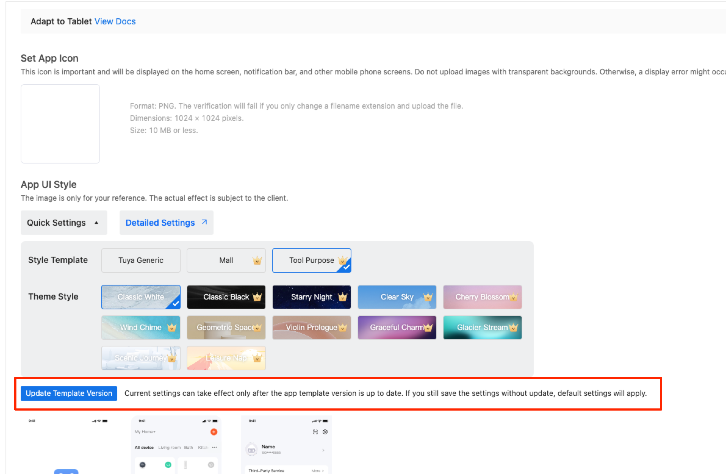
Style template
-
Select a style template. Currently, three style templates are available. Stay tuned for an increasing number of style templates to meet your individualized needs. Existing style templates are described in the following table.
Style template name Description Remarks Generic This is a basic component template that supports basic device tools, including but not limited to basic device pairing, device control, and scene linkage. Supported after you subscribe to the OEM App Basic edition or OEM App Advanced edition. Mall Purpose This is the mall component added on top of the Generic style template. You can leverage the e-commerce capabilities of the app that is developed with the Mall Purpose style template to promote online sales of your products. This style template applies to e-commerce scenarios. Supported only after you subscribe to the OEM App Advanced edition or purchase the Custom App Tools. Tool Purpose This style template extracts core features for smart device control and applies to scenarios of simple device control. Supported only after you subscribe to the OEM App Advanced edition or purchase the Custom App Tools. -
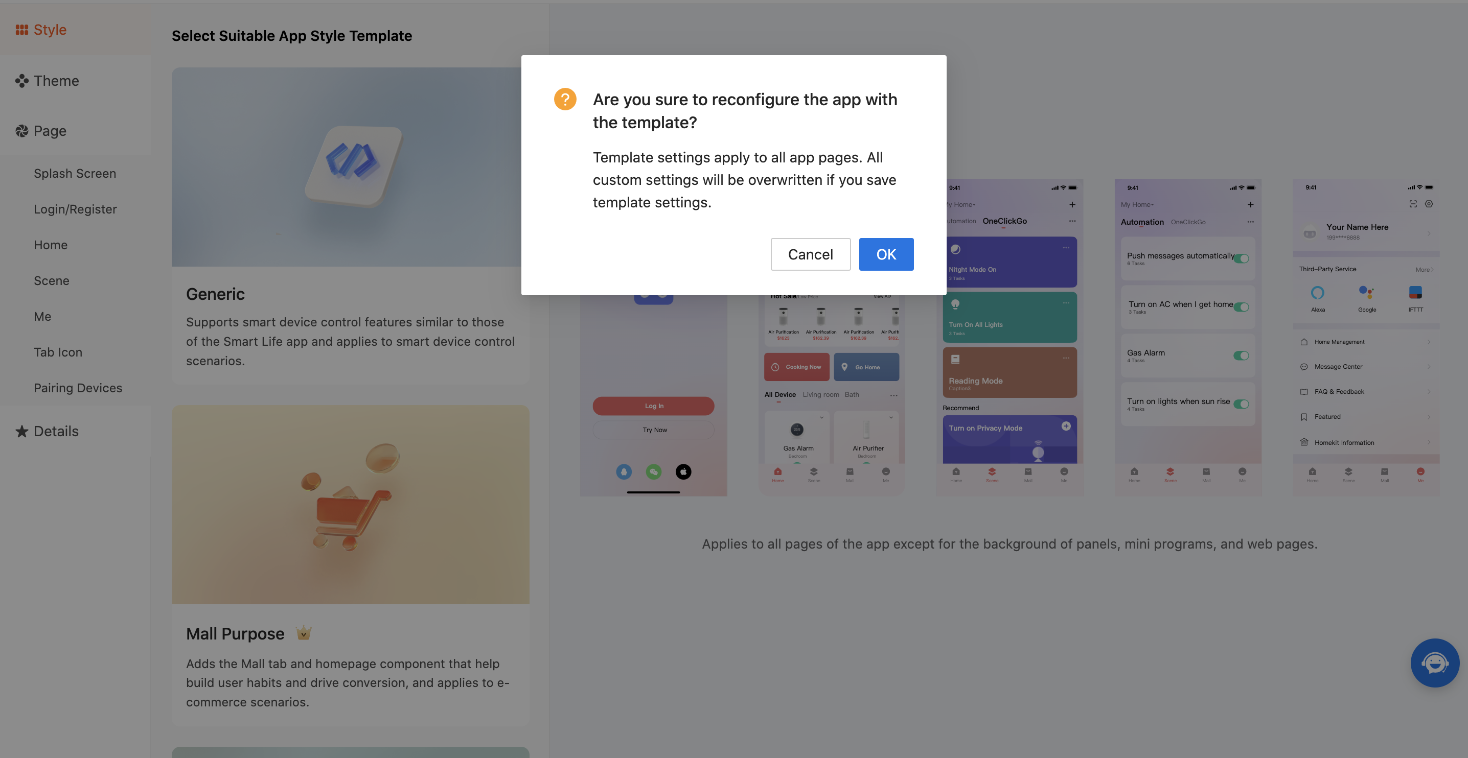
Select a target style template to see the message saying "All custom settings will be overwritten if you save template settings". Click OK to apply the style template and make it effective.
Theme style
Theme template
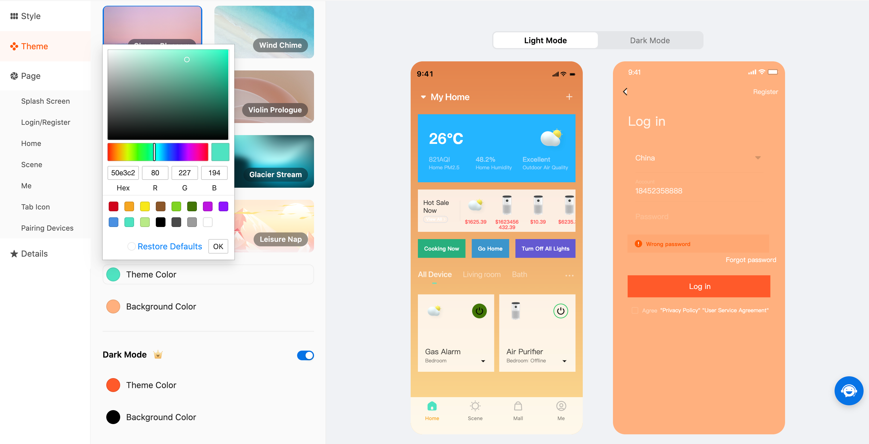
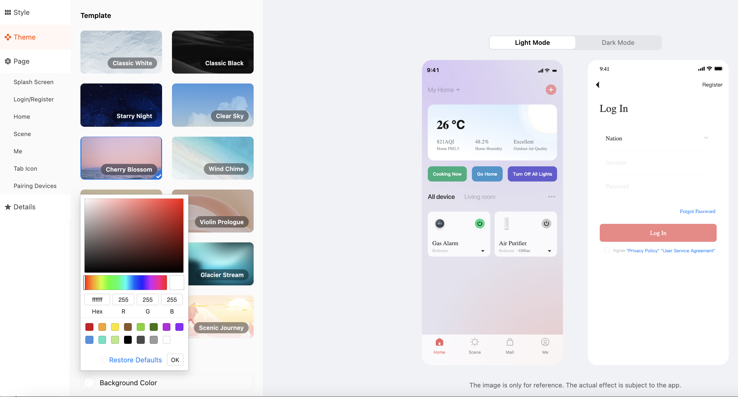
-
Currently, multiple preset theme templates are available to make your app design stand out. A theme template can be used to set the global theme color scheme and background color scheme, as well as the app style.
-
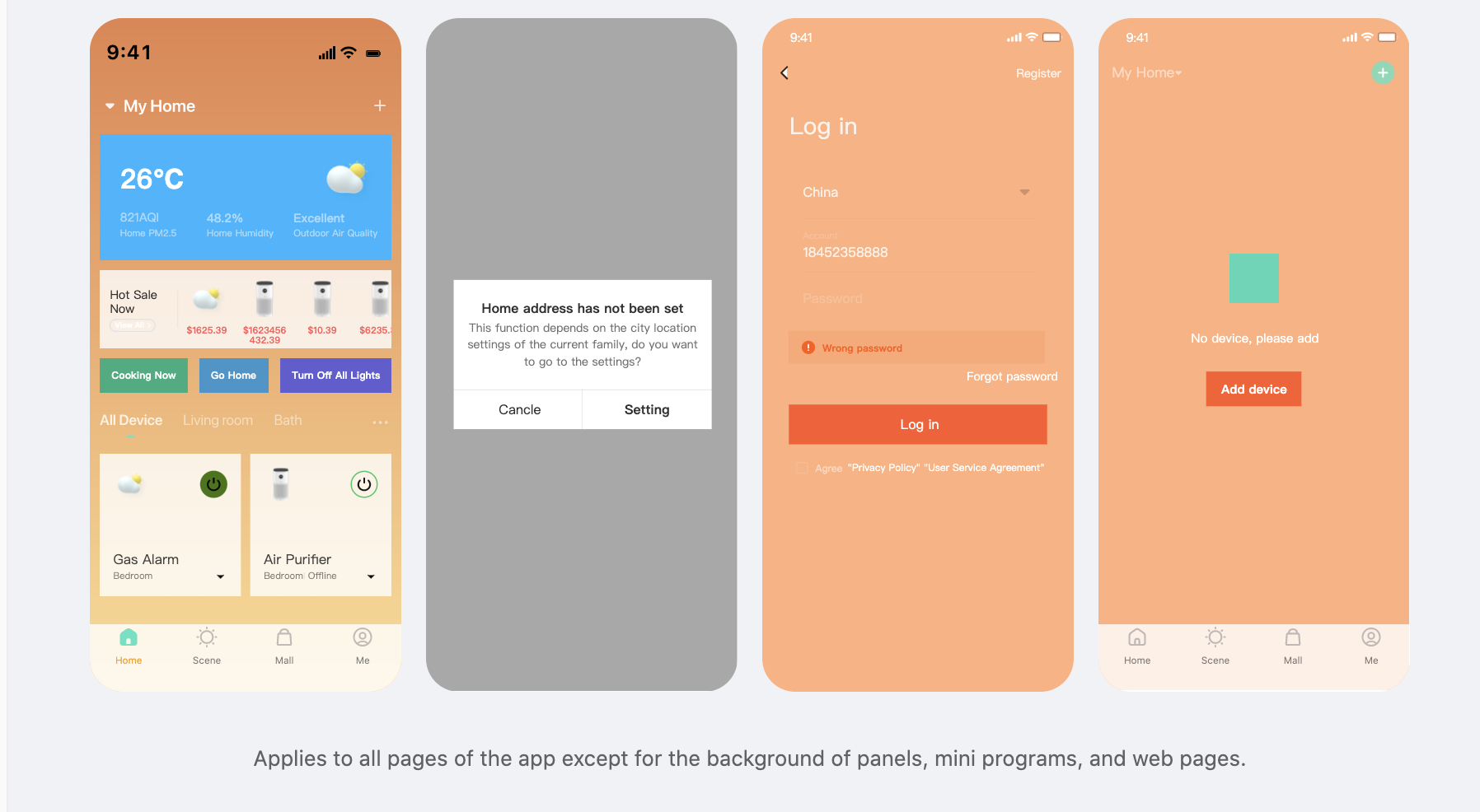
Click Theme Color, and specify a desired color on a palette that appears to set the theme color. A theme color applies to the icons, buttons, and text that use the theme color. As shown in the following figure, the Add button in the top right corner of the page shows the specified theme color.
-
Similar to Theme Color, click Background Color and specify a desired color on a palette that appears to set the background color. A background color applies to the background colors of cards, title bars, and other respective elements. As shown in the following figure, the cards of the mall component, device cards, and tab icons show the specified background color.
If you specify a background image or select a template with a background image, the background image is displayed on a page in priority. Therefore, the specified background color might not take effect.
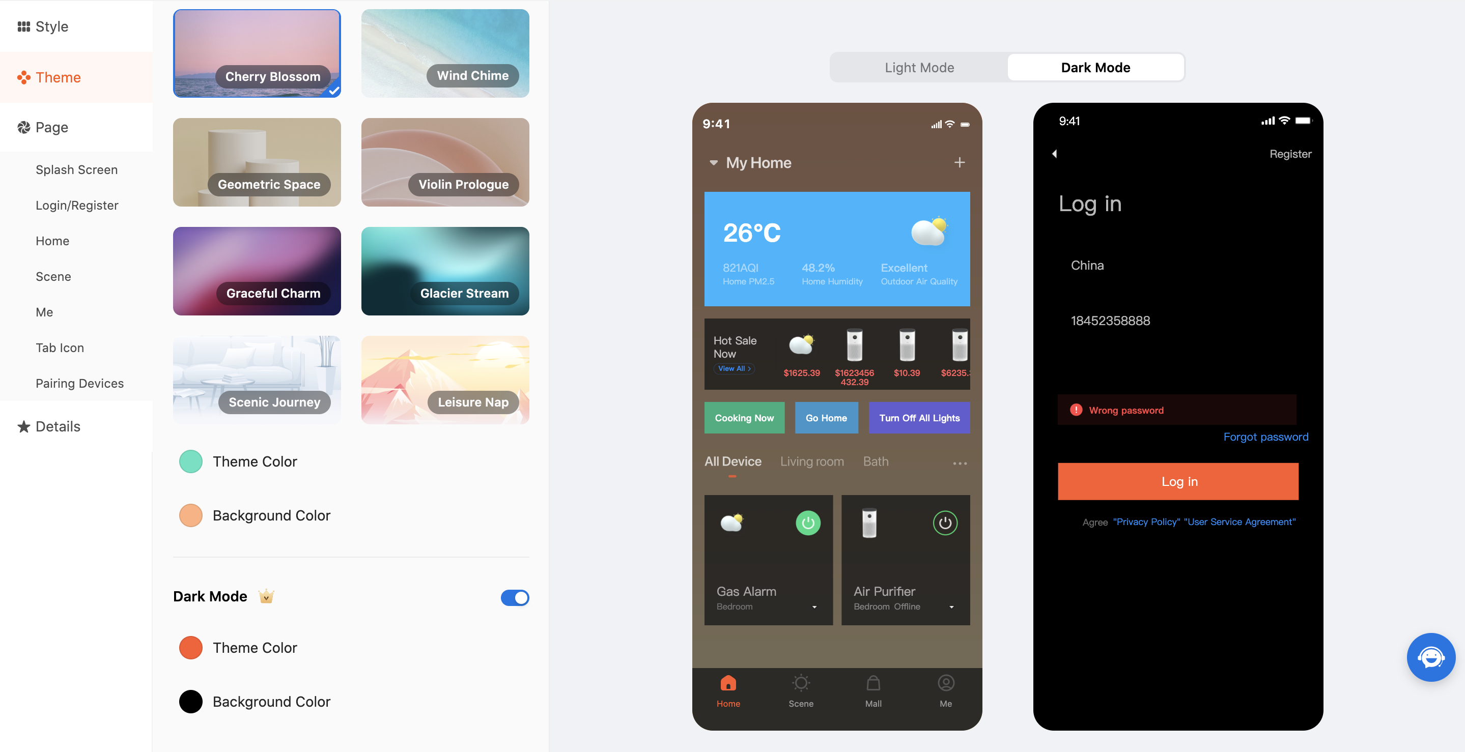
Dark mode
-
When the template version used by your app is v3.25.2 or later, the dark theme can be enabled after you subscribe to the paid service. App users can choose Me > Settings > Dark Mode to select the mode or follow the system settings. If the app follows the system settings, the app will switch the dark mode on or off to match system settings.
-
In dark mode, the theme colors and background colors can also be modified.
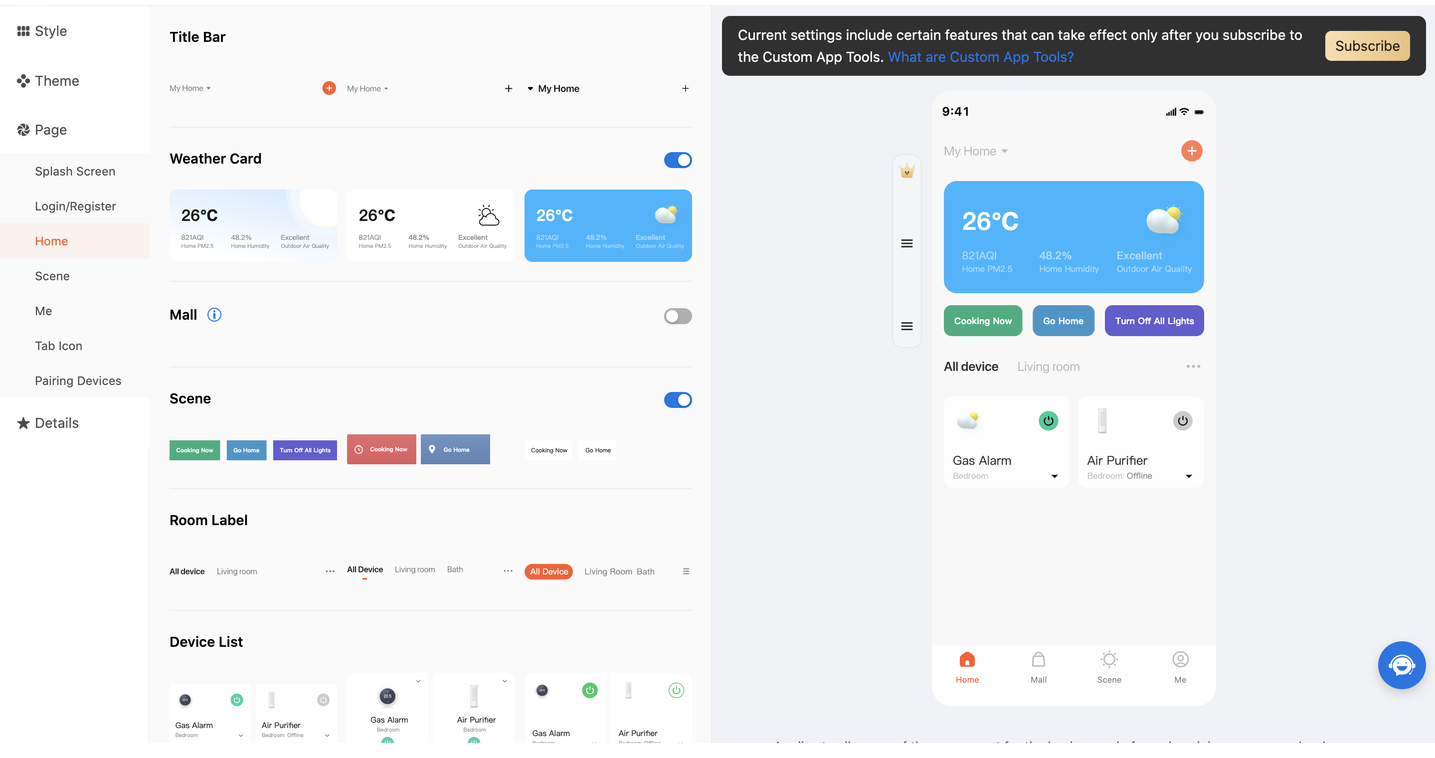
Page component
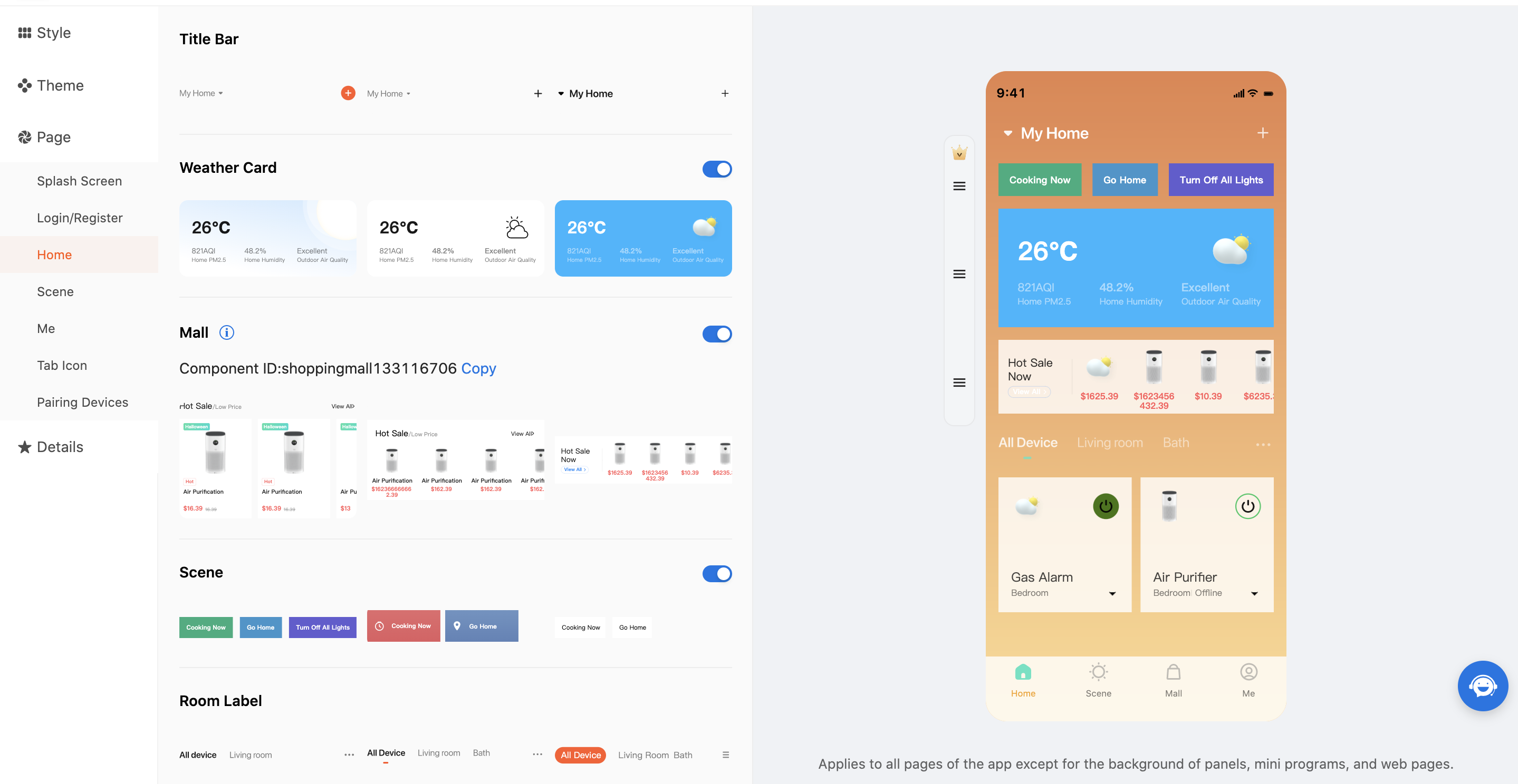
Home
-
In the Home module, you can modify and replace components such as the title bar, weather card, mall, scene, room label, device list, and background image of the current page.
-
For the components such as the title bar, weather card, mall, scene, room label, and device list, you can choose among three styles, and in the right-side preview pane, drag and drop the weather card, mall, and mall components to a desired location.
-
Several background images are optional. You can also upload a background image to fit your personalized needs.
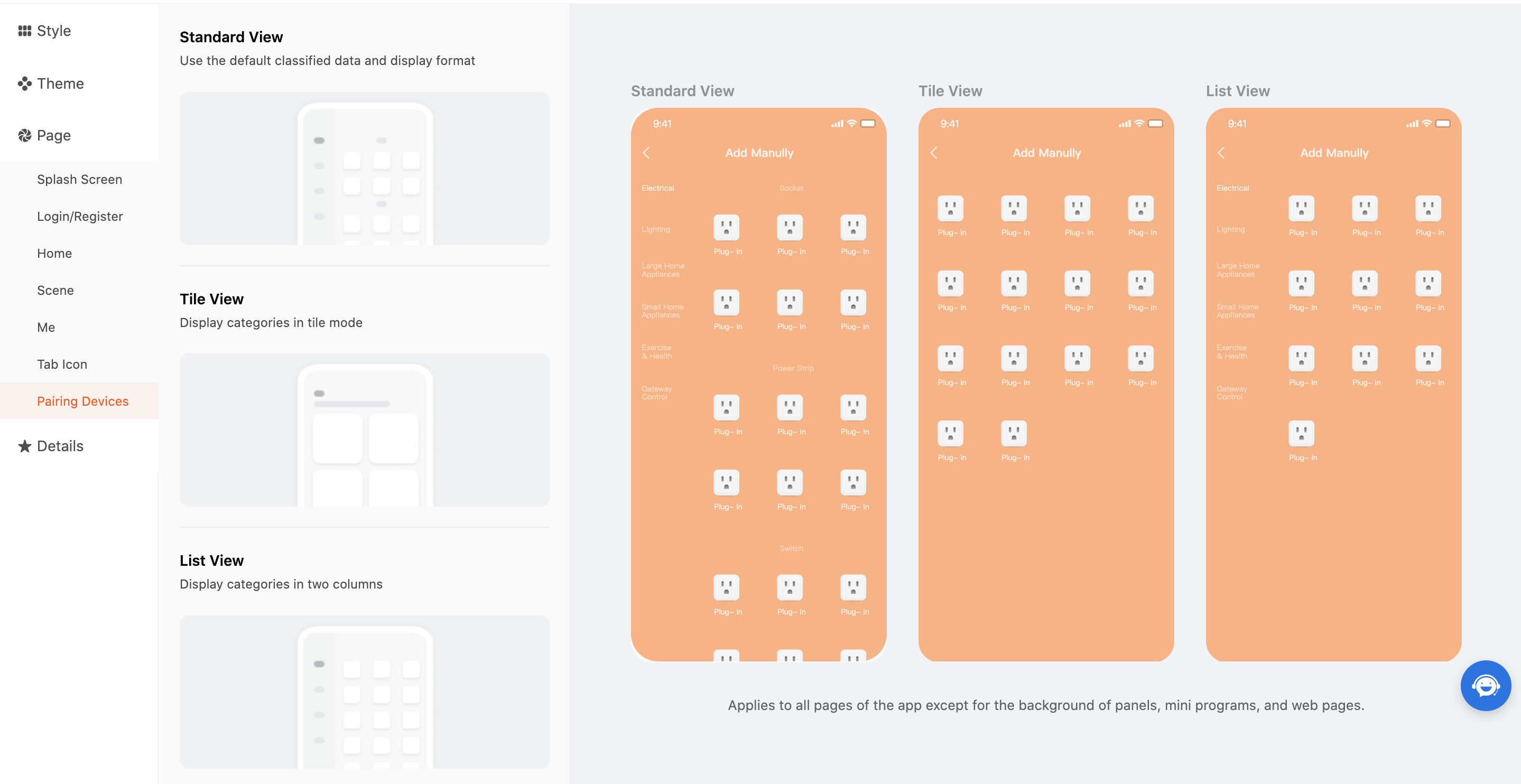
Pairing devices
Click either of Standard View, Tile View, and List View to navigate to the Devices tab for further page settings at OEM App > Optional Setting. Then, click Save and Launch to apply the settings.
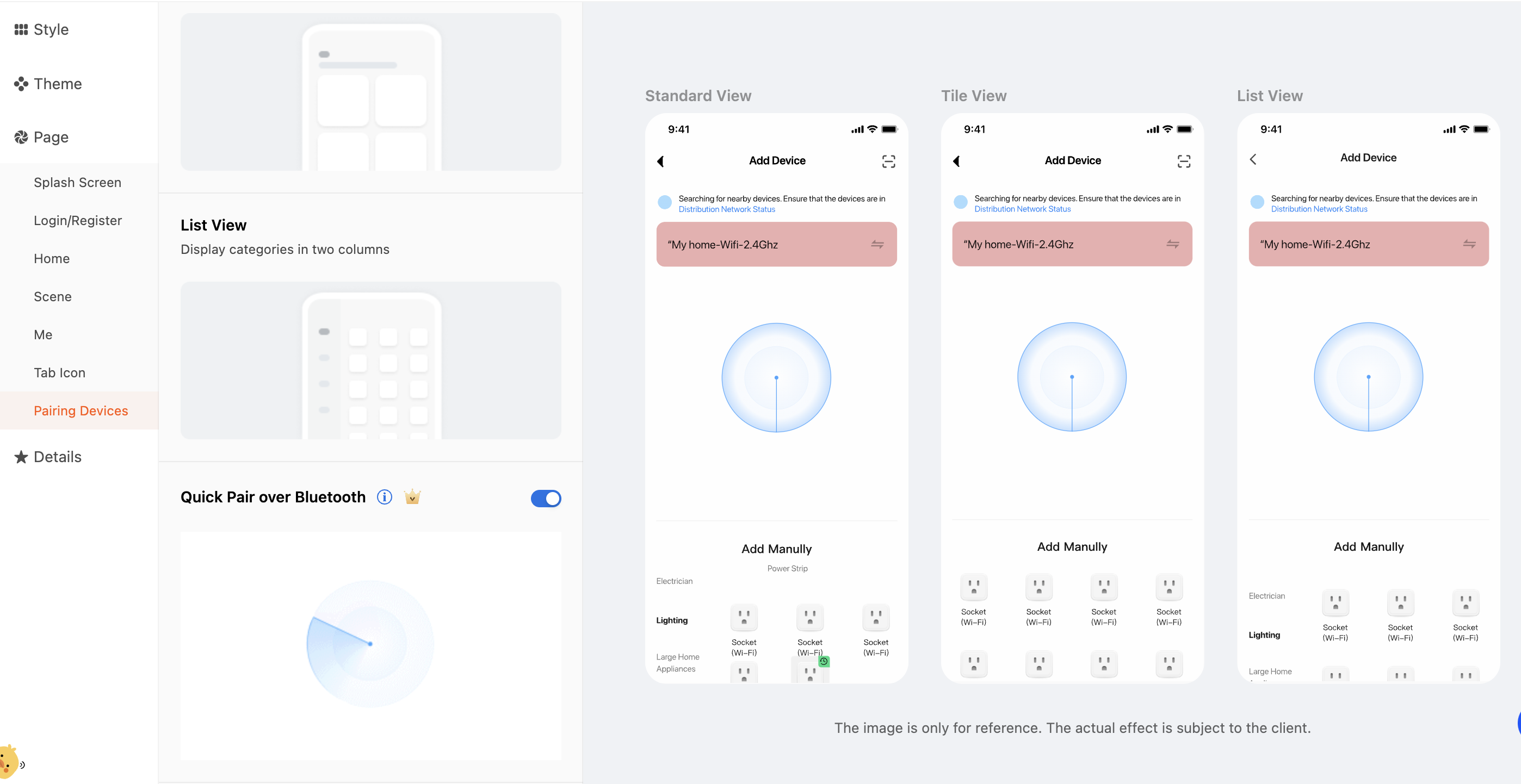
Quick pairing over Bluetooth
The Quick Pair over Bluetooth mode enables automatic search and pairing of Bluetooth devices. The following types of devices are supported: Bluetooth Low Energy (LE), Bluetooth Beacon, Wi-Fi and Bluetooth LE combo, Zigbee and Bluetooth LE combo, Plug and Play (PnP) combo, and Bluetooth mesh gateway sub-devices.
When you use the Custom App Tools, you can go to Page > Pairing Devices and enable the Quick Pair over Bluetooth feature. This way, you can enhance the efficiency of pairing Bluetooth products and improve the user experience.
After this feature is enabled, you can implement the following features for your app:
-
After the pairing device list is opened in the app, available Bluetooth devices can be automatically discovered and displayed as circular device icons in two rows. Users can tap a device icon to automatically pair and add this device.
-
In the section of Bluetooth devices that are automatically discovered, the device icons and names are displayed. Users can swipe left and right to view more discovered devices and easily find the desired device to be paired.
Scene
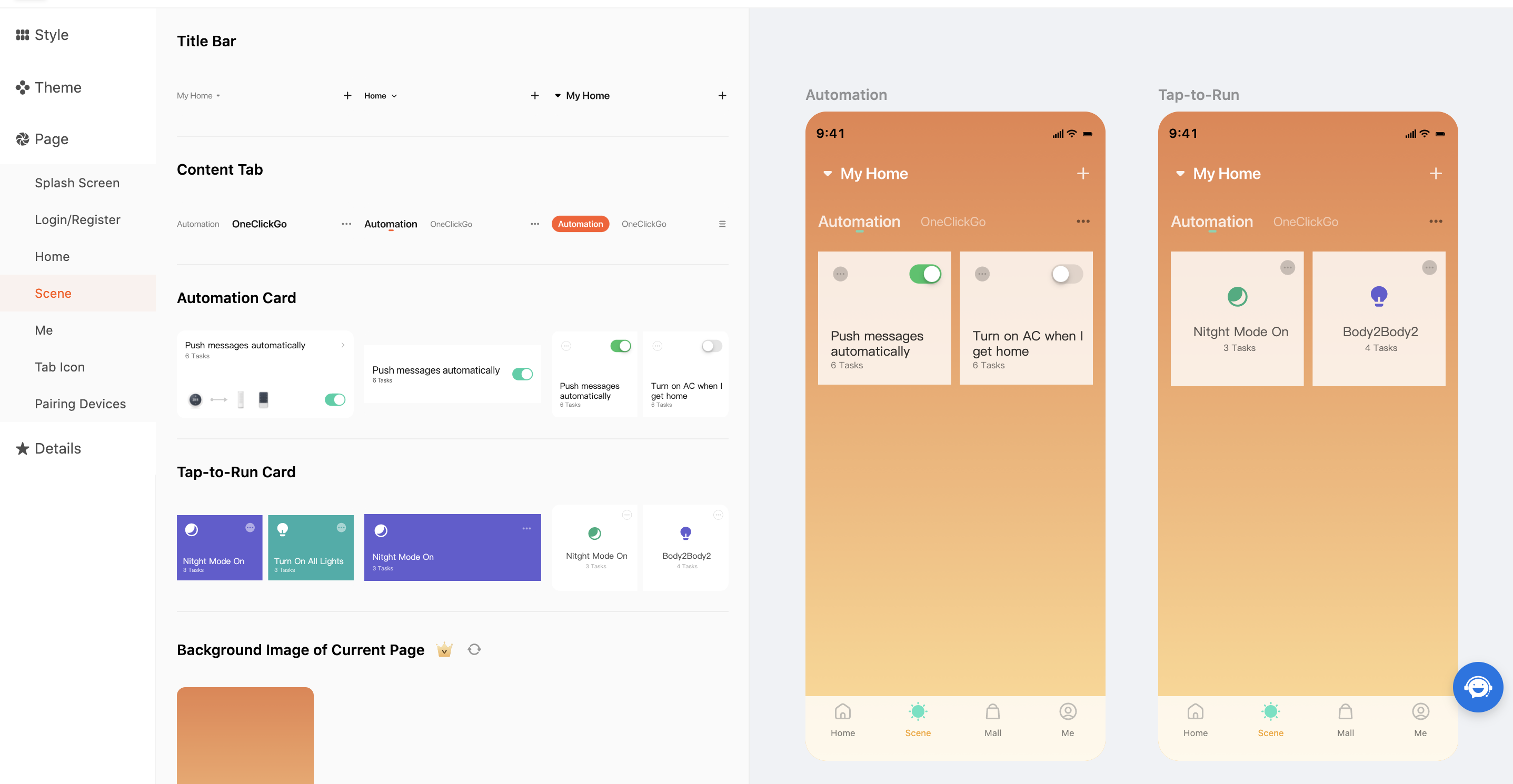
-
In the Scene module, you can modify and replace components such as the title bar, content tab, automation scene card, tap-to-run scene card, and current background image.
-
You can choose among three styles to set the components such as the title bar, content tab, automation scene card, and tap-to-run scene card.
-
Similar to the Home module, several background images are optional. You can also upload a background image to fit your personalized needs.
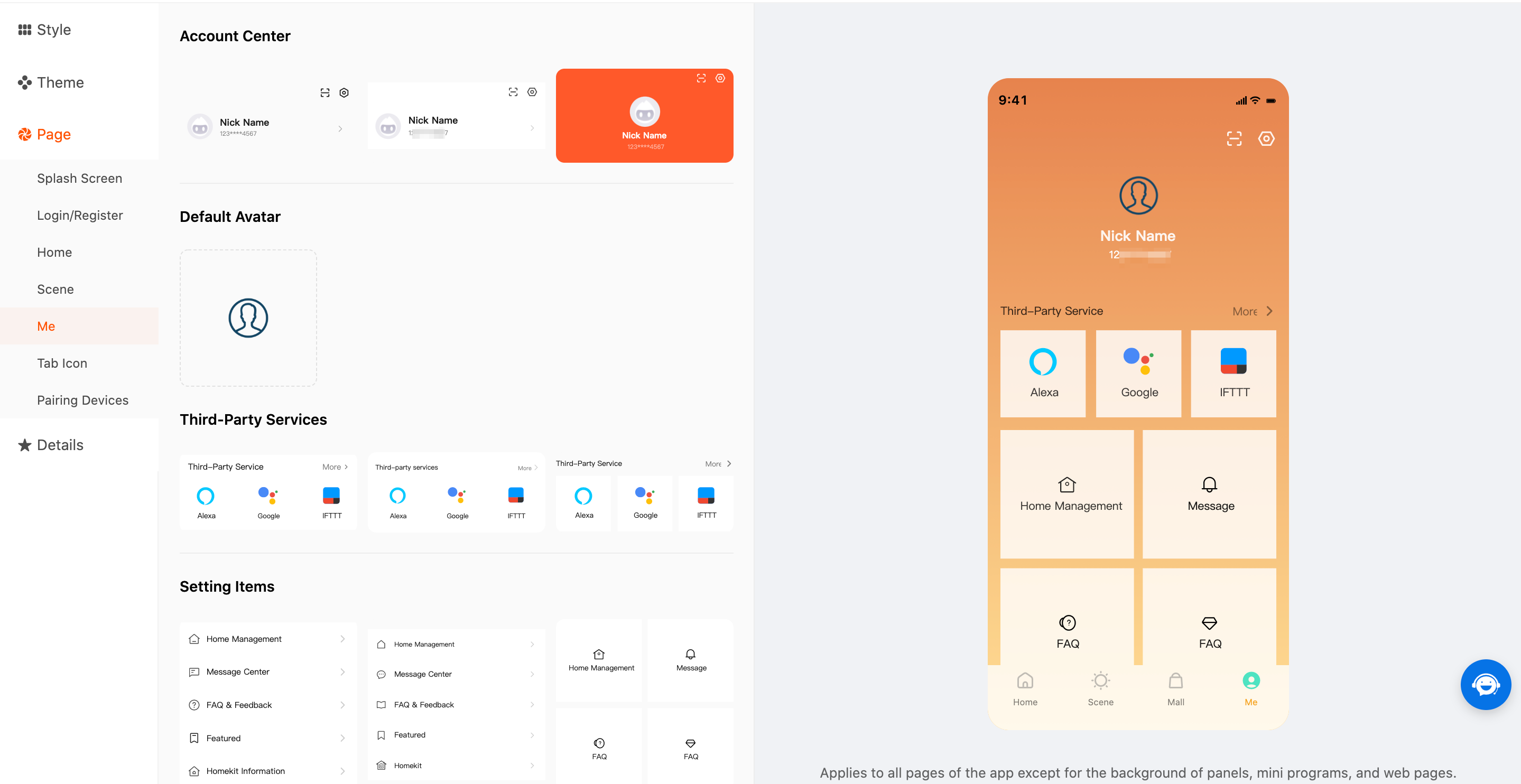
Me
-
In the Me module, you can modify and replace components such as the account center, default avatar, third-party services, setting items, and current background image.
-
You can choose among three styles to set the components such as the account center, default avatar, third-party services, and setting items.
-
Similar to the Home module, several background images are optional. You can also upload a background image to fit your personalized needs.
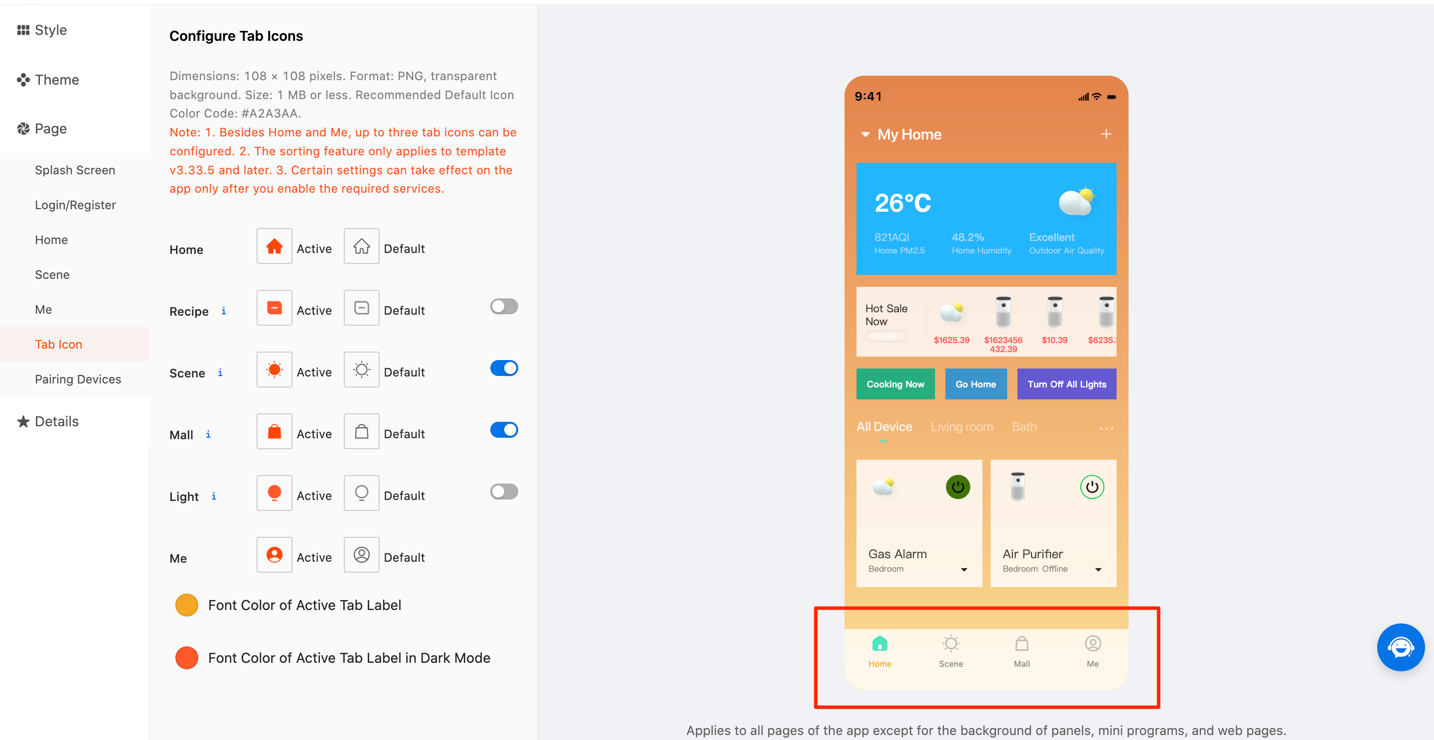
Tab icon
-
In the Tab Icon module, you can modify the tab icons and font colors of active tab labels.
-
The tab icons in the Active and Default states can be modified. The Recipe, Mall, and Light tab icons can be set only after you subscribe to required services.
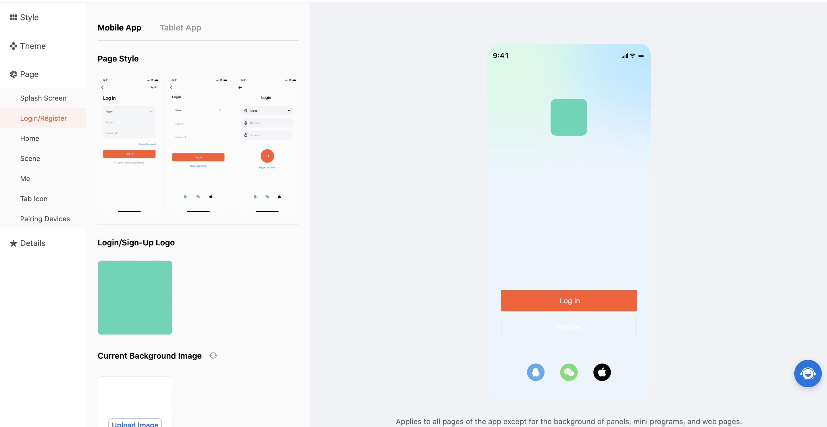
Login/Register
-
In the Login/Register module, you can modify and replace the style, logo, and current background image of the Login/Register page.
-
The logo of the Login/Register page must meet the following requirements:
- Dimensions: 400 × 400 pixels
- Format: .png
- Size: 10 MB or less
-
Similar to the Home module, several background images are optional. You can also upload a background image to fit your personalized needs. A custom image must meet the following requirements:
- Dimensions: 1080 × 1920 pixels
- Format: .png
- Size: 10 MB or less
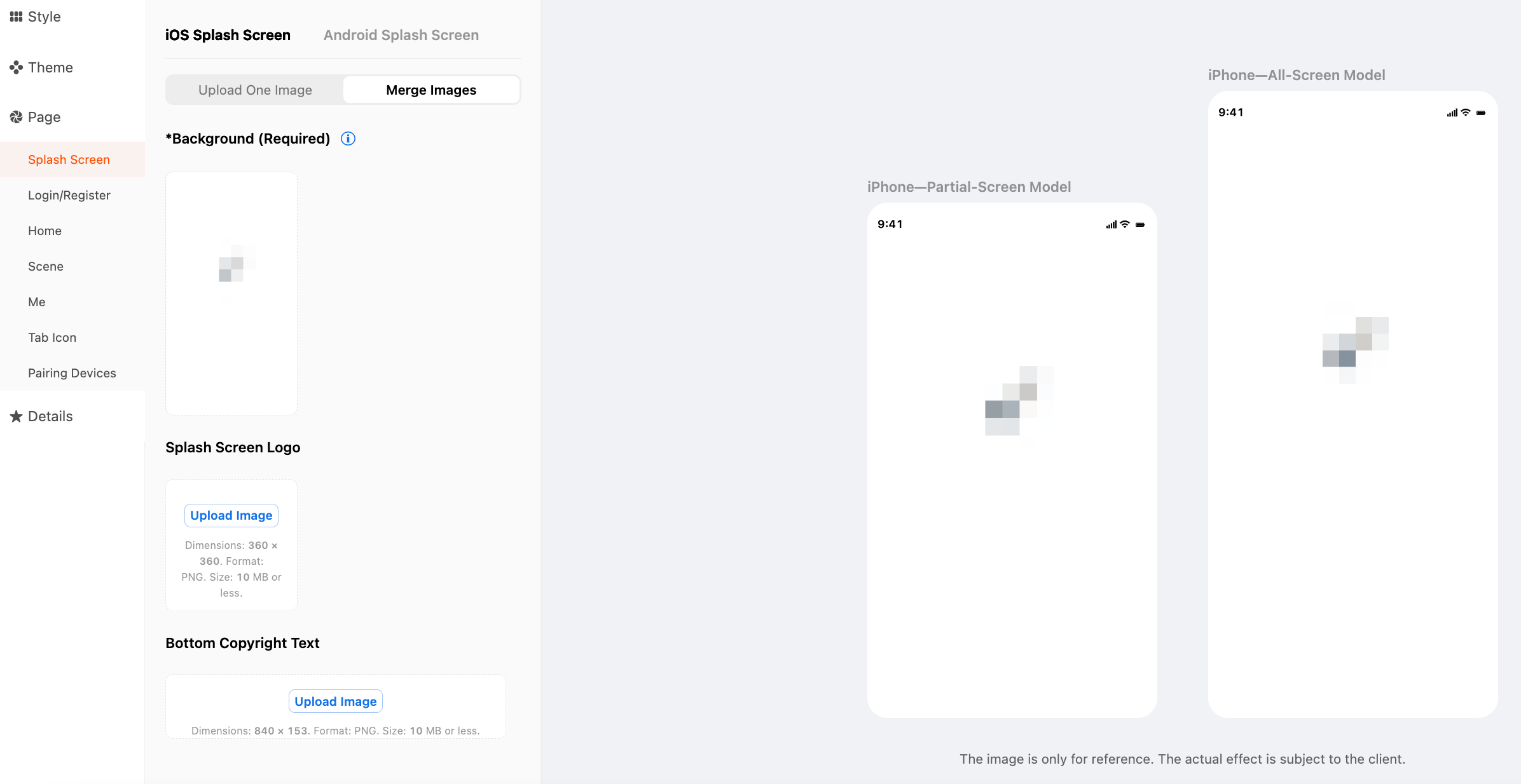
Splash screen
You can upload one image or merge images to set a splash screen.
-
To upload one image, the following requirements must be met.
Platform Terminal Specification iOS Mobile app Dimensions: 1242 × 2688 pixels.
Format: .png.
Size: 10 MB or less.iOS Tablet Dimensions: 2732 × 2048 pixels.
Format: .png.
Size: 10 MB or less.Android Mobile app Dimensions: 1080 × 1920 pixels and 1080 × 2160 pixels.
Format: .png.
Size: 10 MB or less.Android Tablet Dimensions: 2560 × 1600 pixels.
Format: .png.
Size: 10 MB or less.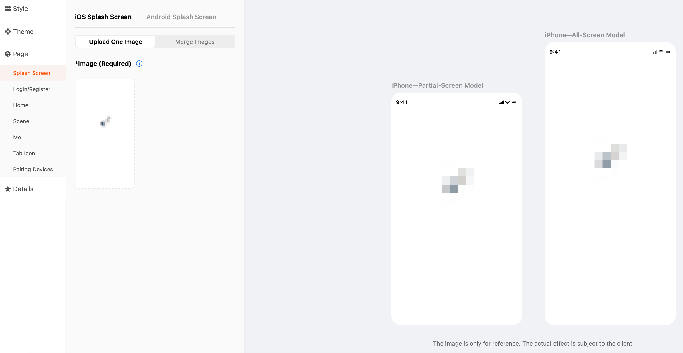
-
On the Merge Images tab, you can upload a background image, a logo image, and a bottom copyright text image. The following requirements must be met.
Platform Terminal Specification iOS Mobile app - Background: Dimensions: 1242 × 2688 pixels. Format: .png. Size: 10 MB or less.
- Splash Screen Logo: Dimensions: 344 × 344 pixels. Format: .png. Size: 10 MB or less.
- Bottom Copyright Text: Dimensions: 840 × 153 pixels. Format: .png. Size: 10 MB or less.
iOS Tablet - Background: Dimensions: 2732 × 2048 pixels. Format: .png. Size: 10 MB or less.
- Splash Screen Logo: Dimensions: 344 × 344 pixels. Format: .png. Size: 10 MB or less.
- Bottom Copyright Text: Dimensions: 840 × 153 pixels. Format: .png. Size: 10 MB or less.
Android Mobile app - Background: Dimensions: 1080 × 1920 pixels and 1080 × 2160 pixels. Format: .png. Size: 10 MB or less.
- Splash Screen Logo: Dimensions: 344 × 344 pixels. Format: .png. Size: 10 MB or less.
- Bottom Copyright Text: Dimensions: 840 × 153 pixels. Format: .png. Size: 10 MB or less.
Android Tablet - Background: Dimensions: 2560 × 1600 pixels. Format: .png. Size: 10 MB or less.
- Splash Screen Logo: Dimensions: 344 × 344 pixels. Format: .png. Size: 10 MB or less.
- Bottom Copyright Text: Dimensions: 840 × 153 pixels. Format: .png. Size: 10 MB or less.
Details
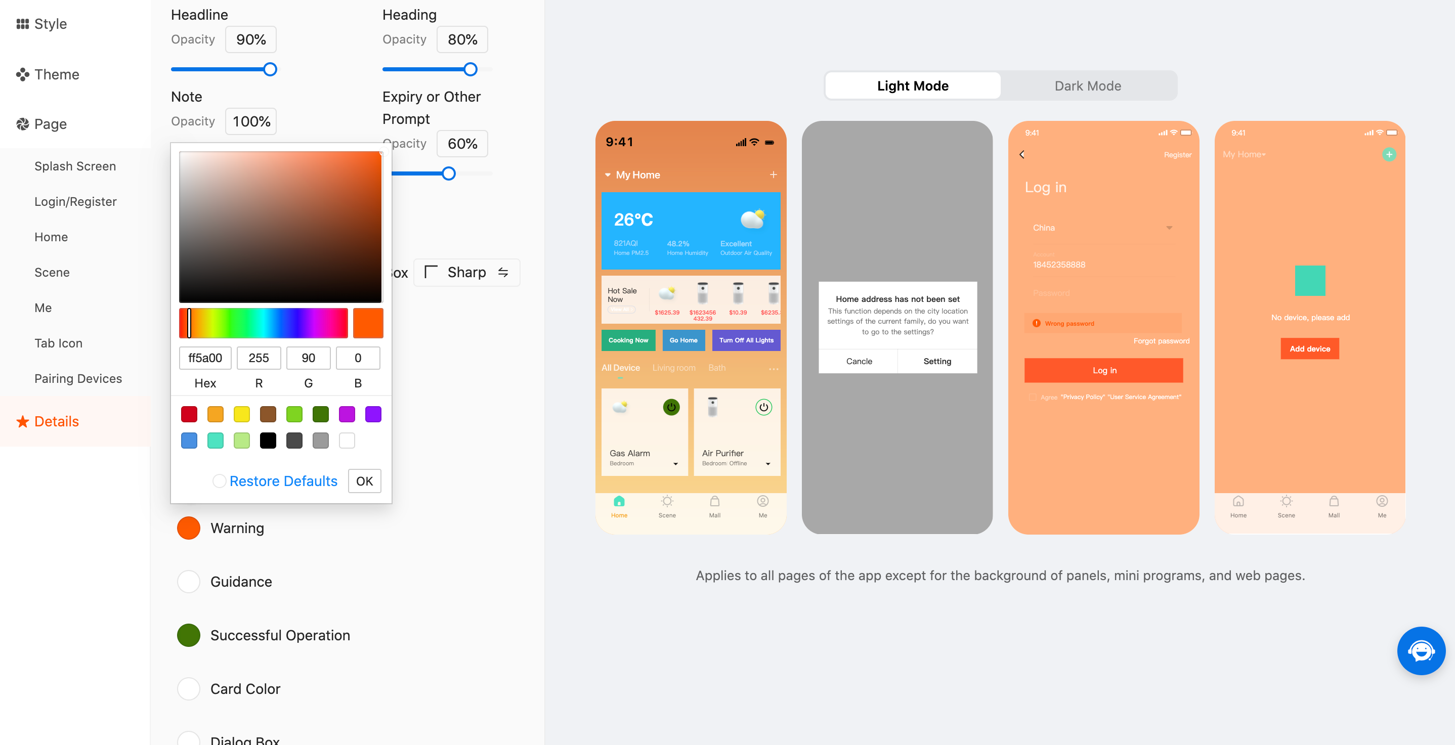
-
In the Details module, you can set the Empty State Image, Text Colors, Round Corner, and Personalized Colors sections respectively in light and dark modes.
-
In the Empty State Image section, you can set the icon that appears on a blank page. The icon must meet the following requirements:
- Dimensions: 360 × 360 pixels
- Format: .png
- Size: 10 MB or less
-
In the Text Colors section, you can adjust the text transparency. Currently, the headlines, headings, notes, expiry prompts, and other prompts are supported.
-
In the Round Corner section, you can set the corner style of cards, dialog boxes, and buttons to Round or Sharp.

-
In the Personalized Colors section, the options Warning, Guidance, Successful Operation, Card Color, Dialog Box, and Background Color of Tab Bar are currently available.
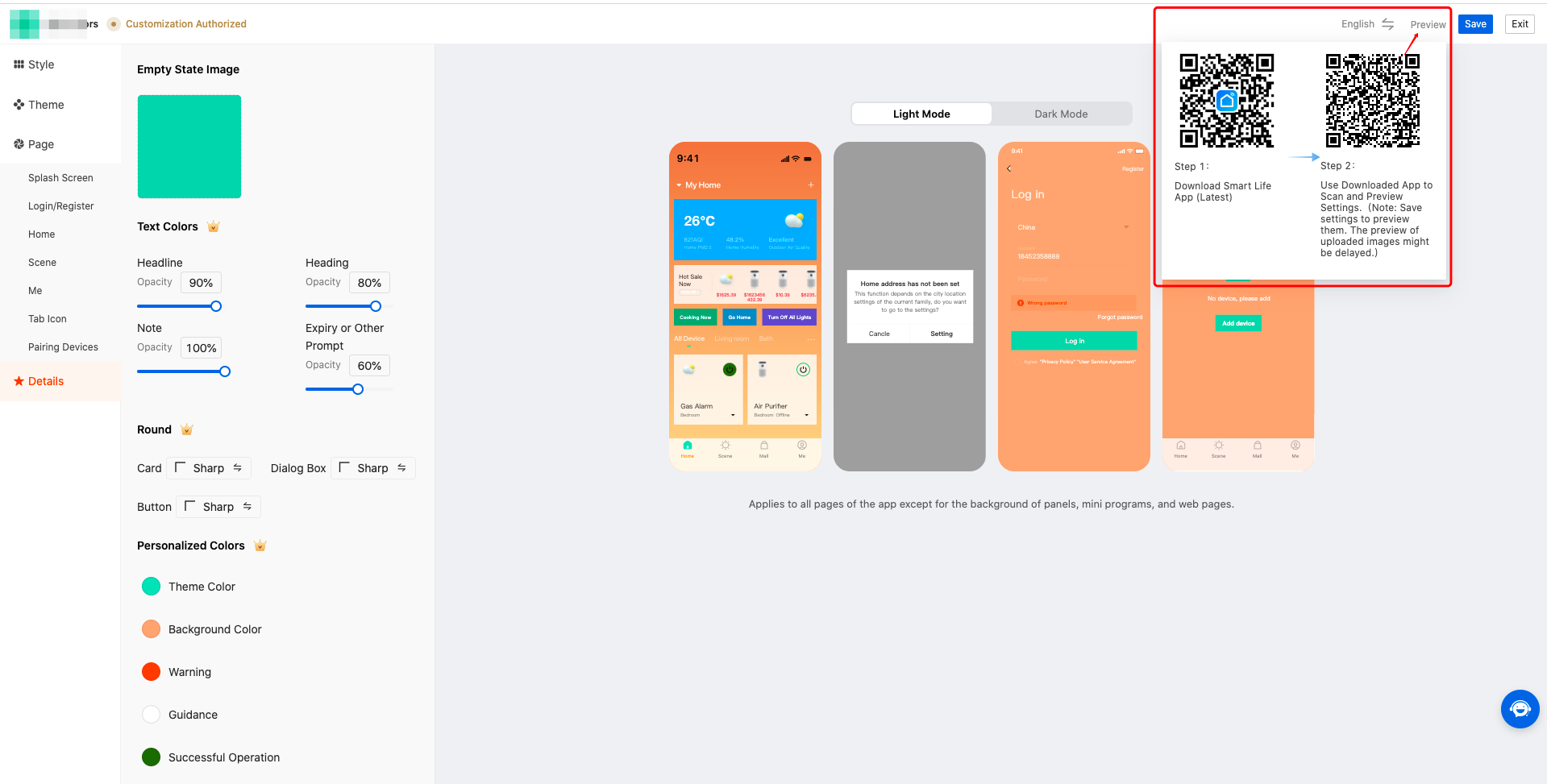
Preview
-
After the settings are finished, in the top right corner of the page, click Save to save the current settings.
-
Click Preview to see two QR codes. If the SmartLife app is not installed, scan the QR code in Step 1 to download and install the app. Then, use the app to scan the QR code in Step 2 and follow the instructions that appear to restart the app and preview the configuration result.
Permissions
Message on feature permissions
If you have not subscribed to the Custom App Tools, when you set the items that do not require specific permissions, the system shows a message on feature permissions in the right-side preview pane. This message still exists after you click Save.
Instruction on template update
If you set the items that are supported only by the template version later than the current one, these settings cannot take effect on the built app without the update to the later version.
If the components exclusive to the template version later than the current one are configured, the instruction on the template update appears in the App UI Style section.
Is this page helpful?
YesFeedbackIs this page helpful?
YesFeedback


