Style Linking Rules
This topic describes how to configure style linking rules on the Tuya Developer Platform. You can configure style linking rules when you edit a panel to support a specific scenario. For example, the background becomes blue when the associated product is switched on. The background becomes gray when the associated product is switched off.
Overview
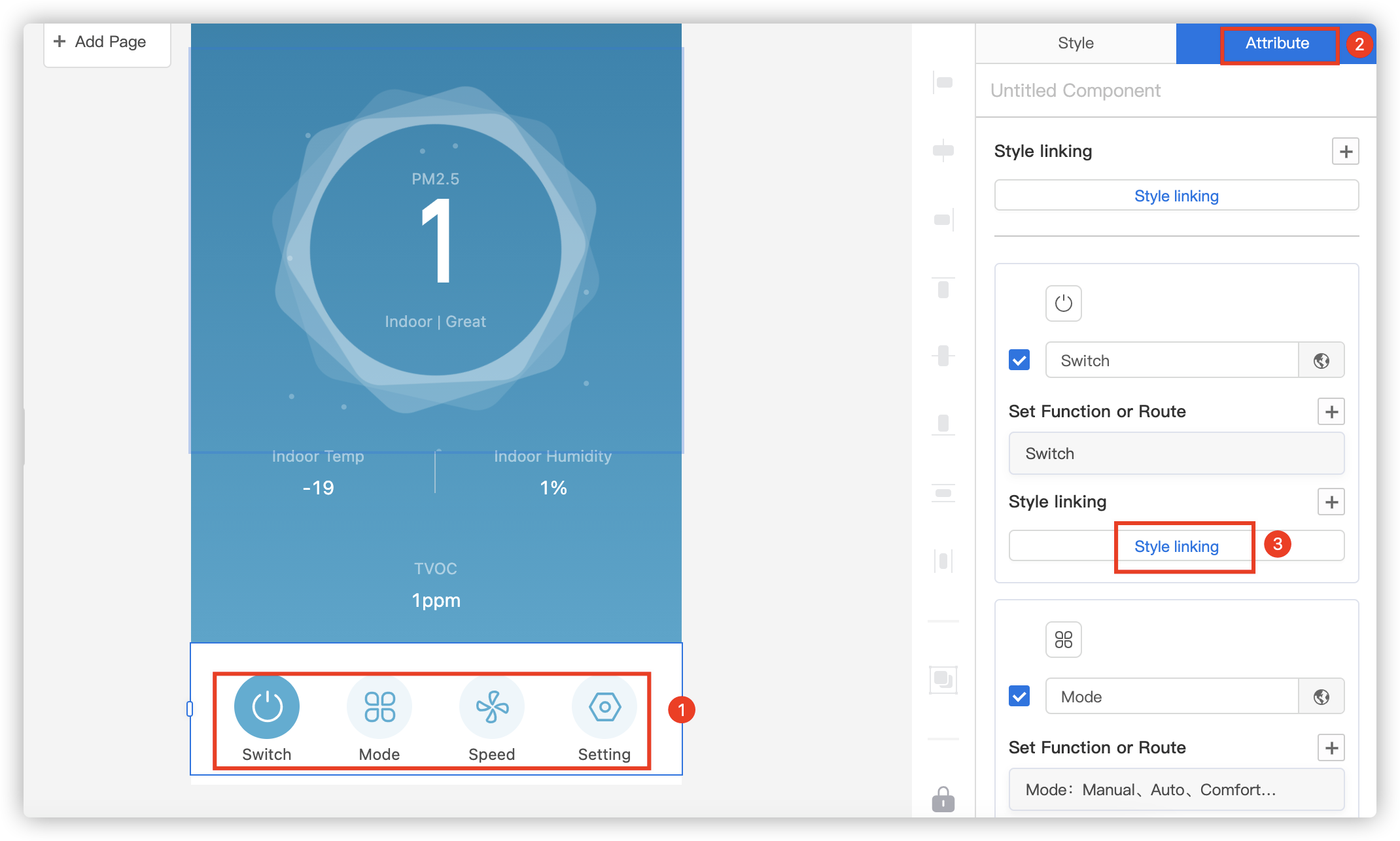
In the following example, an air purifier is used to describe how to configure the style linking rules. The icon and text of the Mode component can vary in different modes. For example, when Mode is set to Auto, the text is displayed as Auto and the auto mode icon is displayed.
Procedure
-
Select the required component from the canvas in the Panel Studio. In the top right corner of the page, click the Attribute tab. In the Mode section, click Style linking.

-
In the Style linking pane, click Add.
Note: The style linking rules are used to apply the specified text and icon to a specific scenario. For example, a specific button can be hidden in certain mode.
-
In the Add pane, configure the style linking rules. For example, the following rule can be specified: When Mode is set to Auto, the text is displayed as Auto.

-
Click Preview in the top right corner of the Panel Studio and use the Tuya app to scan the QR code that appears. Then, you can test the style linking effect in the app.
Operation result:
Based on the configured style linking rules, when users change the mode in the app, the specified style takes effect. The following figure shows the effect of the style linking function.

Is this page helpful?
YesFeedbackIs this page helpful?
YesFeedback


